
darkly
v1.0.20
Published
Dark React Starter Template + UI Kit

Readme
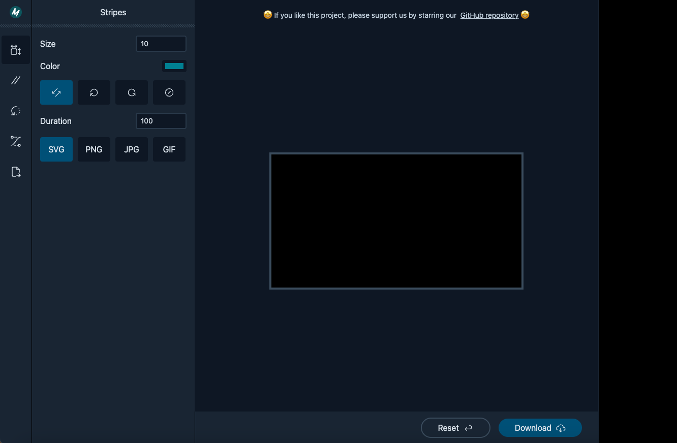
⋆⁺。☆ Darkly ☆。⁺⋆
Dark React Starter Template + UI Kit.
Features
- Responsive
- Written in TypeScript
- Based on Tailwind CSS framework
- Uses esbuild bundler
Usage
First install the module from npm:
npm i darklyThen copy one of the templates.
Import CSS file:
import 'darkly/dist/darkly.min.css';Components
Bars
Top Bar
export interface ITopBar {
    children?: React.ReactNode;
    classes?: string;
    style?: CSSProperties;
}
<BottomBar classes="justify-end">...</BottomBar>Bottom Bar
export interface IBottomBar {
    children?: React.ReactNode;
    classes?: string;
    style?: CSSProperties;
}
<TopBar classes="text-center justify-center">...</TopBar>
Boxes
Stretch Box
export interface IStretchBox {
    children?: React.ReactNode;
    classes?: string;
    style?: CSSProperties;
}
<StretchBox classes="flex justify-center items-center p-4">...</StretchBox>
Buttons
Button
export enum EButtonType {
    Primary = 1,
    OutlinePrimary = 2,
    Secondary = 3,
    OutlineSecondary = 4,
}

export interface IButton {
    children?: React.ReactNode;
    classes?: string;
    style?: CSSProperties;
    type?: EButtonType;
    onClick?: Function;
}
<Button type={ EButtonType.OutlineSecondary }>Reset</Button>
Dividers
Horizontal Splitter
export interface IHSplitter {
    classes?: string;
    style?: CSSProperties;
}
<HSplitter classes="mb-4" />
Form
Buttons Group
export interface IButtonsGroup {
    children?: React.ReactNode;
    classes?: string;
    style?: CSSProperties;
}

export interface IButtonsGroupButton {
    children?: React.ReactNode;
    classes?: string;
    style?: CSSProperties;
    title?: string;
    selected?: boolean;
    onClick?: Function;
}
<ButtonsGroup> <ButtonsGroupButton selected={ myValue === 0 } onClick={ () => { setMyValue(0); }}>My Value 1</ButtonsGroupButton> <ButtonsGroupButton selected={ myValue === 1 } onClick={ () => { setMyValue(1); }}>My Value 2</ButtonsGroupButton> <ButtonsGroupButton selected={ myValue === 2 } onClick={ () => { setMyValue(2); }}>My Value 3</ButtonsGroupButton> </ButtonsGroup>Icons Radio Buttons
export interface IIconRadioButtonGroup {
    children?: React.ReactNode;
    classes?: string;
    style?: CSSProperties;
}

export interface IIconRadioButton {
  groupName: string;
  children?: React.ReactNode;
  classes?: string;
  style?: CSSProperties;
  title?: string;
  checked?: boolean;
  onChange?: Function;
}
<IconRadioButtonGroup> <IconRadioButton groupName="my-group" title="My Title 1" checked={ myValue === 0 } onChange={ () => { setValue(0); }}> My Radio 1 </IconRadioButton> <IconRadioButton groupName="my-group" title="My Title 2" checked={ myValue === 1 } onChange={ () => { setValue(1); }}> My Radio 2 </IconRadioButton> </IconRadioButtonGroup>Color Picker
export interface IColorPicker {
    color: string;
    setColor?: Function;
    children?: React.ReactNode;
    classes?: string;
    style?: CSSProperties;
    popupPosition?: string;
    buttonWidth?: string;
    buttonHeight?: string;
    buttonPadding?: string;
}
<ColorPicker classes="m-4" color={ color } setColor={ setColor }> Color </ColorPicker>Numbers TextBox
export interface INumberTextBox {
    children?: React.ReactNode;
    classes?: string;
    style?: CSSProperties;
    width?: string|number;

    min?: number | string;
    max?: number | string;
    step?: number | string;
    decimalPlaces?: number;
    removeRegex?: RegExp;

    value?: number | string;
    setValue?: Function;
}
<NumberTextBox classes="m-4" width="100px" value={ size } setValue={ setSize }> Size </NumberTextBox>
Images
Framed Image
export interface IFramedImage {
    children?: React.ReactNode;
    classes?: string;
    style?: CSSProperties;
    width?: string|number;
    height?: string|number;
}
<FramedImage width={ '500px' } height={ '270px' } classes="mx-auto">...</FramedImage>
Menus
Vertical Icons Menu
export interface IVIconsMenu {
    children?: React.ReactNode;
    classes?: string;
    style?: CSSProperties;
}

export interface IVIconsMenuButton {
  children?: React.ReactNode;
  classes?: string;
  style?: CSSProperties;
  title?: string;
  selected?: boolean;
  onClick?: Function;
}

export interface IVIconsMenuLogo {
  href?: string;
  children?: React.ReactNode;
  classes?: string;
  style?: CSSProperties;
  title?: string;
}
<VIconsMenu> <div className="flex"> <HamburgerButton /> <VIconsMenuLogo href="/"> <svg>...</svg> </VIconsMenuLogo> </div> <HSplitter classes="mb-4" /> <VIconsMenuButton title="Image Size" selected={ true }> <svg>...</svg> </VIconsMenuButton> ... </VIconsMenu>Mobile Menu
export interface ICloseMobileMenuButton {
    classes?: string;
    style?: CSSProperties;
}

export interface IHamburgerButton {
    classes?: string;
    style?: CSSProperties;
}
Panels
Panel
export interface IPanel {
    children?: React.ReactNode;
    classes?: string;
    style?: CSSProperties;
    slideOnMobile?: boolean;
}

export interface IPanelTitle {
  classes?: string;
  style?: CSSProperties;
  children?: React.ReactNode;
}

export interface IPanelSection {
  children?: React.ReactNode;
  classes?: string;
  style?: CSSProperties;
  fullHeight?: boolean;
  scrollable?: boolean;
}
<Panel slideOnMobile={ true }> <PanelTitle> Stripes <CloseMobileMenuButton /> </PanelTitle> <HSplitter /> <PanelSection> </PanelSection> ... </Panel>
SideBars
SideBar
export interface ISideBar {
    children?: React.ReactNode;
    classes?: string;
    style?: CSSProperties;
}
<SideBar>...</SideBar>