
darkmode-plus-a11y
v0.8.0
Published
Dark mode plus 14 more accessible themes (high contrast, color-vision deficiency, anti-glare), generated from your light theme at Sass compile time. Framework-agnostic — the output is plain CSS custom properties. WCAG contrast enforced mechanically, acces

Maintainers
 simon_lm
Readme
darkmode-plus-a11y
You came for dark mode. Your users leave with 15 accessible themes — dark, four high-contrast variants, seven color-vision-deficiency palettes, anti-glare — all generated from your light theme at compile time, with WCAG contrast enforced mechanically, not promised.
⚠️ Beta — the entire
0.xlineEvery
0.xrelease is a beta release. The engine runs in production and every guarantee it ships is mechanically verified, but the API is still settling — so a breaking change can land in a minor release, and one already has (0.4→0.5changed the sign of a config option). Migration steps are always in Upgrading, so read it before you bump a minor.
1.0.0is where the beta ends and strict semver takes over. Until then, pin the version you tested if that matters to you — and please send feedback: shaping the API before it locks is exactly what this stage is for.
See it live: www.simon-lm.dev — the portfolio of this package's author, running the engine in production. Click the accessibility button in the header to switch themes.
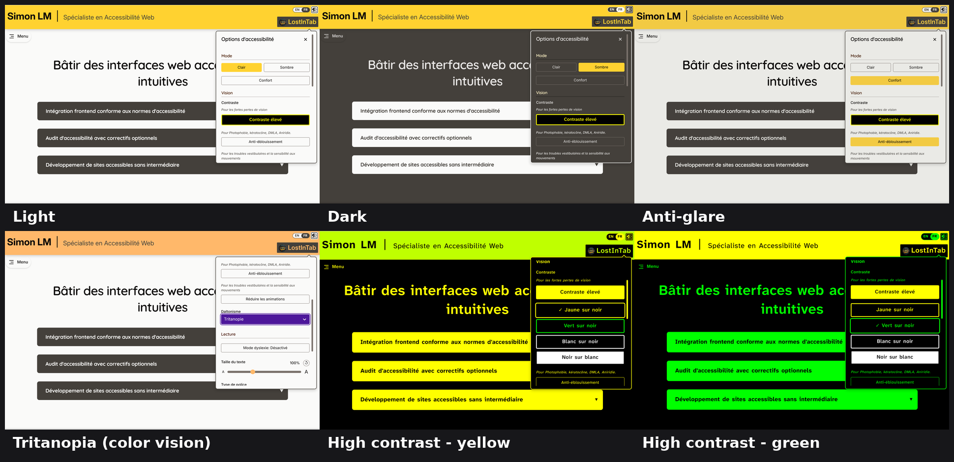
One page, six of the fifteen generated themes — every one derived from
a single light-theme declaration. The panel is the accessibility menu
init scaffolds into your project.
Why this exists
Assistive software of professional quality costs users hundreds to thousands of euros. The technologies behind it are not exotic — they just need to be normalized and spread. This package builds that quality into your website itself, free for the end user: the person who needs yellow-on-black high contrast, a color-blind-safe palette, or a dyslexia-friendly font gets it from your site, not from a €2,000 license.
What you get
- One light theme in, 15 themes out. Declare your gray family and
brand primitives once (as Tailwind-geometry
("family", weight)pairs); the engine derives dark,high-contrast(yellow, green, white, paper), all six chromatic CVD themes plus achromatopsia, and two anti-glare themes (OKLCH-based) — as plain CSS custom properties per[data-theme]block. - Guarantees, not intentions. A contrast suite you run in your own
CI (WCAG ratio per pair per theme), color-vision distinguishability
checks (ΔE CIEDE2000 on simulated perception), and a semantic
inspector (
npx darkmode-plus-a11y audit) that catches tokens wired to the wrong role — the mistake your eyes can't see in 15 themes. Note what a failure does and does not mean. The suites measure declared role pairs, so a failing pair is first a prompt to check whether those two roles are actually superimposed in your interface — text on that background, an icon on that button. Where they are, a contrast failure is a real defect. Where they never collide, the number describes nothing a user sees. AGENTS.md sets the format an AI assistant must use when it reports one to you, so presence and collision come stated rather than left for you to re-establish. - A Sass engine, not a React library. The theme engine is pure Sass and emits plain CSS custom properties, so it works in Vue, Svelte, Astro, static HTML — anything that can load a stylesheet. The React parts below are optional extras, not the product.
- React runtime (optional).
useTheme,usePrefersDarkMode, a genericusePreference, and an anti-FOUC inline script so the right theme paints first. - Accessible typography modules (opt-in). Bundled OFL fonts —
OpenDyslexic, Andika, Atkinson Hyperlegible Next, Lexend Giga/Deca —
with
@font-faceemission, font-selector classes with x-height compensation (font-size-adjust), a configurable dyslexia mode (BDA-aligned spacing), and a reduced-motion module. - A ready-made accessibility menu (optional, React), copied into
your project by
init(shadcn model): trigger button + card (theme switcher, font selector, text-size control). You own the copy — restyle it, translate it, rewire it.init --diffshows upstream changes when you want them. On another framework, the SCSS still applies and the markup is yours to write.
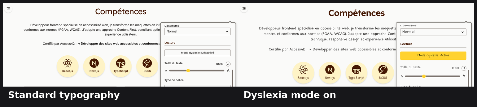
Dyslexia mode is a typography axis, not a color one: x-height
compensation (font-size-adjust) keeps the switched typeface optically
the same size, and the spacing follows BDA guidance.
Best adopted at the start of a project. The engine asks you to express colors as roles rather than values — which is a natural way to build, and an intrusive way to retrofit. On a new site you pick a role as you write each rule, and the 15 themes come for free.
On an existing site with hardcoded colors, the same result means a deliberate refactor: the mapping takes judgement rather than find-and-replace, it touches a lot of files at once, and a wrong role choice stays invisible in your light theme while surfacing in only some of the other fourteen. It is entirely doable — Migrating an existing site is that methodology, and the audit catches the mechanical part — but plan it as a refactor, not as an install, and read that section before committing to it.
Quick start
npm install darkmode-plus-a11y
npm install -D sass            # yes, even though the package depends on sass — see below
npx darkmode-plus-a11y init   # copies the UI into ./a11y + fonts into ./public/fonts
That second line is not redundant. This package does depend on sass,
but that copy belongs to its tools — the audit CLI and the contrast
suite, which compile your stylesheet to inspect it. Compiling your own
stylesheets is your build's job, so your project needs its own
declared compiler (or a bundler with SCSS support). With npm's flat
node_modules the package's copy happens to be reachable and skipping
the line appears to work; with pnpm it is not, and the build fails.
Depending on it either way would mean depending on another package's
private choice.
Declare your brand palette in
a11y/scss/theme-setup.scss— as Tailwind("family", weight)pairs (all 26 families are available):@use "darkmode-plus-a11y/scss/state" as * with ( $gray-family: "stone", $primitives: ( "accent": ( "amber", 300, ), "link": ( "sky", 900, ), // …your brand; see theme-setup.scss for the full default set ) );Import the copied SCSS from your global stylesheet (adjust the relative path):
@use "./a11y/scss/theme-setup"; // your palette → all 15 themes
@use "./a11y/scss/accessibility-features"; // fonts + dyslexia + motion
@use "./a11y/scss/accessibility-trigger";
@use "./a11y/scss/accessibility-menu";
Set the theme before first paint (anti-FOUC), e.g. Next.js App Router:
import { themeInitScript, THEMES } from "darkmode-plus-a11y/react";
import { A11Y_INIT_OPTIONS } from "./a11y/react/accessibilityPreferences";

<head>
	<script
		dangerouslySetInnerHTML={{
			__html: themeInitScript(THEMES, A11Y_INIT_OPTIONS),
		}}
	/>
</head>;
The second argument restores the typography preferences — text size, chosen font, dyslexia mode — in the same pass as the theme. It is optional, but leave it out and those apply after hydration instead: someone reading at 200 % then gets a frame of text they cannot read, on every page load.
A11Y_INIT_OPTIONSis scaffolded byinit, next to the storage keys it refers to.Not on Next.js? The call returns a plain string — inline it in a
<script>in<head>however your stack allows (staticindex.html, Vite plugin…). See AGENTS.md § Path A, step 3, for a static-HTML worked example.Render the trigger in your header, in the document flow — never a floating
position: fixedbutton (it overlaps content at high zoom):import AccessibilityControl from "@/a11y/react/AccessibilityControl"; <AccessibilityControl language="en" />;On hover/focus the trigger just needs the icon and its background to stay a contrast-safe pair — you choose what moves: invert both (the default), move the background (let your site's
button:hover,
a:hover
fill the button with your interaction color; the icon follows), or move the icon (keep the background, recolor the icon — its color then needs a weight that passes 4.5:1 on that background, see Migrating an existing site). Either way the icon is recolored via the shipped…svg g { fill }line (itsfill=currentColordoesn't follow hover on its own). High-contrast keeps its own inversion; check the hover pair in dark and anti-glare.Wire your own tokens in
a11y/scss/theme.config.scss— every token derives from a role ($bg-base,$accent,$link…), never a raw#hex. That single rule is what makes all 15 themes correct. Migrating an existing site? Read Migrating an existing site below first — picking a role from what an element looks like instead of what its original color was is the most common migration mistake.Verify mechanically:
npx darkmode-plus-a11y audit --entry styles/main.scss --load-path node_modules…and add the contrast suite to your tests — the full recipe lives in AGENTS.md.
Prefer your own UI? Skip init and use the engine directly
(AGENTS.md § Path B) — one
generate-all-themes() call. Every theme's engine config can be
tuned per theme through its $configs parameter (partial maps,
deep-merged over the defaults — see
AGENTS.md § Per-theme engine overrides).
The API: 3 layers, one rule
- Palettes — Tailwind color geometry (your brand as
("family", weight)pairs), all 26 Tailwind families (every weight, 50…950): the 17 chromatic hues (red,orange,amber,yellow,lime,green,emerald,teal,cyan,sky,blue,indigo,violet,purple,fuchsia,pink,rose), the 5 neutral grays (slate,gray,zinc,neutral,stone), and the 4 tinted neutrals (taupe,mauve,mist,olive). Your gray family tints the whole dark theme, so it's a look choice worth weighing — see Migrating an existing site below. - Roles — the package API the engines transform per theme:
backgrounds (
$bg-base,$bg-subtle,$bg-container,$bg-container-high,$bg-emphasis,$bg-emphasis-strong,$bg-inverse), foregrounds ($fg-base,$fg-muted,$fg-on-accent,$fg-on-emphasis), brand ($accent,$accent-strong,$accent-ink,$accent-soft), links & focus ($link,$link-hover,$focus-ring), borders ($border-base,$border-subtle,$border-strong), status ($success,$danger), and the neutral rail ($gray-50…$gray-950,$off-white,$near-black). - Your tokens — each defined from a role, emitted per theme as CSS custom properties.
From 1.0.0, roles follow strict semver: adding is a minor,
removing or renaming is a major with a deprecation path. While the
package is still in 0.x, a role change can land in a minor release —
either way, a removed role fails your Sass build loudly, never silently
in production.
Migrating an existing site
The recommended case is a new project, where roles are simply how you write colors from the first rule onward. Retrofitting works, and this section plus the AGENTS guide exist to make it work — but it is the harder and riskier path, so go in knowing that: the effort is a refactor across your whole stylesheet, the mapping decisions below need judgement a tool cannot supply, and the cost of getting one wrong is a defect that your light theme will happily hide from you.
Two things trip people up most — both covered in full, with grep recipes, in AGENTS.md § Migrating an existing codebase:
Map a color by its VALUE, not by what the element is. The roles are a "how visually distinct should this be" ladder (
$bg-base<$bg-container<$bg-emphasis…), not an element catalog. A "card" that was the same color as your page background should map to the same role as the page (usually$bg-base) — giving it$bg-container"because it's a card" invents a shade difference that wasn't there and can surface in only some themes. Rule of thumb: two elements that were the same hex → the same role.A color's nearest family is a starting point, not the verdict — weigh the dark-mode look you want. For the background — whose family becomes the whole neutral rail and tints every dark theme (the dark themes come from the rail's dark end, which keeps the family's hue) — contrast is guaranteed whatever you pick, so that family is a look choice, not a correctness one, and it's the one that matters most. Along the spectrum:
neutral/zinc/stonestay gray,gray/slatego cooler (slateclearly blue), the tinted neutralstaupe/mauve/mist/oliveadd a gentle wash that still works in dark, and a chromatic family (blue,emerald…) gives a boldly colored dark (a+2toward900/950keeps it usable). Find the nearest match to a real color on your site, then move along that spectrum to the look you want — the nearest match may itself be a colored family, which is fine if that's what you're after. Check with the contrast suite.For a color that must meet a ratio, pick the weight that passes — not the nearest hex-match you verify afterward. Family is a look choice, but within it the weight is the contrast: for a status color, text in a brand color, or the trigger icon when it recolors on hover, the light-theme weight you declare is used as-is. Pick the nearest weight that already passes 4.5:1. If the closest passing weight drifts from your brand color, that's a trade-off to decide (shift the shade, or adjust its background). Verify with the contrast suite.
SCSS-first — and a real bridge for Tailwind projects
This package is SCSS-first by conviction: the guarantees live at compile time (a mistyped role is a build failure, not a shipped bug), and the discipline it encodes — relative units, roles over raw colors — is what deep accessibility requires.
Using Tailwind? The bridge is short and honest: the engine's output is
plain CSS variables, so you map them once as semantic utilities
(the shadcn pattern) and keep writing Tailwind. One bg-base replaces
bg-white dark:bg-gray-900 — and scales to all 15 themes. See
AGENTS.md § Tailwind projects for the
v3/v4 snippets and the guard that makes raw palette utilities
impossible.
Extreme zoom: what the panel does
At 1000 % page zoom a 1920-wide screen reports a viewport of roughly 192 × 108 CSS pixels. That is the size the panel has to remain usable at, and it is where most CSS quietly falls apart.
The rule the scaffolded panel follows: no fixed rem on any inset.
At that viewport, 1rem is 16px — a gap on each side would eat 30 % of
the screen while everything else collapsed. Every inset is a clamp whose
middle term is driven by vw and whose floor is in px:
--panel-gap: clamp(1px, calc(1.5vw - 5px), 1rem);Read it as: 1rem is the comfortable desktop value, 1px is the floor,
and the slope decides where it starts tightening. The knee — the width at
which the value leaves its ceiling — is 100 × (ceiling + offset) / slope.
A plain N * vw passes through the origin, so its knee usually sits far
below any window you would test by hand; the negative offset is what makes
the curve steep enough to matter.
The px floor is deliberate and is one of the rare places px is the
right unit: a rem floor grows back into a wide band at exactly the zoom
levels where the space is scarcest.
Three more things the panel does, each of which took a real bug to find:
box-sizing: border-box. The height is derived from100vh, so it has to mean the outer height. Under content-box the padding and border are added on top, and the panel ends up taller than every formula believes — gaps that read1remand measure 2px.- A floor on
top, not a bigger ceiling.topdesignates the centre (the panel is translated by −50 %), so it spanstop ± height/2and fits only whiletop >= height/2. A centre capped above 50vh therefore limits the usable height to twice its own value, whatevermax-heightsays. That is arithmetic, not a value to tune. - The menu carries no height of its own. The panel is a flex column
and hands it what is left.
min-height: 0is required: a flex item defaults tomin-height: autoand refuses to shrink below its content, sooverflow-ynever engages.
Result at 1000 %: the panel takes 98 % of the height and 99 % of the width, with gaps that measure what they say.
Performance: what the fonts cost
The bundled accessibility fonts are loaded on demand. OpenDyslexic, Andika and Lexend stay out of the network trace until a visitor actually selects them, so the feature costs nothing to everyone else.
There is one exception, and it is worth knowing before you install:
- Atkinson Hyperlegible is used by the menu's own chrome (the high-contrast variant buttons), so it loads whenever the menu's markup is rendered — about 78 kB.
- The menu also sets
font-style: italicon its help descriptions, which pulls one italic face of your own body font. The weight depends on your typeface, and it can be the larger of the two.
Both are free as long as the closed panel is display: none — a subtree
that generates no box triggers no font resolution. The scaffolded SCSS
does this. If you restyle the panel, do not swap it for
visibility: hidden or opacity: 0 alone: a hidden element still takes
part in layout, so the browser resolves its fonts and downloads them, and
every visitor pays for a menu they may never open.
If you want the open/close fade back, transition-behavior:
allow-discrete with @starting-style restores it on browsers newer than
the oklch() floor above — the panel simply appears outright on the
others.
To remove the one-time swap on first open, preload both faces on the
trigger's mouseenter or focus. Visitors who never open the menu still
pay nothing.
Scope and direction
Today this package covers colors (the theme system) and text fonts (plus the dyslexia-typography and reduced-motion modules). The long-term direction is broader — coding recommendations for layouts that survive extreme magnification, far beyond WCAG's 400 % reflow — but that is future work, not a shipped feature.
Feedback wanted before 1.0.0
The point of a beta is to change things while changing them is still cheap. Right now a concrete report is worth more than a star — and these are the five things I would most like to be told I got wrong:
- The role vocabulary.
$bg-base,$bg-container,$accent-ink,$fg-on-emphasis… does that set map cleanly onto a design system you already have? What did you have to bend, and what was simply missing? This is the part that locks at1.0.0, so pushing back on it now is the single most useful thing you can do. - Themes built on a palette unlike mine. The engine derives every theme from your colors, and it has been exercised on a handful of palettes, not hundreds. If a color-vision or anti-glare theme comes out unreadable or plain ugly on your brand, that is a bug — send the primitives you declared with it.
- Retrofitting an existing site. Migrating an existing site is a methodology, not a tool. Where did it fail to survive contact with a real codebase?
- Stacks other than Next.js. The engine is plain Sass and should not care, but Next is where it gets the most mileage. Vite, Astro, SvelteKit, Rails — reports welcome, especially about the anti-FOUC step.
- Judgement from people who actually rely on these modes. If high contrast, a color-vision palette or a dyslexia-friendly typeface is something you use rather than something you implement, your read on the shipped defaults beats any ratio I can compute.
Where to send it:
- GitHub issues — preferred, because it is public and searchable: the next person finds the answer instead of the problem.
- The contact form on my site — if you would rather not open a GitHub account. Feedback about accessibility should not itself require clearing an accessibility hurdle.
Upgrading
0.7.x → 0.8.0 — the menu drops react-select, and the panel is rebuilt
for extreme zoom. init --diff is the whole upgrade, and this one is
worth reading before you take it: the two dropdowns change shape.
react-selectis gone. It was never declared as a dependency — only mentioned inAGENTS.md— yet the template imported it, soinitproduced code that would not compile until you had installed it. It is now needed by nothing. On the consumer that reported it, react-select and Emotion were 31 KB gzipped out of an 87 KB entry bundle, loaded by every visitor including those who never opened the menu. If you installed it only for this template, you can remove it.- The colour-vision and font pickers are button groups, revealed by a
parent toggle — the pattern the high-contrast variants already used.
A dropdown hid the choices behind an interaction, needed a keyboard
workaround to reopen reliably, and rendered its list through a portal in
position: fixed, which covers the page at high zoom. Buttons need none of that. - The colour-vision buttons come from your stylesheet. The menu reads
the loaded CSS and offers only the
[data-theme]blocks you actually emit. A button for a theme you never wrote is not a missing option — the user presses it and nothing happens, which for someone with a colour vision deficiency is a broken promise. Override withCOLOR_VISION_MODESinaccessibilityPreferences.ts:"auto"(default),"all", or an explicit list. - The panel survives a 1000 % page zoom. Its insets are clamps driven
by
vwwith apxfloor instead of fixedrem, it isborder-box, and the menu fills it through flex rather than carrying viewport units of its own. Details in Extreme zoom.
If you have styled the dropdowns yourself, that CSS now targets nothing —
.react-select-container and everything under it can go.
0.6.x → 0.7.0 — three fixes in the copied UI, so init --diff is the
whole upgrade. The engine is unchanged; everything below lives in
templates/, which means publishing does not fix your project. Run
npx darkmode-plus-a11y init --diff to see what moved, and port what you
want by hand — that is the shadcn model working as intended, but it does
put the step on you.
- Dyslexia mode is now persisted. It was never written to
localStorage, so it switched itself off on every reload — the one setting a user had to re-enable at each visit. Inside a single-page app only a real reload lost it, which is why it went unnoticed for so long. - The closed panel is
display: none, notvisibility: hidden. A hidden panel still takes part in layout, so the browser resolved and downloaded the menu's fonts for every visitor on every page, including those who never opened it. See Performance. The trade-off is the open/close fade, which is gone unless you bring it back withallow-discrete. - The compliance link's icon no longer shrinks. It sits in a flex row
without
flex-shrink: 0, so flex compressed it before letting the label wrap, and it rendered smaller than declared.
themeInitScript also takes an optional second argument now, so the
typography preferences are restored before the first paint like the
theme already was. Without it they apply after hydration, and someone
reading at 200 % gets a frame of unreadable text on every load:
import { A11Y_INIT_OPTIONS } from "./a11y/react/accessibilityPreferences";

themeInitScript(THEMES, A11Y_INIT_OPTIONS);
Called with one argument the output is unchanged, so existing wiring keeps working — it just keeps flashing until you pass the options.
0.5.x → 0.6.0 — a new warning, no action required. Nothing changes in
your output. On the four red-green themes the engine now reports a status
color that may be indistinguishable from your link, because those two
roles tend to land in the same place there. It is a heads-up to verify with
the distinguishability suite, not a defect and not a correction — your
colors are untouched. If you have already checked, silence it with
$status-link-separation-warn: 0. The reasoning is in
AGENTS.md.
0.4.x → 0.5.0 — adjustments signs changed (dark themes). The
per-role adjustments knob now reads the same on both sides of the
palette's midpoint: +N moves a role toward the dark end (950), -N
toward the light end (50). Previously the adjustment was added to the
shift's step count, so it inherited that shift's direction and its meaning
inverted above the midpoint — +1 darkened a light weight but lightened
a dark one.
What to do: flip the sign of any adjustment you set on a role whose
light-theme weight is above 500 (600…950). Adjustments on weights
below 500 are unaffected, and roles you never adjusted need no change.
Nothing fails loudly here — the build still compiles and the colors simply
move the other way — so re-check your dark themes after upgrading, or run
the contrast suite.
Same release, no action needed: link and link-hover are now shifted
as a pair, so two neighboring weights of one family can no longer
collapse onto the same dark value. If you had added an adjustment purely
to keep a hover state distinct from its link, you can drop it.
Good to know
- Browser support. Themes are emitted as
oklch()colors with no sRGB fallback, so the floor is Chrome 111+, Safari 15.4+, Firefox 113+ (Baseline 2023). Everything else the engine relies on — CSS custom properties,[data-theme]attribute selectors — is far older. Supporting pre-2023 browsers is not something this package does today. - Prebuilt dist.
react/andtesting/are consumed as compiled CommonJS with type declarations (dist/, built at pack time): no transpile step, notranspilePackages, no Node version requirement — any bundler and any test runner just works. The TypeScript sources ship alongside for reading and debugging. - Dependency weight.
sass,postcss, andculoriare regular dependencies on purpose: they power the verification suite and the zero-configauditCLI — the guarantees are the product, so the batteries come included. - UI languages. The copied menu ships FR/EN labels; for another language, edit your copy — you own it.
- Fonts licensing. Bundled fonts are OFL 1.1 (license texts in
fonts/LICENSES/); the package code is MIT. SPDX:MIT AND OFL-1.1. - For AI agents (and humans who want the deterministic version):
AGENTS.md is the integration contract — exact
commands, failure modes, both integration paths.
initcopies it next to the code.
Made by Simon LM (LostInTab) — web accessibility specialist. The engine runs in production on his portfolio, which is also the reference consumer for every guarantee this package ships.