
daterange-picker-reactjs
v1.0.9
Published
A beautiful and customizable single date and date-range picker component for React.js applications
Maintainers
 omogiade
Readme
React date and date-range picker
Features
- Easily customized and add unique styles with Tailwindcss
- Lightweight
- Typescript support
- Select date ranges across multiple months
- Keyboard navigation
Usage/Examples
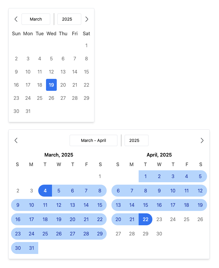
Date Picker
import { DatePicker } from "daterange-picker-reactjs";

function App() {
  return (
    <DatePicker
        preSelectedDate={new Date(2025, 1, 12)}
        onChange={(date) => console.log(date)}
        weekStartsOn = 0,
        customDaysOfWeek = {['S', 'M', 'T', 'W', 'T', 'F', 'S']}
    />
  )
}

NOTE: When customizing the customDaysOfWeek prop, make sure the start
day coincides with the weekStartsOn prop. Eg, if customDaysOfWeek's first
day starts on Monday, the weekStartsOn value should be 1.
DatePicker Props
| Name | Description | Type | isRequired | Default | |-------|-----|-----|-------|--------| | preSelectedDate | Default date selected | Date | null | null | |isSelectedStyle | Style for highlighting selected date | string | false | bg-blue-500 text-white | onChange | Callback for returning your selected date. Takes in a date prop | Function | true | - | weekStartsOn | Start day of the week | Number | false | 0 | customDaysOfWeek | Customize week names | string[] | false | ["Sun", "Mon", "Tue", "Wed", "Thu", "Fri", "Sat"] | containerStyle | CSS rules for styling calendar container | String | false | py-4 px-2 border rounded shadow-md | disabledDate | Date to be unselectable | Date | false | null | | showYearMonthDivider | Opt in to have the year/month divider visible or not | boolean | false | true | daysOfWeekStyles | Custom styles for days of the week | string | false | text-center font-medium text-black/70 | | visibleDatesStyle | Style for dates in the month | string | false | hover:bg-blue-100 cursor-pointer | prevMonthBtnIcon | Some icon/component to fit into the button for navigating to previous months | React.ReactNode | false | Chevron-left icon | nextMonthBtnIcon | Some icon/component to fit into the button for navigating to nextious months | React.ReactNode | false | Chevron-right icon | outlineStyle | Custom outline style to be applied on all focused states | string | false | outline-blue-500
DateRange Picker
import { DateRangePicker } from "daterange-picker-reactjs";

function App() {
  return (
    <DateRangePicker
        onRangeChange={(range) => console.log("Selected Range:", range)}
        disabledDates={[
          new Date(2024, 11, 25),
          new Date(2024, 0, 1),
        ]}
        customDaysOfWeek={['S', 'M', 'T', 'W', 'T', 'F', 'S']}
        preSelectedRange={{
          start: new Date(2025, 0, 12),
          end: new Date(2025, 1, 12),
        }}
        monthTitleStyle="text-red-500 uppercase"
        daysOfWeekStyles="text-red-700"
        endDateStyle="bg-red-500 text-white rounded-r-full"
        isCurrentMonthStyle="text-red-900 hover:bg-red-500"
        visibleMonths={3}
        weekStartsOn={0} // Week starts on Sunday
    />
  )
}
DateRangePicker Props
| Name | Description | Type | isRequired | Default | |-------|-----|-----|-------|--------| | onRangeChange | Callback for returning your selected range. Takes in a range prop | Function | true | - | disabledDates | Array of dates to be unselectable | Date[] | false | null | | customDaysOfWeek | Customize week names | string[] | false | ["Sun", "Mon", "Tue", "Wed", "Thu", "Fri", "Sat"] | preSelectedRange | Highlight a range of dates preselected on render. Great for when editing | { start: Date; end: Date } | false | null startDateStyle | Styling for first day of range | string | false | bg-blue-500 text-white rounded-l-full | inRangeStyles | Styling for dates in range other than first and last dates | string | false | bg-blue-200 text-blue-800 | endDateStyle | Styling for last day of range | string | false | bg-blue-500 text-white rounded-r-full | visibleDatesStyle | Styling for dates visible | string | false | some css classes | daysOfWeekStyles | Styling for days of the week | string | false | font-medium text-black/70 | monthTitleStyle | Styling for month name and year title | string | false | text-center font-semibold | containerStyle | CSS rules for styling calendar container | String | false | py-4 px-2 border rounded shadow-md | visibleMonths | The number of months to show at a time | number | false | 2 | weekStartsOn | Preferred start day of the week | number | false | 0 | prevMonthBtnIcon | Some icon/component to fit into the button for navigating to previous months | React.ReactNode | false | Chevron-left icon | nextMonthBtnIcon | Some icon/component to fit into the button for navigating to nextious months | React.ReactNode | false | Chevron-right icon | outlineStyle | Custom outline style to be applied on all focused states | string | false | outline-blue-500 | showYearMonthDivider | Opt in to have the year/month divider visible or not | boolean | false | true