
datex-ui
v1.2.7
Published
A modern, lightweight, and customizable date range picker for TypeScript/JavaScript applications
Maintainers
 emilio_dev
Readme
DateX UI - Modern Date Range Picker
A modern, lightweight, and customizable date range picker for TypeScript/JavaScript applications. Built with native JavaScript, no external dependencies.
Features
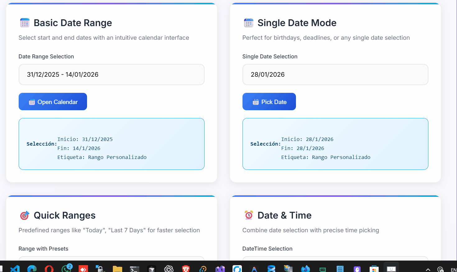
- 📅 Date Range Selection - Select start and end dates with intuitive interface
- 📆 Single Date Mode - Use as a single date picker
- ⏰ Time Picker - Optional time selection with 12/24 hour formats
- 🎨 Customizable Themes - Built-in themes (Default, Bootstrap, Material) or create your own
- 🌍 Internationalization - Built-in Spanish locale with easy customization
- 📱 Responsive Design - Works on desktop and mobile devices
- 🚀 Zero Dependencies - Pure JavaScript/TypeScript implementation
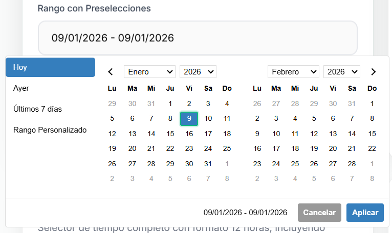
- 🎛️ Predefined Ranges - Quick selection with common date ranges
- ♿ Accessible - Keyboard navigation and screen reader support
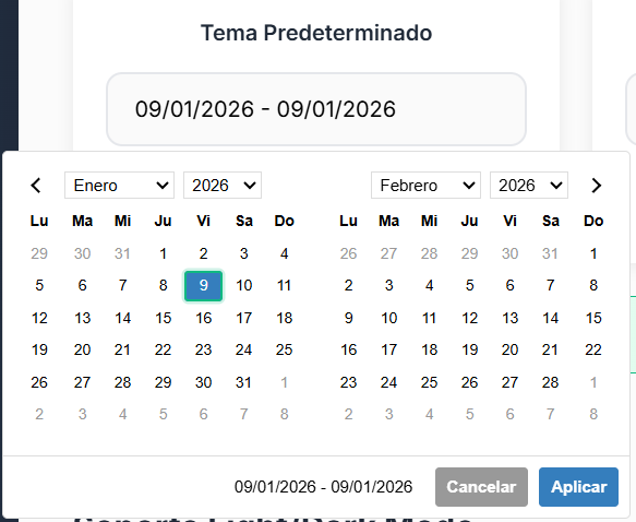
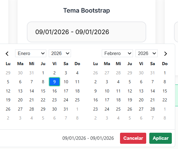
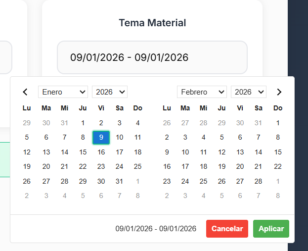
Themes
DateX UI comes with multiple built-in themes to match your application's design:
Default Theme
Bootstrap Theme
Material Theme
Screenshots
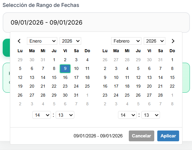
Basic Date Range Selection
Single Date Picker

Installation
npm install datex-ui
# or
pnpm add datex-ui
# or
yarn add datex-ui
Quick Start
import { Datex, SPANISH_LOCALE, DEFAULT_THEME } from "datex-ui";

// Basic usage with CSS selector
const picker = new Datex(
  "#date-input", // CSS selector or DOM element
  {
    locale: SPANISH_LOCALE,
    theme: DEFAULT_THEME,
  },
  (startDate, endDate, label) => {
    console.log("Selected:", { startDate, endDate, label });
  }
);

// Also works with class selectors and DOM elements
const picker2 = new Datex(".date-range-picker");
const picker3 = new Datex(document.getElementById("my-input"));
Usage Examples
Basic Date Range Picker
import { Datex, SPANISH_LOCALE } from "datex-ui";

// Using CSS selectors
const picker = new Datex(
  "#date-input", // ID selector
  {
    locale: SPANISH_LOCALE,
    autoUpdateInput: true,
  },
  (startDate, endDate) => {
    console.log(`Selected: ${startDate} to ${endDate}`);
  }
);

// Also works with class selectors
const picker2 = new Datex(".date-range-picker");

// Or complex CSS selectors
const picker3 = new Datex("[data-datex='range']");

// Or DOM elements directly
const picker4 = new Datex(document.getElementById("my-input"));
Single Date Picker
const singlePicker = new Datex("#single-date", {
  singleDatePicker: true,
  locale: SPANISH_LOCALE,
});
With Predefined Ranges
import { getSpanishRanges } from "datex-ui";

const picker = new Datex("#range-input", {
  ranges: getSpanishRanges(), // Built-in Spanish ranges
  locale: SPANISH_LOCALE,
  autoApply: true,
});

// Or create custom ranges
const customRanges = {
  Hoy: [new Date(), new Date()],
  Ayer: [
    new Date(Date.now() - 24 * 60 * 60 * 1000),
    new Date(Date.now() - 24 * 60 * 60 * 1000),
  ],
  "Últimos 7 días": [
    new Date(Date.now() - 6 * 24 * 60 * 60 * 1000),
    new Date(),
  ],
};

const picker2 = new Datex("#custom-ranges", {
  ranges: customRanges,
  locale: SPANISH_LOCALE,
});
With Time Picker
import { SPANISH_LOCALE_WITH_TIME } from "datex-ui";

const timePicker = new Datex("#datetime-input", {
  timePicker: true,
  timePicker24Hour: true,
  timePickerIncrement: 15,
  locale: SPANISH_LOCALE_WITH_TIME,
});
Date and Time Combined
Custom Theme
import { Datex } from "datex-ui";
const customTheme = {
primaryColor: "#ff6b6b",
backgroundColor: "#ffffff",
borderColor: "#e1e5e9",
textColor: "#495057",
selectedColor: "#ff6b6b",
rangeColor: "#ffe0e0",
};
const picker = new Datex("#themed-input", {
theme: customTheme,
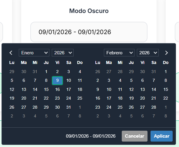
});Dark Mode Support
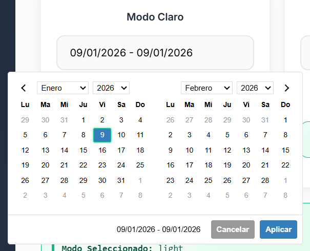
Light Mode
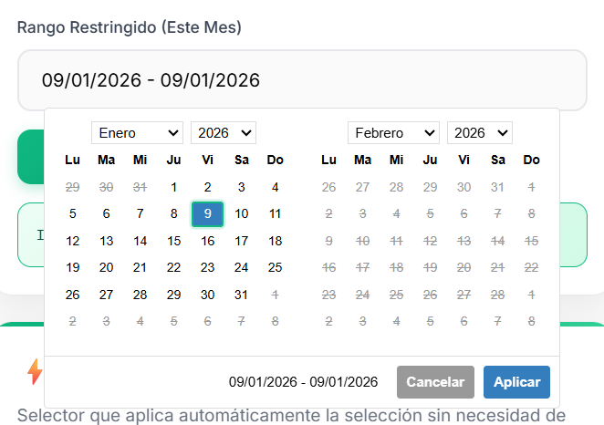
Date Restrictions
You can restrict selectable dates with min/max date options:
Mobile Responsive
DateX UI is fully responsive and works great on mobile devices:
Configuration Options
interface DatexOptions {
  startDate?: Date; // Initial start date
  endDate?: Date; // Initial end date
  minDate?: Date | null; // Minimum selectable date
  maxDate?: Date | null; // Maximum selectable date
  minYear?: number; // Minimum year in dropdowns
  maxYear?: number; // Maximum year in dropdowns
  maxSpan?: { days?: number }; // Maximum range span
  autoApply?: boolean; // Auto-apply selection
  singleDatePicker?: boolean; // Single date mode
  showDropdowns?: boolean; // Show month/year dropdowns
  linkedCalendars?: boolean; // Link calendar navigation
  autoUpdateInput?: boolean; // Auto-update input value
  alwaysShowCalendars?: boolean; // Always show calendars
  showCustomRangeLabel?: boolean; // Show "Custom Range" option
  timePicker?: boolean; // Enable time picker
  timePicker24Hour?: boolean; // 24-hour format
  timePickerIncrement?: number; // Minute increment
  timePickerSeconds?: boolean; // Show seconds
  ranges?: Record<string, [Date, Date]>; // Predefined ranges
  opens?: "left" | "right" | "center"; // Picker position
  drops?: "up" | "down" | "auto"; // Picker direction
  locale?: DatexLocale; // Localization
  theme?: DatexTheme; // Theme configuration
}
Built-in Themes
DEFAULT_THEME- Clean, modern default themeBOOTSTRAP_THEME- Bootstrap-compatible stylingMATERIAL_THEME- Material Design inspired theme
Visual Examples
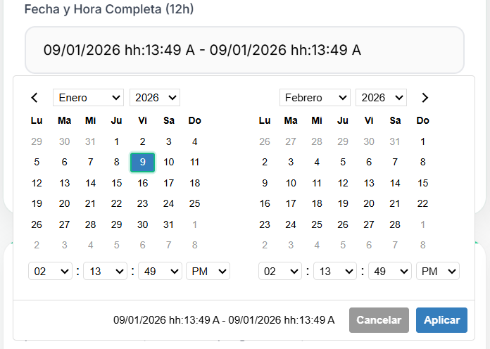
Date and Time Picker
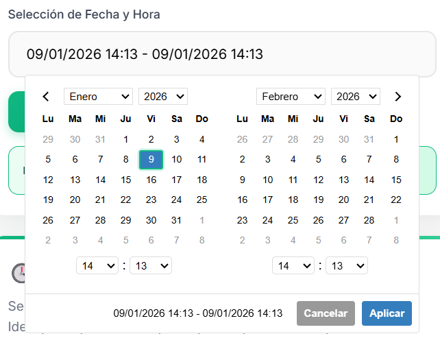
Combined date and time selection with 12/24 hour format support
Built-in Locales
SPANISH_LOCALE- Spanish localization for datesSPANISH_LOCALE_WITH_TIME- Spanish localization with time format
API Methods
// Show/hide picker
picker.show();
picker.hide();
picker.toggle();

// Get/set dates
const startDate = picker.getStartDate();
const endDate = picker.getEndDate();
picker.setStartDate(new Date());
picker.setEndDate(new Date());

// Theme management
picker.setTheme(newTheme);
picker.refreshTheme();

// Update ranges
picker.updateRanges(newRanges);

// Cleanup
picker.remove();
Events
The picker dispatches custom events:
element.addEventListener("show.daterangepicker", (e) => {
  console.log("Picker shown");
});

element.addEventListener("hide.daterangepicker", (e) => {
  console.log("Picker hidden");
});

element.addEventListener("apply.daterangepicker", (e) => {
  console.log("Selection applied");
});

element.addEventListener("cancel.daterangepicker", (e) => {
  console.log("Selection cancelled");
});
Legacy Support
For backward compatibility, you can still use the old names:
import { DateRangePicker } from "datex-ui"; // Same as Datex
// All DateRangePickerOptions, DateRangePickerTheme, etc. are available
Browser Support
- Chrome 60+
- Firefox 60+
- Safari 12+
- Edge 79+
Development
# Install dependencies
pnpm install

# Start development server
pnpm run dev

# Build library
pnpm run build

# Run tests
pnpm test

# Type checking
pnpm run type-check
Testing
Open test.html in your browser to see the library in action with various configurations.
License
MIT License - see LICENSE file for details.
Contributing
Contributions are welcome! Please read CONTRIBUTING.md for guidelines.