
dc-rangeslide
v0.1.4
Published
Slider chart for use with dc.js
Maintainers
 karenpommeroy
Readme
rangeslide.js
Customizable range slider with labels (but without jQuery)
Table of contents
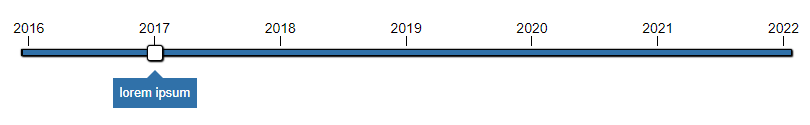
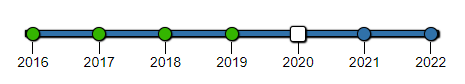
Screenshots
Quick start
Several quick start options are available:
Download the latest build
Development
Production
Install From Bower
bower install rangeslide.js --saveInstall From Npm
npm install rangeslide.js --saveDone!
Usage
Including files:
<link rel="stylesheet" href="/path/to/rangeslide.css">
<script src="/path/to/rangeslide.js"></script>
Required HTML structure
<div id="rangeslide" class="rangeslide"></div>Initialization
All you need to do is invoke rangeslide on an element:
var myRangeslide = rangeslide(domNode, options);You can also initialize with css selector string:
var myRangeslide = rangeslide("#elementId", options);Examples
There are some example usages that you can look at to get started. They can be found in the examples folder.
Options
rangeslide.js can accept an options object to alter the way it looks and behaves.
If no options object is passed default values are used.
The example of a structure of an options object is as follows:
{
  data: [
  	{ name: "example1", item: "Example text" },
  	{ name: "example2", item: "Another example text" },
  	{ name: "example3", item: function() { return "And yet another example text"; }
  ],
  showLabels: true,
  showTicks: true,
  labelsPosition: "alternate",
  startAlternateLabelsFromTop: true,
  startPosition: 0,
  thumbHeight: 16,
  thumbWidth: 16,
  handlers: {
    initialized: function(rangeslideElement) {},
    valueChanged: function(data, rangeslideElement) {},
    markerClicked: function(data, markerElement) {}
  }
Here is the explanation of options object:
Option | Type | Description | Default | Options --------------------------- | ------- | ------------------------------------------------------- | ------- | ---------- | autoPlay | Boolean | Enable auto play mode | false | autoPlayDelay | Number | Delay (in miliseconds) between steps in auto play mode | 1000 | data | Array | Array of data objects (property 'name' is mandatory | [] | enableLabelClick | Boolean | Enable click on labels | true | enableMarkerClick | Boolean | Enable click on track markers | true | enableTrackClick | Boolean | Enable click on track | true | handlers | Object | Event handlers collection | {} | highlightSelectedLabels | Boolean | Enable highlighting of selected labels | false | labelsPosition | String | Position of labels on a rangeslide | 'below' | 'above', 'below', 'alternate' labelsWidth | Number | Width of labels | 60 | leftLabel | String | Text to display on left side label | "" | loop | Boolean | Enable loop when auto play mode is active | true | markerSize | Number | Size of track marker (pixels) | 14 | rightLabel | String | Text to display on right side label | "" | showLabels | Boolean | Show/hide labels | false | sideLabelsWidth | Number | Width of left and right side labels | 40 | showTrackMarkersProgress | Boolean | Indicate progress on markers | false | showTicks | Boolean | Show/hide label ticks | false | showTrackMarkers | Boolean | Show/hide track markers | false | showTrackProgress | Boolean | Indicate progress on track | false | showValue | Boolean | Show/hide value indicator | false | startAlternateLabelsFromTop | Boolean | Show first label above if labelsPosition is 'alternate' | false | startPosition | Number | Initial position of rangeslide thumb | 0 | stepSize | Number | Size of rangeslider step | 16 | thumbHeight | Number | Height of thumb element (in pixels) | 16 | thumbWidth | Number | Width of thumb element (in pixels) | 16 | tickHeight | Number | Height of label's tick (in pixels) | 16 | trackHeight | Number | Height of rangeslide track (in pixels) | 7 | valueIndicatorOffset | Number | Value indicator offset from rangeslider thumb | 5 | valueIndicatorWidth | Number | Width of value indicator (in pixels) | 32 | valueIndicatorHeight | Number | Height of value indicator (in pixels) | 32 | valuePosition | String | Position of value indicator | 'thumb' | 'above', 'below', 'thumb' valueSource | String | Source of data for value indicator | 'index' | 'index', 'name', 'item'
Data
Data collection for rangeslide is provided during instatiation or later using "data" attribute in options. Number of steps (markers) for a slider is equal to number of items passed in this attribute. Each data item is required to have at least "name" attribute (String). You can also pass additional data using "item" attribute. Below is an example of proper data setup:
rangeslide("#element" {
	data: [
    	{ name: "data1", item: "simple string data"},
        { name: "data2", item: ["data", "in", "a", "form", "of ", "an", "array"] },
        { name: "data3", item: function() { return "data in a form of a function"; } },
        { name: "data4", item: { "passing": "object", "as": "data" } },
        { name: "data5" }
    ]
})
Rangeslide constructed with the above data will have 3 steps (markers).
Methods
Methods are called on rangeslide instances. You shoud save the instances to variable to have further access to it.
Object getValue()
Get current rangeslide value.
var item = rangeslide.getValue();DOMNode getElement()
Gets rangeslide's DOM node object.
var node = rangeslide.getElement();void setValue(Number index)
Set rangeslide value by specifying data index.
rangeslide.setValue(2);void setValueByName(String name)
Set rangeslide value by specifying data name. If multiple data items with the same names are found first one is set.
rangeslide.setValueByName("exampleName");void setOption(String name, Object value)
Gets rangeslide's DOM node object.
rangeslide.setOption("autoPlay", true);void refresh()
Manually refresh and redraw rangeslide. Invoked automatically when options change.
rangeslide.refresh();Events
rangeslide.js provides custom events for some of it's actions. Appropriate callbacks can be specified in options.
Event | Description | Arguments ----------------- | --------------------------------------- | ------------------ | valueChanged | Fires after slider value is changed | dataItem, rangeslideElement playStart | Fires when auto play is started | dataItem, rangeslideElement playStop | Fires when auto play is stopped | dataItem, rangeslideElement initialized | Fires after slider is initialized | rangeslideElement refreshed | Fires after slider is refreshed | rangeslideElement trackClicked | Fires after slider track is clicked | dataItem, trackElement labelClicked | Fires after label is clicked | dataItem, labelElement markerClicked | Fires after track marker is clicked | dataItem, markerElement thumbDragStart | Fires when thumb dragging is initiated | dataItem, thumbElement thumbDragged | Fires when thumb is being dragged | dataItem, thumbElement thumbDraggedEnd | Fires when thumb is dropped | dataItem, thumbElement
Event handlers are passed in rangeslide options like in the example below:
rangeslide("#element" {
	handlers: {
    	"valueChanged": [function(data, element) { console.log(data); }],
        "labelClicked": [
        	function(data, element) { console.log(data); },
            function(data, element) { return data.name; },
            function(data, element) { element.style.backroundColor = "#e2e3e4"; },
        ]
    }
})
Copyright and license
Licensed under MIT license.