
diandi-ele-upload-file
v1.1.0
Published
对 element-ui upload 组件进一步封装, 使其更简单、易用
Maintainers
 ddiot
ddiotReadme
vue-ele-upload-file | 使 element-ui upload 组件更简单、好用


安装
npm install vue-ele-upload-file --save用法
import EleUploadFile from "vue-ele-upload-file";

export default {
  components: {
    EleUploadFile
  }
};
示例
简单用法
<template>
  <ele-upload-file
    :responseFn="handleResponse"
    action="https://jsonplaceholder.typicode.com/posts/"
    v-model="file"
  />
</template>
<script>
  export default {
    data() {
      return {
        file: []
      };
    },
    methods: {
      // 对请求结果处理, 返回对象
      handleResponse(response, file) {
        return {
          url: URL.createObjectURL(file.raw),
          name: file.name,
          size: file.size
        };
      }
    }
  };
</script>
增加属性
<template>
<ele-upload-file
:disabled="false"
:file-type="['doc', 'pdf', 'png', 'jpeg', 'jpg']"
:fileSize="2"
:isCanDelete="true"
:isCanDownload="true"
:isCanUploadSame="true"
:isShowSize="true"
:isShowTip="true"
:limit="6"
:multiple="true"
:responseFn="handleResponse"
action="https://jsonplaceholder.typicode.com/posts/"
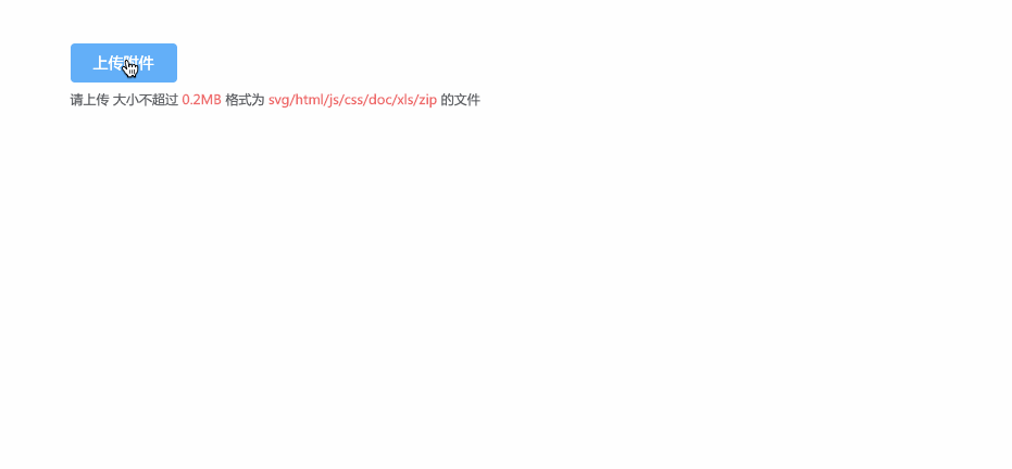
placeholder="上传附件"
v-model="file"
/>
</template>Props 参数
  props: {
    // 值
    value: [String, Object, Array],
    // 必选参数,上传的地址
    // 同 element-ui upload 组件
    action: {
      type: String,
      required: true
    },
    // 大小限制(MB)
    fileSize: Number,
    // 响应处理函数
    responseFn: Function,
    // 文件类型, 例如['png', 'jpg', 'jpeg']
    fileType: Array,
    // 提示
    placeholder: String,
    // 是否禁用
    disabled: Boolean,
    // 是否显示文件大小
    isShowSize: {
      type: Boolean,
      default: true
    },
    // 是否显示下载
    isCanDownload: {
      type: Boolean,
      default: true
    },
    // 是否可删除
    isCanDelete: {
      type: Boolean,
      default: true
    },
    // 是否可上传相同文件
    isCanUploadSame: {
      type: Boolean,
      default: true
    },
    // 是否显示提示
    isShowTip: {
      type: Boolean,
      default: true
    },
    // 是否显示上传成功的提示
    isShowSuccessTip: {
      type: Boolean,
      default: true
    },
    // 删除前的操作
    // 同 element-ui upload 组件
    beforeRemove: Function
    // 设置上传的请求头部
    // 同 element-ui upload 组件
    headers: Object,
    // 是否支持多选文件
    // 同 element-ui upload 组件
    multiple: {
      type: Boolean,
      default: true
    },
    // 上传时附带的额外参数
    // 同 element-ui upload 组件
    data: Object,
    // 上传的文件字段名
    // 同 element-ui upload 组件
    name: {
      type: String,
      default: 'file'
    },
    // 支持发送 cookie 凭证信息
    // 同 element-ui upload 组件
    withCredentials: {
      type: Boolean,
      default: false
    },
    // 接受上传的文件类型
    // 同 element-ui upload 组件
    accept: String,
    // 最大允许上传个数
    // 同 element-ui upload 组件
    limit: Number
  },
事件
| 事件名称 | 说明 | 回调参数 | | -------- | ------------------ | ---------------- | | remove | 当文件被删除时触发 | (file, fileList) | | success | 文件上传成功时触发 | (file, fileList) | | error | 上传失败时触发 | (error) |