
didi-simple-table
v0.2.5
Published
A lightweight, developer-friendly data table for Angular with sorting, searching, pagination, selection and custom cell templates.

Maintainers
 dddpsilva
Readme
didi-simple-table
The lightweight Angular table for everyday applications.
Live Demo → · ★ Star · ♥ Sponsor


If this table is useful, please star the repo — it helps other Angular developers find it. You can also sponsor on GitHub to keep the project going.
You do not need AG Grid, PrimeNG, or Angular Material for a normal CRUD/admin table. Pass in columns and row data. The table handles the rest.
- Sorting
- Search
- Pagination
- Row selection
- Row click
- Loading state
- Empty state
- Custom cell templates
- Sticky header
- Horizontal scrolling
- TypeScript-friendly
npm install didi-simple-tablePeer dependencies: @angular/core and @angular/common >=14.0.0 <23.0.0 (Angular 14 through 22).
Quick start
Lead with standalone. Import the table, give it a row type, then bind columns and data. key is checked against the row type, so typos fail at compile time.
import { Component } from '@angular/core';
import { SimpleTableComponent, TableColumn } from 'didi-simple-table';

interface User {
  id: number;
  name: string;
  email: string;
  status: string;
}

@Component({
  selector: 'app-users',
  standalone: true,
  imports: [SimpleTableComponent],
  template: `
    <didi-simple-table
      [columns]="columns"
      [data]="users"
      [sortable]="true"
      [searchable]="true"
      [pageSize]="10"
    ></didi-simple-table>
  `
})
export class UsersComponent {
  columns: TableColumn<User>[] = [
    { key: 'name', label: 'Name', sortable: true },
    { key: 'email', label: 'Email' },
    { key: 'status', label: 'Status' }
  ];

  users: User[] = [
    { id: 1, name: 'Ada Lovelace', email: '[email protected]', status: 'Active' },
    { id: 2, name: 'Alan Turing', email: '[email protected]', status: 'Active' },
    { id: 3, name: 'Grace Hopper', email: '[email protected]', status: 'Leave' }
  ];
}
That is the whole setup. Nested fields use dotted paths such as address.city.
Why this table
didi-simple-table is the simple Angular data table — not the most powerful Angular data grid.
AG Grid and ngx-datatable win when you need a spreadsheet: virtualization, pinning, resizing, and enterprise features. This library is for the table you ship in an admin app: typed columns, sort, search, pagination, and templates, with no extra UI kit.
Custom cells
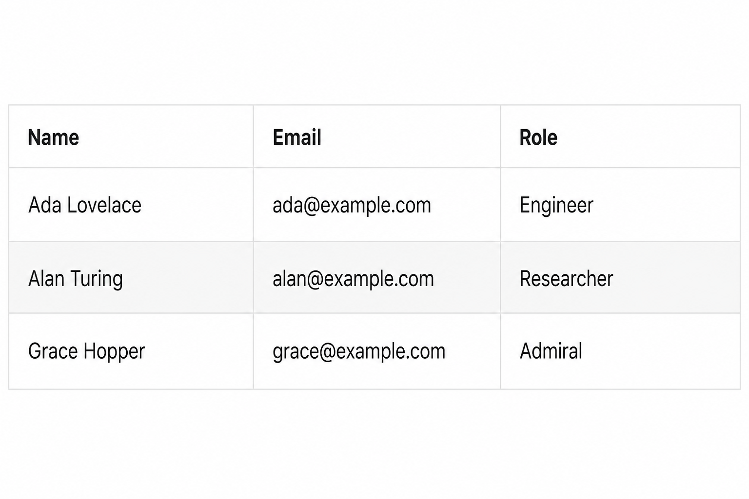
For buttons, links, or badges, import SIMPLE_TABLE_IMPORTS so the didiCell / didiHeader / didiEmpty / didiLoading directives are available.
import { Component } from '@angular/core';
import { SIMPLE_TABLE_IMPORTS, TableColumn } from 'didi-simple-table';

interface User {
  name: string;
  email: string;
  role: string;
}

@Component({
  selector: 'app-users',
  standalone: true,
  imports: [...SIMPLE_TABLE_IMPORTS],
  template: `
    <didi-simple-table
      [columns]="columns"
      [data]="users"
      [loading]="loading"
      [sortable]="true"
      [pageSize]="3"
    >
      <ng-template didiCell="email" let-row>
        <a [href]="'mailto:' + row.email">{{ row.email }}</a>
      </ng-template>

      <ng-template didiCell="role" let-row>
        <span class="badge">{{ row.role }}</span>
      </ng-template>

      <ng-template didiEmpty>No users to show.</ng-template>
      <ng-template didiLoading>Loading users…</ng-template>
    </didi-simple-table>
  `
})
export class UsersComponent {
  loading = false;

  columns: TableColumn<User>[] = [
    { key: 'name', label: 'Name' },
    { key: 'email', label: 'Email' },
    { key: 'role', label: 'Role' }
  ];

  users: User[] = [
    { name: 'Ada Lovelace', email: '[email protected]', role: 'Engineer' },
    { name: 'Alan Turing', email: '[email protected]', role: 'Researcher' },
    { name: 'Grace Hopper', email: '[email protected]', role: 'Admiral' }
  ];
}
NgModule apps can import SimpleTableModule instead. It re-exports the same standalone component and directives.
import { NgModule } from '@angular/core';
import { SimpleTableModule } from 'didi-simple-table';

import { UsersComponent } from './users.component';

@NgModule({
  declarations: [UsersComponent],
  imports: [SimpleTableModule]
})
export class UsersModule {}
Features
Columns without a didiCell template still print the field value. Use format on a column for a simple formatter, didiHeader for a custom header, and didiCell for buttons, icons, or conditional styles. If loading is true, the loading state replaces the rows. If loading is false and data is empty, the empty state is shown instead. With [sortable]="true", click a header to cycle ascending, descending, and the original order. Inactive sort arrows show on hover (sortIcons="hover", the default); the active column keeps its arrow. Set [sortIcons]="'always'" to keep every arrow visible, or 'never' to hide them — headers stay clickable. Strings, numbers, and dates sort automatically; set sortType or compare when you need control. [multiSort]="true" sorts by more than one column. Server paging leaves data as-is and emits (sortChange) so the parent can reload.
Set [pageSize] to paginate. The pager includes First, Previous, Next, and Last. Set [pagerNav]="'icon'" for « ‹ › » instead of words. Switch with [pagination]="'client'" or [pagination]="'server'". [pageSizeOptions] adds a rows-per-page selector. [searchable] adds a search box; client mode filters locally, server mode emits the term so you can query the API.
- Client: pass the full list. The table searches, sorts, and slices it.
- Server: pass one page,
[total]from the API, and reloaddataon(queryChange)(or the individual page, sort, search, and page-size events). - Page state: sort and search reset to page 1 by default. Set
[resetPageOnSort]/[resetPageOnSearch]tofalseto keep the current page (it is clamped if it is now past the last page).
(rowClick) emits the row you clicked. [selectable]="'single'" or "'multiple'" highlights rows; bind [(selected)] to keep them. Use identityKey so selection still matches after the API returns new objects.
[stickyHeader]="true" with maxHeight keeps headers visible while rows scroll. Sticky headers and pinned columns use an opaque background so rows do not show through. caption names the table for assistive tech.
[columnCollapse]="true" lets users hide extra columns from a Columns menu. Hover a header to reveal a hide control (headerHideButtons="hover", the default). Set [headerHideButtons]="'always'" to keep the × visible on every collapsible column, or 'never' to remove header hide buttons so users only use the Columns menu. After hiding some, Show all restores the full set in one click. Set hidden: true on a column to start it collapsed, or collapsible: false to keep it always visible.
On small screens, responsive="stack" turns each row into a labeled card when the table is narrower than breakpoint. Card labels use the same didiHeader template as the column title (so translations apply), or column.label if there is no template. maxHeight / sticky header are ignored while stacked so the pager stays under the cards. responsive="scroll" keeps the grid and scrolls sideways; [stickyFirstColumn]="true" pins the first column. Set pinned: true (or 'start') on identifier columns and pinned: 'end' on action columns so the middle can scroll. Set hideOnMobile: true on a column to drop it automatically in the narrow view.
By default the table inherits the host app’s font and text color (theme="inherit"). Set theme="light" (or dark, teal, warm, compact) for a packaged look. You can still override CSS variables on didi-simple-table, or add a class and target inner elements (th, td, .didi-pager).
<didi-simple-table [columns]="columns" [data]="users"></didi-simple-table><didi-simple-table theme="dark" [columns]="columns" [data]="users"></didi-simple-table>didi-simple-table {
--didi-accent: #0f766e;
--didi-header-bg: #f0fdfa;
--didi-radius: 4px;
}
.my-table th {
text-transform: uppercase;
}<didi-simple-table
[columns]="columns"
[data]="users"
[loading]="loading"
[sortable]="true"
[sort]="sort"
[pageSize]="10"
[pageSizeOptions]="[10, 25, 50]"
[page]="page"
[pagination]="pagination"
[total]="total"
[searchable]="true"
[search]="search"
(queryChange)="onQueryChange($event)"
></didi-simple-table>API
Import
| Export | Use |
| --- | --- |
| SIMPLE_TABLE_IMPORTS | Spread into a standalone component imports array. Includes the table and template directives. |
| SimpleTableModule | Import in an NgModule (or in imports of a standalone component). Re-exports the same pieces. |
| SimpleTableComponent | Standalone table. Import this plus the template directives, or use the array / module above. |
Selector
didi-simple-table
Inputs
| Input | Type | Default | Description |
| ---------------- | ------------------ | -------------- | ------------------------------------------------ |
| columns | TableColumn<T>[] | [] | Header labels and which field each column reads. |
| data | T[] | [] | Rows to render. Full list for client paging, or one page for server paging. |
| loading | boolean | false | When true, shows an overlay if rows are already visible, or a loading row when the table is empty. |
| emptyMessage | string | 'No data' | Empty text when there is no search/filter and no custom didiEmpty content. Override via labels too. |
| noResultsMessage | string | 'No matching rows' | Empty text when search or column filters match nothing. |
| loadingMessage | string | 'Loading...' | Loading text when there is no custom didiLoading content. |
| sortable | boolean | false | When true, clickable headers sort by that column. |
| sortIcons | 'hover' \| 'always' \| 'never' | 'hover' | Inactive sort arrows show on hover/focus. The active column keeps its arrow. 'always' shows every arrow. 'never' hides them; headers stay clickable. |
| sort | TableSort<T> \| TableSort<T>[] \| null | null | Current sort. A single spec, or an array when multiSort is on. Use with (sortChange) or [(sort)]. |
| multiSort | boolean | false | When true, each header click adds or cycles that column without clearing the others. |
| pageSize | number \| null | null | Rows per page. Omit or null to show every row. |
| pageSizeOptions | number[] \| null | null | Sizes shown in the pager select. Omit to hide the control. |
| page | number | 1 | Current page (1-based). Use with (pageChange) or [(page)]. |
| pagination | 'client' \| 'server' | 'client' | client searches, sorts, and slices data. server leaves data as-is. |
| pagerNav | 'label' \| 'icon' | 'label' | Pager buttons as words (First, Previous, Next, Last) or icons (« ‹ › »). Aria labels stay as words. |
| total | number \| null | null | Total row count. Required for the pager in server mode. |
| searchable | boolean | false | When true, shows a search box above the table. |
| search | string | '' | Current search text. Use with (searchChange) or [(search)]. |
| searchPlaceholder | string | 'Search' | Placeholder for the search box. |
| searchKeys | Array<TableField<T>> \| null | null | Fields to match. Defaults to every column key. |
| searchDebounce | number | 300 | Delay in ms before search emits. 0 is immediate. Enter and clear apply immediately. |
| labels | Partial<TableLabels> | {} | Override pager, search, columns, and aria strings. Use {count}, {label}, {page}, {total}, {start}, {end} placeholders. |
| filters | TableFilters<T> | {} | Per-column filter values. Use with (filtersChange) and column.filter. |
| resetPageOnSort | boolean | true | When true, sorting moves back to page 1. |
| resetPageOnSearch | boolean | true | When true, searching moves back to page 1. |
| selectable | false \| 'single' \| 'multiple' | false | Row selection. true is the same as 'single'. |
| selected | T[] | [] | Currently selected rows. Use with (selectedChange) or [(selected)]. |
| identityKey | TableField<T> | — | Field used to compare rows after they are recreated, including nested paths. |
| selectOnRowClick | boolean | true | When false, clicking a row emits (rowClick) but does not toggle selection. Use checkboxes to select. |
| selectAllMode | 'page' \| 'filtered' | 'page' | Header checkbox selects the current page, or every matching row. |
| stickyHeader | boolean | false | When true, header cells stay visible while the table body scrolls. |
| maxHeight | string \| null | null | Max height of the scroll area, for example '240px'. Use with stickyHeader. |
| caption | string | '' | Accessible table name (visually hidden). |
| theme | 'inherit' \| 'light' \| 'dark' \| 'teal' \| 'warm' \| 'compact' | 'inherit' | inherit uses the host font and currentColor. Packaged looks: light, dark, teal, warm, compact. Unknown values fall back to inherit. |
| themePicker | boolean | false | When true, shows a theme select in the table toolbar. Off by default so only apps that want end-user theming show it. |
| themeOptions | TableTheme[] \| null | null | Subset of themes in the picker. Defaults to every packaged theme. |
| themeOptionLabels | Partial<Record<TableTheme, string>> | {} | Custom names for picker options (for i18n). |
| columnCollapse | boolean | false | When true, users can hide and restore columns from a Columns menu and header controls. |
| headerHideButtons | 'hover' \| 'always' \| 'never' | 'hover' | When columnCollapse is on: show the header × on hover/focus, keep it always visible, or remove it so users only use the Columns menu. |
| hiddenColumns | Array<TableField<T>> \| null | null | Keys of collapsed columns. Use with (hiddenColumnsChange) or [(hiddenColumns)]. |
| responsive | 'scroll' \| 'stack' | 'scroll' | scroll keeps the grid and overflows horizontally. stack becomes labeled cards when the table is narrower than breakpoint. |
| breakpoint | string | '640px' | Width at which stack and hideOnMobile apply. Measured on the table, not the viewport. |
| stickyFirstColumn | boolean | false | When true, the first visible column stays pinned while the table scrolls horizontally. To pin other columns, set pinned on them. |
| striped | boolean | false | Alternate near-white row backgrounds so rows are easier to scan. Hover is a slightly stronger tint. |
| density | 'comfortable' \| 'compact' \| null | null | Compact padding without changing the color theme. |
| nullPlaceholder| string | '' | Shown when a cell value is null or empty. |
| locale | string | — | Used by formatType (number, date, currency). |
| rowClass | (row) => string \| string[] \| Record<string, boolean> | — | Extra classes on each data row. |
| cellClass | (value, row, column) => ... | — | Extra classes on each cell. |
| expandable | boolean | false | Row expand control. Pair with ng-template didiDetail. |
| groupBy | TableField<T> \| null | null | Group client rows by a field. |
| exportable | boolean | false | Shows an Export CSV button. |
| columnResize | boolean | false | Drag header edges to resize. |
| columnReorder | boolean | false | Drag headers to reorder. |
| virtualScroll | boolean | false | Window rows inside maxHeight. |
| persistKey | string \| null | null | Saves hidden columns, order, and widths to localStorage. |
Outputs
| Output | Type | Description |
| ------------- | ------------------------------- | ------------------------------------------------ |
| sortChange | TableSort<T> \| TableSort<T>[] \| null | Emits on header click. null means unsorted. Array when multiSort is on. |
| pageChange | number | Emits when the page changes. |
| pageSizeChange | number | Emits when the rows-per-page value changes. |
| searchChange | string | Emits when the search box value changes. |
| queryChange | TableQuery<T> | Emits { page, pageSize, sort, search, filters } after page, size, sort, search, or filter changes. |
| rowClick | T | Emits the row when the row is clicked. |
| selectedChange | T[] | Emits the selected rows. |
| hiddenColumnsChange | Array<TableField<T>> | Emits the keys of collapsed columns. |
| filtersChange | TableFilters<T> | Emits per-column filter values. |
| cellEdit | TableCellEdit<T> | Emits after an editable cell is committed. |
| expandedChange | T[] | Emits expanded rows. |
| columnOrderChange | Array<TableField<T>> | Emits after a header drag-reorder. |
| themeChange | TableTheme | Emits when the toolbar theme picker changes. Use with [(theme)]. |
Templates
| Template | Context | Description |
| ------------------------ | ------------------------------- | ----------- |
| ng-template didiCell="key" | let-row (also row, column, value) | Custom cell for the column whose key matches. value is the resolved field, including nested paths. |
| ng-template didiHeader="key" | let-column | Custom header for the column whose key matches. Also used as the label on stacked cards. |
| ng-template didiEmpty | none | Custom empty content. Omit it, or leave it empty, to use emptyMessage. |
| ng-template didiLoading| none | Custom loading content. Omit it, or leave it empty, to use loadingMessage. |
| ng-template didiDetail | let-row | Expanded row body when expandable is on. |
| ng-template didiFooter="key" | let-column (also rows, value) | Footer cell for a column. |
TableColumn<T>
| Field | Type | Description |
| ------- | ------------------- | ------------------------------------------------ |
| key | TableField<T> | Field on the row, a nested path such as address.city, or a virtual key such as _actions. |
| label | string | Header text. |
| sortable | boolean | Set to false to disable sorting for this column when the table is sortable. |
| width / minWidth | string | Column size, for example '12rem'. |
| align | 'start' \| 'center' \| 'end' | Cell alignment. Use end for numbers. |
| pinned | boolean \| 'start' \| 'end' | Pin while scrolling horizontally. true / 'start' freeze from the left (identifiers). 'end' freezes from the right (actions). You can pin several on each side. |
| editable | boolean | Double-click to edit. Emits (cellEdit). |
| filter | boolean \| 'text' \| 'select' \| 'number' \| 'date' | Show a filter control under the header. |
| filterOptions | { label, value }[] | Options when filter is 'select'. |
| format | (value, row) => unknown | Optional formatter used when there is no didiCell template. |
| formatType | 'number' \| 'date' \| 'currency' | Built-in Intl formatting when format is omitted. |
| sortType | 'auto' \| 'string' \| 'number' \| 'date' | How to compare this column. Default auto detects numbers, dates, and strings. |
| compare | (left, right, leftRow, rightRow) => number | Custom comparator. Return negative if left comes first. |
| hidden | boolean | Set to true to start the column collapsed. |
| collapsible | boolean | Set to false to keep the column always visible when columnCollapse is on. |
| hideOnMobile | boolean | Set to true to hide the column when the table is narrower than breakpoint. |
| footer | (rows) => unknown | Footer value from the filtered/sorted rows. |
T defaults to Record<string, unknown> if you do not pass a row type.
TableSort<T>
| Field | Type | Description |
| ----------- | ------------------ | ------------------------------------ |
| key | TableField<T> | Column currently being sorted. |
| direction | 'asc' \| 'desc' | Sort direction. |
null means the table is showing rows in the original data order.
TableQuery<T>
| Field | Type | Description |
| ---------- | ------------------ | ------------------------------------------------ |
| page | number | Current page (1-based). |
| pageSize | number \| null | Rows per page, or null when paging is off. |
| sort | TableSortState<T> | Current sort, or null when unsorted. |
| search | string | Current search text. |
| filters | TableFilters<T> | Per-column filter values. |
Listen to (queryChange) when the parent loads rows from an API so page, size, sort, and search stay in one handler.
Theming
theme defaults to inherit, so drop-in use matches the host app’s font and text color. Pick a packaged look when you want the library palette instead. Then optionally override CSS variables, or add a class and put extra rules in a global stylesheet (styles.css).
| Theme | Look |
| --- | --- |
| inherit | Default. Uses the page font-family, font-size, and currentColor. Borders and hover tints are mixed from that color. |
| light | Packaged white table. |
| dark | Dark surface and blue accent. |
| teal | Teal headers and selection. |
| warm | Orange headers and selection. |
| compact | Tighter padding and smaller type. |
<didi-simple-table [columns]="columns" [data]="users"></didi-simple-table><didi-simple-table theme="dark" [columns]="columns" [data]="users"></didi-simple-table>Set CSS variables on didi-simple-table (or a parent) to map your app tokens. Values below are the light theme; inherit uses currentColor and transparent surfaces.
:root {
  --didi-accent: var(--app-primary);
  --didi-text: var(--app-text);
}
| Variable | Default | Use |
| --- | --- | --- |
| --didi-accent | #2563eb | Sort arrow, focus, checkboxes |
| --didi-text | #0f172a | Body text |
| --didi-muted | #64748b | Empty state, pager text |
| --didi-surface | #ffffff | Table background |
| --didi-border | #e5e7eb | Frame and row lines |
| --didi-header-bg | #f8fafc | Header and pager background |
| --didi-header-text | #334155 | Header text |
| --didi-header-size | 12px | Header font size |
| --didi-hover | #f1f5f9 | Row hover |
| --didi-selected | #eff6ff | Selected row |
| --didi-selected-hover | #dbeafe | Selected row hover |
| --didi-radius | 10px | Corner radius |
| --didi-row-height | 44px | Header row height |
| --didi-cell-pad-y | 12px | Cell padding top/bottom |
| --didi-cell-pad-x | 14px | Cell padding left/right |
| --didi-pager-bg | header bg | Pager background |
| --didi-font-size | 14px | Table font size |
| --didi-focus | accent | Focus ring |
.my-table td {
  padding: 8px 10px;
}

.my-table .didi-pager {
  justify-content: flex-end;
}
Local development
This repo is an Angular workspace. The publishable library lives in projects/simple-table. The demo app in projects/demo imports it from source so you can try changes without publishing. The hosted playground is the live demo.
npm install
npm start
Open http://localhost:4200/.
npm run buildThe library build output is written to dist/simple-table.
Support
If didi-simple-table helps your project, a GitHub star is the nicest thanks — it makes the library easier for others to discover.
Sponsoring is optional. Stars and issues already help a lot. Sponsorship supports continued maintenance so the table stays free and independent.