
dile-date-without-calendar
v1.0.4
Published
Web component that selects a date without a calendar, for an input text field, based on LitElement.
Maintainers
 dennysjmarquez
Readme
dile-date-without-calendar
Web component that shows a date without calendar to a date based on LitElement
Go to DEMOS page!
Install
npm install dile-date-without-calendarUsage
Import the component
Into your HTML page
<script src="./node_modules/dile-date-without-calendar/dist/dile-date-without-calendar.min.js"></script>into your module script
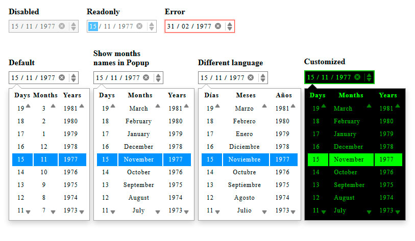
import 'dile-date-without-calendar/dile-date-without-calendar';Default
<dile-date-without-calendar
    value="1977-11-15"></dile-date-without-calendar>
Disabled
<dile-date-without-calendar
    value="1977-11-15"
    disabled></dile-date-without-calendar>
Readonly
<dile-date-without-calendar
    value="1977-11-15"
    readonly></dile-date-without-calendar>
Show months names in Popup
<dile-date-without-calendar
    value="1977-11-15"
    options='{"monthsNames":true}'></dile-date-without-calendar>
Different language
<dile-date-without-calendar
value="1977-11-15"
options='{
"locale":{
"months":["Enero","Febrero","Marzo","Abril",
"Mayo","Junio","Julio","Agosto","Septiembre",
"Octubre","Noviembre","Diciembre"],
"daysTag":"Días",
"monthsTag":"Meses",
"yearsTag":"Años"
}
}'></dile-date-without-calendar>Customized
 <style>
    .date1 {
      /*Input*/

      --dileDateWithoutCalendar-InputboxFocus-border-color: #000;
      --dileDateWithoutCalendar-InputboxFocus-box-shadow: rgba(43, 58, 66, 0.25);
      --dileDateWithoutCalendar-Inputbox-border-width: 2px;
      --dileDateWithoutCalendar-Inputbox-border-color: #00c000;
      --dileDateWithoutCalendar-Inputbox-background-color: #000;
      --dileDateWithoutCalendar-Inputbox-text-color: #00c000;
      --dileDateWithoutCalendar-field-background-color: #00ff00;
      --dileDateWithoutCalendar-field-text-color: #000;
      --dileDateWithoutCalendar-field-color: #00ff00;
      --dileDateWithoutCalendar-buttons-color: #00ff00;
      --dileDateWithoutCalendar-InputboxFocus-box-shadow-width: 0.2rem;
      --dileDateWithoutCalendar-InputboxErr-box-shadow-width: 0.3rem;

      /*Popup*/

      --dileDateWithoutCalendar-PopupFieldMonth-text-align: left;
      --dileDateWithoutCalendar-Popup-background-color: #000;
      --dileDateWithoutCalendar-Popupfield-text-color: #00c000;
      --dileDateWithoutCalendar-PopupButtons-color: #00ff00;
      --dileDateWithoutCalendar-Popupfield-hover-background-color: #00c000;
      --dileDateWithoutCalendar-Popupfield-hover-text-color: #000;
      --dileDateWithoutCalendar-Popupfield-active-background-color: #00ff00;
      --dileDateWithoutCalendar-Popupfield-active-text-color: #000;
      --dileDateWithoutCalendar-PopupFieldBox-hover-border-color: #00ff00;
      --dileDateWithoutCalendar-PopupFieldBox-hover-box-shadow: rgba(0, 192, 0, 0.25);
      --dileDateWithoutCalendar-PopupfieldTag-text-color: #00ff00;
      --dileDateWithoutCalendar-PopupFieldMonth-min-width: 87px;
      --dileDateWithoutCalendar-PopupFieldDay-min-width: 40px;
    }
    </style>

    <dile-date-without-calendar
        class="date1"
        value="1977-11-15"
        options='{"monthsNames":true}'
    ></dile-date-without-calendar>
Events, Change and Error
LitElement emits events
<dile-date-without-calendar
    value="1977-11-15"
    options='{"monthsNames":true}'
    @dileDateWithoutCalendar-change=${event => {

          console.log(event.detail);

    }}

    @dileDateWithoutCalendar-error=${event => {

        console.log(event.detail);

    }}></dile-date-without-calendar>
window cash events
<dile-date-without-calendar id="date"
    value="1977-11-15"></dile-date-without-calendar>

<script>

    var date = document.getElementById('date');

    date.addEventListener('dileDateWithoutCalendar-error', (event)=>{

        console.log(event.detail)

    }, false);

    document.addEventListener('dileDateWithoutCalendar-change', (event)=>{

        console.log(event.detail)

    }, false);

</script>
Properties
| Prop | Default | Description | |----------|--------------|---------------------------------------------------------------------------------------------------------------------------| | value | Date current | Set date, format valid: "YYYY-MM-DD" or "YYYYY-MM-DD" | | disabled | false | The disabled attribute can be set to keep a user from using the | | readonly | false | The readonly attribute can be set to keep a user from changing the value until some other conditions |
Special Properties
| options | |---------|
A json string, sets the configuration for the languages, determines if the names of the months are displayed in the Popup
{

   "monthsNames": false,
   "locale": {
     "months": ["January", "February", "March", "April", "May", "June",
       "July", "August", "September", "October", "November", "December"
     ],
     "daysTag": "Days",
     "monthsTag": "Months",
     "yearsTag": "Years"
   }
 }
Styling
| Custom property | Default | Description | |--------------------------------------------------------------|------------------------|-------------------------------------| | --dileDateWithoutCalendar-Inputbox-border-width | 1px | Input box border width | | --dileDateWithoutCalendar-Inputbox-border-color | #7A7A7A | Input box border color | | --dileDateWithoutCalendar-Inputbox-background-color | transparent | Input box background color | | --dileDateWithoutCalendar-Inputbox-text-color | currentColor | Input box text color | | --dileDateWithoutCalendar-InputboxFocus-border-color | rgba(43,58,66,0.17) | Input box Focus border color | | --dileDateWithoutCalendar-InputboxFocus-box-shadow-width | .1rem | Input box Focus box shadow width | | --dileDateWithoutCalendar-InputboxFocus-box-shadow | rgba(43,58,66,0.25) | Input box Focus box shadow | | --dileDateWithoutCalendar-InputboxErr-border-color | rgba(244,67,54) | Input box Err border color | | --dileDateWithoutCalendar-InputboxErr-box-shadow-width | .1rem | Input box Err box shadow width | | --dileDateWithoutCalendar-InputboxErr-shadow | rgba(244,67,54,.25) | Input box Err shadow | | --dileDateWithoutCalendar-field-color | currentColor | Field color | | --dileDateWithoutCalendar-field-background-color | #2792FF | Field background color | | --dileDateWithoutCalendar-field-text-color | #FFFFFF | Field text color | | --dileDateWithoutCalendar-Buttons-color | currentColor | Buttons color | | --dileDateWithoutCalendar-PopupButtons-color | currentColor | Buttons color of Popup | | --dileDateWithoutCalendar-Popup-background-color | #FFFFFF | Popup background color | | --dileDateWithoutCalendar-PopupFieldDay-min-width | auto | Popup Field Day min width | | --dileDateWithoutCalendar-PopupFieldDay-text-align | center | Popup Field Day text align | | --dileDateWithoutCalendar-PopupFieldMonth-min-width | auto | Popup Field Month min width | | --dileDateWithoutCalendar-PopupFieldMonth-text-align | center | Popup Field Month text align | | --dileDateWithoutCalendar-PopupFieldYear-min-width | auto | Popup Field Year min width | | --dileDateWithoutCalendar-PopupFieldYear-text-align | center | Popup Field Year text align | | --dileDateWithoutCalendar-PopupFieldBox-hover-border-color | rgba(130,190,255,0.17) | Popup Field Box hover border color | | --dileDateWithoutCalendar-PopupFieldBox-shadow-width | .1rem | Popup Field Box shadow width | | --dileDateWithoutCalendar-PopupFieldBox-hover-box-shadow | rgba(0,123,255,.25) | Popup Field Box hover box shadow | | --dileDateWithoutCalendar-PopupfieldTag-font-weight | bold | Popup field Tag font weight | | --dileDateWithoutCalendar-PopupfieldTag-text-color | currentColor | Popup field Tag text color | | --dileDateWithoutCalendar-Popupfield-font-size | 12px | Popup field font size | | --dileDateWithoutCalendar-Popupfield-text-color | #00C000 | Popup field text color | | --dileDateWithoutCalendar-Popupfield-hover-background-color | #2792FF | Popup field hover background color | | --dileDateWithoutCalendar-Popupfield-hover-text-color | #FFFFFF | Popup field hover text color | | --dileDateWithoutCalendar-Popupfield-active-background-color | #2792FF | Popup field active background color | | --dileDateWithoutCalendar-Popupfield-active-text-color | #FFFFFF | Popup field active text color |