
directus-extension-expandable-blocks
v1.3.6
Published
M2A interface with inline expandable editing for Directus. Provides reusable ItemSelector components for other extensions.
Maintainers
 smartlabsat
Readme
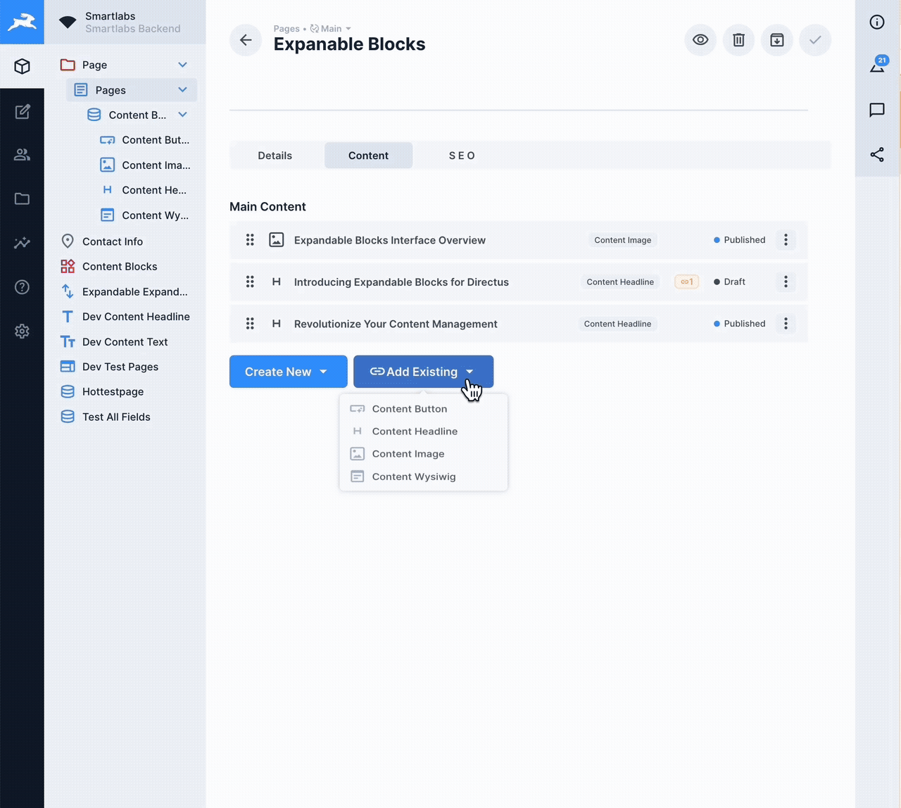
Directus Expandable Blocks Interface


A powerful, production-ready M2A (Many-to-Any) interface extension for Directus with inline expandable editing, advanced item selection, comprehensive permissions, and seamless integration with Directus' native save system. Also provides reusable ItemSelector components for other extensions.
📚 Documentation • 🐛 Report Bug • ✨ Request Feature • 📦 NPM Package
📖 Table of Contents
- Why Expandable Blocks?
- Features
- Installation
- Usage
- Configuration
- Shared Components
- Testing
- Development
- Documentation
- Contributing
- License
🎯 Why Expandable Blocks?
Unlike other block editors, this extension works directly with Directus' native form system and provides unique killer features:
🚀 Killer Features
- 🔍 Reference Tracking - See EVERYWHERE an item is used across your entire system
- 🔗 Link or Copy - Choose to reference existing items or create independent copies
- ⚠️ Usage Protection - Never accidentally delete content that's used elsewhere
✅ Native Integration
- Native Save & Stay - Works perfectly with Directus' save options
- Global Discard - Integrates with Directus' "Discard Changes" button
- Proper Dirty State - Save button only appears when changes exist
- No Data Loss - All changes tracked through Directus' form state
- Enterprise Ready - Production-tested with comprehensive permissions
- 100% Test Coverage - 470 unit tests ensuring reliability
✨ Features
🎨 Core Interface Features
Block Management
- 📝 Inline Expandable Editing - Edit content without opening separate forms
- 🎯 Drag & Drop Sorting - Intuitive block reordering with visual feedback
- 🆕 Visual NEW Indicator - See unsaved blocks at a glance
- 📊 Status Management - Quick status changes with color-coded indicators
- 📋 Duplicate Blocks - Clone existing blocks with one click
- 🗑️ Smart Delete - Unlink or permanently delete with confirmation
- 🔄 Discard Changes - Revert individual blocks to original state
Item Selection & Search
- 🔍 Advanced Item Selector - Select and link existing items from any collection
- 🔗 Link or Copy Mode - Choose to reference existing items or create copies
- 📊 Table View - Browse items in a sortable, filterable table
- 🏷️ Tag-Based Search - Search with AND/OR operators and field-specific queries
- 🎯 Smart Search - Simple search mode with optional advanced tag search
- 🔎 Search Highlighting - See matching terms highlighted in results
- 📌 Search History - Remember and reuse previous searches
- 📈 Result Count - See number of matching items instantly
Table Features
- 📊 Intelligent Columns - Auto-sizing based on field types
- 📌 Sticky Columns - Keep important columns visible while scrolling
- ↕️ Sortable Headers - Sort by any field with 3-click cycle
- 🎨 Field Display - Smart rendering for all Directus field types
- 🖼️ Image Preview - Hover to see full images
- 📝 WYSIWYG Support - Automatic HTML stripping for clean display
- ⚡ Virtual Scrolling - Handle thousands of items efficiently
🌍 Advanced Features
Translation Support
- 🌐 Multi-Language - Full support for Directus translations
- 🔄 Language Switching - Change languages on the fly
- 🔍 Translation Search - Search across all language versions
- 🏷️ Language Indicators - See which fields are translatable
Permissions & Security
- 🔐 Directus Permissions - Respects all native permissions
- 👥 Role-Based Control - Configure per-role access
- 🔒 Read-Only Mode - Automatic for restricted items
- ⚠️ Permission Indicators - Visual feedback for restricted actions
- 🛡️ Security - Built-in validation and permission checks
Usage Tracking & References 🚀 (Requires API Extension)
- 🔍 Reference Detection - Instantly see ALL places where an item is used across your entire Directus instance
- 📍 Cross-Collection References - Track usage across different collections and relationships
- 🔗 Deep Links - Navigate directly to parent items with one click
- ⚠️ Usage Warnings - Get alerts before deleting items that are referenced elsewhere
- 📊 Usage Paths - Visual breadcrumbs showing complete relationship chains
- 🎯 Smart Prevention - Prevents accidental deletion of referenced content
Note: These features require the optional API extension to be installed.
Inline Editing
- ✏️ Edit Drawer - Edit items without leaving the interface
- 💾 Independent Saves - Save edits without affecting main form
- 🔄 Live Updates - See changes reflected immediately
- 📐 Adjustable Width - Resize drawer to your preference
⚡ Performance & Quality
Performance
- 🚀 Multi-Layer Caching - Configurable TTLs for optimal speed
- 📊 Smart Loading - Load only what's needed
- 🔄 Debounced Operations - Prevent excessive API calls
- ⚡ Optimized Re-renders - Using Vue 3's advanced features
- 💾 Persistent Preferences - Remember user settings
Code Quality
- ✅ 100% Test Coverage - 470 passing unit tests
- 🎯 TypeScript Strict Mode - Zero type errors
- 📏 ESLint Compliant - Zero linting errors
- 🏗️ Modular Architecture - 15+ reusable components
- 📚 Comprehensive Docs - Wiki, API docs, and inline comments
🛠️ Developer Features
Extension Architecture
- 📦 Interface Extension - Clean, focused interface implementation
- 🔌 Composable Architecture - Reusable Vue composables
- 🎨 Component Library - Modular, tested components
- 🔧 Utility Functions - Shared helpers and validators
- 📝 TypeScript Types - Full type definitions
📦 Installation
Via NPM (Recommended)
# Install the interface extension
npm install directus-extension-expandable-blocks

# Optional: Install the API extension for advanced usage tracking
npm install directus-extension-expandable-blocks-api
Via pnpm
# Install the interface extension
pnpm add directus-extension-expandable-blocks

# Optional: Install the API extension for advanced usage tracking
pnpm add directus-extension-expandable-blocks-api
Manual Installation
- Download the latest release from GitHub Releases
- Extract to your Directus
extensions/directory - Restart Directus
- Optional: Install the API extension for usage tracking
Docker Installation
# Install the interface extension
RUN npm install directus-extension-expandable-blocks

# Optional: Install the API extension for advanced usage tracking
RUN npm install directus-extension-expandable-blocks-api
📝 Important Note About the API Extension
The API extension is now a separate, optional package. The core Expandable Blocks interface works perfectly without it, using Directus' native API for all standard operations.
When to install the API extension:
- ✅ You want to see where items are used before deleting them
- ✅ You need to track references across M2A relationships
- ✅ You want protection against accidentally deleting referenced content
The interface works without the API extension:
- ✅ All core features (editing, sorting, adding blocks) work normally
- ✅ Uses native Directus API for all operations
- ⚠️ Cannot verify item usage before deletion (shows warning instead)
🚀 Usage
Basic Setup
1️⃣ Create an M2A Field
- Navigate to Settings → Data Model → [Your Collection]
- Click "Create Field"
- Choose "Many to Any Relationship (M2A)"
- Configure the relationship
2️⃣ Select the Expandable Blocks Interface
- In the field configuration, go to "Interface" tab
- Select "Expandable Blocks" from the dropdown
- Configure your options
3️⃣ Configure Options
The interface provides extensive configuration grouped into logical sections:
- Display Options - Visual preferences
- Permissions & Actions - What users can do
- Collections & Relations - Available collections
- Advanced Settings - Caching, translations, etc.
⚙️ Configuration
Display Settings
| Option | Type | Default | Description |
|--------|------|---------|-------------|
| enableSorting | boolean | true | Enable drag & drop reordering |
| showItemId | boolean | true | Display item IDs |
| showCollectionName | boolean | true | Show collection type |
| startExpanded | boolean | false | Start with blocks expanded |
| accordionMode | boolean | false | One block open at a time |
| compactMode | boolean | false | Condensed view |
Permissions
| Option | Type | Default | Description |
|--------|------|---------|-------------|
| isAllowedDelete | boolean | true | Allow deletion |
| isAllowedDuplicate | boolean | true | Allow duplication |
| allowLinkExisting | boolean | true | Allow linking existing |
| allowDuplicateExisting | boolean | true | Allow duplicating linked |
| maxBlocks | number | null | Maximum blocks allowed |
Collections
| Option | Type | Default | Description |
|--------|------|---------|-------------|
| collection | array | [] | Collections for new blocks |
| allowedCollectionsForExisting | array | Falls back to collection | Collections for existing items |
Advanced
| Option | Type | Default | Description |
|--------|------|---------|-------------|
| enableCache | boolean | true | Enable API caching |
| enableTranslations | boolean | true | Support translations |
| showUsageWarnings | boolean | true | Show usage indicators |
Environment Variables
Configure caching behavior:
# Cache TTL Settings (in minutes)
EXPANDABLE_BLOCKS_CACHE_TTL_METADATA=30
EXPANDABLE_BLOCKS_CACHE_TTL_SEARCH=5
EXPANDABLE_BLOCKS_CACHE_TTL_DETAIL=10
EXPANDABLE_BLOCKS_CACHE_TTL_PATHS=10

# Maximum cache size
EXPANDABLE_BLOCKS_CACHE_MAX_SIZE=50000
🔗 Shared Components for Other Extensions
This extension provides reusable ItemSelector components that can be used in other Directus extensions, allowing you to avoid code duplication and maintain consistent UX across extensions.
Quick Start for Extension Developers
# Add as dependency to your extension
npm install directus-extension-expandable-blocks
// Import shared components in your extension
import {
useItemSelector,
ItemSelectorDrawer,
type ItemSelectorConfig
} from 'directus-extension-expandable-blocks/shared';
// Configure for your extension
const itemSelector = useItemSelector(api, ['pages', 'articles'], {
loggerPrefix: '[MyExtension]',
allowLink: true,
allowDuplicate: false,
collectionIcons: {
'pages': 'description',
'articles': 'article'
}
});Available Shared Components
useItemSelector- Core composable with all functionalityItemSelectorDrawer- Main selector interfaceItemSearchPanel- Advanced search with operatorsFieldDisplay- Field value display componentUsagePopover- Shows item usage across collections
Configuration Options
interface ItemSelectorConfig {
  loggerPrefix?: string;           // Custom logging prefix
  allowLink?: boolean;             // Allow linking items
  allowDuplicate?: boolean;        // Allow duplicating items
  defaultItemsPerPage?: number;    // Pagination size
  defaultLanguage?: string;        // Translation language
  collectionIcons?: Record<string, string>; // Custom icons
  fieldMappings?: Record<string, string>;   // Field name mappings
  debug?: boolean;                 // Enable debug logging
}
Full Documentation
📖 Complete Shared Components Documentation - Detailed usage guide, examples, and API reference for extension developers.
Example Usage in LayoutBlocks Extension
<template>
  <ItemSelectorDrawer
    :open="itemSelector.isOpen.value"
    :collection="itemSelector.selectedCollection.value"
    :items="itemSelector.availableItems.value"
    :loading="itemSelector.loading.value"
    :logger-prefix="'[LayoutBlocks]'"
    @close="itemSelector.close"
    @confirm="handleItemsSelected"
  />
</template>

<script setup>
import { useItemSelector, ItemSelectorDrawer } from 'directus-extension-expandable-blocks/shared';

const itemSelector = useItemSelector(api, ['layouts'], {
  loggerPrefix: '[LayoutBlocks]',
  allowDuplicate: false
});
</script>
🧪 Testing
# Run all tests (100% coverage)
npm run test -- --run

# Test with UI
npm run test:ui

# Coverage report
npm run test:coverage

# Type checking
npm run type-check

# Linting
npm run lint
Test Statistics
- ✅ 470 unit tests - All passing
- ✅ 100% coverage - Full test coverage
- ✅ 0 TypeScript errors - Strict mode compliant
- ✅ 0 ESLint errors - Clean code
📝 Development
# Install dependencies (we use pnpm)
pnpm install

# Development mode
npm run dev

# Production build
npm run build

# Type checking
npm run type-check

# Create demo videos
npm run demo:product
npm run demo:highlights
Project Structure
expandable-blocks/
├── config/           # Configuration files
│   ├── scripts/      # Build scripts
│   └── *.config.*    # Various configs
├── src/
│   ├── components/   # Vue components
│   ├── composables/  # Vue composables
│   ├── types/        # TypeScript types
│   └── utils/        # Utilities
├── test/             # Test files
└── wiki/             # Documentation
📚 Documentation
Wiki Documentation
Visit our GitHub Wiki for:
- 🏠 Getting Started
- 📦 Installation Guide
- ⚙️ Configuration
- 🏗️ Architecture
- 🔐 Security
- 🚀 Advanced Features
- 🎬 Demo Videos
- ⚡ Cache Configuration
🤝 Contributing
We welcome contributions! Please see our Contributing Guide for details.
📄 License
MIT License - see LICENSE file for details
🙏 Acknowledgments
Made with ❤️ for the Directus community
🏆 Stats
- 200+ commits of continuous improvement
- 15+ components for modular architecture
- 470 tests ensuring reliability
- 0 errors in TypeScript and ESLint
- 100% coverage for peace of mind
Ready for production use! 🚀