dp-data-table
v3.0.0
Published
A simple and easy to customize data table with filter and sort functionalities. This component is build using React and can be directly used in static html as well.
Maintainers
Readme
dp-data-table
dp Data Table is a simple ready to integrate component made in React using bootstrap styling.
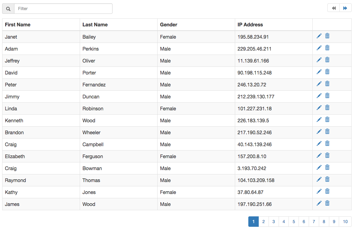
Screenshot

Demo Link
Integration
Here is a sample integration:
<script src="https://cdnjs.cloudflare.com/ajax/libs/react/18.2.0/umd/react.production.min.js"></script>
<script src="https://cdnjs.cloudflare.com/ajax/libs/react-dom/18.2.0/umd/react-dom.production.min.js"></script>
<script src="dist/dpDataTable.js"></script>
<script>
  window.RenderDpDataTable({
    selector: '#data-table-1',
    items: [.......]
  });
</script>
React Integration:
import React from 'react';
import DpDataTable from 'dp-data-table';

......

<DataTable items={[.......]} />
To have proper styling, include bootstrap.
Options
The options are passed in as props when used as a React component.
Option | Type | Description
----------|------------|------------
items | array | Collection of items to bind to the grid
headers | array | array of keys and their matching Header names.[{'first_name' : 'First Name'}]
hidePagination | boolean | Boolean to hide the pagination values. Setting this to true will show all items in same page.
itemsPerPage | number | No of items per page. Default is 15.
isLoading | boolean | Boolean to show the loading icon over the grid.
iconClasses | object | An object with all the class names for the font icons used in the project. {LOADING: 'glyphicon glyphicon-refresh'}. Available options to override: LOADING, EDIT, DELETE, PAGE_PREV, PAGE_NEXT, FILTER, SORT_NONE, SORT_ASC, SORT_DESC
showFilter | boolean | Boolean to show the filter input
filterableFields | array | Array of item property keys that can be made filterable. If not provided, all columns are filterable.
onFiltering | function | Override function for filter. onFiltering({items, filterString})
showSort | boolean | Boolean to show column sort
sortableFields | array | Array of column keys which can be sorted.
showContextColor | boolean | Boolean to add context css to table row. Setting this to true will apply the __dp__contextCss property of item, to the row.
onSorting | function | Override function to sortonDeleting({items, sortKey, sortOrder})
onEditing | function | Event handler for editing a row. The edit icon is enabled only when a function is supplied to this option.onEditing({item, index})
onDeleting | function | Event handler for deleting a row. The delete icon is enabled only when a function is supplied to this option.onDeleting({item, index})
onView | function | Event handler for viewing details of a row. The view icon is enabled only when a function is supplied to this option.onView({item, index})
onItemsChange | function | Event handler to get all changes that happen within the component. onItemChange(e)
Development
- Development server
npm start. - Continuously run tests on file changes
npm run watch-test; - Run tests:
npm test; - Build
npm run build;
