
dxf-vuer
v3.0.0
Published
Vue 3 DXF file viewer — render AutoCAD DXF drawings in the browser with Three.js. Built-in parser, vector text rendering, TypeScript support.
Maintainers
 timbrk
Readme
dxf-vuer


Vue 3 DXF viewer component — render AutoCAD DXF drawings in the browser. A thin, fully typed wrapper around dxf-render, the framework-agnostic Three.js/WebGL engine.
Live Demo | GitHub | Open in StackBlitz
Why dxf-vuer?
- One tag — drop in
<DXFViewer>with reactive props,v-model, and slots - Runs in the browser — DXF is parsed client-side in a Web Worker; no backend, no AutoCAD, nothing uploaded
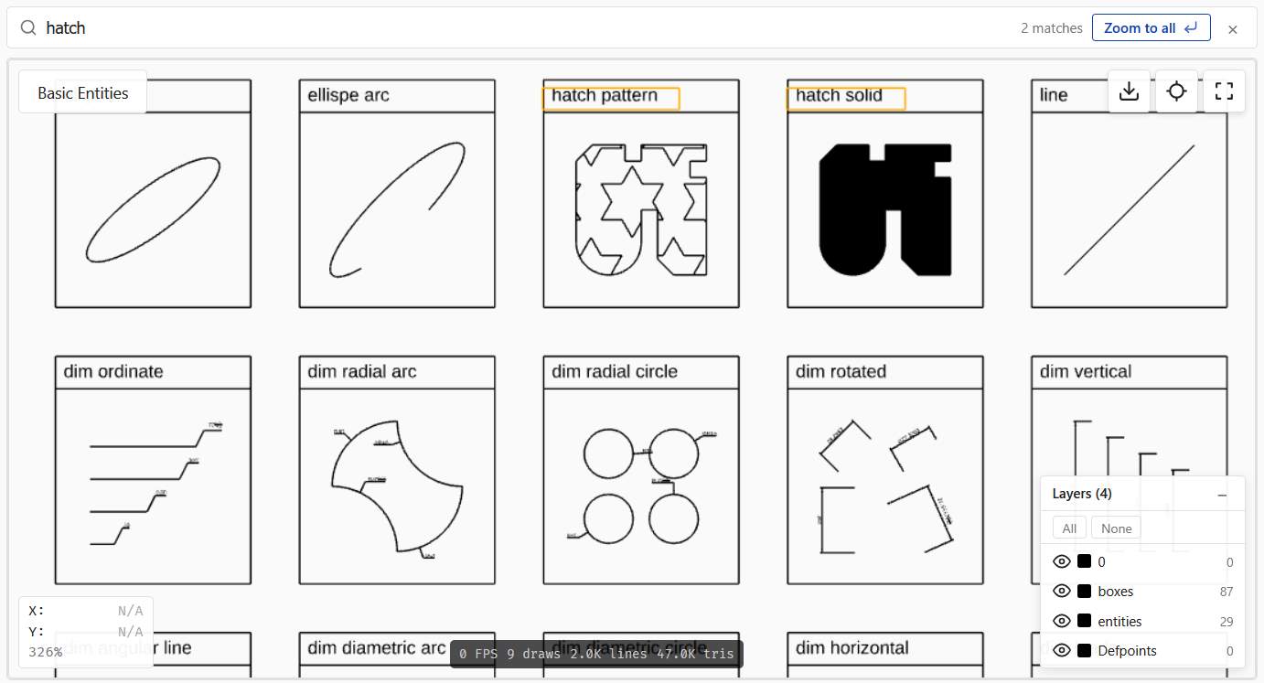
- 22 entity types — lines, arcs, splines, hatches, dimensions, leaders, multilines, regions, and block inserts with attributes
- Crisp vector text — triangulated opentype.js glyphs stay sharp at any zoom
- Interactive — pan, zoom, layer toggles, measure tools, dark theme, and PNG export
- TypeScript-native — fully typed props with
entity-hover/entity-clickevents over the dxf-render engine
Installation
npm install dxf-vuer dxf-render threePeer dependencies: vue >= 3.4, three >= 0.160, dxf-render >= 1.7.0.
Upgrading from v2.x? v3.0's only breaking change renames every public CSS class to the
.dxfk-*prefix and every CSS variable to--dxfk-*(shared now withdxf-react/dxf-lit). See Migration from v2.x for the full rename table.
Quick Start
<script setup>
import { ref } from "vue";
import { DXFViewer, parseDxf } from "dxf-vuer";
import "dxf-vuer/style.css";

const dxfData = ref(null);

async function loadFile(file) {
  const text = await file.text();
  dxfData.value = parseDxf(text);
}
</script>

<template>
  <input type="file" accept=".dxf" @change="loadFile($event.target.files[0])" />
  <DXFViewer :dxf-data="dxfData" show-reset-button style="width: 100%; height: 600px" />
</template>
Components
| Component | Description |
| --------------------- | -------------------------------------------------------------------------------------------------- |
| DXFViewer | Main viewer: Three.js scene, layer panel, toolbar, rulers, measurement, properties panel, drag-and-drop, dark theme, slots |
| ViewerToolbar | Toolbar with export, fit-to-view, fullscreen + measurement buttons. Has #extra slot for custom buttons |
| FileUploader | File input button. Emits file-selected with File |
| LayerPanel | Collapsible layer-visibility panel with color indicators + prefix grouping |
| PropertiesPanel | Read-only property inspector for the entity selected via picking |
| UnsupportedEntities | Collapsible list of unsupported entity types |
| DXFStatistics | File statistics (entities, layers, blocks, AutoCAD version) |
DXFViewer Props
| Prop | Type | Default | Description |
| ---------------------- | ------------------ | ----------------- | ----------------------------------------------------------------------------------------------------------------------------------------------------------------------- |
| dxfData | DxfData \| null | null | Parsed DXF data object |
| fileName | string | "" | File name displayed in the viewer |
| url | string | "" | URL to fetch and display a DXF file |
| showResetButton | boolean | false | Show fit-to-view button |
| showFullscreenButton | boolean | true | Show fullscreen toggle button |
| showExportButton | boolean | false | Show export-to-PNG button |
| showFileName | boolean | true | Show file name overlay |
| showCoordinates | boolean | false | Show cursor world coordinates on hover |
| showZoomLevel | boolean | false | Show zoom percentage (100% = fit-to-view) |
| showDebugInfo | boolean | false | Show debug overlay (FPS, draw calls, lines, triangles) |
| showLayerPanel | boolean | true | Show the layers panel (auto-hidden when the drawing has no layers) |
| groupLayers | boolean \| GroupLayersByPrefixOptions | false | Auto-group layers by name prefix in <LayerPanel> (A-WALL, A-DOOR → group A). Pass true for the defaults (separator: /[-_]/, minGroupSize: 2) or an options object to customize |
| allowDrop | boolean | false | Enable drag-and-drop file loading |
| darkTheme | boolean | false | Dark theme for viewer and scene |
| autoFit | boolean | true | Auto-fit camera to drawing on load |
| antialiasing | AntialiasingMode | "msaa" | Anti-aliasing mode (init-time only — recreate the component via :key to switch) |
| fontUrl | string | "" | Custom font URL for text rendering |
| fileNamePosition | OverlayPosition | "top-left" | Position of file name overlay |
| toolbarPosition | OverlayPosition | "top-right" | Position of toolbar |
| coordinatesPosition | OverlayPosition | "bottom-left" | Position of coordinates overlay |
| debugPosition | OverlayPosition | "bottom-center" | Position of debug overlay |
| layerPanelPosition | OverlayPosition | "bottom-right" | Position of layer panel |
| overlayPosition | OverlayPosition | "top-center" | Position of #overlay slot content |
| pickingEnabled | boolean | false | Enable hover/click events + raycasting (off by default — opt-in to interactivity) |
| highlightOnHover | boolean | true | Draw a built-in highlight overlay on the hovered entity. Turn off if you render selection from your own UI |
| highlightAssociated | boolean | true | When the hovered entity participates in an association (MLEADER / LEADER+TEXT / INSERT+ATTRIB / DIMENSION / ACAD_GROUP), highlight all its members instead of just the entity itself |
| highlightColor | string | "#ffaa00" | Color used by the built-in hover highlight |
| keyboardNavigation | boolean | true | Enable keyboard pan/zoom (arrow keys, +/-, 0). Listener fires only when the canvas is focused |
| persistLayersKey | string | "" | When set, layer visibility is persisted to localStorage under ${persistLayersKey}:${fileName \|\| "default"}. Empty string disables persistence. Ignored when hiddenLayers is provided (parent owns the state) |
| hiddenLayers | string[] | — | Named v-model (v-model:hidden-layers). Array of layer names that should be hidden. When provided, the viewer is controlled — the parent owns visibility state and the viewer emits update:hiddenLayers on every internal toggle. When omitted (default), the viewer is uncontrolled and manages state internally |
| classes | ViewerClasses | {} | Headless UI-style class map. Each key adds a class onto the matching .dxfk-* root element (e.g. { toolbar: 'my-toolbar' }). See Customizing styles |
| showRulers | boolean | false | Show horizontal + vertical rulers along the top/left edges of the canvas with adaptive tick density, cursor marker, and a corner unit badge |
| rulerUnits | RulerUnits | "mm" | Units displayed on ruler tick labels. "mm"/"inch" convert via $INSUNITS; on a Unitless file ($INSUNITS=0) raw values are treated as the chosen unit 1:1 |
| rectangleSelection | boolean | false | Enable modifier-drag rectangle selection. Requires pickingEnabled to function (the picking index is the source of bboxes) |
| rectangleSelectionModifier | "shift" \| "ctrl" \| "alt" | "shift" | Modifier key that arms the rectangle drag. While held, OrbitControls panning is suspended and the cursor turns into a crosshair |
| rectangleSelectionMode | "auto" \| "window" \| "crossing" | "auto" | auto — drag direction decides (AutoCAD): L→R = window (fully inside), R→L = crossing (any overlap). The other values lock the semantic regardless of drag direction |
| measureMode | MeasureMode | "none" | Named v-model (v-model:measure-mode). Selects the active measurement tool. "distance" — two-point linear ruler; "area" — N-point polygon; "angle" — 3-point directed angle. The tools are mutually exclusive. See Measurement tools |
| showMeasureButton | boolean | false | Render a ruler-icon toggle in <ViewerToolbar> for the distance tool. Active state via .dxfk-toolbar-button--active + aria-pressed |
| showMeasureAreaButton | boolean | false | Render a polygon-icon toggle in <ViewerToolbar> for the area tool |
| showMeasureAngleButton | boolean | false | Render an angle-icon toggle in <ViewerToolbar> for the angle tool |
| measureUnits | RulerUnits | — | Override distance-label units independently from rulerUnits. When omitted (default), distance labels follow rulerUnits |
| measureAreaUnits | AreaUnits | "auto" | Square units for the area label. "auto" mirrors rulerUnits (mm→mm², inch→in², dxf-units→no suffix); "m²" / "ft²" etc. force an explicit unit. The perimeter uses the matching linear unit |
| measureAngleUnits | AngleUnits | "deg" | Display format for the angle label: "deg" (123.4°), "rad" (2.150 rad), or "dms" (123°30'15"). Angles are dimensionless — never converted via $INSUNITS |
| measureColor | string | "#ff6b1a" | Color of the measurement segments, fill, rays, arc, marker points, and value labels (all three tools). Cascades into the --dxfk-measure-color CSS custom property |
| snapToGeometry | boolean | true | Snap measurement clicks to nearby geometry (endpoint / midpoint / center / quadrant / point-node) and show an AutoCAD-style marker under the cursor. Active only while a measurement mode is on; set to false to place points exactly under the cursor. Works with or without pickingEnabled. See Measurement tools |
OverlayPosition = "top-left" | "top-center" | "top-right" | "bottom-left" | "bottom-center" | "bottom-right"
RulerUnits = "dxf-units" | "mm" | "inch"
MeasureMode = "none" | "distance" | "area" | "angle"
AreaUnits = "auto" | "mm²" | "m²" | "in²" | "ft²"
AngleUnits = "deg" | "rad" | "dms"
AntialiasingMode = "msaa" | "smaa" | "fxaa" | "taa" | "ssaa" | "none"
| Mode | Description |
| ------ | --------------------------------------------------------------------------------------------------------------------------------------------------------------- |
| msaa | Hardware multisample antialiasing (default). Crisp geometric edges, almost free runtime cost. Best for CAD with thin lines and text |
| smaa | Edge-detection post-processing AA. Cheap and works while panning. Note: can fade pixels at corners of 1px lines — known limitation when applied to line art |
| fxaa | Cheapest fullscreen AA — single shader pass. Smooths edges but tends to blur thin lines and small text |
| taa | Temporal AA: accumulates 32 jittered frames after the camera stops. Very smooth on static views; first frame after movement looks aliased |
| ssaa | Super-sampling: renders at higher resolution and downscales. Reference quality; expensive — not recommended for interactive use on large drawings |
| none | No antialiasing. Maximum performance and pixel sharpness, with visible staircase aliasing on diagonals |
antialiasing is init-time only — the renderer is built once with the chosen mode. To let users switch at runtime, recreate <DXFViewer> via Vue's :key attribute:
<DXFViewer :key="aaMode" :antialiasing="aaMode" :dxf-data="dxfData" />DXFViewer Slots
| Slot | Scoped data | Description |
| ---------------- | ------------------------------------------------------------ | ------------------------------------------------------ |
| #toolbar | { resetView, exportToPNG, toggleFullscreen, isFullscreen, measureMode, toggleMeasureDistance, toggleMeasureArea, toggleMeasureAngle, measureDistanceActive, measureAreaActive, measureAngleActive } | Replace entire toolbar |
| #toolbar-extra | — | Add buttons to the existing toolbar |
| #loading | { phase, progress } | Replace loading screen |
| #error | { message, retry } | Replace error screen |
| #empty-state | — | Replace "Select a DXF file" placeholder |
| #overlay | { zoomPercent, cursorX, cursorY } | Custom overlay (positioned via overlayPosition prop) |
<!-- Add a custom button to the toolbar -->
<DXFViewer :dxf-data="dxfData">
  <template #toolbar-extra>
    <button class="dxfk-toolbar-button" @click="print">Print</button>
  </template>
</DXFViewer>

<!-- Custom error screen with retry -->
<DXFViewer :dxf-data="dxfData">
  <template #error="{ message, retry }">
    <p>{{ message }}</p>
    <button @click="retry">Try again</button>
  </template>
</DXFViewer>
DXFViewer Events
| Event | Payload | Description |
| ---------------------- | ---------------------- | ------------------------------------------------------------------------------------ |
| dxf-loaded | boolean | Emitted after load attempt (true = success) |
| dxf-data | DxfData \| null | Parsed DXF data or null on error |
| error | string | Error message on parse/render/fetch failure |
| unsupported-entities | string[] | List of unsupported entity types found |
| reset-view | — | Emitted when view is reset to fit |
| file-dropped | string | File name when a file is dropped |
| entity-hover | PickingEvent \| null | Hover changed (only when pickingEnabled). null when the cursor leaves the entity |
| entity-click | PickingEvent | Tap on an entity. Mousedown→up that moves more than 4px is treated as pan, not click |
| entities-select | PickingEvent[] | Final result of a rectangle drag (only when rectangleSelection). Empty array if the rect didn't cover anything |
| selection-start | "window" \| "crossing" | Fired when a rectangle drag passes the 4px threshold. Payload is the resolved mode |
| selection-end | — | Fired after entities-select or when the drag is cancelled (Esc) |
| layer-hover | string \| null | Fires the layer name on <LayerPanel> row mouseenter and null on mouseleave (frozen rows do not fire). When highlightOnHover + pickingEnabled are on, the viewer also highlights all entities on the hovered layer via findEntitiesByLayer + the precise-geometry overlay. The event itself fires regardless of those gates |
| update:hiddenLayers | string[] | Sent on every internal layer toggle / show-all / hide-all (only when hiddenLayers is provided). Powers v-model:hidden-layers |
| update:measureMode | MeasureMode | Sent when a toolbar measurement button toggles or setMeasureMode() is called. Powers v-model:measure-mode |
| measure | MeasureResult | Fires after the second click of a distance measurement. Payload: { kind: "distance", p1, p2, valueRaw, value, units } (value is scaled to displayed units, valueRaw is in raw DXF units) |
| measure-area | AreaMeasureResult | Fires when an area polygon is closed (≥3 vertices). Payload: { points, areaRaw, area, perimeterRaw, perimeter, areaUnits, lengthUnits, selfIntersecting } (*Raw are in raw DXF units, scaled values use measureAreaUnits) |
| measure-angle | AngleMeasureResult | Fires when the third point of an angle measurement is placed. Payload: { vertex, p1, p2, radians, degrees, reflex, units } (radians/degrees are the directed CCW sweep in [0, 360); reflex is true when > 180°) |
| measure-cancel | — | Fires on Esc / toggling off a tool while a measurement draft was in flight |
DXFViewer Methods (via ref)
| Method | Description |
| ------------------------------------------ | ------------------------------------------------------------------------------------------- |
| loadDXFFromText(text: string) | Load from a DXF string |
| loadDXFFromData(data: DxfData) | Load already-parsed DXF data |
| loadDXFFromUrl(url: string) | Fetch and load from a URL |
| loadDXFFromBuffer(buffer: ArrayBuffer) | Load from an ArrayBuffer (auto-decodes UTF-8 / UTF-16 LE/BE by BOM) |
| loadDXFFromBlob(blob: Blob) | Load from a Blob (storage SDKs, drag-and-drop, fetch().blob()) |
| resize() | Trigger viewer resize |
| resetView() | Fit camera to drawing |
| exportToPNG() | Trigger PNG download |
| getRenderer() | Access the underlying Three.js WebGLRenderer |
| highlight(handles: string[]) | Draw the highlight overlay over the listed entities (e.g. when an external UI selects them) |
| clearHighlight() | Remove all highlight overlays |
| getAssociations() | Return all EntityAssociation[] derived from the loaded DXF |
| findAssociationsByHandle(handle: string) | Return all associations a given handle participates in |
| zoomToEntity(handles: string[]) | Fit the camera to the union of the entities' bboxes, with 20% padding. Requires pickingEnabled |
| zoomToLayer(layerName: string) | Fit the camera to all entities on the given layer. Requires pickingEnabled. Layer names are case-sensitive (DXF spec) |
| getPickingIndex() | Returns the underlying PickingIndex \| null. Useful for filtering external search results (e.g. from findEntitiesByText) to entities that are actually rendered in the scene |
| clearMeasure() | Clear any in-flight or completed measurement overlay (distance, area, and angle) from the canvas without firing measure-cancel |
| setMeasureMode(mode: MeasureMode) | Emit update:measureMode with the given mode — same code path the toolbar buttons use, useful for binding keyboard shortcuts |
<script setup>
import { ref } from "vue";
import { DXFViewer } from "dxf-vuer";

const viewer = ref(null);

async function loadFromStorage() {
  const blob = await fetch("https://storage.example.com/file.dxf").then((r) => r.blob());
  viewer.value.loadDXFFromBlob(blob);
}
</script>

<template>
  <DXFViewer ref="viewer" />
</template>
Picking & Associations
Picking lets users hover and click individual DXF entities. Each picking event is optionally enriched with an association — a structural link between entities that exists inside the DXF data itself (no geometric heuristics).
Enabling picking
Picking is opt-in. Turn it on with pickingEnabled:
<DXFViewer
  :dxf-data="dxfData"
  picking-enabled
  @entity-hover="onHover"
  @entity-click="onClick"
/>
Both events fire with a PickingEvent:
interface PickingEvent {
  handle: string; // DXF handle, e.g. "BD8"
  pickId?: string; // unique pick id (distinguishes INSERT instances of the same block)
  type: string; // "LINE", "MTEXT", "INSERT", ...
  layer: string;
  text?: string; // shortcut: association.text ?? entity text
  entity?: DxfEntity; // raw parsed entity
  association?: EntityAssociation; // see below
}
How highlighting works
The viewer ships a built-in highlight overlay that traces the precise geometry of the hovered entity — lines, circles, arcs, polylines (with bulge), splines, hatch contours, and INSERT children all follow their real outline, not a bounding rectangle. Entities without a meaningful outline (TEXT, MTEXT, DIMENSION, ATTRIB, ATTDEF, POINT) fall back to bbox edges so they remain visually identifiable.
Three props control it:
| Prop | Effect |
| --------------------- | --------------------------------------------------------------------------------------------------------------------------------------------------------------------------------------------------------------------------------------- |
| pickingEnabled | Master switch. When false, no events are emitted and no highlight is drawn |
| highlightOnHover | When true, the viewer draws the highlight overlay on hover. Turn it off if you render selection from your own UI (e.g. AG Grid) and only need the events |
| highlightAssociated | When true (default), hovering an entity that participates in an association highlights all members (e.g. LEADER + linked MTEXT). When false, only the hovered entity is highlighted. Has no effect if highlightOnHover is off |
For consumers building a fully custom selection visual, the same machinery is available framework-agnostic as buildHighlightGeometry(entity, worldMatrix) from dxf-render — it returns the polyline point arrays without allocating Three.js objects.
Highlight on layer hover
The same overlay is also used by <LayerPanel>: hovering a layer row highlights every entity on that layer. The viewer emits a layer-hover(layerName | null) event (the name on mouseenter, null on mouseleave); when highlightOnHover and pickingEnabled are both on, it also resolves the handles via findEntitiesByLayer (re-exported from dxf-render) and calls the internal highlight(). Frozen rows do not emit. External listeners can wire the event for custom UI even when the internal highlight is disabled.
Associations
buildAssociations(dxf) (re-exported from dxf-render) extracts these links:
| Kind | Source | Members |
| --------------- | --------------------------------------------------------- | -------------------------- |
| mleader | MULTILEADER inline contextData text | the MULTILEADER itself |
| leader | LEADER ↔ TEXT/MTEXT via DXF code 340 (annotationHandle) | LEADER + annotation entity |
| block-attribs | INSERT with one or more ATTRIB children | INSERT + all ATTRIBs |
| dimension | DIMENSION text override or actualMeasurement | the DIMENSION itself |
| group | ACAD_GROUP record from the OBJECTS section | every member entity |
Real-world note: not every LEADER in a DXF carries the 340 link — it's optional in
the format. buildAssociations deliberately doesn't guess via geometry; a future
opt-in spatial heuristic is on the roadmap.
For kind: "group", association.primary is the handle of the GROUP object
(not a real entity — it cannot be raycast or highlighted), and association.members
contains only the member entity handles — primary is intentionally excluded.
For every other kind, members still includes primary as before. The raw
parsed groups are also available at dxf.objects?.groups (Record<string, DxfGroup>)
if you want to bypass buildAssociations.
Example: console-logging hovers and clicks
<script setup lang="ts">
import { ref } from "vue";
import { DXFViewer } from "dxf-vuer";
import type { PickingEvent } from "dxf-vuer";
import "dxf-vuer/style.css";

const dxfData = ref(null);

function onHover(e: PickingEvent | null) {
  if (!e) return;
  console.log("hover", e.type, e.handle, e.text, e.association?.kind);
}

function onClick(e: PickingEvent) {
  if (e.association) {
    console.log(
      `Clicked ${e.type}, part of ${e.association.kind} (${e.association.members.length} members)`,
    );
  }
}
</script>

<template>
  <DXFViewer :dxf-data="dxfData" picking-enabled @entity-hover="onHover" @entity-click="onClick" />
</template>
Example: bidirectional sync with an external grid
Useful when the same data is shown both in the viewer and in a table (AG Grid, custom list, etc). The viewer drives the grid via events; the grid drives the viewer via the imperative highlight() method.
<script setup lang="ts">
import { ref } from "vue";
import { DXFViewer } from "dxf-vuer";
import type { PickingEvent } from "dxf-vuer";

const viewer = ref<InstanceType<typeof DXFViewer> | null>(null);
const dxfData = ref(null);
const selectedHandle = ref<string | null>(null);

// 1. Viewer → external state
function onClick(e: PickingEvent) {
  selectedHandle.value = e.handle;
  // ... call your grid's selectByKey() or scroll-into-view here
}

// 2. External state → viewer (call this from a grid row-click handler)
function selectFromGrid(handle: string) {
  selectedHandle.value = handle;
  const all = viewer.value?.findAssociationsByHandle(handle) ?? [];
  // highlight the entity itself plus everything it's associated with,
  // and pan/zoom the camera so the user can see what was selected.
  const handles = all.length > 0 ? Array.from(new Set(all.flatMap((a) => a.members))) : [handle];
  viewer.value?.highlight(handles);
  viewer.value?.zoomToEntity(handles);
}
</script>

<template>
  <DXFViewer
    ref="viewer"
    :dxf-data="dxfData"
    picking-enabled
    :highlight-on-hover="false"
    @entity-click="onClick"
  />
</template>
Example: rectangle selection (window / crossing)
Hold the modifier key (Shift by default) and drag on the canvas to select multiple entities at once. The drag direction picks the AutoCAD semantic:
- Left → right = window — only entities whose bbox is fully inside the rectangle (drawn as a solid blue overlay).
- Right → left = crossing — any entity whose bbox touches the rectangle (drawn as a dashed green overlay).
While the modifier is held the canvas cursor turns into a crosshair and panning is suspended; releasing the modifier restores normal pan/zoom. Esc cancels an in-progress drag without firing entities-select. Drags shorter than 4 px are silently dropped, so a stray Shift-click won't blow away the selection.
<script setup lang="ts">
import { ref } from "vue";
import { DXFViewer } from "dxf-vuer";
import type { PickingEvent } from "dxf-vuer";

const viewer = ref<InstanceType<typeof DXFViewer> | null>(null);
const dxfData = ref(null);
const selection = ref<PickingEvent[]>([]);

function onSelect(events: PickingEvent[]) {
  selection.value = events;
  console.log(`selected ${events.length} entities`);
  // Re-highlight the selection through the imperative API so it survives
  // the drag overlay disappearing.
  viewer.value?.highlight(events.map((e) => e.handle));
}
</script>

<template>
  <DXFViewer
    ref="viewer"
    :dxf-data="dxfData"
    picking-enabled
    rectangle-selection
    rectangle-selection-modifier="shift"
    rectangle-selection-mode="auto"
    @entities-select="onSelect"
  />
</template>
Both pickingEnabled and rectangleSelection must be true — the rectangle helper reuses the same PickingIndex that drives raycast picking. The entities-select payload uses the same PickingEvent shape as entity-click, so consumers can run both through the same handler.
By default INSERT instances are returned as a single aggregate entry (mirroring AutoCAD's "an INSERT is one selectable block"). Use the pure helper findEntriesInRect directly with { granularity: "leaf" } from dxf-render if you need the individual child entities.
Example: find-and-zoom (text search)
findEntitiesByText is re-exported from dxf-render. Combine it with the
viewer's imperative API for a "find in drawing" UX:
import { findEntitiesByText } from 'dxf-vuer'

function search(query: string) {
  const dxf = viewer.value!.getRenderer ? /* your loaded DxfData */ : null
  if (!dxf) return
  const found = findEntitiesByText(dxf, query) // case-insensitive substring

  // Optionally drop matches that aren't visible (e.g. text inside
  // unreferenced blocks left over by AutoCAD).
  const index = viewer.value!.getPickingIndex()
  const visible = index ? found.filter((h) => index.byHandle.has(h)) : found

  viewer.value!.highlight(visible)
  viewer.value!.zoomToEntity(visible)
}
findEntitiesByText accepts { caseSensitive: true } or { regex: true }.
For layer-based or type-based focus, the matching helpers are findEntitiesByLayer and findEntitiesByType (also re-exported from dxf-render); pair them with zoomToLayer / highlight:
import { findEntitiesByType } from 'dxf-vuer'

// Highlight every dimension on the drawing
viewer.value!.highlight(findEntitiesByType(dxf, 'DIMENSION'))

// Or focus the camera on the WALLS layer (no need to gather handles yourself)
viewer.value!.zoomToLayer('WALLS')
Example: list every association in the file
Handy for sanity-checking a DXF or building a "Notes" panel:
const all = viewer.value!.getAssociations();

const byKind = all.reduce<Record<string, number>>((acc, a) => {
  acc[a.kind] = (acc[a.kind] ?? 0) + 1;
  return acc;
}, {});
console.log(byKind); // { mleader: 1, leader: 3, 'block-attribs': 18, dimension: 127 }

// Highlight the very first MLEADER in the drawing
const firstMleader = all.find((a) => a.kind === "mleader");
if (firstMleader) viewer.value!.highlight(firstMleader.members);
Picking is implemented as an invisible bbox group on the scene — entities are picked by their bounding box, which is very fast and framework-agnostic. The highlight overlay, in contrast, traces the precise geometry of the selected entity (lines, arcs, polylines, hatch contours, INSERT children); only types without a meaningful outline (TEXT, DIMENSION, etc.) fall back to bbox edges.
Accessibility
Keyboard navigation — when
keyboardNavigationis on (default), the canvas becomes focusable (tabindex="0") and responds to:| Keys | Action | | ---------------- | ---------------------------- | |
←↑→↓| Pan by 5% of the viewport | |+/=| Zoom in (×1.2) | |-/_| Zoom out (÷1.2) | |0| Reset to fit-to-view |Listener bails out when the focused element is an
<input>,<textarea>, orcontenteditableso it never steals keystrokes from forms inside#toolbar-extraor#overlay.ARIA — viewer container exposes
role="region"+aria-labeland reflectsaria-busywhile loading. Toolbar isrole="toolbar"; buttons carry per-actionaria-label, fullscreen toggle hasaria-pressed. Layer panel header is keyboard-activatable (Enter/Space) witharia-expanded; per-layer toggles arerole="button"witharia-pressed/aria-disabled. Loading overlay isrole="status" aria-live="polite"; error overlay isrole="alert" aria-live="assertive".prefers-reduced-motion— when the user has enabled "reduce motion" in their OS, the TAA antialiasing mode renders a single frame without the 32-frame jitter accumulation animation. Other AA modes are unaffected.
Persisting layer visibility
Set persistLayersKey to enable per-file persistence in localStorage:
<DXFViewer
  :dxf-data="dxfData"
  :file-name="currentFileName"
  persist-layers-key="my-app:layers"
/>
Hidden layer names are stored under ${persistLayersKey}:${fileName || "default"}. Different files keep separate visibility configurations. Stored names that no longer exist in the current DXF are silently ignored, so changing files between sessions is safe. Frozen layers are never persisted (they're already hidden by DXF flags).
Controlled layer visibility (v-model:hidden-layers)
persistLayersKey is fire-and-forget — the viewer owns the state and tucks it away in localStorage between sessions. When you need the parent component to see and control which layers are hidden (sync to a backend, drive other UI from the same state, restore a saved view), use the named v-model instead:
<script setup>
import { ref } from "vue";

const hiddenLayers = ref(["A-DIMS"]);
</script>

<template>
  <DXFViewer :dxf-data="dxfData" v-model:hidden-layers="hiddenLayers" />

  <p>{{ hiddenLayers.length }} layers hidden</p>
  <button @click="hiddenLayers = []">Show all</button>
</template>
The viewer treats the parent's array as the source of truth — it applies the list on every DXF load (overriding DXF's own frozen / visible defaults) and emits update:hiddenLayers whenever the user toggles a layer through <LayerPanel> or you call viewer.showAllLayers() / viewer.hideAllLayers() (via the layer panel buttons). In return, mutating hiddenLayers from the parent immediately reflects in the panel and on screen.
A few rules to keep in mind:
persistLayersKeyis ignored whenhiddenLayersis provided. Mixing the two is ambiguous (which side wins on init?), so the controlled prop takes over. Persist on the parent side instead — usually whatever store/router/server you already drive the prop from.- Frozen layers never appear in the list. They're hidden by the DXF
frozenflag, not by user choice. Passing a frozen layer's name in the array is a silent no-op. - Unknown names are ignored. Names that don't match any layer in the current DXF won't trigger an error — handy when switching files.
- No initial
update:hiddenLayersis emitted on DXF load. The viewer only emits in response to genuine user actions. If you want to mirror the file's ownfrozen/visibleflags into the parent, read them offdxf-dataafterdxf-loaded.
The symmetric pattern is used by the dxf-react and dxf-lit wrappers — same string[] shape, the binding mechanism is the only thing that differs (hiddenLayers + onHiddenLayersChange / hidden-layers property + hidden-layers-change event).
Rulers
Set showRulers to render a horizontal ruler along the top edge of the canvas and a vertical ruler along the left edge. Both stay synchronized with pan / zoom, ticks adapt density based on the current zoom level, and a cursor marker (a line in --dxfk-ruler-cursor) tracks the mouse position on both axes.
<DXFViewer
  :dxf-data="dxfData"
  :show-rulers="true"
  ruler-units="mm"
/>
The 24×24 top-left corner shows the active unit label (mm / in / —).
rulerUnits
| Value | Conversion |
| ------------- | ---------------------------------------------------------------------------------------------------------- |
| "dxf-units" | None — raw DXF values, corner badge shows — |
| "mm" (default) | value × UNITS_TO_MM[$INSUNITS]; for a Unitless file ($INSUNITS = 0) raw values are treated as mm 1:1 |
| "inch" | Same as "mm", then divided by 25.4 |
Caveats
- Unitless files (
$INSUNITS = 0) — the conversion factor is unknown, somm/inchfall back to 1:1. Switching between the three modes changes the corner label but the numbers stay identical. If you know the intended unit out-of-band, just pick the rightrulerUnitsand the badge will read correctly. - Ruler ticks ≠ dimension labels. The rulers show the actual coordinates of the geometry. Dimension entities (DIMENSION / MULTILEADER) can carry a
DIMLFACmultiplier and may display measured lengths that don't equal the geometric distance. The discrepancy is a property of the DXF file, not a ruler bug. - The cursor marker uses the same NDC → world math as
showCoordinates, so the marker position always agrees with the X/Y readout in the coordinates overlay.
Styling
CSS custom properties (override in :root or under .dxfk-dark):
| Variable | Default (light) | Default (dark) | Purpose |
| ------------------------- | --------------- | -------------- | ----------------------------------------- |
| --dxfk-ruler-size | 24px | 24px | Thickness of both rulers + corner badge |
| --dxfk-ruler-bg | #fafafa | #1f1f1f | Ruler background |
| --dxfk-ruler-text | #333 | #ddd | Tick label color |
| --dxfk-ruler-tick | #999 | #888 | Tick lines + inner separator |
| --dxfk-ruler-cursor | #1040b0 | #ffaa00 | Cursor marker line |
Hook classes (low-specificity, safe to override with plain CSS or Tailwind @apply):
| Class | Element |
| ---------------------- | ------------------------------------------------------------- |
| .dxfk-ruler-h | Horizontal ruler container (top edge of canvas) |
| .dxfk-ruler-v | Vertical ruler container (left edge of canvas) |
| .dxfk-ruler-corner | 24×24 corner badge showing the unit label |
For per-instance class injection, use the rulerHorizontal / rulerVertical / rulerCorner keys in classes.
Layout impact
When showRulers is on, the overlay grid receives padding-top: 24px; padding-left: 24px so existing overlays (file name, coordinates, debug, toolbar) don't sit underneath the rulers. The canvas itself stays full-size — picking, coordinates, and all NDC math are unchanged. The rulers are just overlays painted on top.
Measurement tools
Three mutually-exclusive on-canvas tools, selected via v-model:measure-mode:
"distance"— click point A, click point B, see the Euclidean distance."area"— click N vertices to draw a polygon, close it, and read its area + perimeter."angle"— click the vertex, then two points to define the rays; read the directed angle (CCW,[0°, 360°)) on the bisector. Move the cursor past the first ray to pick the angle or its reflex.
In all three tools the geometry (segments, polygon fill, rays, arc, markers) lives in the Three.js scene so it follows pan / zoom natively; the numbers are rendered as positioned HTML labels. Completed measurements stay visible until the next interaction.
<script setup>
import { ref } from "vue";
import { DXFViewer } from "dxf-vuer";
import type {
  MeasureMode,
  MeasureResult,
  AreaMeasureResult,
  AngleMeasureResult,
} from "dxf-vuer";

const measureMode = ref<MeasureMode>("none");
const lastDistance = ref<MeasureResult | null>(null);
const lastArea = ref<AreaMeasureResult | null>(null);
const lastAngle = ref<AngleMeasureResult | null>(null);
</script>

<template>
  <DXFViewer
    :dxf-data="dxfData"
    v-model:measure-mode="measureMode"
    :show-measure-button="true"
    :show-measure-area-button="true"
    :show-measure-angle-button="true"
    :show-rulers="true"
    ruler-units="mm"
    measure-area-units="m²"
    measure-angle-units="deg"
    @measure="lastDistance = $event"
    @measure-area="lastArea = $event"
    @measure-angle="lastAngle = $event"
  />
  <p v-if="lastDistance">
    Distance: {{ lastDistance.value.toFixed(2) }} {{ lastDistance.units }}
  </p>
  <p v-if="lastArea">
    Area: {{ lastArea.area.toFixed(2) }} {{ lastArea.areaUnits }} ·
    Perimeter: {{ lastArea.perimeter.toFixed(2) }} {{ lastArea.lengthUnits }}
  </p>
  <p v-if="lastAngle">
    Angle: {{ lastAngle.degrees.toFixed(1) }}°{{ lastAngle.reflex ? " (reflex)" : "" }}
  </p>
</template>
Distance state machine
| State | Visual | What the user can do |
| ----- | ----------------------------------- | ----------------------------------------------------------------------------------- |
| empty | (nothing on canvas) | Click anywhere → places point A → transition to one |
| one | Marker A + live segment A → cursor | Move cursor → segment + label follow. Click → places point B → fires measure, transition to two. Esc cancels → measure-cancel |
| two | Marker A + marker B + final segment | Click → starts a new measurement (click becomes the new A). Esc clears |
Area state machine
| State | Visual | What the user can do |
| -------- | ----------------------------------------------------- | ------------------------------------------------------------------------------------ |
| empty | (nothing on canvas) | Click → places the first vertex → one |
| one | 1 marker + live segment to cursor | Click → second vertex → two |
| two | preview triangle, Area: —, live perimeter | Click → third vertex → three+ |
| three+ | growing polygon + fill, live area + perimeter | Click → add vertex. Close the polygon → closed. Backspace removes the last vertex |
| closed | filled polygon + final label | Click → starts a fresh polygon. Esc clears |
Closing the polygon (requires ≥3 vertices): double-click, click on the first vertex (it highlights when the cursor is in snap range), or press Enter. Closing fires measure-area.
The area is the absolute Shoelace value; self-intersecting polygons are reported as-is with selfIntersecting: true in the result so you can warn the user if you want. measureAreaUnits controls the square units ("auto" mirrors rulerUnits); the perimeter uses the matching linear unit.
The angle tool takes exactly three clicks:
| State | Angle overlay | Behavior |
| ------ | ---------------------------------------------- | --------------------------------------------------------------------------- |
| empty | nothing | Click → vertex (apex) → one |
| one | preview ray vertex → cursor | Click → first ray endpoint → two |
| two | both rays + directed arc + live angle label | Move cursor → angle / arc update (picks angle vs reflex). Click → closed, fires measure-angle |
| closed | final rays + arc + label | Click → starts a new measurement. Backspace undoes a point, Esc clears |
The reported angle is directed (CCW from the first ray to the second), so it covers the full [0°, 360°) range — reflex: true marks results over 180°. measureAngleUnits controls the label format ("deg" / "rad" / "dms"); angles never go through $INSUNITS.
measureColor controls the color of all three tools (segments, polygon fill, rays, arc, markers, labels).
Snap to geometry
While a measurement tool is active and snapToGeometry is true (the default), clicks snap to the nearest characteristic point of surrounding geometry, and a marker glyph tracks the cursor:
| Snap | Marker | Where |
| ---- | ------ | ----- |
| endpoint | □ square | ends of lines, arcs, polyline/MLINE/leader segments, SOLID/3DFACE corners, spline ends |
| midpoint | △ triangle | midpoint of straight segments and arcs |
| center | ○ circle | center of circles, arcs, ellipses |
| quadrant | ◇ diamond | the 0/90/180/270° points of circles, arcs, ellipses |
| node | ✕ cross | POINT entities |
Snapping engages only during measurement, so it never interferes with picking or panning. It reuses the picking index when pickingEnabled is on, otherwise it builds a lightweight index lazily the first time you enter a measurement mode — so it works even without picking. Set :snap-to-geometry="false" to place points exactly under the cursor. The marker is tinted with measureColor. (Entity-intersection snaps and polyline bulge-arc midpoints are not yet supported.)
Interaction with pan / zoom
While any measurement tool is active, the viewer rebinds the mouse so left-click places points instead of panning:
- Left-click → place point (composable temporarily nulls
controls.mouseButtons.LEFT, restores on exit) - Middle / right-button drag → pan (unchanged)
- Wheel → zoom (unchanged)
- Esc → cancel / clear
Picking (pickingEnabled) and rectangle selection (rectangleSelection) are automatically suspended while a measurement tool is active and restored when measureMode returns to "none" — they share the same left-click stream.
Imperative control
Drive the tools from your own UI via the v-model + ref methods:
<script setup>
import { ref } from "vue";
const measureMode = ref("none");
const viewer = ref();
</script>

<template>
  <button @click="measureMode = measureMode === 'distance' ? 'none' : 'distance'">Distance</button>
  <button @click="measureMode = measureMode === 'area' ? 'none' : 'area'">Area</button>
  <button @click="viewer.clearMeasure()">Clear</button>

  <DXFViewer ref="viewer" :dxf-data="dxfData" v-model:measure-mode="measureMode" />
</template>
Result shapes
interface MeasureResult {
  kind: "distance";
  p1: { x: number; y: number; z: number };  // world coords
  p2: { x: number; y: number; z: number };
  valueRaw: number;       // distance in raw DXF units
  value: number;          // distance scaled to `units`
  units: "dxf-units" | "mm" | "inch";
}

interface AreaMeasureResult {
  points: { x: number; y: number; z: number }[];  // polygon vertices (world coords)
  areaRaw: number;        // area in raw DXF units²
  area: number;           // area scaled to `areaUnits`
  perimeterRaw: number;   // perimeter in raw DXF units
  perimeter: number;      // perimeter scaled to `lengthUnits`
  areaUnits: string;      // "m²" | "mm²" | "in²" | "ft²" | "" (dxf-units)
  lengthUnits: string;    // "m"  | "mm"  | "in"  | "ft"  | ""
  selfIntersecting: boolean;
}
*Raw is what you store; the scaled values + unit labels are what you display.
Styling
| Hook | Element / variable |
| --------------------------- | ----------------------------------------------------------------- |
| .dxfk-measure-label | HTML label positioned over the distance-segment midpoint |
| .dxfk-measure-area-label | HTML label (area + perimeter) positioned at the polygon centroid |
| --dxfk-measure-color | Color of the label backgrounds, segments, polygon fill, and marker dots (cascades from the measureColor prop) |
For per-instance class injection, use the measureLabel / measureAreaLabel keys in classes.
Customizing styles
dxf-vuer exposes three layers of style customization, ordered from least to most invasive. Pick the one that matches your toolchain.
1. CSS custom properties
All built-in styles use --dxfk-* custom properties with inline var(..., fallback) so the components work without importing dxf-vuer/style.css. To recolor or rescale globally, override on :root or any wrapper container:
:root {
  --dxfk-primary-color: #ff6600;
  --dxfk-border-radius: 8px;
  --dxfk-bg-color: #fafafa;
}
Available variables:
| Variable | Default | Used for |
| --------------------------- | ----------- | ------------------------------------------------------- |
| --dxfk-primary-color | #1040b0 | Spinner, progress bar, drop zone border, focus rings |
| --dxfk-error-color | #f44336 | Error icon |
| --dxfk-bg-color | #fafafa | Viewer background, DXFStatistics background |
| --dxfk-text-color | #212121 | Primary text |
| --dxfk-text-secondary | #757575 | Muted text, labels, captions |
| --dxfk-border-color | #e0e0e0 | Borders, dividers |
| --dxfk-border-radius | 4px | All rounded corners |
| --dxfk-spacing-xs/sm/md/lg| 4/8/16/24 | Internal paddings/margins |
| --dxfk-selection-rect-bg-window | rgba(64,128,255,.12) | Window-mode (L→R) rectangle fill |
| --dxfk-selection-rect-border-window | #4080ff | Window-mode rectangle border |
| --dxfk-selection-rect-bg-crossing | rgba(64,192,64,.12) | Crossing-mode (R→L) rectangle fill |
| --dxfk-selection-rect-border-crossing | #40c040 | Crossing-mode rectangle border |
| --dxfk-measure-color | #ff6b1a | Measurement segment, marker dots, label background (cascades from measureColor prop) |
2. Hook classes
Every overlay and component root carries a stable .dxfk-* class with single-class selectors only (no nesting, low specificity), so you can override them with one declaration and they play nicely with Tailwind @apply or scoped global styles.
Stable hook classes:
| Class | Element |
| ------------------------------ | ------------------------------------------------------------ |
| .dxfk-viewer | Root container of DXFViewer |
| .dxfk-toolbar | Root of ViewerToolbar |
| .dxfk-toolbar-button | Each button inside the toolbar |
| .dxfk-layer-panel | Root of LayerPanel |
| .dxfk-layer-panel-header | Layer panel header (the collapsible bar) |
| .dxfk-layer-panel-action | All / None buttons |
| .dxfk-layer-filter | Layer filter <input> |
| .dxfk-layer-item | One row per layer |
| .dxfk-layer-item--in-group | Modifier — added to rows that live inside a group body |
| .dxfk-layer-group | Root of one group (gated by groupLayers) |
| .dxfk-layer-group--collapsed | Modifier — collapsed state |
| .dxfk-layer-group-header | Group header (collapse zone + name + counter + eye-toggle) |
| .dxfk-layer-group-name | Prefix label inside the group header |
| .dxfk-layer-group-count | visible / total · entities counter |
| .dxfk-layer-group-collapse | + / − button inside the group header |
| .dxfk-layer-group-toggle | Batch eye-toggle button (group show/hide all) |
| .dxfk-layer-group-toggle--all-visible / --mixed / --all-hidden / --all-frozen | Eye-toggle state modifiers |
| .dxfk-layer-group-body | Wrapper around the layer rows inside an expanded group |
| .dxfk-file-uploader | Root of FileUploader |
| .dxfk-file-uploader-button | Upload button inside FileUploader |
| .dxfk-statistics | Root of DXFStatistics |
| .dxfk-unsupported | Root of UnsupportedEntities (amber warning palette) |
| .dxfk-file-name-overlay | File name display |
| .dxfk-coordinates-overlay | Cursor X/Y + zoom overlay |
| .dxfk-debug-overlay | FPS / draw calls / triangles overlay |
| .dxfk-loading-overlay | Loading screen |
| .dxfk-error-overlay | Error screen |
| .dxfk-drop-overlay | Drag-and-drop target |
| .dxfk-ruler-h | Horizontal ruler (top edge of canvas) — gated by showRulers|
| .dxfk-ruler-v | Vertical ruler (left edge of canvas) — gated by showRulers |
| .dxfk-ruler-corner | 24×24 badge in the top-left corner showing the unit label |
| .dxfk-selection-rect | Rectangle-drag overlay (gated by rectangleSelection) |
| .dxfk-selection-rect--window | Modifier — added when the drag resolves to window mode |
| .dxfk-selection-rect--crossing | Modifier — added when the drag resolves to crossing mode |
| .dxfk-measure-label | HTML value label of the measurement tool (gated by measureDistance) |
| .dxfk-dark | Modifier — added to .dxfk-viewer / .dxfk-toolbar / .dxfk-layer-panel / .dxfk-ruler-* when darkTheme is on |
These class names are part of the public API — they won't change between patch / minor versions.
Plain CSS:
.dxfk-toolbar-button {
  background: #fff;
  box-shadow: 0 4px 12px rgba(0, 0, 0, 0.12);
}
Tailwind @apply works because the default selectors have specificity 0,1,0:
.dxfk-toolbar {
  @apply gap-2 rounded-xl bg-white/90 backdrop-blur;
}
.dxfk-toolbar-button {
  @apply border-slate-200 shadow-md hover:border-blue-500;
}
3. classes prop (Headless UI-style)
For utility-CSS workflows (Tailwind / UnoCSS) or for per-instance namespacing without writing global selectors, pass a classes map. Each key concatenates onto the matching .dxfk-* root element:
<DXFViewer
  :dxf-data="dxfData"
  :classes="{
    root: 'rounded-2xl shadow-xl',
    toolbar: 'gap-2',
    layerPanel: 'bg-white/95 backdrop-blur',
    loadingOverlay: 'bg-slate-900/60',
    errorOverlay: 'bg-rose-50/95'
  }"
/>
Available keys (ViewerClasses interface, all optional):
| Key | Maps to |
| -------------------- | -------------------------------------------- |
| root | .dxfk-viewer |
| toolbar | .dxfk-toolbar (the default ViewerToolbar)|
| layerPanel | .dxfk-layer-panel |
| fileNameOverlay | .dxfk-file-name-overlay |
| coordinatesOverlay | .dxfk-coordinates-overlay |
| debugOverlay | .dxfk-debug-overlay |
| loadingOverlay | .dxfk-loading-overlay |
| errorOverlay | .dxfk-error-overlay |
| dropOverlay | .dxfk-drop-overlay |
| emptyStateOverlay | Empty-state .dxfk-message-overlay |
| rulerHorizontal | .dxfk-ruler-h |
| rulerVertical | .dxfk-ruler-v |
| rulerCorner | .dxfk-ruler-corner |
| selectionRect | .dxfk-selection-rect (rectangle drag overlay) |
| measureLabel | .dxfk-measure-label (measurement HTML value label) |
Standalone components (FileUploader, UnsupportedEntities, DXFStatistics, LayerPanel, ViewerToolbar) accept a regular class attribute thanks to Vue's class fallthrough — no separate classes prop is needed when you compose them yourself:
<ViewerToolbar class="my-toolbar" />
<LayerPanel class="my-layers" :layers="layers" />
Migration from v2.x
In v3.0 every public class was renamed from dxf-* / viewer-* / layer-* to a unified .dxfk-* prefix, and CSS variables moved from --dxf-vuer-* to --dxfk-*. The prefix is framework-neutral so future dxf-react / web-component wrappers share the same surface. Rename one-to-one in your overrides:
| v2.x | v3.0 |
| -------------------------- | ------------------------------- |
| --dxf-vuer-primary-color | --dxfk-primary-color |
| --dxf-vuer-bg-color | --dxfk-bg-color |
| --dxf-vuer-spacing-md | --dxfk-spacing-md (etc.) |
| .dxf-viewer | .dxfk-viewer |
| .viewer-toolbar | .dxfk-toolbar |
| .toolbar-button | .dxfk-toolbar-button |
| .layer-panel | .dxfk-layer-panel |
| .layer-panel-header | .dxfk-layer-panel-header |
| .layer-item | .dxfk-layer-item |
| `.actio