
dynamix-button
v1.0.13
Published
A customizable, expandable, and highly usable button library for React.

Readme
Advanced React Button
A customizable, expandable, and highly usable button library for React.


Features
- ✨ Hover Expansion - Buttons with icons expand to show text on hover
- 🎨 Full Customization - Sizes, variants, colors, and icon positioning
- 📱 Responsive - Adaptive design for various devices
- ♿ Accessible - ARIA support and high contrast
- 🔄 Loading State - Integrated spinner with optional text
- 🛠️ Easy to Use - Simple and intuitive API
Basic Usage
import React from 'react';
import { Button } from 'dynamix-button';
import { Heart } from 'lucide-react'; // or any icon library

function App() {
  return (
    <div>
      {/* Basic button */}
      <Button onClick={() => alert('Clicked!')}>
        Click here
      </Button>

      {/* Button with icon - expands on hover */}
      <Button icon={<Heart />}>
        Favorite
      </Button>
    </div>
  );
}
API
Component Props
| Prop | Type | Default | Description |
|------|------|---------|-------------|
| children | ReactNode | - | Button content (text) |
| icon | ReactNode | - | Icon to be displayed on the button |
| onClick | () => void | - | Function called on button click |
| size | 'sm' | 'md' | 'lg' | 'md' | Button size |
| variant | 'primary' | 'secondary' | 'outline' | 'ghost' | 'danger' | 'primary' | Button style |
| iconPosition | 'left' | 'right' | 'left' | Icon positioning |
| alwaysShowText | boolean | false | Always show text |
| fullWidth | boolean | false | Whether the button should be full width |
| disabled | boolean | false | Whether the button is disabled |
| loading | boolean | false | Whether the button is in loading state |
| loadingText | string | - | Text to display while loading |
| title | string | - | Title attribute for tooltip and accessibility |
| ariaLabel | string | - | ARIA label for accessibility |
| backgroundColor | string | - | Custom background color |
| hoverBackgroundColor | string | - | Background color on hover |
| activeBackgroundColor | string | - | Background color on click |
| textColor | string | - | Text color |
| borderColor | string | - | Border color |
Advanced Examples
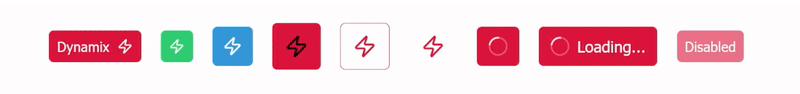
Different Variants
<Button variant="primary">Primary</Button>
<Button variant="secondary">Secondary</Button>
<Button variant="outline">Outline</Button>
<Button variant="ghost">Ghost</Button>
<Button variant="danger">Danger</Button>
Different Sizes
<Button size="sm">Small</Button>
<Button size="md">Medium</Button>
<Button size="lg">Large</Button>
Button with Icon (Hover Expansion)
import { Send } from 'lucide-react';

// Icon on the left (default)
<Button icon={<Send />}>Send</Button>

// Icon on the right
<Button icon={<Send />} iconPosition="right">Send</Button>
Loading State
// Loading button with text
<Button loading loadingText="Sending...">Send</Button>

// Loading button without text
<Button loading>Send</Button>
Custom Colors
// Fully customized color button
<Button
  backgroundColor="#3498db"
  hoverBackgroundColor="#2980b9"
  activeBackgroundColor="#1c6ca1"
  textColor="#ffffff"
  borderColor="#2980b9"
>
  Blue Button
</Button>

// Outline button with custom color
<Button
  variant="outline"
  textColor="#9b59b6"
  borderColor="#9b59b6"
  hoverBackgroundColor="rgba(155, 89, 182, 0.1)"
>
  Purple Option
</Button>
Full Width Button
<Button fullWidth>Full Width Button</Button>Disabled Button
<Button disabled>Disabled Button</Button>Accessibility
<Button
  ariaLabel="Button to submit form"
  title="Click to submit the form"
>
  Submit
</Button>
Expansion Behavior
One of the main features of this component is its expansion behavior on hover. When a button has an icon:
- Initially, only the icon is visible
- On hover, the button smoothly expands to show the text
- On mouse out, it collapses back to icon state
This behavior is ideal for interfaces with limited space, such as sidebars, toolbars, or compact menus.
import { Heart, Send, Settings, User } from 'lucide-react';

// Toolbar with expandable buttons
<div style={{ display: 'flex', gap: '8px' }}>
  <Button icon={<Heart />}>Favorite</Button>
  <Button icon={<Send />}>Send</Button>
  <Button icon={<Settings />}>Settings</Button>
  <Button icon={<User />}>Profile</Button>
</div>
Usage with Icon Libraries
The component is designed to work well with popular icon libraries:
Lucide React
import { Download } from 'lucide-react';

<Button icon={<Download />}>Download</Button>
React Icons
import { FiDownload } from 'react-icons/fi';

<Button icon={<FiDownload />}>Download</Button>
Material UI Icons
import DownloadIcon from '@mui/icons-material/Download';

<Button icon={<DownloadIcon />}>Download</Button>
Style Customization
The component automatically resizes icons according to the button size, ensuring a consistent and proportional appearance.
Contributing
Contributions are welcome! Feel free to open issues or submit pull requests.
License
MIT © [ramonexe]