easy-copy-tooltip
v1.1.2
Published
A React easy component with tooltip
Maintainers
Readme
Easy Copy Tooltip
A lightweight, production-ready React component for instant click-to-copy functionality with a built-in, accessible tooltip.
Built with TypeScript and Tailwind CSS. Fully compatible with Next.js (App Router & Pages), Vite, and standard React apps.


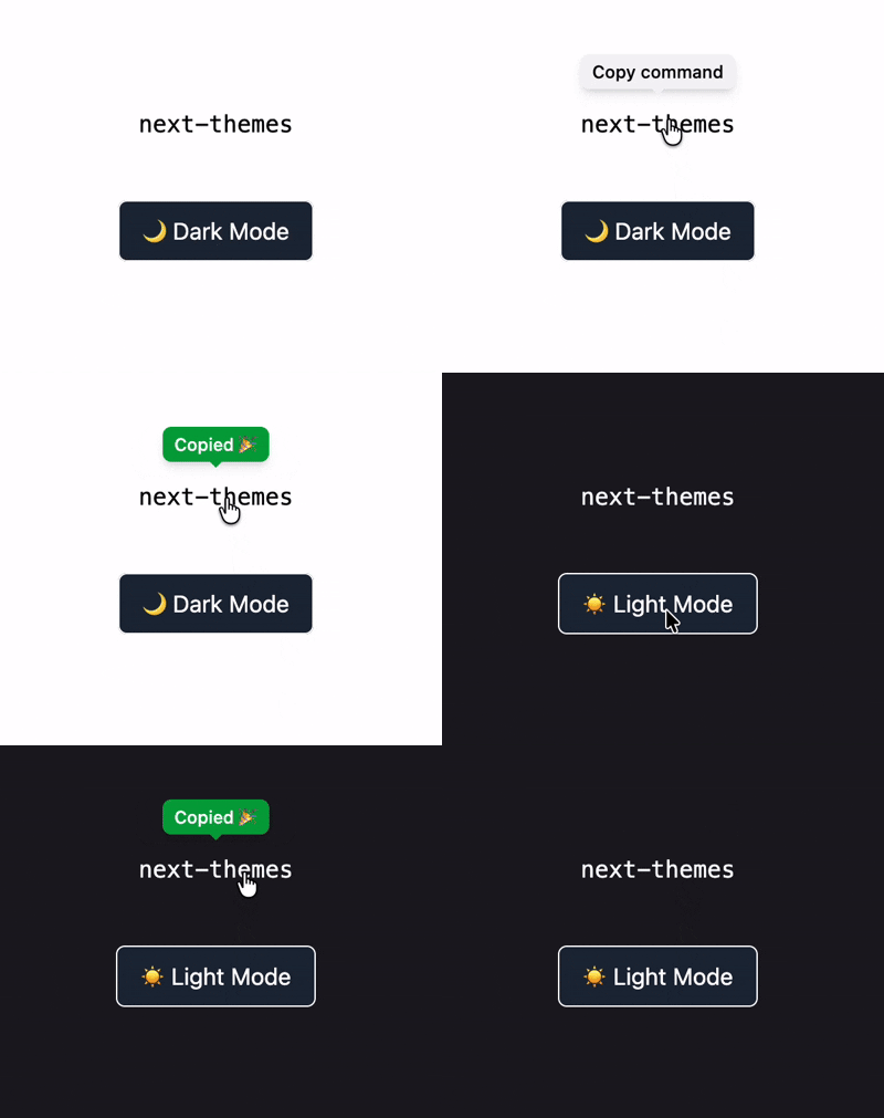
Demo

Features
- Zero Setup Logic – Wrap any element and it just works.
- Built-in Tooltip – Automatically shows a “Copied!” confirmation.
- Dark Mode Ready – Works seamlessly with Tailwind
dark:classes. - Next.js Compatible – Includes
"use client"for App Router. - TypeScript First – Written in TypeScript, works perfectly in JavaScript.
- Accessible by Default – Keyboard support and proper ARIA roles.
- No Dependencies – Uses only the Web Clipboard API.
Installation
Install with your preferred package manager:
# npm
npm install easy-copy-tooltip

# pnpm
pnpm add easy-copy-tooltip

# yarn
yarn add easy-copy-tooltip

# bun
bun add easy-copy-tooltip
Usage
Basic Example
Import the component and wrap any clickable element (button, icon, text, etc.).
import EasyCopy from "easy-copy-tooltip";

export default function Home() {
  return (
    <div className="flex min-h-screen items-center justify-center bg-gray-50">
      <EasyCopy value="this will be copied to clipboard">
        <button className="px-6 py-2 rounded-lg bg-blue-600 text-white transition hover:bg-blue-700 active:scale-95">
          Copy Link
        </button>
      </EasyCopy>
    </div>
  );
}
Inline / Text Usage
<EasyCopy value="npm install easy-copy-tooltip">
  <code className="px-2 py-1 rounded bg-gray-200 dark:bg-gray-800">
    npm install easy-copy-tooltip
  </code>
</EasyCopy>
Custom Layout / Styling
Pass extra classes to the wrapper if needed:
<EasyCopy value="123456" className="flex items-center justify-between w-full">
  <span>API Key</span>
  <span className="text-blue-600">Copy</span>
</EasyCopy>
Props API
| Prop | Type | Required | Description |
| ------------- | ----------------- | -------- | ---------------------------------- |
| children | React.ReactNode | ✅ | Element the user interacts with |
| value | string | ✅ | Text copied to clipboard |
| className | string | ❌ | Additional classes for the wrapper |
| copyLabel | string | ❌ | Tooltip text before copying |
| copiedLabel | string | ❌ | Tooltip text after copying |
| timeout | number | ❌ | Tooltip reset delay (ms) |
Accessibility
- Keyboard support (
Enter,Space) - Screen reader friendly (
aria-live) - Focus-visible styles
- No hover-only interactions
Dark Mode
Dark mode is handled via Tailwind’s dark: classes and works automatically when your app toggles the dark class on <html>.
No configuration required.
Compatibility
| Environment | Supported | | ---------------------- | --------- | | Next.js (App Router) | ✅ | | Next.js (Pages Router) | ✅ | | Vite | ✅ | | Create React App | ✅ | | TypeScript | ✅ | | JavaScript | ✅ |
License
MIT © @rimu-7

