
ehscan-react-components
v0.1.43
Published
components
Maintainers
 beeplaced
Readme
ehscan-react-components
- Button
- Window
- TextArea
- TextAreaDropDown
- AddBox
- useChangeAddBox.tsx
- css changes on vars can be done in parent class
Usage
AddBox
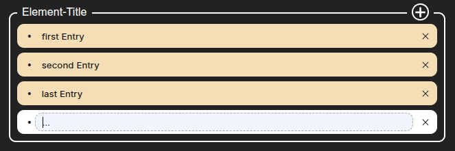
AddBox is a React component for managing a list of entries. It allows users to add, edit, and remove rows dynamically. Each row has an id and a title.
The component is fully controlled — the parent manages the state and receives updates via the onChange callback.
Implementation
import { useEffect, useState } from "react";
import { AddBox, useChangeAddBox } from 'ehscan-react-components';

const Elements = () => {

    const [inValue, setInValue] = useState({
    add: [
      { id: 0, title: "first Entry" },
      { id: 1, title: "second Entry" },
      { id: 2, title: "last Entry" }
    ]
  });

  useEffect(() => {
    console.log(inValue); //use ValueChanges on save
  },[inValue])

  const changeAddBox = useChangeAddBox(inValue, setInValue, "add"); //change on specific tag

  return (
    <>
      <div className="element-wrapper"> {/* ✏️ Put custom styling overrides here */}
      <AddBox title="Element-Title" value={inValue.add} onChange={(value, id) => changeAddBox(value, id)} />
      </div>
    </>
  );
}

export default Elements;
Styling
CSS Variables for AddBox
| Variable | Default | Applies To / Description |
| ----------------------------------------------- | --------------------- | ---------------------------------------------- |
| --ext-add-inputbox-border-radius | 10px | Border radius of the outer AddBox container |
| --ext-add-inputbox-border | 2px solid white | Border of the AddBox container |
| --ext-add-inputbox-title-top | -15px | Top position of the title row |
| --ext-add-inputbox-plus-svg-stroke | white | Stroke color of the “plus” SVG lines |
| --ext-add-inputbox-plus-svg-strokeWidth | 3 | Stroke width of the “plus” SVG lines |
| --ext-add-inputbox-plus-bck-clr | lightblue | Background color of the plus-wrapper container |
| --ext-add-inputbox-plus-padding | 7px | Horizontal padding inside plus-wrapper |
| --ext-add-inputbox-title-plus-margin-right | 15px | Margin-right of the plus wrapper |
| --ext-add-inputbox-title-plus-bck-clr | transparent | Background color of the plus button |
| --ext-add-inputbox-title-plus-border-radius | 50px | Border radius of the plus button |
| --ext-add-inputbox-title-plus-h | 25px | Height of the plus button |
| --ext-add-inputbox-title-plus-w | 25px | Width of the plus button |
| --ext-add-inputbox-title-plus-border | 2px solid white | Border of the plus button |
| --ext-add-inputbox-title-plus-bck-clr-hvr | lightgray | Background color of plus button on hover |
| --ext-add-inputbox-txt-margin-left | 10px | Margin-left of the title text |
| --ext-add-inputbox-txt-bck-clr | lightblue | Background color of the title text |
| --ext-add-inputbox-txt-clr | black | Text color of the title text |
| --ext-add-inputbox-txt-plus-h | 20px | Height of the title text container |
| --ext-add-inputbox-body-padding | 20px 10px 10px 10px | Padding for the AddBox body |
| --ext-add-content-row-height | 30px | Height of each row in the AddBox |
| --ext-add-content-row-bck-clr | white | Background color of each row |
| --ext-add-content-row-border-radius | 50px | Border radius of each row |
| --ext-add-content-row-hover-bck-clr | whitesmoke | Background color of row on hover |
| --tag-erase-w | 25px | Width of the row delete button |
| --tag-erase-h | 25px | Height of the row delete button |
| --ext-addbox-textarea-tag-erase-hover-bck-clr | darkgray | Background color of the delete button on hover |
| --ext-addbox-input-focus-border | 1px dashed darkgrey | Border of the input on focus |
Styling
- TextAreaDropDown
| Variable | Fallback / Default |
| ---------------------------------- | ----------------------------------- |
| --ext-textarea-box-bck-clr | lightgray |
| --ext-textarea-box-border-radius | 10px |
| --ext-dropdown-border-radius | 20px |
| --input-txt-size | (not explicitly set, optional) |
| --d-font-weight | (not explicitly set, optional) |
| --input-clr | black |
| --textarea-tag-bck-clr | white (some places transparent) |
| --textarea-tag-clr | darkblue (some places white) |
| --d-input-placeholder-clr | black |
| --d-input-bck-clr | transparent |
| --dropdown-item-bck-clr | wheat |
| --dropdown-amount-row-bck-clr | yellow |
| --animate-s | .5s |
Base Button Variables
| Variable | Default/Fallback |
| --------------------- | ----------------------------------------- |
| --btn-bg | #007aff |
| --btn-color | #fff |
| --btn-radius | 18px |
| --btn-padding-y | 0.5rem |
| --btn-padding-x | 1rem |
| --btn-width | fit-content |
| --btn-height | auto |
| --btn-font-size | 1rem |
| --btn-font-weight | 500 |
| --btn-transition | all 0.2s ease |
| --btn-line-height | 1.5 |
| --ripple-box-shadow | rgb(100 100 111 / 20%) 0px 7px 29px 0px |
| --ripple-effect-bck | rgb(0 0 0 / 15%) |
Size-specific overrides
| Variable | Size | Default/Fallback |
| -------------------- | ---- | ---------------- |
| --btn-padding-y-sm | sm | 0.25rem |
| --btn-padding-x-sm | sm | 0.75rem |
| --btn-font-size-sm | sm | 0.85rem |
| --btn-padding-y-md | md | 0.5rem |
| --btn-padding-x-md | md | 1rem |
| --btn-font-size-md | md | 1rem |
| --btn-padding-y-lg | lg | 0.75rem |
| --btn-padding-x-lg | lg | 1.5rem |
| --btn-font-size-lg | lg | 1.1rem |
Variant-specific variables
| Variable | Variant | Default/Fallback |
| ----------------------- | --------- | ---------------- |
| --btn-bg-primary | primary | #007aff |
| --btn-color-primary | primary | #fff |
| --btn-bg-secondary | secondary | #e5e5ea |
| --btn-color-secondary | secondary | #111 |
| --btn-bg-outline | outline | transparent |
| --btn-color-outline | outline | #007aff |
| --btn-bg-ghost | ghost | transparent |
| --btn-color-ghost | ghost | #007aff |
| --btn-bg-danger | danger | #ff3b30 |
| --btn-color-danger | danger | #fff |
Specific Button Types
| Variable | Type | Default/Fallback |
| ----------------------- | -------- | ---------------- |
| --btn-width-close | closeBtn | 35px |
| --btn-height-close | closeBtn | 35px |
| --btn-bg-close | closeBtn | lightgray |
| --btn-height-save | saveBtn | 35px |
| --btn-padding-x-save | saveBtn | 30px |
| --btn-bg-save | saveBtn | #007aff |
| --btn-height-trash | trashBtn | 35px |
| --btn-padding-x-trash | trashBtn | 10px |
| --btn-radius-trash | trashBtn | 4px |
| --btn-bg-trash | trashBtn | lightgray |
Window
styling
| Variable | Default | Description |
| ------------------------------------ | ----------------------------- | ---------------------------------- |
| --ext-window-bck-color | white | Window background color |
| --ext-window-width | 400px | Window default width |
| --ext-window-min-height | 300px | Window minimum height |
| --ext-window-border-radius | 12px | Window border radius |
| --ext-window-shadow | rgba(50,50,93,0.25) ... | Box shadow for window |
| --ext-window-opacity | 0 | Initial opacity (used for fade-in) |
| --ext-window-transition | opacity 0.4s ease-in-out | Fade transition |
| --ext-window-header-bck-color | var(--ext-window-bck-color) | Header background color |
| --ext-window-close-bck | aqua | Close button background |
| --ext-window-body-bck | transparent | Body background color |
| --ext-window-footer-bck | transparent | Footer background color |
| --ext-window-footer-min-height | 50px | Footer min height |
| --ext-window-scrollbar-thumb | white | Scrollbar thumb color |
| --ext-window-scrollbar-thumb-hover | #555 | Scrollbar thumb color on hover |
| --ext-window-resize-bck | darkgreen | Resize handle background |