
ehscan-react-mobile-components
v0.1.15
Published
components
Maintainers
 beeplaced
Readme
ehscan-react-mobile-components
Bundle of react Components for Mobile Web View
📦 Available Components
Table of Contents
PopUp
Mobile Window
Page Swiper (for Window)
FAB (Floating Action Button)
SegmentNavigation
Installation
npm ehscan-react-mobile-components
# or
yarn add ehscan-react-mobile-components
Usage Examples
SwipeToReveal
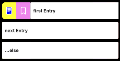
SwipeToReveal is a reusable React component that adds swipe-to-reveal actions to any row-based UI (e.g. lists, tables, or cards). It allows users to swipe left or right on a row to reveal configurable action buttons on either side, similar to mobile email or task apps.
The component supports both touch and mouse interactions, making it suitable for mobile and desktop environments.
Features:
Bidirectional swipe
- Swipe right to reveal left-side actions
- Swipe left to reveal right-side actions
Configurable action buttons
- Buttons can be customized with icons, colors, widths, and action identifiers
- Separate button sets for left and right sides
Snap & threshold behavior
- Rows only open when the swipe passes a defined threshold
- Partial swipes snap back to the closed state
Single open row control
- Integrates with a shared close state to ensure only one row is open at a time
Dynamic visuals
- Smooth dragging and snapping animations
- Adaptive border radius while swiping
- Stretch feedback when swiping against an already open side
import { SwipeToReveal } from 'ehscan-react-mobile-components';

const SwipeLoop = () => {

    const [close, setClose] = useState(0);

    // Define Buttons for all entries of this chunk
    // If set of Buttons change, open a new SwipeLoop
    // Some Examplatory SVGs - https://cc0-icons.jonh.eu/

    interface Button {
      title: ReactNode;
      action: string;
      backClr: string;
      clr: string;
      width: number;
    }

    const buttons: { left: Button[]; right: Button[] } = {
        left: [
            { title: <SVGFile />, action: "do one start", backClr: "yellow", clr: "white", width: 50 },
            { title: <SVGBookmark />, action: "do two start", backClr: "violet", clr: "white", width: 50 },
        ],
        right: [
            { title: <SVGMore />, action: "do one end", backClr: "darkviolet", clr: "white", width: 50 },
            { title: <SVGTrash />, action: "do two end", backClr: "red", clr: "white", width: 40 },
        ]
    };

    // Define Entries as rows
    const rows = [{ id: 1, title: 'first Entry' }, { id: 2, title: 'next Entry' }, { id: 3, title: '...else' }];

    //Global Action
    const action = (entry: { id: number, action: string }) => {
        console.log("do something with", entry);
    }

    return (
        rows.map(row => {
            return (<>
                <SwipeToReveal
                    key={`swipe_${row.id}`}
                    row={{ id: row.id }}
                    close={close}
                    setClose={setClose}
                    buttons={buttons}
                    action={action}
                ><div style={{ padding: 10 }}>{row.title}</div>
                </SwipeToReveal>
            </>)
        })
    );
};

export default SwipeLoop;
Mobile Header

import { HeaderElement } from 'ehscan-react-mobile-components';

const Page = () => {

  const doStuff = () => {
    console.log("doStuff")
  }

  const closeStuff = () => {
    console.log("closeStuff")
  }

  const DefButton = ({ onClick }) => (
    <div onClick={onClick} aria-label="menu">
      <svg
        xmlns="http://www.w3.org/2000/svg"
        height="24px"
        viewBox="0 -960 960 960"
        width="24px"
        fill="#FFFFFF"
      >
        <path d="M480-160q-33 0-56.5-23.5T400-240q0-33 23.5-56.5T480-320q33 0 56.5 23.5T560-240q0 33-23.5 56.5T480-160Zm0-240q-33 0-56.5-23.5T400-480q0-33 23.5-56.5T480-560q33 0 56.5 23.5T560-480q0 33-23.5 56.5T480-400Zm0-240q-33 0-56.5-23.5T400-720q0-33 23.5-56.5T480-800q33 0 56.5 23.5T560-720q0 33-23.5 56.5T480-640Z" />
      </svg>
    </div>
  );

  const CloseButton = ({ onClick }) => (
    <div onClick={onClick} aria-label="menu">
      <svg
        xmlns="http://www.w3.org/2000/svg"
        height="24px"
        viewBox="0 -960 960 960"
        width="24px"
        fill="#FFFFFF"
      >
        <path d="m256-200-56-56 224-224-224-224 56-56 224 224 224-224 56 56-224 224 224 224-56 56-224-224-224 224Z" />
      </svg>
    </div>
  );

  return (<>
  <div className="inject-header-styling">
    <HeaderElement
      index={'header'}
      initButton={<DefButton onClick={doStuff} />}
      secondaryButton={<DefButton onClick={doStuff} />}
      closeButton={<CloseButton onClick={closeStuff} />}
      editButton={<DefButton onClick={doStuff} />}
      title={"Lorem ipsum dolor sit amet, consetetur sadipscing elitr, sed diam nonumy eirmod tempor invidunt ut labore et dolore magna aliquyam erat, sed diam voluptua."} />
      </div>
  </>)
}
Styling
.inject-header-styling {
  /* Header layout */
  --ext-header-height: 50px;
  --ext-header-side-padding: 10px;
  --ext-header-gap: 3px;

  /* Header colors */
  --ext-header-bck-clr: #007aff;
  --ext-header-title-clr: lightslategrey;

  /* Typography */
  --ext-header-font-weight: 500;
}
Changelog
[0.1.4] - 2026-01-15
- Added --ext-segment-nav
[0.1.3] - 2026-01-15
- Added grid repeat based upon pages.length
[0.1.2] - 2026-01-15
- Added Translation to SegmentNav
[0.1.0] - 2025-12-15
- Added SwipeToReveal, image and docu
[0.0.8] - 2025-12-13
- Added HeaderElement, image and docu
- inject module styling