
endlessgui
v0.9.0
Published
Endless Work GUI — customizable React GUI components: sliders, buttons, folders, color pickers, uploaders and more


Readme
Endless GUI
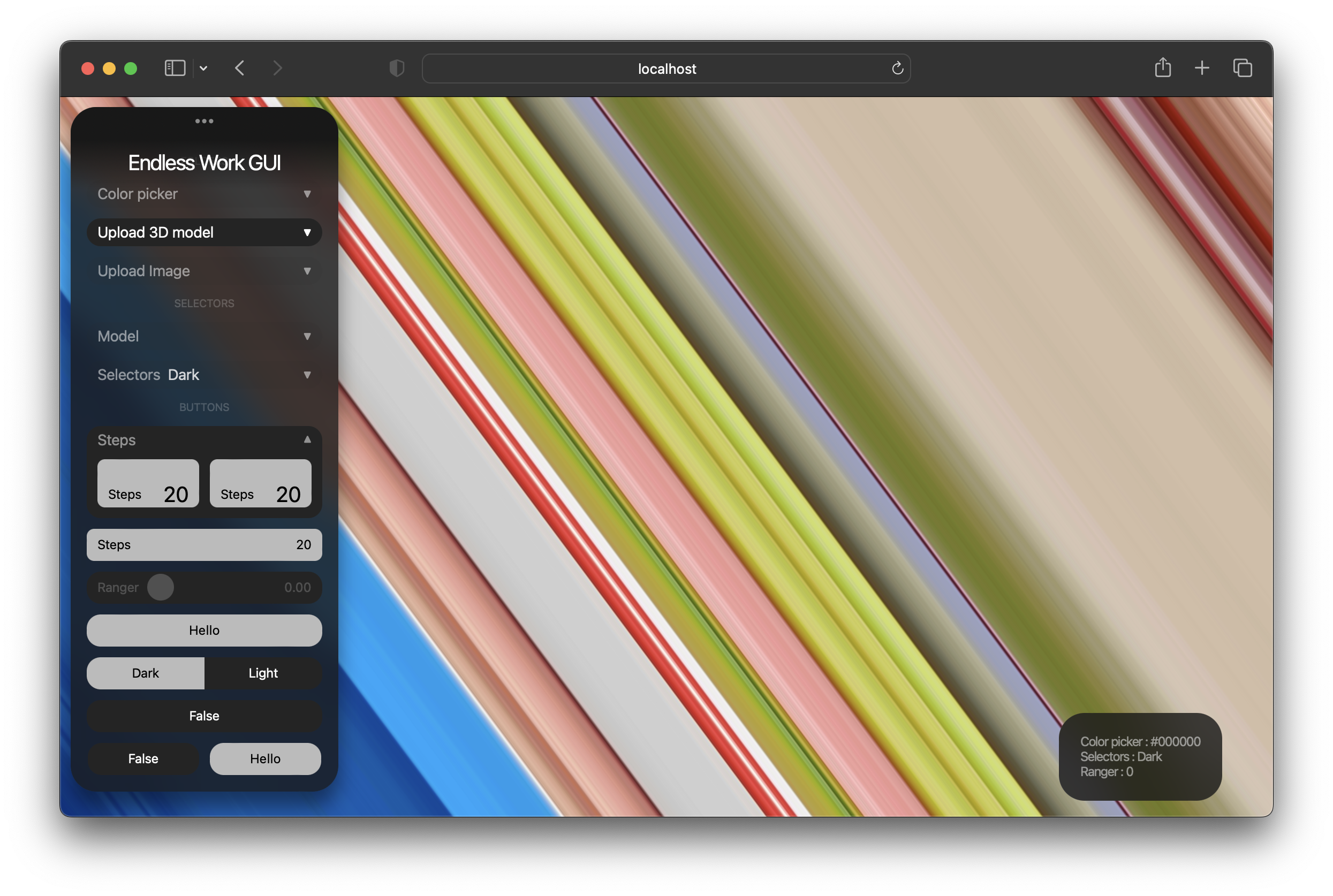
A lightweight, draggable GUI panel for React — sliders, buttons, folders, color pickers, file uploaders and more. Perfect for creative tools, 3D scenes, generative art and quick prototype controls.
- Works with React 18 and React 19
- Dark / Light / Custom themes — customize colors, radius, spacing, fonts with a single prop
- Styles are bundled and injected automatically — no CSS imports, no Tailwind setup required
- Draggable panel, mobile-friendly (collapses to a bottom sheet)
- Zero configuration: wrap your controls in
<EwGui>and go
Table of contents
- Installation
- Quick start
- The EwGui container
- Theming & design customization
- Components
- Buttons: ButtonEW, TogglerEW, Toggler3xEW, RadioEW, StepButtonEW
- Sliders & vectors: SliderEW, VectorControllerEW
- Selectors: DropdownEW, DropdownThumbnailsEW
- Color: ColorPickerEW
- Uploaders: ImageUploaderEW, UniversalUploaderEW, LinkUploaderEW, ImageAndTextEW
- Text: TextareaEW
- Layout: FolderEW, SplitEW, FolderSplitEW, LabelEW
- Utilities: PreloaderEW, DataEW
- Mobile behavior & accordion mode
Installation
npm i endlessguiQuick start
import { useState } from "react";
import { EwGui, SliderEW, ButtonEW, TogglerEW, DropdownEW, ColorPickerEW } from "endlessgui";

export default function App() {
  const [intensity, setIntensity] = useState(0.5);
  const [color, setColor] = useState("#2E7CF6");

  const modes = [
    { label: "Wireframe", value: "wire" },
    { label: "Solid", value: "solid" },
    { label: "Textured", value: "tex" },
  ];

  return (
    <>
      {/* your app / canvas / scene here */}

      <EwGui width={"300px"} title={"My Controls"}>
        <SliderEW title={"Intensity"} min={0} max={1} step={0.01} value={intensity} onChange={setIntensity} />
        <DropdownEW title={"Mode"} items={modes} onSelect={(item) => console.log(item.value)} />
        <ColorPickerEW title={"Color"} value={color} onChange={setColor} />
        <TogglerEW title_a={"On"} title_b={"Off"} onClick_a={() => {}} onClick_b={() => {}} />
        <ButtonEW title={"Apply"} onClick={() => console.log("apply")} />
      </EwGui>
    </>
  );
}
That's it — no CSS imports needed. The panel renders fixed on screen and can be dragged by its header.
The EwGui container
EwGui is the root panel. All components must be placed inside it.
<EwGui
  width={"300px"}        // panel width on desktop
  title={"My GUI"}       // header title
  theme={"dark"}         // 'dark' (default) | 'light' | 'custom'
  customTheme={{}}       // design overrides, used with theme='custom' (see Theming)
  scale={0.8}            // scale of the whole panel, draggable across the full screen
  rounded={24}           // panel corner radius, px
  top={20} left={20}     // initial position, px
  desktopHeight={95}     // max panel height on desktop, vh
  mobileHeight={40}      // max panel height on mobile, vh
  rollup={true}          // start collapsed on mobile
  attach={false}         // accordion mode: only one group open at a time
  data={true}            // show the "?" button with a live values popup
>
  {/* components */}
</EwGui>
| Prop | Type | Default | Description |
| :--- | :--- | :--- | :--- |
| width | string | number | — | Panel width on desktop (on mobile it's 95vw) |
| title | string | — | Header title, also the drag handle |
| theme | string | 'dark' | 'dark', 'light' or 'custom' |
| customTheme | object | {} | Design tokens for theme='custom' |
| scale | number | 1 | Visual scale of the whole panel (0.7 = 70%) |
| rounded | number | 24 | Panel border radius, px |
| top, left | number | 0 | Initial position |
| desktopHeight | number | 95 | Max visible height on desktop, vh |
| mobileHeight | number | 40 | Max visible height on mobile, vh |
| rollup | boolean | false | Start collapsed on mobile |
| attach | boolean | — | Accordion mode for groups (see below) |
| data | boolean | — | Live values popup (works with SliderEW, ColorPickerEW, DropdownEW, VectorControllerEW) |
Theming & design customization
Built-in themes
<EwGui theme={"dark"}>  ...  </EwGui>   // default
<EwGui theme={"light"}> ...  </EwGui>   // full inversion of the dark theme
Custom theme
Set theme="custom" and pass only the keys you want to change — everything else falls back to the dark theme. All semi-transparent shades (hover states, muted text, subtle backgrounds) are derived from your base colors automatically.
<EwGui
  theme={"custom"}
  customTheme={{
    /* Colors */
    background: "rgba(10, 20, 46, 0.85)", // panel background (rgba supported)
    header: "#0A142E",                    // header / solid panel color
    surface: "#16294F",                   // controls background
    inset: "#0F1E3D",                     // inputs and upload areas
    accent: "#2E7CF6",                    // active / pressed buttons
    accentHover: "#5EA0FF",               // buttons on hover
    accentText: "#FFFFFF",                // text on accent buttons
    text: "#DCE9FF",                      // main text color

    /* Shape & effects */
    radius: 13,                           // base border radius, px
    blur: true,                           // backdrop blur behind the panel

    /* Spacing & typography */
    padding: 15,                          // horizontal padding of controls, px
    gap: 5,                               // vertical gap between components, px
    fontSize: 12,                         // base font size, px
    buttonPadding: 9,                     // inner padding of buttons, px
  }}
>
  ...
</EwGui>
| Key | Type | Default | Description |
| :--- | :--- | :--- | :--- |
| background | color | rgba(24,24,24,0.8) | Panel background, supports alpha |
| header | color | #181818 | Header gradient / solid panel color |
| surface | color | #242424 | Background of controls (togglers, dropdowns, sliders) |
| inset | color | #1E1E1E | Text inputs and drag & drop areas |
| accent | color | #BBBBBB | Active / pressed buttons |
| accentHover | color | #FFFFFF | Buttons on hover |
| accentText | color | #000000 | Text on accent buttons |
| text | color | #FFFFFF | Main text; muted shades are derived from it |
| radius | number | 13 | Base radius; smaller radii scale proportionally |
| blur | boolean | true | Backdrop blur on/off |
| padding | number | 15 | Horizontal padding of controls inside the panel |
| gap | number | 5 | Vertical gap between components |
| fontSize | number | 12 | Base font size; headers/labels/icons scale from it |
| buttonPadding | number | 9 | Button height = fontSize + buttonPadding * 2 |
Tip: you can use theme="custom" just for sizing without changing colors:
<EwGui theme={"custom"} customTheme={{ radius: 6, padding: 20, fontSize: 14 }}>Visual theme editor (experimental)
Add editThemeMode={true} and a pencil button appears under the header. It opens a live editor with mini color inputs and sliders for every theme key — tweak the design visually, then press Copy theme to copy the resulting customTheme JSON to the clipboard and paste it into your code.
<EwGui theme={"custom"} customTheme={myTheme} editThemeMode={true}>The editor is meant for development — remove the prop when you're done.
Components
Buttons
ButtonEW — simple button
<ButtonEW title={"Apply"} onClick={() => console.log("clicked")} width={"100%"} />| Prop | Description |
| :--- | :--- |
| title | Button label |
| onClick | Click handler |
| width | Optional width |
TogglerEW — two-state switch
<TogglerEW
  title_a={"Day"} title_b={"Night"}
  onClick_a={() => setMode("day")}
  onClick_b={() => setMode("night")}
/>
Toggler3xEW — two or three-state switch
<Toggler3xEW
  title_a={"Low"} title_b={"Mid"} title_c={"High"}
  onClick_a={() => setQuality(0)}
  onClick_b={() => setQuality(1)}
  onClick_c={() => setQuality(2)}
/>
Omit title_c / onClick_c to get a two-state switch.
RadioEW — on/off toggle button
<RadioEW
  title_a={"Enabled"} title_b={"Disabled"}
  start={false}
  onClick={() => setEnabled((v) => !v)}
/>
| Prop | Description |
| :--- | :--- |
| title_a / title_b | Labels for on / off states |
| start | Initial state |
| onClick | Called on every toggle |
StepButtonEW — cycles through values
const [steps, setSteps] = useState(0);

<StepButtonEW title={"Samples"} min={0} max={100} step={10} value={steps} setFunction={setSteps} />
Each click adds step; after max it wraps back to min. Add design={true} for a taller variant with a big value.
Sliders & vectors
SliderEW — range slider
const [value, setValue] = useState(0.5);

<SliderEW title={"Opacity"} min={0} max={1} step={0.01} value={value} onChange={setValue} />
Note: onChange receives the value as a string with 2 decimals — wrap with parseFloat() if you need a number.
VectorControllerEW — 2D joystick pad
<VectorControllerEW
  title={"Direction"}
  height={"120px"}
  onChange={({ vectorX, vectorY }) => setDirection([+vectorX, +vectorY])}
/>
Returns normalized coordinates from -1 to 1 on both axes.
Selectors
DropdownEW — dropdown list
const items = [
  { label: "First", value: "1" },
  { label: "Second", value: "2" },
  { label: "Third", value: "3" },
];

<DropdownEW title={"Preset"} items={items} cols={2} onSelect={(item) => console.log(item.value)} />
| Prop | Description |
| :--- | :--- |
| items | Array of { label, value } |
| onSelect | Receives the selected item |
| cols | Number of columns in the open list |
| title | Optional — wraps the list into a collapsible group |
DropdownThumbnailsEW — dropdown with image previews
const models = [
  { label: "Cube", value: "cube", thumbnail: "/thumbs/cube.png" },
  { label: "Sphere", value: "sphere", thumbnail: "/thumbs/sphere.png" },
];

<DropdownThumbnailsEW title={"Model"} items={models} cols={3} onSelect={(item) => load(item.value)} />
Color
ColorPickerEW — HEX color picker
const [color, setColor] = useState("#2E7CF6");

<ColorPickerEW title={"Background"} value={color} onChange={setColor} />
Uploaders
ImageUploaderEW — drag & drop for images
const [image, setImage] = useState(null);

<ImageUploaderEW
  title={"Texture"}
  height={"120px"}
  onImageLoaded={setImage}
  asBase64={false}   // false: blob URL (default), true: Base64 string
/>
UniversalUploaderEW — drag & drop for 3D models and files
<UniversalUploaderEW
  title={"3D model"}
  height={"120px"}
  onFileLoaded={(url, file) => loadModel(url)}
  getFileType={(ext) => console.log(ext)}  // 'glb', 'fbx', 'obj', 'gltf', 'pdf', 'bin'
/>
LinkUploaderEW — image by URL with preview
const [link, setLink] = useState("http://...");

<LinkUploaderEW
  title={"Image link"}
  value={link}
  onChange={setLink}
  height={"120px"}
  titleButton={"Load"}
  onClickButton={() => applyImage(link)}
/>
ImageAndTextEW — image + prompt combo (for AI workflows)
<ImageAndTextEW
  title={"Generate"}
  titleButton={"Run"}
  onSubmit={({ image, prompt }) => generate(image, prompt)}
/>
Can be used uncontrolled (as above) or controlled via imageValue/onImageChange and value/onChange.
Text
TextareaEW — text input with optional preview and button
const [prompt, setPrompt] = useState("Your prompt here...");

<TextareaEW
  title={"Prompt"}
  value={prompt}
  onChange={setPrompt}
  rows={4}
  buttonNeed={true}
  titleButton={"Send"}
  onClickButton={() => send(prompt)}
  modeImage={true}          // show an image preview above the textarea
  imageOut={resultImageUrl} // image to preview
/>
Layout
FolderEW — collapsible group
<FolderEW title={"Transform"}>
  <SliderEW folder={true} title={"X"} min={-1} max={1} step={0.01} value={x} onChange={setX} />
  <SliderEW folder={true} title={"Y"} min={-1} max={1} step={0.01} value={y} onChange={setY} />
</FolderEW>
Pass folder={true} to children placed inside a folder for correct compact margins.
SplitEW — two components side by side
<SplitEW>
  <RadioEW split={true} title_a={"A"} title_b={"B"} onClick={() => {}} />
  <ButtonEW split={true} title={"Go"} onClick={() => {}} />
</SplitEW>
Use FolderSplitEW instead of SplitEW when splitting inside a FolderEW.
LabelEW — section label
<LabelEW title={"Lighting"} />Utilities
PreloaderEW — progress indicator
const [running, setRunning] = useState(false);

<PreloaderEW run={running} onFinish={(seconds) => console.log(`done in ${seconds}s`)} />
Shows an animated progress bar with a timer while run={true}, then "Done in Xs".
DataEW — live values popup
Added automatically when <EwGui data={true}>. Click the ? button to open a draggable popup with current values of sliders, pickers and dropdowns. Click the popup to copy values to clipboard.
Mobile behavior & accordion mode
- On screens ≤ 600px the panel becomes a bottom sheet (95vw wide,
mobileHeighttall) and can collapse by tapping the header (rollupsets the initial state). - On mobile — or on desktop with
attach={true}— groups work as an accordion: opening one closes the others. For this to work give each group component a uniqueid:
<EwGui attach={true} title={"GUI"}>
  <FolderEW id={"transform"} title={"Transform"}> ... </FolderEW>
  <ColorPickerEW id={"color"} title={"Color"} value={color} onChange={setColor} />
  <ImageUploaderEW id={"texture"} title={"Texture"} onImageLoaded={setImage} />
</EwGui>
License
MIT © staswrs