
event-banner
v1.0.5
Published
A customizable web component for displaying event banners on your website
Maintainers
 frmachao
Readme
Event Banner Component
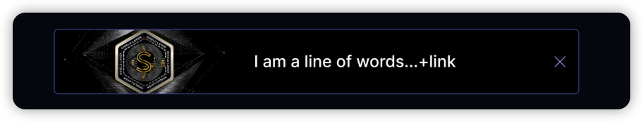
A customizable web component for displaying event banners on your website. Easy to integrate and fully responsive.
Installation
# Using npm
npm install event-banner

# Using yarn
yarn add event-banner

# Using pnpm
pnpm add event-banner
Usage
Using ES modules
// Import the component
import 'event-banner';

// Use in your HTML
<event-banner>
  <img slot="icon" src="icon.svg" alt="Icon">
  <a slot="link">Your message here</a>
</event-banner>
Using CDN
<script type="module" src="https://cdn.jsdelivr.net/npm/event-banner@latest/src/event-banner.js"></script>Attributes
| Attribute | Description | Default | Example |
| ---------- | ---------------------------------------- | --------- | ------------------- |
| top | Position from top (for fixed position) | "20%" | "30%", "20px", "2rem" |
| width | Banner width | "auto" | "100%", "500px" |
| fixed | Fixed positioning | true | "false" |
| duration | Auto-close duration in milliseconds. It will not automatically close if set 0 | 15000 | "0", "2000" |
Slots
The component provides three slots for content customization:
icon: For the banner icon (usually an image)link: For the main content/messageclose: For the close button (has a default implementation)
Styling
Using :host
<event-banner style="background: sandybrown;">
  <img src="./banner.svg" alt="Info icon" slot="icon" />
  <a slot="link">
    lorem ipsum dolor sit amet consectetur adipisicing elit. Quisquam...
  </a>
</event-banner>
Using ::part
The component exposes several parts that can be styled from the outside:
/* Style the icon container */
#custom-parts-banner::part(icon-container) {
  background: sandybrown;
  padding: 4px;
  border-radius: 4px;
}

/* Style the link container */

#custom-parts-banner::part(link-container) {
  border: 2px solid salmon;
}

/* Style the close button container */
#custom-parts-banner::part(close-container) {
  background: rgba(255, 255, 255, 0.1);
  padding: 4px;
  border-radius: 4px;
  transition: background-color 0.3s;
}
<event-banner id="custom-parts-banner">
<img src="./banner.svg" alt="Info icon" slot="icon" />
<a slot="link">
lorem ipsum dolor sit amet consectetur adipisicing elit. Quisquam...
</a>
</event-banner>Examples
Default Banner (Center Position)
<event-banner>
  <img src="./banner.svg" alt="Info icon" slot="icon" />
  <a slot="link">Your message here</a>
</event-banner>
Custom top (30% from top)
<event-banner top="30">
  <img src="./banner.svg" alt="Info icon" slot="icon" />
  <a slot="link">Your message here</a>
</event-banner>
Static Banner (Full Width)
<event-banner fixed="false" width="100%">
  <img src="./banner.svg" alt="Info icon" slot="icon" />
  <a slot="link">
    lorem ipsum dolor sit amet consectetur adipisicing elit. Quisquam...
  </a>
</event-banner>
Custom Close Button
<event-banner>
  <img src="./banner.svg" alt="Info icon" slot="icon" />
  <a slot="link">
    lorem ipsum dolor sit amet consectetur adipisicing elit. Quisquam...
  </a>
  <button slot="close" class="close-button">
    <img src="./btn_close.svg" alt="close" style="width: 30px;height: 30px;" />
  </button>
</event-banner>
Custom Duration
<!-- Auto-close after 2 seconds -->
<event-banner duration="2000">
  <img src="./banner.svg" alt="Info icon" slot="icon" />
  <a slot="link">This banner will auto-close after 2 seconds</a>
</event-banner>

<!-- Disable auto-close -->
<event-banner duration="0">
  <img src="./banner.svg" alt="Info icon" slot="icon" />
  <a slot="link">This banner will not auto-close</a>
</event-banner>
Default Styles
The banner comes with a default dark theme:
- Dark background
- White text
- Responsive layout
- Smooth close animation
- Flexible width
- Optional fixed positioning