
expo-dot-matrix-text
v1.0.3
Published
A lightweight Expo-compatible React Native component library for rendering customizable 5x5 dot-matrix text using pure View-based glyphs.

Readme
expo-dot-matrix-text
A lightweight Expo-compatible React Native component library for rendering
customizable 5x5 dot-matrix text using pure View-based glyphs.
The package has no native code and does not depend on Skia, SVG, Canvas, Reanimated, or Expo-specific APIs. It works in Expo Go, development builds, plain React Native apps, and React Native Web.
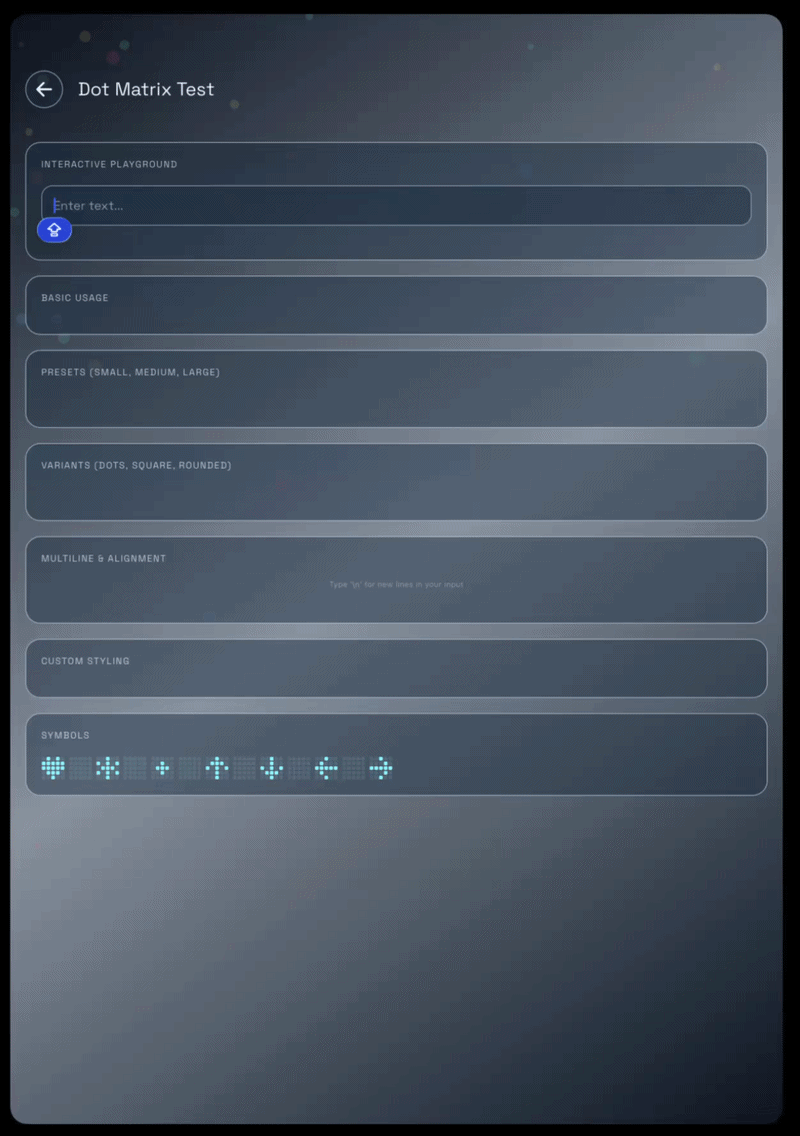
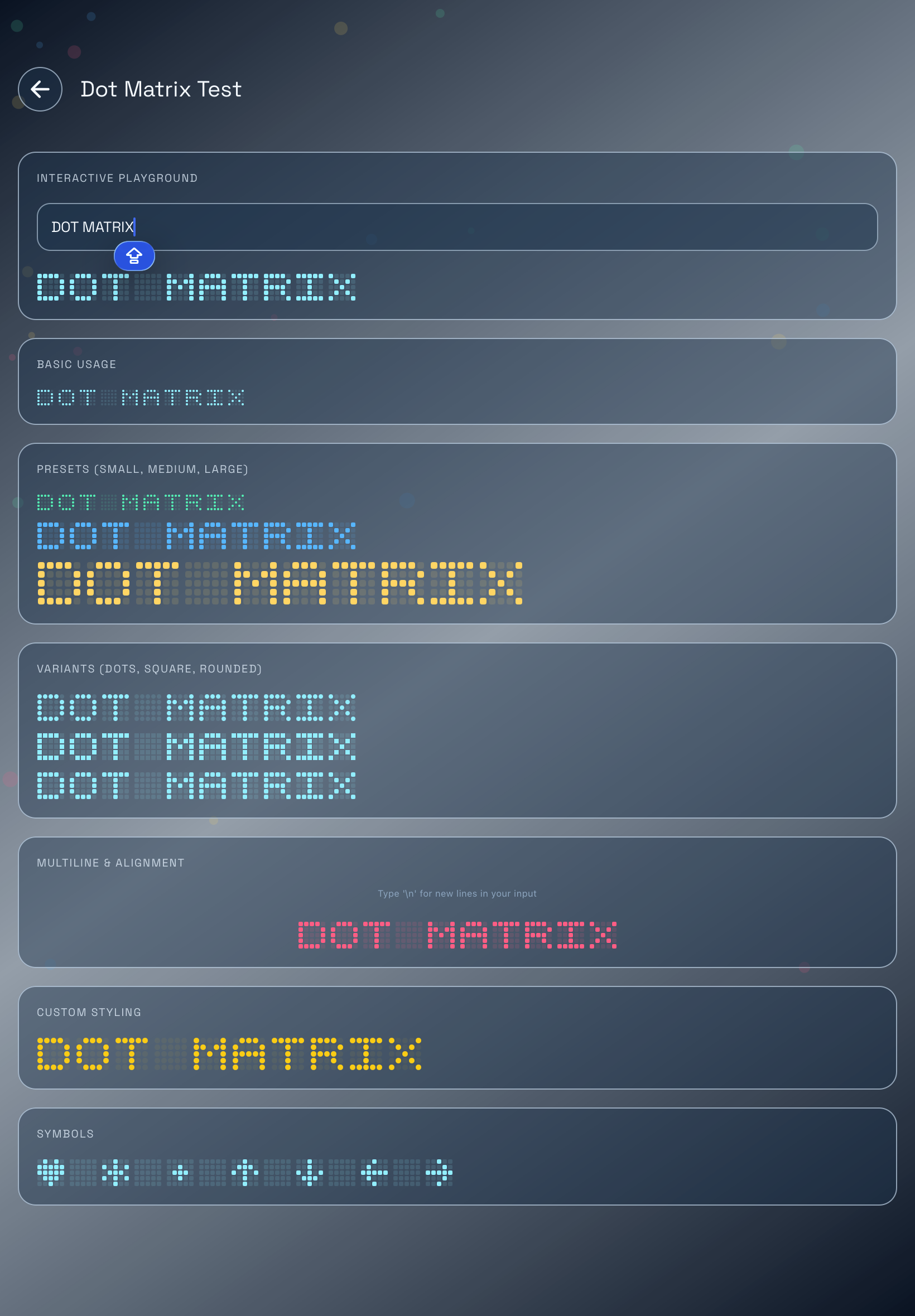
Preview
Installation
npm install expo-dot-matrix-textyarn add expo-dot-matrix-textQuick Start
import { DotMatrixText } from 'expo-dot-matrix-text';

export function InstallBanner() {
  return <DotMatrixText text="INSTALL UNKIND" />;
}
With custom styling:
<DotMatrixText
  text="INSTALL UNKIND"
  color="#f97316"
  dotSize={5}
  dotGap={1}
  letterSpacing={5}
  variant="dots"
/>
Usage
Basic Text
import { DotMatrixText } from 'expo-dot-matrix-text';

<DotMatrixText text="INSTALL UNKIND" />;
Sizes
Control the size of each dot with dotSize, and the spacing around each dot
with dotGap.
<DotMatrixText text="INSTALL UNKIND" dotSize={3} dotGap={1} />

<DotMatrixText text="INSTALL UNKIND" dotSize={6} dotGap={2} />
Colors
color controls active cells. Inactive cells use the active color with reduced
opacity by default.
<DotMatrixText text="INSTALL UNKIND" color="#22c55e" />Use inactiveOpacity to make inactive cells more or less visible:
<DotMatrixText
  text="INSTALL UNKIND"
  color="#38bdf8"
  inactiveOpacity={0.06}
/>
Use inactiveColor when you want inactive cells to have a separate color:
<DotMatrixText
  text="INSTALL UNKIND"
  color="#facc15"
  inactiveColor="#1f2937"
/>
Variants
The variant prop controls the shape of each active and inactive cell.
<DotMatrixText text="INSTALL UNKIND" variant="dots" />
<DotMatrixText text="INSTALL UNKIND" variant="square" />
<DotMatrixText text="INSTALL UNKIND" variant="rounded" />
Available variants:
| Variant | Shape |
| --- | --- |
| dots | Circular dots |
| square | Sharp square cells |
| rounded | Rounded square cells |
Multiline Text
Use \n to render multiple lines.
<DotMatrixText
  text={'INSTALL\nUNKIND'}
  color="#c084fc"
  dotSize={5}
  lineHeight={12}
/>
Alignment
Use align with a constrained container width.
<DotMatrixText
  text={'INSTALL\nUNKIND'}
  align="center"
  style={{ width: 260 }}
/>
<DotMatrixText
text="INSTALL UNKIND"
align="right"
style={{ width: 320 }}
/>Wrapping
Wrapping is enabled by default. Set wrap={false} for a single unwrapped row.
<DotMatrixText
  text="INSTALL UNKIND"
  wrap={false}
/>
For wrapping text, constrain the container width:
<DotMatrixText
  text="INSTALL UNKIND"
  style={{ width: 180 }}
/>
Presets
Use DOT_MATRIX_PRESETS for common sizes.
import { DOT_MATRIX_PRESETS, DotMatrixText } from 'expo-dot-matrix-text';

<DotMatrixText text="INSTALL UNKIND" {...DOT_MATRIX_PRESETS.small} />;

<DotMatrixText
  text="INSTALL UNKIND"
  color="#a3e635"
  {...DOT_MATRIX_PRESETS.medium}
/>;

<DotMatrixText
  text="INSTALL UNKIND"
  color="#facc15"
  {...DOT_MATRIX_PRESETS.large}
/>;
Current presets:
| Preset | dotSize | dotGap |
| --- | ---: | ---: |
| small | 2 | 1 |
| medium | 4 | 1 |
| large | 6 | 2 |
Styling Each Dot
Use dotStyle to apply additional React Native styles to every cell.
<DotMatrixText
  text="INSTALL UNKIND"
  color="#14b8a6"
  dotStyle={{
    borderWidth: 1,
    borderColor: '#ffffff33',
  }}
/>
Styling the Container
Use style for the outer container.
<DotMatrixText
  text="INSTALL UNKIND"
  color="#f8fafc"
  style={{
    backgroundColor: '#020617',
    padding: 16,
  }}
/>
Accessibility
The component is accessible by default and uses text as the accessibility
label unless you provide accessibilityLabel.
<DotMatrixText
  text="INSTALL UNKIND"
  accessibilityLabel="Install Unkind"
/>
Testing
Use testID on the outer container.
<DotMatrixText
  text="INSTALL UNKIND"
  testID="install-unkind-dot-matrix"
/>
API
import {
  DotMatrixChar,
  DotMatrixText,
  DOT_MATRIX_PRESETS,
  GLYPHS,
  getGlyph,
  registerGlyphs,
} from 'expo-dot-matrix-text';

import type {
  DotMatrixCharProps,
  DotMatrixGlyph,
  DotMatrixPreset,
  DotMatrixTextProps,
} from 'expo-dot-matrix-text';
DotMatrixText
DotMatrixText is the primary component. It renders each character as a 5x5
glyph.
| Prop | Type | Default | Description |
| --- | --- | --- | --- |
| text | string | Required | Text to render. Supports \n for multiple lines. |
| color | string | '#10b981' | Active cell color. |
| inactiveColor | string | undefined | Optional color for inactive cells. |
| inactiveOpacity | number | 0.13 | Opacity for inactive cells when inactiveColor is not set. |
| dotSize | number | 2 | Width and height of each cell. |
| dotGap | number | 1 | Space around each cell. Internally applied as margin: dotGap / 2. |
| letterSpacing | number | 4 | Space between rendered characters. |
| lineHeight | number | 6 | Space between rendered lines. |
| align | 'left' \| 'center' \| 'right' | 'left' | Horizontal alignment of each line inside the container. |
| wrap | boolean | true | Allows characters to wrap inside a constrained width. |
| variant | 'dots' \| 'square' \| 'rounded' | 'rounded' | Cell shape. |
| dotStyle | StyleProp<ViewStyle> | undefined | Extra style applied to every cell. |
| style | StyleProp<ViewStyle> | undefined | Style applied to the outer container. |
| glyphs | Record<string, DotMatrixGlyph> | undefined | Per-component glyph overrides. |
| fallbackChar | string | '?' | Character used when no glyph exists for a given input character. |
| testID | string | undefined | Test id for the outer container. |
| accessibilityLabel | string | text | Accessibility label for the rendered text. |
Custom Glyphs
A glyph is an array of strings. Each string is one row. The built-in glyphs use 5 rows and 5 columns.
import type { DotMatrixGlyph } from 'expo-dot-matrix-text';

const customA: DotMatrixGlyph = [
  '11111',
  '10001',
  '11111',
  '10001',
  '10001',
];
Only 1 is treated as active. Any other character is treated as inactive.
Per-Component Glyphs
Use the glyphs prop to override characters for one component instance.
const glyphs = {
  A: ['11111', '10001', '11111', '10001', '10001'],
};

<DotMatrixText text="INSTALL UNKIND" glyphs={glyphs} />;
Global Glyph Registration
Use registerGlyphs to register custom glyphs globally.
import { registerGlyphs } from 'expo-dot-matrix-text';

registerGlyphs({
  '~': ['00000', '01010', '10100', '00000', '00000'],
});
Then any DotMatrixText can render the character:
<DotMatrixText text="INSTALL UNKIND ~" />Custom glyph keys are normalized to uppercase.
getGlyph
getGlyph returns the glyph for a single character.
import { getGlyph } from 'expo-dot-matrix-text';

const glyph = getGlyph('I');
Resolution order:
- Registered custom glyph
- Built-in glyph
- Built-in
?fallback glyph
Lowercase input is normalized:
getGlyph('i') === getGlyph('I');DotMatrixChar
DotMatrixChar renders one glyph. Most apps should use DotMatrixText, but
this lower-level component is available for custom composition.
import { DotMatrixChar, getGlyph } from 'expo-dot-matrix-text';

<DotMatrixChar
  glyph={getGlyph('U')}
  color="#22c55e"
  inactiveOpacity={0.13}
  dotSize={4}
  dotGap={1}
  variant="rounded"
/>;
Built-In Characters
The built-in glyph map includes:
- Uppercase letters
A-Z - Digits
0-9 - Space
- Common punctuation:
. , : ; ! ? ' " - _ + = / \ | - Brackets:
( ) [ ] { } < > - Symbols:
@ # $ % & * - Special symbols:
♥ ★ • ↑ ↓ ← →
Unsupported characters fall back to ? unless you provide fallbackChar or
custom glyphs.
Expo and React Native Compatibility
This library is pure React Native UI. It can be used in:
- Expo Go
- Expo development builds
- EAS builds
- Bare React Native apps
- React Native Web
No native install step is required.
License
MIT