
expo-native-compact-tabs
v0.2.1
Published
A native floating tab bar for Expo that keeps every tab visible when compact.

Maintainers
 0xkevs
Readme
expo-native-compact-tabs
A native floating tab bar for Expo apps that keeps every tab visible when it becomes compact.
[!IMPORTANT] Expo Go is not supported. This package contains custom Swift and Kotlin code that is not included in the Expo Go app, even when your project's Expo SDK version matches the version supported by Expo Go. Use a development build or production build instead.
expo-native-compact-tabs hosts a standalone UITabBar, so iOS still owns the
Liquid Glass material, selection capsule, hit testing, and accessibility. Your
React Native navigator continues to own routes and screen lifecycle. Because
the bar is not managed by a UITabBarController, your app—not
UITabBarMinimizeBehavior—decides what compact means.
On iOS 26, this gives you Apple's actual Liquid Glass and water-drop selection motion while allowing a compact state that removes labels but keeps every icon. On iOS 16.4–18.x, the same component automatically uses a solid floating pill and a Swift-animated selection capsule with matching expanded and compact geometry. It is deliberately not described as Liquid Glass: that material is only available on iOS 26 and newer.
On Android, a native Kotlin view renders the same solid floating-pill design as the older-iOS fallback. Its selection capsule can be dragged continuously between tabs and springs to the destination when released.
Demo
iOS 26 Liquid Glass

The demo shows the native selection capsule moving between tabs, animated tab icons, and the bar compacting on downward scroll while keeping every icon visible. Watch the higher-quality MP4.
Android and iOS 16.4–18.x fallback
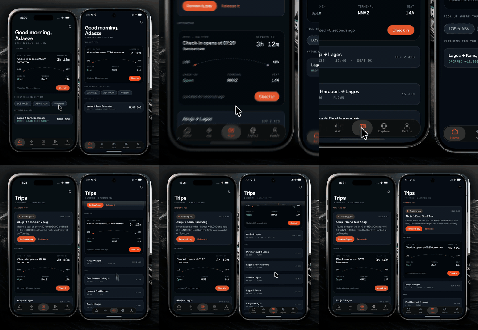
The fallback demo shows both native implementations side by side, including drag selection, compact-on-scroll, safe-area placement, and matching floating pill geometry. Watch the higher-quality MP4.
Requirements
- Expo SDK 57 or newer
- React Native 0.86 or newer
- React Native Reanimated 4 or newer
- iOS 16.4 or newer
- Android 7.0 (API 24) or newer
- A development build or production build; custom native modules do not run in Expo Go
Platform behavior
No platform check or alternate component is required in your app. The native module selects the appropriate rendering path while keeping the same props and tab-selection events.
| OS | Surface and selection | Native behavior | Compact state | | --- | --- | --- | --- | | iOS 26+ | Apple's real Liquid Glass and native water-drop selection capsule | UIKit owns rendering, hit testing, accessibility, and icon animation | Labels disappear, the bar shrinks, and every icon remains visible | | iOS 16.4–18.x | Solid floating pill with a Swift-drawn spring selection capsule | Real UIKit tab items retain hit testing, accessibility, icon animation, and drag selection | The same labels and geometry animate between expanded and compact states | | Android | Native solid floating pill with a spring selection capsule | Native Views provide hit testing, accessibility, icon animation, haptics, and drag selection | The same labels and geometry animate between expanded and compact states |
The older-iOS and Android paths preserve the interaction model and floating pill shape, but they do not claim to reproduce an iOS 26 material that those platforms do not provide.
Install
npx expo install expo-native-compact-tabs react-native-reanimatedFor local development, install Expo's development client and create a native
build. Add --device when targeting a connected physical device:
npx expo install expo-dev-client
npx expo run:ios
# npx expo run:ios --device

npx expo run:android
# npx expo run:android --device
The run command builds, installs, and launches the development build, then
starts Metro automatically. On later sessions, when the native dependencies
have not changed, start Metro with:
npx expo start --dev-clientIf you are not using Expo's installer, the equivalent npm command is
npm i expo-native-compact-tabs react-native-reanimated.
After adding or upgrading the package, rebuild the native app. A Metro reload cannot install Swift code into an existing binary.
Setup prompt for coding agents
If you are asking a coding agent to add this package to an existing Expo Router app, give it this task (and ask it to inspect the repository before editing):
Install
expo-native-compact-tabswithnpx expo installand integrate it into the existing Expo Router tabs. Keep the router as the navigator, hide its built-in tab bar, and renderNativeCompactTabBaras the visible native bar. Create one module-scopecreateCompactTabBarController()and share it between the tab layout and every tab screen. Use stable keys withuseCollapsingScroll(key), routeonTabSelectedthrough the existing tab routes, and callscrollToTop(key, animated)for Android destination resets and active-tab reselects. Reuse the app's existing icons; do not replace the native component with a JavaScript-only tab bar. Rebuild withnpx expo run:iosornpx expo run:android, then verify expanded/compact scrolling, reselect-to-top, drag selection, and safe-area placement on every supported platform.
The agent should adapt the example below to the app's existing route names and icon assets rather than inventing a second navigator. Native modules do not run in Expo Go, and an iOS or Android rebuild is required after installation.
Expo Router example
Keep Expo Router's native tabs as the navigator, hide its system bar, and place the standalone bar above it. First create one controller that the layout and scrolling screens can share:
// tab-controller.ts
import { createCompactTabBarController } from 'expo-native-compact-tabs';

export const tabBarController = createCompactTabBarController();
Then render the native control in the tab layout:
import { router, usePathname } from 'expo-router';
import { NativeTabs } from 'expo-router/unstable-native-tabs';
import { Platform, View } from 'react-native';
import {
  NativeCompactTabBar,
  type NativeCompactTabBarItem,
} from 'expo-native-compact-tabs';
import { tabBarController } from './tab-controller';

const routes = ['/', '/search', '/saved'] as const;
const items: NativeCompactTabBarItem[] = [
  {
    key: 'home',
    label: 'Home',
    icon: require('./assets/home-0.png'),
    animationFrames: [
      require('./assets/home-0.png'),
      require('./assets/home-1.png'),
      require('./assets/home-2.png'),
    ],
  },
  {
    key: 'search',
    label: 'Search',
    icon: require('./assets/search.png'),
  },
  {
    key: 'saved',
    label: 'Saved',
    icon: require('./assets/saved.png'),
  },
];

export default function TabLayout() {
  const pathname = usePathname();
  const compact = tabBarController.useCompact();
  const selectedIndex = Math.max(routes.indexOf(pathname as (typeof routes)[number]), 0);

  return (
    <View style={{ flex: 1 }}>
      <NativeTabs hidden minimizeBehavior="never">
        <NativeTabs.Trigger name="index" />
        <NativeTabs.Trigger name="search" />
        <NativeTabs.Trigger name="saved" />
      </NativeTabs>

      <NativeCompactTabBar
        items={items}
        selectedIndex={selectedIndex}
        compact={compact}
        tintColor="#ff5a36"
        inactiveTintColor="#a7afbc"
        onTabSelected={({ nativeEvent }) => {
          tabBarController.expand();
          const href = routes[nativeEvent.index];
          const key = items[nativeEvent.index]?.key;
          const isReselection = href === pathname;
          if (Platform.OS === 'android' && key) {
            tabBarController.scrollToTop(key, isReselection);
          }
          if (href && !isReselection) router.navigate(href);
        }}
        style={{
          position: 'absolute',
          left: 0,
          right: 0,
          bottom: 0,
          height: 78,
        }}
      />
    </View>
  );
}
Attach the controller's scroll handler to the first scroll view in each tab:
import Animated from 'react-native-reanimated';
import { tabBarController } from './tab-controller';

export function Feed() {
  const { scrollRef, scrollY, onScroll } =
    tabBarController.useCollapsingScroll('home');

  return (
    <Animated.ScrollView ref={scrollRef} onScroll={onScroll} scrollEventThrottle={16}>
      {/* content */}
    </Animated.ScrollView>
  );
}
Create the controller once at module scope and export app-specific wrapper hooks if multiple screens need it. Each controller owns an independent compact state. Downward scrolling compacts after meaningful travel; upward scrolling or returning near the top expands it. Rubber-band overscroll is ignored.
Passing a stable key to useCollapsingScroll(key) also registers that tab for
scrollToTop(key, animated). On Android, call it before navigating to reset a
previously visited destination, or with animated: true when the active tab is
reselected. A request made before a lazy screen mounts is retained and applied
when that keyed scroll view registers. iOS restores these controller semantics
inside its native bridge, so the explicit call is only needed on Android.
Icon animation
animationFrames is optional. When supplied, the native view resolves and
caches the frames, then plays them once at 34 ms per frame on selection and
reselection. The selected capsule remains visible throughout. Frame 0 is
restored when playback finishes. iOS Reduce Motion and disabled Android system
animations prevent frame playback.
Use local, equally sized PNGs with transparent backgrounds. Put the resting
image first. Keep the items array at module scope or memoize it so React does
not needlessly resolve the same sources again.
Props
| Prop | Type | Default | Purpose |
| --- | --- | --- | --- |
| items | NativeCompactTabBarItem[] | required | Labels, icons, optional animation frames |
| selectedIndex | number | required | Controlled selected tab |
| compact | boolean | required | Removes labels and animates compact geometry |
| tintColor | string | system | Selected item tint |
| inactiveTintColor | string | system | Unselected item tint |
| expandedHorizontalInset | number | 12 | Host inset in expanded state |
| compactWidth | number | 352 | Compact host width; UIKit adds its own visual inset |
| expandedHeight | number | 78 | Expanded native host height |
| compactHeight | number | 70 | Compact native host height |
| animationFrameDuration | number | 0.034 | Seconds per icon frame |
| selectionDragEnabled | boolean | true | Enables drag selection on Android and iOS 16.4–18.x; intentionally ignored on iOS 26+ |
| onTabSelected | event callback | — | Reports the tapped item index |
The component should normally be pinned to bottom: 0. UITabBar preserves
its own lower layout space for the home indicator, which avoids device-specific
safe-area guesses.
Native behavior and limitations
- This is a visible native control, not a navigator. Route changes must be
handled in
onTabSelected, andselectedIndexmust follow the active route. - With drag selection enabled on Android and iOS 16.4–18.x, the capsule previews continuously, crosses tabs with haptic feedback, and commits navigation only when released. Ending a drag on the active tab is not treated as a reselect; tapping the active tab still is.
- On iOS, active-tab reselect scrolls the selected Expo Router NativeTabs scroll
view to
-adjustedContentInset.top, matching UIKit's visual top rather thany: 0. Android emits the reselect event and leaves the route decision to the caller; the bundled keyedscrollToTophelper restores reselect and destination-reset behavior for registered React Native scroll views. - Nested-stack pop-to-root behavior is not currently implemented.
- The compact geometry is intentionally controlled. Apple's
UITabBarMinimizeBehavioronly controls when the system minimizes and its built-in compact result keeps only the selected tab. - iOS 16.4–18.x and Android use the solid fallback described above. Only iOS 26+ renders Apple's Liquid Glass material and native selection capsule.
- Android appearance follows Expo's configured
userInterfaceStyle, falling back to the system light/dark mode when the app leaves it automatic.
Why native controls?
On iOS, custom React Native bars can reproduce the layout but not UIKit's exact
Liquid Glass selection capsule. A normal UITabBarController preserves that
capsule but owns the minimize policy. A standalone UITabBar is the useful
seam: UIKit still renders and interacts; React Native controls the frame,
titles, routes, and scroll policy.
Android has no Liquid Glass control to preserve, so its native Kotlin view uses the same geometry and interaction contract as the solid iOS fallback. Keeping that implementation native makes the capsule, haptics, hit testing, and accessibility independent of the JavaScript frame rate while navigation stays controlled by React Native.
Publishing
Before a release:
npm run typecheck
npm pack --dry-run
npm publish --access public
Publishing is intentionally manual. Verify the packed file list, commit and tag the release, then publish from a clean checkout.
License
MIT