
expo-react-native-toastify
v1.0.19
Published
expo-react-native-toastify allows you to add notifications to your expo react-native app (ios, android, web) with ease.
Maintainers
 geeek
geeekReadme
expo-react-native-toastify
expo-react-native-toastify allows you to add notifications to your expo react-native app (ios, android, web) with ease.
A demo is worth 1000 words
Features
Smooth enter/exit animations
Plain simple and flexible APIs
Resize itself correctly on device rotation
Swipeable
Easy to set up for real, you can make it work in less than 10sec!
Super easy to customize
RTL support
Swipe to close 👌
Can choose swipe direction
Super easy to use an animation of your choice. Works well with animate.css for example
Define behavior per toast
Pause toast on hover (web) or touch (mobile) 🖱️
Fancy progress bar to display the remaining time
Progress bar pauses with toast
Static Toasts (duration: 0)
Possibility to update a toast
You can control the progress bar a la nprogress 😲
You can display multiple toast at the same time
Dark and light mode 🌒
Custom component support
Flexible icon system using Ionicons
And much more!
Installation
Using npm:
npm install expo-react-native-toastifyUsing yarn:
yarn add expo-react-native-toastifyPause Behavior
The toast notification and its progress bar will pause:
- On web: When hovering over the toast with mouse
- On mobile: When touching the toast
- The timer and progress bar will resume when the interaction ends
- Static toasts (duration: 0) are not affected by pause
Example with pause:
// Toast will pause on hover (web) or touch (mobile)
Toast.info("Pausable message", {
  duration: 5000,  // 5 seconds
  position: "top"
});

// Static toast - won't pause
Toast.info("Static message", {
  duration: 0,  // Static toast
  position: "top"
});
Quick Start
import React from "react";
import { StyleSheet, View, TouchableOpacity, Text } from "react-native";
import ToastManager, { Toast } from "expo-react-native-toastify";


const App = () => {
  const showToasts = () => {
    Toast.info("This is a toast.",{position:'top'});
  };

  return (
    <View style={styles.container}>
      <ToastManager />
      <TouchableOpacity
        onPress={showToasts}
        style={{
          backgroundColor: "white",
          borderColor: "green",
          borderWidth: 1,
          padding: 10,
        }}
      >
        <Text>SHOW SOME AWESOMENESS!</Text>
      </TouchableOpacity>
    </View>
  );
};

const styles = StyleSheet.create({
  container: {
    flex: 1,
    backgroundColor: "#fff",
    alignItems: "center",
    justifyContent: "center",
  },
});

export default App;
Basic Usage
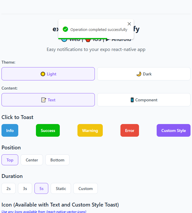
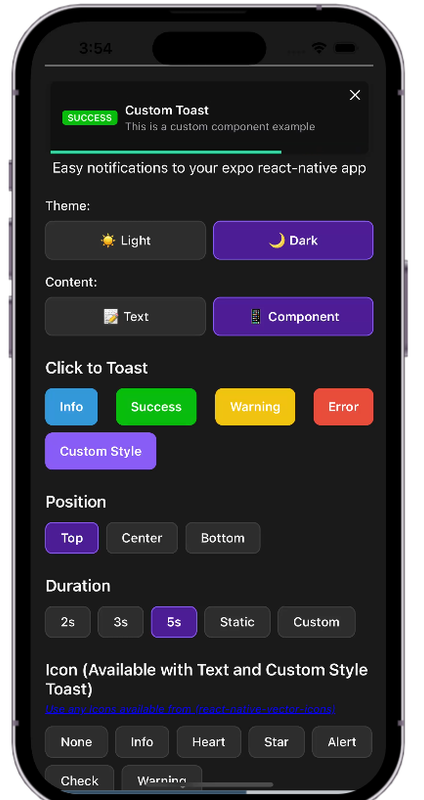
Toast Types
// Basic toasts
Toast.success("Success message");
Toast.error("Error message");
Toast.info("Info message");
Toast.warn("Warning message");

// Custom toast
Toast.custom("Custom message", {
  barColor: "#FF5733",
  icon: "heart",
  position: "top",
  theme: "dark"
});
Positions
Toast.success("Top position", { position: "top" });
Toast.success("Center position", { position: "center" });
Toast.success("Bottom position", { position: "bottom" });
Durations
// Show for 2 seconds
Toast.info("Quick message", { duration: 2000 });

// Show for 5 seconds
Toast.info("Longer message", { duration: 5000 });

// Static toast (won't auto-hide)
Toast.info("Static message", { duration: 0 });
Themes
// Light theme (default)
Toast.success("Light theme", { theme: "light" });

// Dark theme
Toast.success("Dark theme", { theme: "dark" });
Available Props
| Name | Type | Default | Description | | --------------------------- | ---------------------------------- | -------------- | ---------------------------------------------- | | width | number | 256 | Width of toast | | height | number | 68 | Height of the toast | | style | any | null | Style applied to the toast | | position | top, center or bottom | top | Position of toast | | positionValue | number | 50 | position value of toast | | duration | number | 3000 | The display time of toast | | animationStyle | upInUpOut, rightInOut or zoomInOut | upInUpOut | The animation style of toast | | animationIn | string or object | 'slideInRight' | Toast show animation | | animationOut | string or object | 'slideOutLeft' | Toast hide animation | | animationInTiming | number | 300 | Timing for the Toast show animation (in ms) | | animationOutTiming | number | 300 | Timing for the toast hide animation (in ms) | | backdropTransitionInTiming | number | 300 | The backdrop show timing (in ms) | | backdropTransitionOutTiming | number | 300 | The backdrop hide timing (in ms) | | hasBackdrop | bool | false | Render the backdrop | | backdropColor | string | 'black' | The backdrop background color | | backdropOpacity | number | 0.2 | The backdrop opacity when the toast is visible | | icon | string | information-circle| Ionicon name for toast icon | | theme | string | light | Toast theme (light/dark) | | barColor | string | Based on type | Progress bar color |
Icons
This package uses Ionicons for toast icons. You can browse all available icons at: https://oblador.github.io/react-native-vector-icons/
Some commonly used icons:
- information-circle
- checkmark-circle
- alert-circle
- warning
- close-circle
- heart
- star
Available Animations
Take a look at react-native-animatable to see the dozens of animations available out-of-the-box.
See in Action

Try the Demo
Want to see all features in action? Try our interactive demo: Live Demo on Expo Snack
Credits
This package is inspired by toastify-react-native.
License
expo-react-native-toastify is [MIT licensed] by geeek.