
ez-button
v1.0.30
Published
Customizable button component for react-native.
Maintainers
 kwasi633
Readme
ez-button
A customisable react-native button component.
Installation
npm
npm install ez-buttonyarn
yarn add ez-buttonAdding Icons
This button component supports icons but does not include any icon packages by default. To use icons:
Install an icon package from react-native-vector-icons:
Follow the installation instructions for the icon package: https://www.npmjs.com/package/react-native-vector-icons
Adding Images(svg,png,etc)
This button component supports custom svg and png images as props in place of react-native-vector-icons. Make sure your svg image setup is ready before using it. Png images work out of the box.
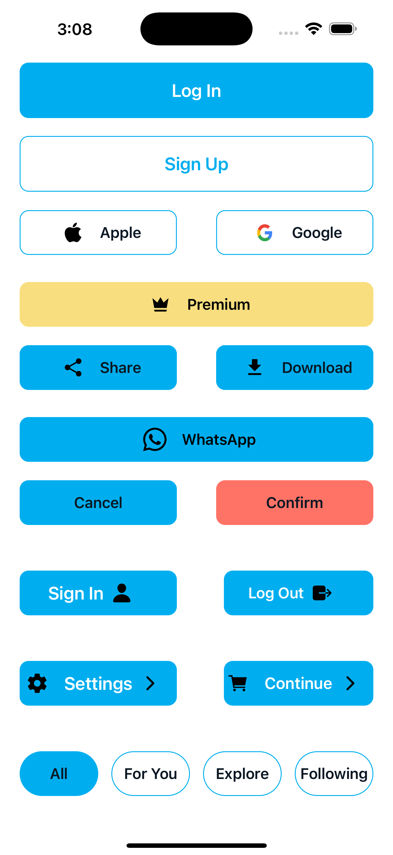
EzButton Sample Usage
Primary Buttons
Primary and secondary buttons for key app flows
import { View } from 'react-native';
import EzButton from 'ez-button';

const App = () => {
  return (
    <View>
 <EzButton
    backgroundColor="#00AEEF"
    color="#fff"
    width={90}
    height={50}
    alignSelf="center"
    fontWeight="600"
    fontSize={20}
    borderRadius={10}
    marginTop={150}
    onPress={() => navigation.navigate('Home')}
  >
    Log In
  </EzButton>

  <EzButton
    backgroundColor="#FFF"
    color="#00AEEF"
    width={90}
    height={50}
    alignSelf="center"
    borderColor="#00AEEF"
    borderWidth={1}
    marginTop={20}
    fontSize={20}
    fontWeight="600"
    borderRadius={10}
    onPress={() => navigation.navigate('Home')}
  >
    Sign Up
  </EzButton>
  </View>
   );
};
export default App;
Button with icons
Buttons styled with icons with react-native-vector-icons and custom images(svg or png)
import GoogleLogo from '../../assets/icons/Google.svg'
import Ion from 'react-native-vector-icons/Ionicons'
import Mat from 'react-native-vector-icons/MaterialCommunityIcons'

    <EzButton
    width={40}
    alignSelf="center"
    fontSize={17}
    fontFamily="Poppins-Medium"
    fontWeight="600"
    color="#0A1723"
    height={50}
    borderColor="#00AEEF"
    backgroundColor="#ffffff"
    borderRadius={10}
    borderWidth={1}
    buttonIcon={<Ion name="logo-apple" size={25} color="#000" />}
  >
    Apple
  </EzButton>

  <EzButton
    width={40}
    alignSelf="center"
    fontSize={17}
    fontWeight="600"
    color="#0A1723"
    height={50}
    borderColor="#00AEEF"
    backgroundColor="#ffffff"
    borderRadius={10}
    borderWidth={1}
    imagePath={GoogleLogo}
    imageWidth={20}
    imageHeight={20}
  >
    Google
  </EzButton>

  <EzButton
  width={dimensions.width * 0.9}
  alignSelf="center"
  fontSize={17}
  fontFamily="Poppins-Medium"
  fontWeight="600"
  height={50}
  backgroundColor="#F8DE7E"
  borderRadius={10}
  color="#000"
  buttonIcon="crown"
  iconComponent={Mat}
  buttonIconColor="#000"
  buttonIconSize={24}
>
  Premium
</EzButton>

//icon will appear after text on the button
<EzButton
  backgroundColor={'#00AEEF'}
  color={'#fff'}
  width={dimensions.width * 0.4}
  height={50}
  alignSelf='center'
  fontWeight={'600'}
  fontSize={20}
  borderRadius={10}
  endButtonIcon='person'
  iconComponent={Ion}
  endButtonIconColor="#000"
  endButtonIconSize={24}
>
  Sign In
</EzButton>

//icons will appear on both sides of text on the button
<EzButton
  backgroundColor={'#00AEEF'}
  color={'#fff'}
  width={dimensions.width * 0.4}
  height={50}
  alignSelf='center'
  fontWeight={'600'}
  fontSize={20}
  borderRadius={10}
  endButtonIcon='chevron-forward-outline'
  iconComponent={Ion}
  endButtonIconColor="#000"
  endButtonIconSize={24}
  buttonIcon='settings-sharp'
  buttonIconSize={24}
>
  Settings
</EzButton>
props
| Prop | Type | Default | Description | |------|------|---------|-------------| | onPress | () => void | Required | Function to call when button is pressed | | backgroundColor | string | - | Background color of the button | | marginHorizontal | number | - | Horizontal margin on both sides | | width | number | string | - | Width of the button | | marginTop | number | - | Top margin of the button | | marginBottom | number | - | Bottom margin of the button | | marginLeft | number | - | Left margin of the button | | marginRight | number | - | Right margin of the button | | color | string | - | Text color of the button | | position | string | - | Position style ('absolute', 'relative') | | fontWeight | number | string | - | Font weight of the text | | fontFamily | string | - | Font family of the text | | borderRadius | number | - | Border radius of the button | | fontSize | number | - | Font size of the button text | | disabled | boolean | false | Whether the button is disabled | | height | number | string | - | Height of the button | | borderWidth | number | - | Width of the button border | | borderColor | string | - | Color of the button border | | left | number | - | Left position when using absolute positioning | | right | number | - | Right position when using absolute positioning | | buttonIconColor | string | - | Color of the icon (if using buttonIcon) | | alignSelf | string | - | Alignment of button within parent ('flex-start', 'center', 'flex-end', etc.) | | bottom | number | - | Bottom position when using absolute positioning | | top | number | - | Top position when using absolute positioning | | marginVertical | number | - | Vertical margin on both top and bottom | | buttonIcon | string | - | Name of the icon (if using an icon library) | | imageWidth | number | - | Width of the image when using imagePath | | imageHeight | number | - | Height of the image when using imagePath | | iconComponent | ComponentType<{ name: string; size?: number; color?: string }> | - | Icon component library to use | | imagePath | ComponentType<{ width?: number; height?: number }> | - | Custom image component to display | | disabledbackGroundColor | string | - | Background color when button is disabled | | buttonIconSize | number | - | Size of the vector icon on the button | | endButtonIcon | string | - | Name of the icon after the text (if using an icon library) | | endButtonIconSize | number | - | Size of the vector icon after the text on the button | | endButtonIconColor | string | - | Color of the icon after the text on the button (if using buttonIcon) | | endImageWidth | number | - | Width of the image after the text when using imagePath | | endImageHeight | number | - | Height of the image after the text when using imagePath | | endImagePath | ComponentType<{ width?: number; height?: number }> | - | Custom image component to display after the text | | disabledTextColor | string | - | Text color when button is disabled | | children | ReactNode | Required | Text on the button |
Dependencies
react
react-native
react-native-vector-icons
typescript
License
MIT