
fable-editor
v1.2.4
Published
FableEditor — a rich text editor with React and Angular wrappers

Maintainers
 sajinsatheesan
Readme
FableEditor
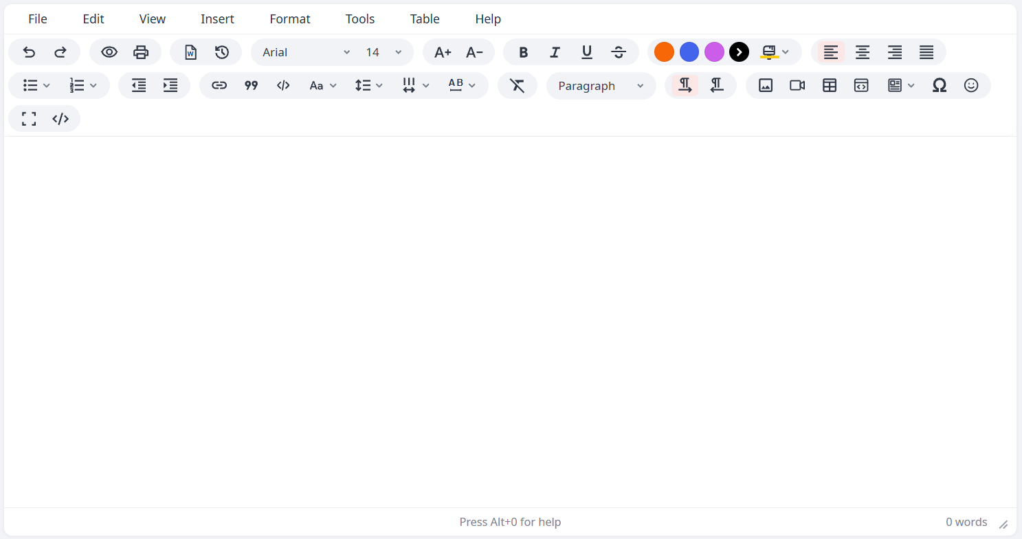
A rich text editor packaged as an npm library with first-class React and Angular wrappers. Built from the original standalone fable-editor.html/fable-editor.js demo, preserving the full feature set.
Features
| Feature | Details |
|---|---|
| Toolbar & menubar | Configurable via toolbar/menubar strings (\|-separated groups), or use the built-in defaults. Menus: File, Edit, View, Insert, Format, Tools, Table, Help |
| Responsive toolbar | On narrow screens (mobile/tablet) — or in a narrow host container — the toolbar collapses to a single row with a trailing … button that expands/collapses the full set. Automatic, width-driven, no configuration needed |
| Tables | Resize handles, row/column insert & delete, row/column reordering (move a row up/down or a column left/right from the context toolbar or Table menu), cell background color picker (build header rows in one click), cell/row/column/table properties, context toolbar |
| Paste handling | PowerPaste-style clean paste from Word / Google Docs / Excel |
| Internationalization | English / Arabic, automatic RTL/LTR switching |
| Fonts & formatting | Configurable font list (fontFamilyFormats), sizes, line-height, word-spacing, letter-spacing, text/background color, change case |
| Theming | primaryColor (accent, default #df3c2b), toolbarGroupBackground and uiFontFamily (default Noto Sans stack) options restyle the editor chrome via CSS variables |
| Custom content styling | contentStyle injects scoped CSS into the editable area (e.g. default font/size) |
| Images | Placeholder upload UI, drag-and-drop, configurable accepted file types (imageFileTypes), pluggable async upload handler |
| Video | Insert/edit dialog with General (source URL / upload / width / height), Embed (paste embed code) and Advanced (alternative source, poster image) tabs. YouTube / Vimeo / Dailymotion page URLs become embedded players — including when pasted directly into the editor. Template media slots can host a video instead of an image. |
| Code | Inline code (toolbar button, or type `snippet` — converts on the closing backtick) and code sample blocks: a dialog with language dropdown + paste-in textarea inserts a styled block with a language header; click a block to edit, copy or delete it. No dependencies, no highlighting engine |
| Documents | Import .docx files, source-code view, print preview |
| Productivity | Undo/redo, revision history, autosave draft restore, word count, special characters & emoji pickers (category tabs + glyph grid), page breaks |
| Fullscreen | Toggle fullscreen editing |
| Help | Built-in shortcuts/help dialog |
Install
npm install fable-editorNote: the package ships framework wrappers as optional peer dependencies. Install React or Angular dependencies only if you use those wrappers.
Vanilla / Core
Import the CSS once in your app, then create an editor instance:
import 'fable-editor/style.css';
import { FableEditor } from 'fable-editor';

const editor = new FableEditor({
  target: document.getElementById('editor')!,
  language: 'en',           // 'en' | 'ar'
  height: 400,
  initialContent: '<p><br></p>',
  onChange: (html) => console.log(html)
});

// API
editor.getContent();
editor.setContent('<p>Hello</p>');
editor.insertContent('<strong>bold</strong>');
editor.setLanguage('ar');
editor.focus();
editor.destroy();
init options
| Option | Type | Default | Description |
|---|---|---|---|
| target | HTMLElement | — | Required. Element to mount the editor into. |
| language | 'en' \| 'ar' | 'en' | UI language; also switches text direction. |
| height | number | 302 | Editable area height in px. |
| initialContent | string | '<p><br></p>' | Starting HTML content. |
| menubar | boolean \| string | true | true/omitted = default menu set. false = hidden. A string is a space-separated subset/reorder, e.g. 'file edit view insert format tools table help'. |
| toolbar | boolean \| string | true | true/omitted = default toolbar. false = hidden. A string lays out the toolbar: \| separates groups, spaces separate items, e.g. 'undo redo \| bold italic'. |
| statusbar | boolean | true | Show/hide the status bar. |
| readonly | boolean | false | Disable editing. |
| fontFamilyFormats | [string, string][] | built-in list | Overrides the font dropdown. Tuples of [displayName, cssFontFamilyValue]. |
| contentStyle | string | — | Custom CSS for the editable area. The literal word body is scoped to this editor instance; other selectors are used verbatim (your responsibility to scope). |
| imageFileTypes | string[] | common image MIME types | accept list for the native image file picker. |
| imageUploadHandler | (file: File) => Promise<string> | — | Resolve with a URL after uploading; omit to inline images as base64. |
| onImageUploadError | (error, file) => void | — | Called when imageUploadHandler rejects. |
| videoFileTypes | string[] | ['video/mp4','video/webm','video/ogg'] | accept list for the native video file picker. |
| videoUploadHandler | (file: File) => Promise<string> | — | Resolve with a URL after uploading; omit to inline videos as base64. |
| onVideoUploadError | (error, file) => void | — | Called when videoUploadHandler rejects. |
| primaryColor | string | '#df3c2b' | Accent color for active states, primary buttons and selection outlines. Any CSS color. Applied as the --fable-primary CSS variable. |
| toolbarGroupBackground | string | '#f1f3f6' | Background of each toolbar button group (the rounded pills). Applied as --fable-tgrp-bg. |
| uiFontFamily | string | Noto Sans stack | Font family for the editor UI (menubar, toolbar, dialogs). Load the Noto Sans webfont in your app to use the default, or pass your own family. Applied as --fable-ui-font. |
| draftKey | string | current page path | Storage key suffix for autosaved drafts. |
| onChange / onReady | functions | — | Content-change and ready callbacks (usually set by the React/Angular wrapper instead). |
Theming
The editor's accent color, toolbar group background and UI font are driven by CSS variables, so they can be set per instance:
new FableEditor({
  target: el,
  primaryColor: '#df3c2b',                 // accent (default)
  toolbarGroupBackground: '#f1f3f6',       // toolbar pill background (default)
  uiFontFamily: "'Noto Sans', sans-serif"  // UI font (default stack)
});
The same values are available as React props / Angular inputs. The UI font defaults to a Noto Sans stack — load the webfont in your app (e.g. from Google Fonts) or pass any family you've already loaded. Alternatively, set the variables yourself in CSS: --fable-primary, --fable-tgrp-bg, --fable-ui-font.
Toolbar & menubar configuration
The toolbar/menubar options accept the same style of layout string as TinyMCE — | separates visual groups, spaces separate items:
new FableEditor({
  target: document.querySelector('#default-editor')!,
  toolbar:
    'undo redo | styles | bold italic underline strikethrough | ' +
    'alignleft aligncenter alignright alignjustify | bullist numlist outdent indent | link image',
  menubar: 'file edit insert format'
});
Available toolbar items: undo redo preview print importword revhistory fontfamily fontsize fontsizeincrease fontsizedecrease bold italic underline strikethrough forecolor backcolor alignleft aligncenter alignright alignjustify bullist numlist outdent indent link blockquote code changecase lineheight wordspacing letterspacing removeformat blocks ltr rtl quickimage quickvideo quicktable codesample template charmap emoji fullscreen sourcecode. The TinyMCE names styles (→ blocks), image (→ quickimage), media (→ quickvideo) and table (→ quicktable) are accepted as aliases, so a typical TinyMCE toolbar string works unchanged. Unknown tokens are skipped with a console warning. Menubar keys: file edit view insert format tools table help.
React
import 'fable-editor/style.css';
import { FableEditor } from 'fable-editor/react';

function App() {
  const [value, setValue] = useState('<p><br></p>');

  return (
    <FableEditor
      value={value}
      onChange={setValue}
      language="en"
      height={400}
      toolbar="undo redo | styles | bold italic underline strikethrough | alignleft aligncenter alignright alignjustify | bullist numlist outdent indent | link image"
    />
  );
}toolbar/menubar accept the same layout strings as the core option (see Toolbar & menubar configuration), so each app can show exactly the controls it needs.
Props: value, defaultValue, onChange, language, height, menubar, toolbar, statusbar, readonly, primaryColor, toolbarGroupBackground, uiFontFamily, fontFamilyFormats, contentStyle, imageFileTypes, imageUploadHandler, onImageUploadError, videoFileTypes, videoUploadHandler, onVideoUploadError, init, className, style (see the init options table above — every option is also a top-level prop). A ref exposes getContent, setContent, insertContent, setLanguage, focus, destroy.
Angular
Add to angular.json styles:
"styles": [
  "src/styles.css",
  "node_modules/fable-editor/style.css"
]
Import the module:
import { FableEditorModule } from 'fable-editor/angular';

@NgModule({
  imports: [FableEditorModule]
})
export class AppModule {}
Use in a template:
<fable-editor
  [(ngModel)]="content"
  language="en"
  [height]="400"
  toolbar="undo redo | styles | bold italic underline strikethrough | alignleft aligncenter alignright alignjustify | bullist numlist outdent indent | link image">
</fable-editor>
Inputs: language, height, menubar, toolbar, statusbar, readonly, primaryColor, toolbarGroupBackground, uiFontFamily, init. menubar/toolbar accept a string directly (e.g. [toolbar]="'undo redo | bold italic'"); fontFamilyFormats, contentStyle, imageFileTypes, imageUploadHandler, onImageUploadError, videoFileTypes, videoUploadHandler, and onVideoUploadError aren't top-level inputs — pass them via [init]="{ contentStyle: '...' }" (see the init options table above). Outputs: editorChange, editorReady. Works with ngModel and formControlName.
Development & testing
npm install
npm run build      # builds core, react, and angular
npm test           # automated core tests (Vitest + jsdom)
Manual smoke tests
# Vanilla demo
npm run demo
# open http://localhost:5173/demo/index.html

# React example
npm run demo:react
# open http://localhost:5173

# Angular example
npm run demo:angular
# open http://localhost:4200
Run
npm run buildbefore the Angular demo so the library files are up to date.
Project layout
src/
  core/         # framework-agnostic editor engine
  react/        # React wrapper
  angular/      # Angular wrapper + module
  index.ts      # Angular library entry point
examples/
  react/        # runnable React test app
  angular/      # runnable Angular CLI test app
demo/
  index.html    # manual vanilla test page
test/
  core.test.ts  # automated core tests
Author
Sajin Satheesan [email protected] — LinkedIn
License
MIT