
faust-orbit-ui
v0.4.1
Published
Orbit-based UI component for Faust-style parameter control, driven by JSON metadata and callbacks.

Readme
faust-orbit-ui
Orbit-based UI component for Faust-style parameter control with a built-in preset library, projection / Shepard navigation overlay, dwell-based auto-promotion, looped playback, undo/redo, and a recall menu — all driven by JSON metadata and callbacks. No DSP / audio engine inside.
What it is
The package exposes two classes:
OrbitUI— the recommended API. A self-contained component that owns itsuiHash, a preset library, the level-1 calque overlay (PCA + Shepard), the loop machinery, undo/redo scopes, and the toolbar. The host getssetLibrary/setSelection/setTrajectory/setLoopSettings/setParamsfor sync-in, andonLibraryChange/onSelectionChange/onTrajectoryChange/onLoopSettingsChange/onCommitfor sync-out. Renders into a shadow root attached to the host element (since v0.4.0) — host stylesheets do not bleed in, and the wrapper's stylesheet does not bleed out. Hosts theme via the CSS custom properties declared at:hostscope.FaustOrbitUI— the legacy renderer that draws the parameter dots and detail panel.OrbitUIwraps it; you only need it directly if you want the bare orbit view without the library / calque / loop layers. Does not use shadow DOM — its styles must be loaded by the host via<link>(see CSS below).
What this package does not do:
- No DSP or audio engine.
- No WebAudio / AudioWorkletNode integration.
- No Faust compiler / runtime dependency.
- No persistence — the host owns the IDB / cloud / file store. The component receives the initial state via setters and emits events on every internal mutation.
Quick start
npm install
npm run build
npm run demo:serve
# open http://localhost:4173/demo/
The demo wires OrbitUI against the legacy ui.json and surfaces every emitted event in a side panel — useful for understanding the data flow.
Minimal integration (OrbitUI)
<div id="orbit-root" style="height: 480px"></div>
<!-- Material Symbols font is loaded by the host page; the @font-face
     reaches inside the shadow root automatically. The wrapper's own
     stylesheet is inlined into the shadow at construction time —
     no <link> needed for `OrbitUI`. -->
<link rel="stylesheet"
      href="https://fonts.googleapis.com/css2?family=Material+Symbols+Outlined:opsz,wght,FILL,[email protected],400..500,0,0" />
<script type="module">
  import { OrbitUI } from './dist/index.js';

  const ui = [
    {
      type: 'vgroup', label: 'synth',
      items: [
        { type: 'hslider', label: 'frequency', address: '/synth/frequency',
          init: 440, min: 20, max: 2000, step: 1 },
        { type: 'hslider', label: 'pressure', address: '/synth/pressure',
          init: 0.5, min: 0, max: 1, step: 0.01 },
      ],
    },
  ];

  const orbit = new OrbitUI(document.getElementById('orbit-root'), {
    uiDescriptor: ui,
    onParamChange: (path, value) => {
      // forward to your audio runtime
      // node.parameters.get(path).value = value;
    },
    onLibraryChange: (records) => idb.saveLibrary(orbit.uiHash, records),
    onTrajectoryChange: (record) => idb.saveTrajectory(sessionId, record),
    onSelectionChange: (entries) => idb.saveSelection(sessionId, entries),
    onLoopSettingsChange: (settings) => idb.saveLoopSettings(sessionId, settings),
  });

  // After construction, push initial state from the host's store.
  const lib = await idb.loadLibrary(orbit.uiHash);
  if (lib) orbit.setLibrary(lib);
</script>
The Material Symbols Outlined font is required for the toolbar icons (label, casino, zoom_in, bubble_chart, delete, my_location, moving, cycle).
Feature surface (OrbitUI)
The component bundles seven concerns the host doesn't have to reinvent:
- Signature identity —
readonly uiHash: stringderived synchronously from the Faust UI descriptor (sync SHA-256 polyfill — bit-identical to the standardcrypto.subtledigest of the same canonical input). - Preset library — keyed by
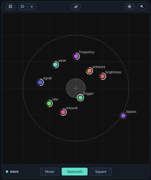
(uiHash, configHash), named vs. anonymous distinction,setLibraryfor sync-in,onLibraryChangefor sync-out. - Calque (level-1 overlay) — PCA-weighted projection of the library + Shepard inverse for continuous navigation. Click a disc to recall, drag the centre cross to morph, double-click empty space to capture a new preset at the click point. Selection (shift+click toggle, shift+drag marquee), trash, inline rename, right-click context menu.
- Auto-promotion — dwell-timer detects stable configurations and memorises them, gated by InGesture / OverlayActive /
setPromotionSuspended. - Loop mode — cyclic playback through the selection with portamento. Formal state machine + dynamic-selection swap rule documented in docs/LOOP.md.
- Undo / redo — two scopes:
- Library (per
uiHash):add/rename/delete/deleteBatch. Triggered byundoLibrary()/redoLibrary(). - Params (per instance): before/after snapshots per gesture commit. Triggered by
undoParams()/redoParams().
- Library (per
- Recall menu — pill in the toolbar with a
+ Save current state as presetentry (with inline name input) and the alphabetised list of named presets, gold-✓ on the active one.
Theming
The wrapper renders inside a shadow root, so host stylesheets cannot reach
inside via class selectors (.orbit-center-btn, .orbit-random-btn, etc.).
Theming happens through CSS custom properties declared at :host scope —
they pierce the shadow boundary, so a host's override on the shadow-host
element reaches every styled element inside.
/* Override on the host element you pass to `new OrbitUI(host, …)`. */
#orbit-root {
  --orbit-bg: #0a1018;
  --orbit-pill-bg: rgba(255, 255, 255, 0.06);
  --orbit-pill-border: rgba(255, 255, 255, 0.12);
  --orbit-pill-hover-bg: rgba(255, 255, 255, 0.10);
  --orbit-fg: #e8edf4;
  --orbit-accent-bg: #5b9bd5;
  --orbit-accent-fg: #ffffff;
  --orbit-accent-border: #7fb4e0;
}
Public theming surface (defaults match the dark palette in the demo):
| Property | Role |
|---|---|
| --orbit-bg | Main canvas / body background |
| --orbit-toolbar-bg | Top toolbar + bottom detail panel background |
| --orbit-toolbar-line | Divider lines + slider track |
| --orbit-pill-bg | Pill button background (Center / Random / Zoom / Library / Trash / preset value box) |
| --orbit-pill-border | Pill button border |
| --orbit-pill-hover-bg | Pill hover background |
| --orbit-fg | Pill text, slider thumb, value labels |
| --orbit-fg-muted | Secondary labels (BPM, ms, …) |
| --orbit-accent-bg | Active / pressed pill background (e.g. Library when calque is open) |
| --orbit-accent-fg | Active / pressed pill text |
| --orbit-accent-border | Active / pressed pill border |
Custom properties are the only way for hosts to theme the wrapper. Class-based overrides on internal selectors no longer work since v0.4.0 (shadow DOM isolation).
Documentation
| Doc | Scope | |---|---| | docs/API.md | Public API surface — constructor, options, methods, events, lifecycle, Cmd+Z routing convention. | | docs/DATAMODEL.md | Conceptual / mathematical model of every piece of state the component owns at any given instant. | | docs/LOOP.md | Formal state machine of the loop mode, with the swap rule for live selection edits. | | docs/PRESETS.md | The algorithms — PCA-weighted projection, Shepard interpolation, dynamic transitions, dwell auto-promotion. |
Cmd+Z routing (host-side)
The component exposes both undo scopes through public methods but does NOT register a global keyboard handler. The host decides routing. Recommended pattern:
window.addEventListener('keydown', (event) => {
  if (!(event.metaKey || event.ctrlKey) || event.key.toLowerCase() !== 'z') return;
  if (event.repeat) return;
  const focused = document.activeElement;
  if (!(focused instanceof HTMLElement)) return;
  const root = focused.closest('.orbit-ui-root');
  if (!root) return;
  // Route on calque visibility, not focus position — toolbar clicks
  // can move focus out of the overlay during a calque session. The
  // wrapper mirrors the calque-active state onto the host element's
  // classList so this check works without piercing the shadow root.
  const calqueOpen = root.classList.contains('orbit-ui-overlay-active');
  event.preventDefault();
  const isRedo = event.shiftKey;
  if (calqueOpen) (isRedo ? orbit.redoLibrary() : orbit.undoLibrary());
  else            (isRedo ? orbit.redoParams()  : orbit.undoParams());
});
The component guarantees two CSS classes for routing decisions, both on the host element (the container passed to new OrbitUI(...)):
.orbit-ui-root— added at construction..orbit-ui-overlay-active— toggled when the calque opens / closes.
UI JSON expectations
Input should follow the common Faust UI metadata shape:
- groups:
vgroup,hgroup,tgroup - active widgets:
hslider,vslider,nentry,button,checkbox - passive widgets are parsed but not interactive in Orbit.
Widgets may include a meta array carrying e.g. unit information:
{ "type": "hslider", "label": "frequency", "address": "/synth/frequency",
  "min": 20, "max": 2000, "step": 1, "init": 440,
  "meta": [{ "unit": "Hz" }] }
init is used by the projection module as the default value when a configuration omits an address.
Legacy FaustOrbitUI (bare renderer)
If you only want the orbit view without the library / calque / loop layers, the lower-level class is still exported:
import { FaustOrbitUI } from './dist/index.js';

const orbit = new FaustOrbitUI(root, paramChangeByUI, options?);
const state = orbit.buildControlsFromUnknown(uiDescriptor);
orbit.setOrbitState(state);
Constructor:
root: HTMLElementparamChangeByUI: (path: string, value: number) => voidoptions?: FaustOrbitUIOptions
Main methods:
buildControlsFromUnknown(input: unknown): OrbitStatesetOrbitState(state: OrbitState): void/getOrbitState(): OrbitStatesetParams(values: Record<string, number>): void/setParamValue(path, value)getParamValues(): Record<string, number>random(c: number)/center()beginUpdate()/endUpdate()/destroy()
OrbitUI constructs and wraps a FaustOrbitUI internally; the toolbar is the same.
Detail panel
A fixed-height bar below the orbit canvas shows the last-touched control with a conventional editing interface:
- Sliders (
hslider,vslider,nentry): editable value field + range slider. The value field shows the unit suffix (e.g.440 Hz), strips it on focus for editing, and clamps to min/max on blur. - Buttons: a trigger button with color feedback on press / release.
- Checkboxes: a toggle button that stays highlighted when active.
When the calque is open, this detail bar is overlaid by the portamento + loop control bar (→ Tp slider | ▶/■ play | BPM slider ↻).
Keyboard shortcuts (orbit view)
| Key | Action |
|---|---|
| ← / → (calque open) | Step through presets in lastSeenAt order (smooth glide via Tp). |
| ← / → (orbit only) | Navigate between controls in the detail panel. |
| ↑ / ↓ (detail panel) | Increment / decrement value by one step. |
| Space | Trigger button or toggle checkbox. |
| R | Randomize controls. |
| L | Toggle the calque. |
| Escape | Close the calque (when open) / cancel value input. |
| Delete / Backspace | Trash selected presets (when calque open). |
CSS
For OrbitUI (wrapper) — no <link> needed. The wrapper inlines its
stylesheet inside its shadow root at construction time.
For FaustOrbitUI (legacy) — the host must include the bundled
stylesheet, which renders into the document tree (no shadow):
<link rel="stylesheet" href="./dist/faust-orbit-ui.css" />The bundle covers the legacy renderer styles plus the calque / dropdown / preset-pill additions, so a host can transition between the two paths without touching the link tag.
Repository layout
src/— package sourcedist/— build output (generated)demo/— browser demo app drivingOrbitUIend-to-enddocs/— concept / API / loop / algorithm specs
Troubleshooting
Port 4173 already in use — pick another:
python3 -m http.server 4174 -d .Orbit panel appears empty — check that the CSS is loaded and the root element has an explicit height (or its parent layout gives it one).
Material icons render as label / casino / zoom_in literal text — the Material Symbols font isn't loaded. Add the Google Fonts <link> shown in the integration example.
computeUIHashSync not found / not exported — make sure you're importing from the package root (./dist/index.js); the hash module is re-exported there.
Publishing checklist
- Remove
"private": truefrompackage.json. - Bump
version. npm run build.npm publish --access public.