
firebase-discussion
v1.2.0
Published
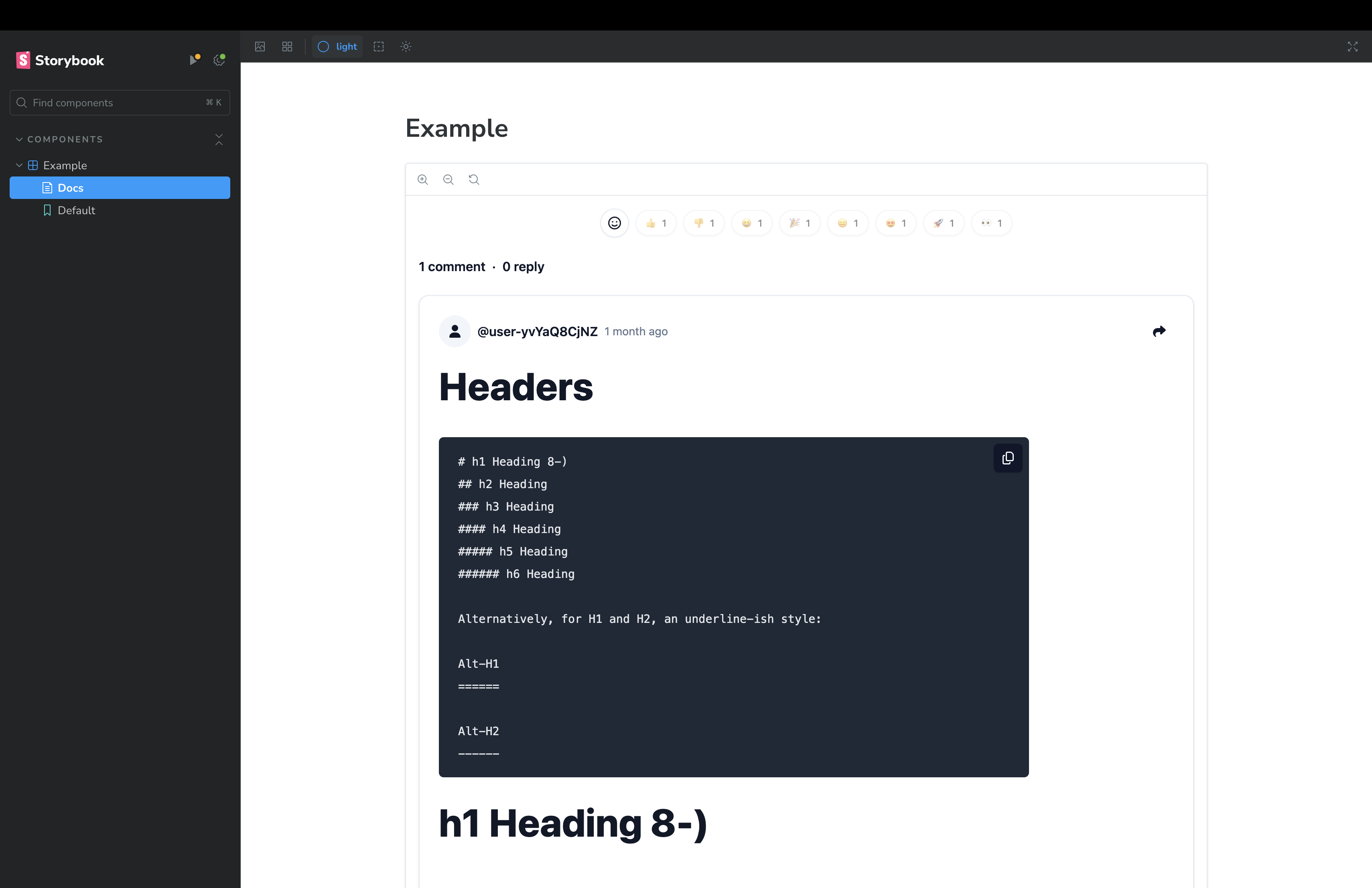
Firebase Discussion is a React TypeScript library that enables rapid development of discussion components within your application.
Downloads
24
Maintainers
 tomfan
Readme
Firebase Discussion

Firebase Discussion is a React TypeScript library that enables rapid development of discussion components within your application. Inspired by the functionality of Giscus, it leverages Firebase for real-time features, allowing website users to vote with emojis, leave comments in Markdown format, and reply to comments, mirroring the capabilities of Giscus.
Features
- Real-time discussion threads with Firestore
onSnapshot - Emoji reactions (like, dislike, laugh, hooray, confused, love, rocket, eyes)
- Markdown support with GitHub Flavored Markdown and syntax highlighting
- Multiple OAuth providers (Google, GitHub, Apple, Facebook, Microsoft, Twitter)
- Custom login button support
- Light and dark theme support
- Optimistic UI updates for reactions
- TypeScript support with full type declarations
Installation
Ensure that you have the peer dependencies installed in your project:
pnpm add react react-dom firebase react-firebase-hooks
pnpm add firebase-discussion
Usage
To use Firebase Discussion in your React project, follow these steps:
- Set up Firebase in your project - Ensure that
firebaseis configured properly for authentication and Firestore.
import { getApp, getApps, initializeApp } from "firebase/app";
import { getAuth } from "firebase/auth";
import { getFirestore } from "firebase/firestore";
import { getStorage } from "firebase/storage";

const firebaseConfig = {
  apiKey: import.meta.env.FIREBASE_API_KEY,
  authDomain: import.meta.env.FIREBASE_AUTH_DOMAIN,
  projectId: import.meta.env.FIREBASE_PROJECT_ID,
  storageBucket: import.meta.env.FIREBASE_STORAGE_BUCKET,
  messagingSenderId: import.meta.env.FIREBASE_MESSAGING_SENDER_ID,
  appId: import.meta.env.FIREBASE_APP_ID,
  measurementId: import.meta.env.FIREBASE_MEASUREMENT_ID,
};

const app = !getApps().length ? initializeApp(firebaseConfig) : getApp();
const firestore = getFirestore(app);
const auth = getAuth(app);
const storage = getStorage(app);

export { app, auth, firestore, storage };- Import and use the Firebase Discussion component:
import React from "react";
import FirebaseDiscussion from "firebase-discussion";

import { auth, firestore } from "./firebase";

const Example: React.FC = () => {
  return (
    <FirebaseDiscussion
      firestore={firestore}
      auth={auth}
      identifier="test-discussion"
      appleProvider={true}
      facebookProvider={true}
      githubProvider={true}
      googleProvider={true}
      microsoftProvider={true}
      twitterProvider={true}
    />
  );
};
export default Example;
Ensure you have configured Firebase in your project as FirebaseDiscussion relies on firestore and auth objects from Firebase.
Configuration
Below are the FirebaseDiscussion component properties for configuration:
firestore: Firebase Firestore instance.auth: Firebase Auth instance.usersCollection: The name of the Firestore collection where user data is stored. Don't input if you don't have a collection for user's displayName and photoURL.identifier: A unique identifier for the discussion.providers: Configuration for OAuth providers, with boolean values to enable/disable each.customLoginButton: Custom Login Button.
Setting Up Firebase Firestore Rules
To ensure the security and integrity of the data within the discussion component, it is essential to configure Firebase Firestore security rules.
You will need to replace the existing rules with the ones provided below to accommodate the structure and requirements of the discussion component:
rules_version = '2';

service cloud.firestore {
  match /databases/{database}/documents {

    // Helper function to verify authenticated users
    function isAuthenticated() {
      return request.auth != null;
    }

    // Function to check if the update only affects the user's own reactions
    function isUpdatingOwnReactions() {
      let diff = request.resource.data.diff(resource.data);
      let affectedKeys = diff.affectedKeys();
      return request.auth != null
        && affectedKeys.hasOnly(['reactions'])
        && request.resource.data.reactions.keys().hasAny([request.auth.uid]);
    }

    function canOnlyUpdateCounters() {
      return request.resource.data.diff(resource.data).affectedKeys().hasOnly(['comments', 'replies']);
    }

    match /firebase-discussion/{discussionId} {
      allow read: if true;
      allow create: if isAuthenticated();
      allow update: if isAuthenticated() && (isUpdatingOwnReactions() || canOnlyUpdateCounters());
      allow delete: if false;

      // Match any document in the 'comments' subcollection of a discussion
      match /comments/{commentId} {
        allow read: if true;
        allow create: if isAuthenticated();
        allow update: if isAuthenticated() && (isUpdatingOwnReactions() || canOnlyUpdateCounters());
        allow delete: if false;

        // Match any document in the 'replies' subcollection of a comment
        match /replies/{replyId} {
          allow read: if true;
          allow create: if isAuthenticated();
          // Only allow updates to own reactions by authenticated users
          allow update: if isAuthenticated() && isUpdatingOwnReactions();
          allow delete: if false;
        }
      }
    }
  }
}
Display User Information
To display user avatars and names in the discussion, you can utilize the following Firebase Cloud Function which captures user data at the time of account creation:
export const createUserDocument = functions.auth
  .user()
  .onCreate(async (user) => {
    await db.collection("users").doc(user.uid).set({
      uid: user.uid,
      displayName: user.displayName,
      photoURL: user.photoURL,
      providerData: user.providerData,
    });
  });
This function will ensure that user-specific details like their display name and photo URL are available for use within your application, enhancing the user experience by personalizing their interactions in discussion threads.
Styling
This library uses Tailwind CSS and Shadcn UI for styling. Ensure you have Tailwind CSS configured in your project. Include the provided custom CSS for optimal styling of discussion elements, respecting light and dark themes.
- global.css
@tailwind base;
@tailwind components;
@tailwind utilities;

@layer base {
  :root {
    --background: 0 0% 100%;
    --foreground: 222.2 47.4% 11.2%;

    --muted: 210 40% 96.1%;
    --muted-foreground: 215.4 16.3% 46.9%;

    --popover: 0 0% 100%;
    --popover-foreground: 222.2 47.4% 11.2%;

    --border: 214.3 31.8% 91.4%;
    --input: 214.3 31.8% 91.4%;

    --card: 0 0% 100%;
    --card-foreground: 222.2 47.4% 11.2%;

    --primary: 222.2 47.4% 11.2%;
    --primary-foreground: 210 40% 98%;

    --secondary: 210 40% 96.1%;
    --secondary-foreground: 222.2 47.4% 11.2%;

    --accent: 210 40% 96.1%;
    --accent-foreground: 222.2 47.4% 11.2%;

    --destructive: 0 100% 50%;
    --destructive-foreground: 210 40% 98%;

    --ring: 215 20.2% 65.1%;

    --radius: 0.5rem;
  }

  .dark {
    --background: 224 71% 4%;
    --foreground: 213 31% 91%;

    --muted: 223 47% 11%;
    --muted-foreground: 215.4 16.3% 56.9%;

    --accent: 216 34% 17%;
    --accent-foreground: 210 40% 98%;

    --popover: 224 71% 4%;
    --popover-foreground: 215 20.2% 65.1%;

    --border: 216 34% 17%;
    --input: 216 34% 17%;

    --card: 224 71% 4%;
    --card-foreground: 213 31% 91%;

    --primary: 210 40% 98%;
    --primary-foreground: 222.2 47.4% 1.2%;

    --secondary: 222.2 47.4% 11.2%;
    --secondary-foreground: 210 40% 98%;

    --destructive: 0 63% 31%;
    --destructive-foreground: 210 40% 98%;

    --ring: 216 34% 17%;

    --radius: 0.5rem;
  }
}

@layer base {
  * {
    @apply border-border;
  }
  body {
    @apply bg-background text-foreground;
  }
}- tailwind.config.js
/** @type {import('tailwindcss').Config} */
import Typography from "@tailwindcss/typography";

export default {
  content: [
    "./index.html",
    "./src/**/*.{js,ts,jsx,tsx}",
    "./node_modules/firebase-discussion/**/*.{js,ts,jsx,tsx}", // Apply tailwind css to custom component
  ],
  darkMode: ["class"],
  theme: {
    extend: {
      colors: {
        border: "hsl(var(--border))",
        input: "hsl(var(--input))",
        ring: "hsl(var(--ring))",
        background: "hsl(var(--background))",
        foreground: "hsl(var(--foreground))",
        primary: {
          DEFAULT: "hsl(var(--primary))",
          foreground: "hsl(var(--primary-foreground))",
        },
        secondary: {
          DEFAULT: "hsl(var(--secondary))",
          foreground: "hsl(var(--secondary-foreground))",
        },
        destructive: {
          DEFAULT: "hsl(var(--destructive))",
          foreground: "hsl(var(--destructive-foreground))",
        },
        muted: {
          DEFAULT: "hsl(var(--muted))",
          foreground: "hsl(var(--muted-foreground))",
        },
        accent: {
          DEFAULT: "hsl(var(--accent))",
          foreground: "hsl(var(--accent-foreground))",
        },
        popover: {
          DEFAULT: "hsl(var(--popover))",
          foreground: "hsl(var(--popover-foreground))",
        },
        card: {
          DEFAULT: "hsl(var(--card))",
          foreground: "hsl(var(--card-foreground))",
        },
      },
      borderRadius: {
        lg: `var(--radius)`,
        md: `calc(var(--radius) - 2px)`,
        sm: "calc(var(--radius) - 4px)",
      },
    },
  },
  plugins: [Typography],
};
Contributing
Contributions are welcome! Please see CONTRIBUTING.md for setup instructions and guidelines.
Security
To report a vulnerability, please see SECURITY.md.
License
This project is licensed under the MIT License - see the LICENSE file for details.