fl-admin
v11.4.1
Published
Admin panel for FounderLab apps
Downloads
640
Readme
Admin panel for FounderLab apps
This module will auto generate a full admin site to manage a backend based on Frameworkstein models. You provide the models you want to manage for and it will generate routes and form pages for them.
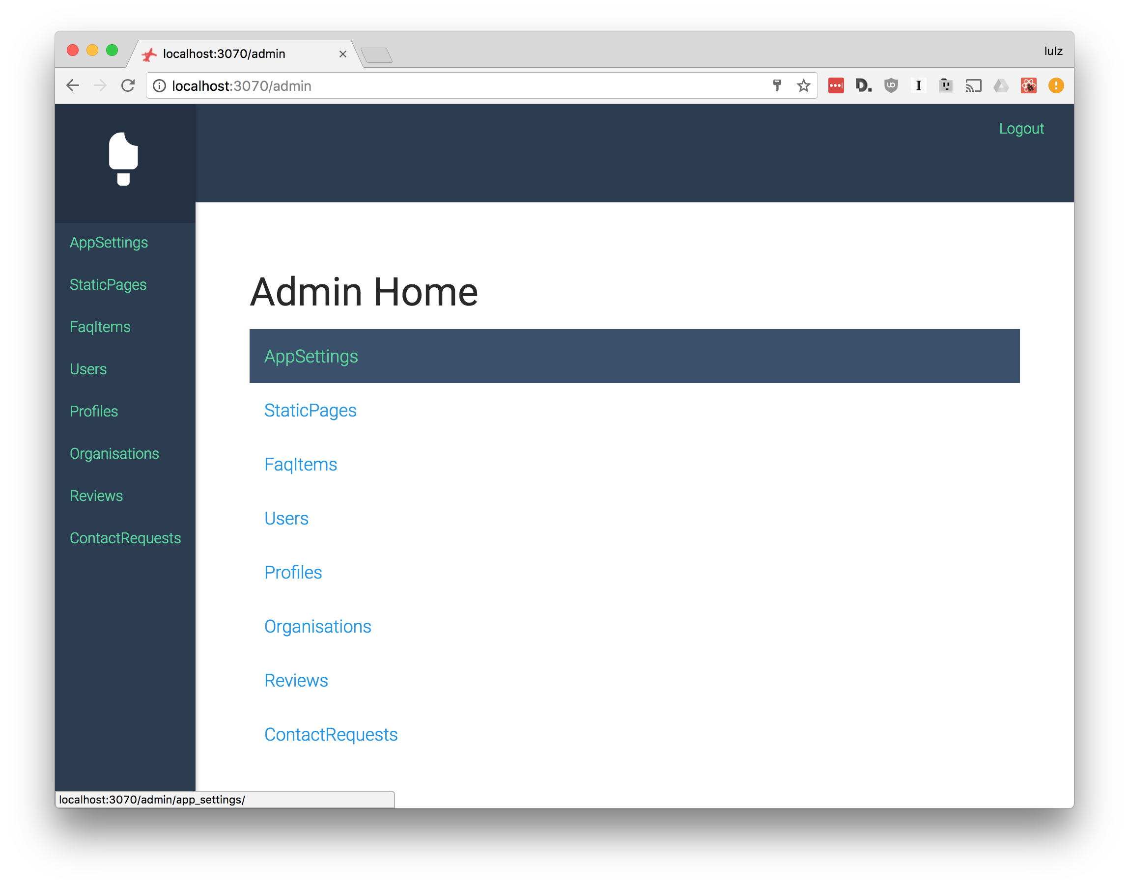
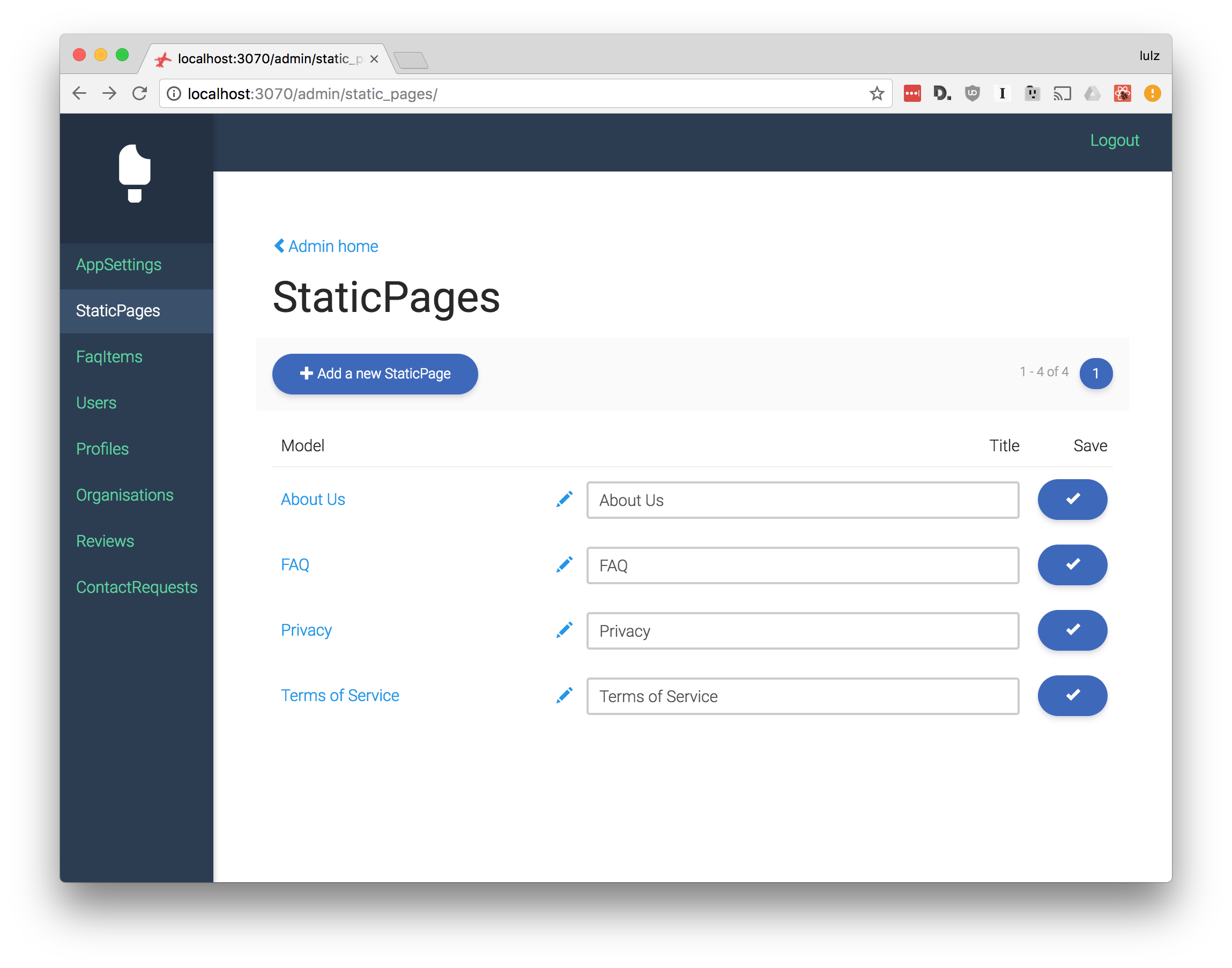
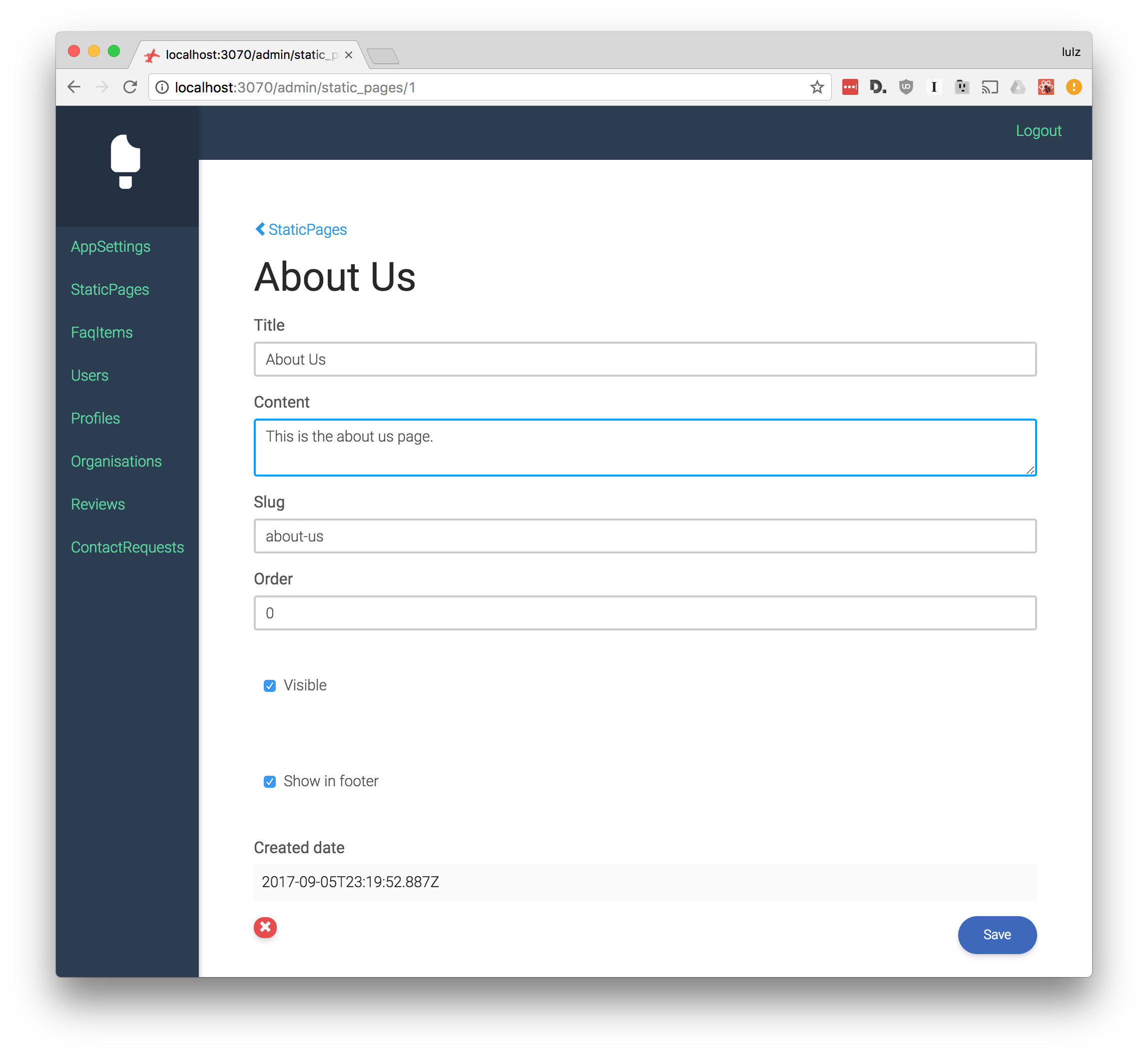
Screenshots
Homepage

Model list

Model detail

How it works
You call configureAdmin and configure the admin with a list of models. It examines each models fields via its schema and generates form fields to edit them. You can pass in some options to control how these form fields are rendered.
Example
    import configureAdmin from 'fl-admin'
    import StaticPage from './models/StaticPage'
    import User from './models/User'

    configureAdmin({
      models: [
        {
          Model: User,
          display: model => model.email,
          fields: {
            email: {
              listDisplay: true,
            },
            admin: {
              listDisplay: true,
            },
          },
        },
        {
          Model: Post,
          fields: {
            title: {
              listEdit: true,
            },
            content: {
              input: 'textarea',
            },
          },
        },
      ],
    })
Configuration
There are model-level and field-level configuration options. Models given to configuration functions are plain javascript objects (not instances of the model class).
Model configuration options
Values below are the defaults.
{
    Model: null,                                              // (required) The model class

    display: model.name || model.title,                       // Function that takes a model object and returns a string representation of it

    name: Model.modelName || Model.model_name || Model.name,  // String representation of the model class

    sort: 'id',                                               // Sorting for list pages

    perPage: 50,                                              // Models to show per list page

    listDelete: false,                                        // Show a delete button on the list page

    rootPath: options.rootPath,

    path: table(Model),                                       // Path to use in the model's url

    plural: plural(Model),                                    // Plural of the model class name

    actionType: `${ACTION_PREFIX}${upper(Model)}`,            // Redux action naming scheme to use

    readOnlyFields: ['createdDate'],                          // List of fields that shouldn't be edited

    ListComponent,                                            // Specify your own component for the list page
    CreateComponent,                                          // Specify your own component for the create page
    DetailComponent,                                          // Specify your own component for the detail page
}
Field configuration options
Values below are the defaults.
{
    label: label(key),                                        // Human readable label to use for the given field

    InputComponent: SmartInput,                               // The component to use to edit this field. Any component that can be used with a `redux-form` field will suit.

    input: 'text',                                            // The input type, will be supplied to the input component as a `type` prop. The default `SmartInput` component knows how to render these options: 'text', 'textarea', 'date', 'datetime', 'time', 'image', 'file', 'checkbox', 'static'.

    listDisplay: false,                                       // Show this field on the listing page

    listEdit: false,                                          // Enable editing of this field on the listing page

    readOnly: false,                                          // Disable editing of this field on the detail page

    hidden: false,                                            // Hide this field on the detail page
}