
flowtext-editor
v0.1.2
Published
A reusable, framework-agnostic Email Rich Text Editor React component.

Maintainers
 gchandru136
Keywords
Readme
FlowText Editor


A modern, feature-rich React Rich Text Editor built for email templates, newsletters, and content editing.
🌐 Live Playground
Try the editor live in your browser:
👉 https://flowtext-editor.vercel.app

✨ Features
- ✅ Rich Text Editing — Clean contenteditable environment inside an isolated iframe to prevent style pollution.
- ✅ Heading & Paragraph Styles — Easily switch between Headings (H1 to H6) and paragraph blocks.
- ✅ Font Size Controls — Fluid font size selector with quick step controls.
- ✅ Text & Background Color — Premium palette picker with custom Hex value input support.
- ✅ Bold / Italic / Underline — Quick standard formatting shortcuts and visual active indicators.
- ✅ Numbered & Bulleted Lists — Predefined list styles plus custom character bullet overrides.
- ✅ Text Alignment — Left, Center, Right, and Justified alignments.
- ✅ Tables — Drag-resizable cell margins, cell borders, and hover-triggered add row/column buttons.
- ✅ Links & Assets — Popover anchor editor to insert, edit, follow, and remove links easily.
- ✅ Undo / Redo — Complete editor action history.
- ✅ Spellcheck Support — Built-in native browser spellcheck with user-provided exclude lists.
- ✅ Responsive Toolbar — Automatic wrapping and row-edge spacing alignment.
- ✅ Light & Dark Theme — Clean custom variables to theme the host shell and inner workspace.
- ✅ Modern UI — Highly polished, split-button container layout inspired by Notion and Google Docs.
📦 Installation
Install the package via your preferred package manager:
# npm
npm install flowtext-editor

# yarn
yarn add flowtext-editor

# pnpm
pnpm add flowtext-editor
🚀 Quick Start
Here is a clean React example to get started:
import React, { useState } from 'react';
import { FlowTextEditor } from 'flowtext-editor';
import 'flowtext-editor/styles.css';

export default function App() {
  const [content, setContent] = useState('<p>Start typing here...</p>');

  return (
    <div style={{ padding: '24px', maxWidth: '1000px', margin: '0 auto' }}>
      <h1>My Editor</h1>
      <FlowTextEditor
        content={content}
        setContent={setContent}
        modalHeight="500px"
        spellcheckIgnoreWords={['FlowText']}
      />
    </div>
  );
}
[!IMPORTANT] Styles Opt-In: Remember to import
flowtext-editor/styles.cssonce in your application entry file to load design tokens and core dialog transitions correctly.
⚙️ Props
The FlowTextEditor component accepts the following props:
| Prop | Type | Default | Description |
| :--- | :--- | :--- | :--- |
| content | string | — | Required. Controlled HTML value representing the editor content. |
| setContent | (content: string) => void | — | Required. Callback triggered on input change, returning the updated HTML. |
| resetContent | boolean | false | When set to true, forces the editor to overwrite its internal content with the current content prop value. |
| modalHeight | string | '650px' | Height of the editor container (accepts any valid CSS unit like px, vh, rem). |
| spellcheckIgnoreWords | string[] | [] | List of custom words (like brand names or codes) that will be excluded from the native browser spellchecker. |
🚀 AI Features
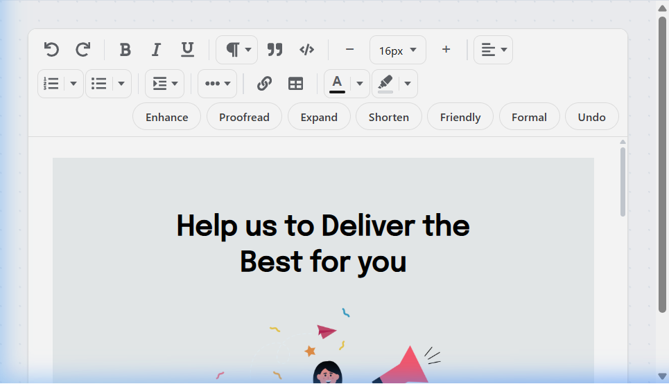
AI-powered writing tools are currently under development and will be available in a future release. Stay tuned for exciting updates.
📄 License
This project is licensed under the MIT License — see the LICENSE file for details.