
framesmith
v2.2.0
Published
MCP server that gives any AI assistant a visual design canvas


Readme
framesmith




An open-source MCP server that turns your AI coding agent into a capable UI designer. It gives the agent a visual canvas, a library of vetted design patterns, and a quality bar it must clear before showing you anything — so you review a real, non-slop design in the browser and agree on it before any framework code is written.
Contents: What it does · Capabilities · Viewer · Installation · Tools · Usage Example · Workflow · Development
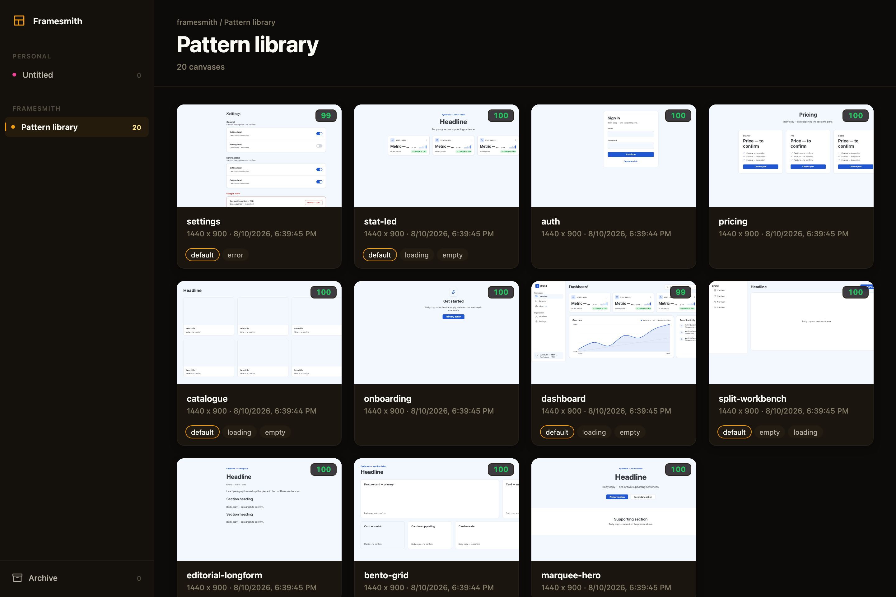
Above: the framesmith viewer, showing the built-in pattern library — 11 vetted page archetypes an agent starts from, each carrying its live quality score and its designed state variants. Workspaces and projects sit in the sidebar; you browse canvases like design files.
What an agent actually ships
Every screen below was built end-to-end by an agent with framesmith's own vocabulary — one generate_design_system call each (a seed color + a personality), stamped patterns, real controls, and every quality gate cleared (score ≥ 95, states designed, stress-tested, both themes):
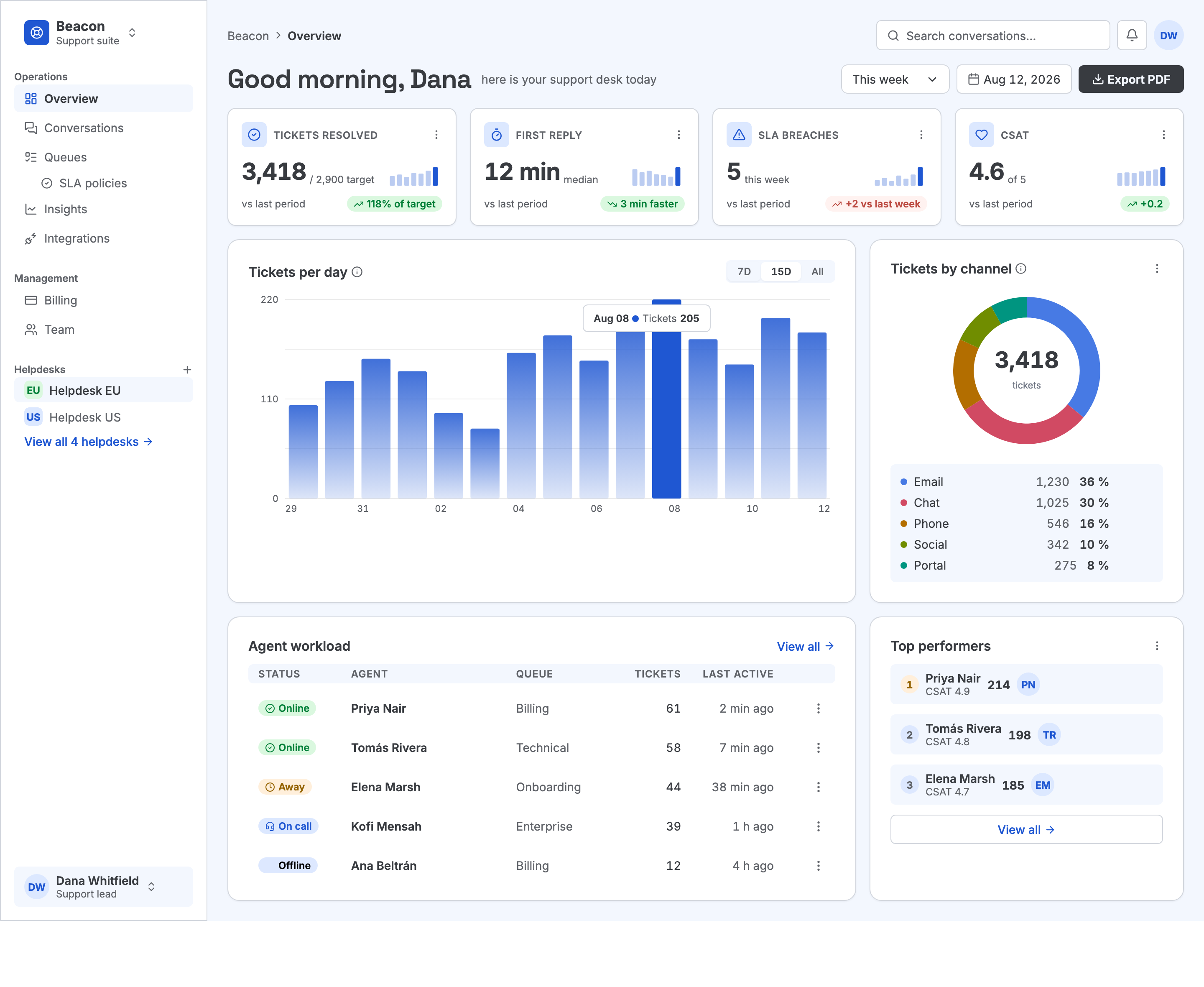
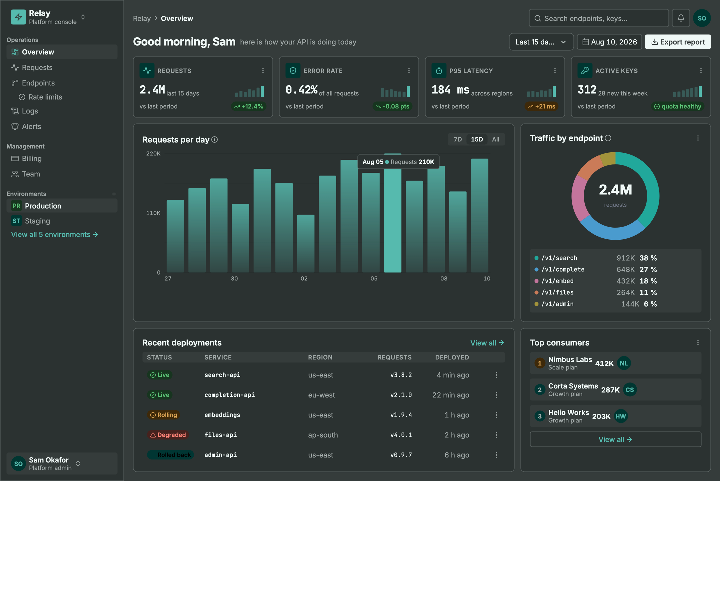
Same machinery, different seed + personality: a light ops dashboard and a dark API console. Every color pair is AA by construction, every chart is data-bound (edit a value, not an SVG path), and the dark theme is generated — not inverted.
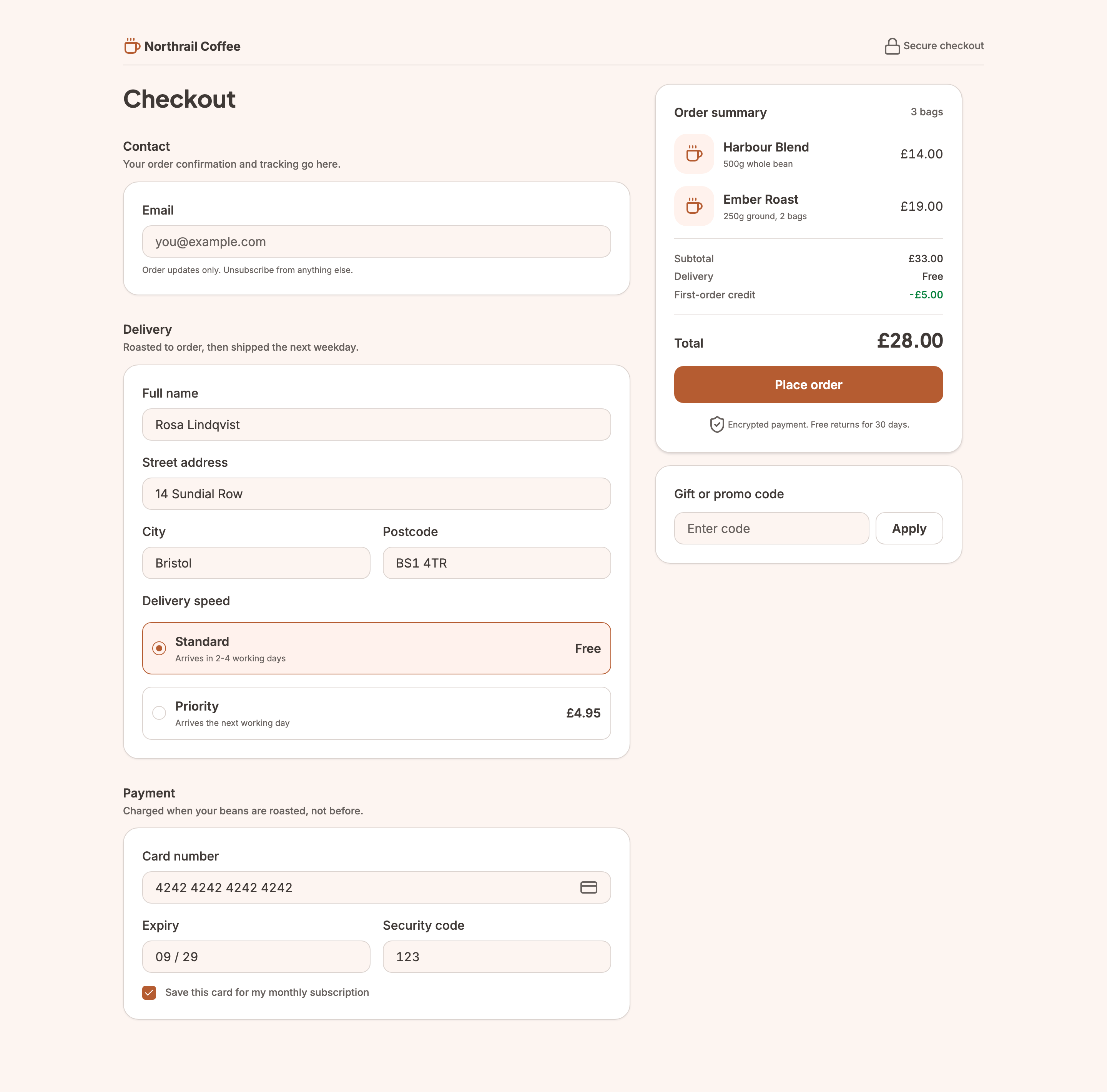
Not every screen is a dashboard. This checkout carries the
commercegenre — the transactional counterpart todashboard— so the evaluator reads its line prices and total as the design rather than as fabricated data. It still cleared the same bar as the two screens above, including designed empty-basket and loading states.
MCP Client → stdio → framesmith server
                        ↓
              Scene Graph (in-memory JSON tree)
                        ↓
              HTML/CSS Renderer (inline styles)
                        ↓
              Puppeteer (headless Chromium → PNG)
What framesmith does
Left to itself, an AI agent tends to produce UI that looks AI-generated — generic spacing, no icons, a purple gradient by default, placeholder text that reads like placeholder text. framesmith closes that gap by moving design before code and holding it to a bar:
- Start from taste, not a blank canvas. The agent stamps one of 11 vetted page patterns (dashboard, auth, pricing, settings, onboarding, and more) — each regression-tested to score > 95 with zero cliché tells across every theme, and every structure (page and component alike) built entirely from type-role tokens so it re-voices under a generated design system instead of injecting stray pixel sizes, and hardened to survive hostile-length content (
canvas_stressCLEAN) — then adapts it. A blank canvas is where slop comes from; a pattern is a non-slop starting point. (list_structures/apply_structure) - Use the whole toolkit — like a real UI does. Real icons (Lucide + Material Symbols), fonts resolved by name, real input controls (
toggle/checkbox/radio/select), data-driven charts (line/bar/donut/sparkline, multi-series, bar emphasis), reusable components, and layered design tokens — never faked with Unicode glyphs, stray ellipses, or hand-drawn SVG paths standing in for a chart. - Evaluate, then self-correct.
canvas_evaluatescores the design across five craft categories plus a cliché-tell detector, a state-coverage check (a data screen without designed empty/loading states isn't done), and a usability layer (hit-target floor, label association, honest action copy), and returns aREADY/NOT READYdirective. The agent resolves every warning and tell and only presents once it'sREADY— polishing to the bar is the agent's job, not yours. - Review in the browser, own the output. You browse canvases like design files, with a live quality inspector and design-system panel. Designs persist as open JSON checked into your repo — no proprietary format, no lock-in — and can be re-imported from shipped HTML to keep the design honest.
Capabilities at a glance
| Area | What you get |
|------|--------------|
| Rendering | Scene graph → HTML/CSS → Puppeteer PNG · responsive breakpoints · real CSS grid (layout: "grid" + spans) for bento/editorial compositions · gradients, shadows, blur, glassmorphism · SVG paths · animations · data-driven charts (line/bar/donut/sparkline, multi-series, bar emphasis + in-SVG gradients) |
| Pattern library | 11 vetted page archetypes + 5 component scaffolds, all scoring > 95 with zero cliché tells, typography built from type-role tokens (not literal pixel sizes), and stress-hardened to survive hostile-length content; taxonomy axes + a diversification signal so successive screens vary |
| Quality & taste | canvas_evaluate (8 categories incl. cliché tells, state coverage + usability floors) with a READY/NOT READY directive · canvas_autofix (mechanical fixes) · optional vision-model rubric critique + canvas_revise · canvas_add_variant clones a screen into a linked empty/loading/error state · canvas_stress content-perturbation testing (long text, i18n, big numbers, empty/many rows) · project_evaluate rolls up a project's screens for cross-screen consistency (radius/accent drift, token adoption, hand-copied chrome, state coverage) plus an optional multi-screen flow critique — advisory, never a gate |
| Design systems | generate_design_system: one seed + one personality (technical / editorial / soft / data-dense) → the complete design language — colors, curated font pairing, typography roles, radius/density stances, $elevation depth tokens (dark-aware), $motion defaults · layered $tokens (workspace ▸ project ▸ canvas) · style presets · DESIGN.md import · generate_scale derives a modular type + spacing scale from a named ratio (optional fluid clamp() sizes) · generate_color_system turns one seed color into OKLCH ramps + AA-checked semantic tokens, a categorical chart palette, and a tint layer for chips/tiles/badges, dark theme included · dual-theme rendering + evaluation (theme: "dark" on screenshot/export, both-theme contrast in canvas_evaluate with APCA advisory) · token-detachment lint re-attaches literals that drift from a token |
| Primitives | Lucide + Material Symbols icons · Google Fonts by name · real form controls · components with instance overrides — create_component promotes existing work, copy_nodes carries subtrees (and their component defs) across canvases |
| Import from code | canvas_import_html / canvas_import_url — token-mapped, structure-reconstructed · canvas_sync_from_url pixel drift · canvas_check_drift structural drift · framesmith verify / check-drift CLI for CI/pre-commit gates, no MCP client needed |
| Viewer | Browser gallery + detail view · quality inspector (score, issues, click-to-highlight) · design-system token panel · point-and-tell feedback (Comment mode + Feedback tab) |
| Open by design | MIT · plain HTML/CSS · open JSON you own in your repo · content-hash versioning (canvas_version) so approvals reference an exact design, not just a name · works with any MCP-compatible client |
Viewer
Run npx -p framesmith framesmith-viewer to start the standalone browser viewer (default port 3001). Open any canvas to review it at multiple breakpoints, compare them side-by-side, inspect the underlying JSON, or archive / delete.
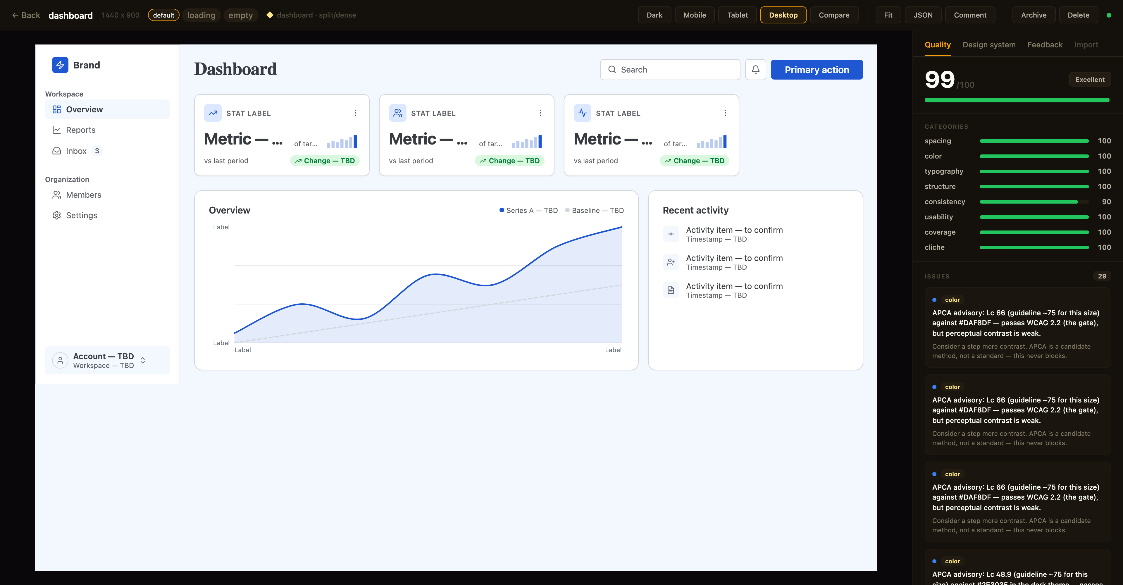
Above: a canvas in the detail view with the Quality inspector on the right — the same
canvas_evaluatescore the agent sees, with per-category bars and the issue list; the tabs along the top switch to the Design-system and Feedback panels. The toolbar exposes breakpoint previews, Compare, Fit, JSON, a Comment toggle for point-and-tell feedback, and lifecycle actions.
Quality panel. The canvas detail view shows a read-only quality inspector on the right: the heuristic canvas_evaluate score (0–100), per-category bars, and the issue list — each cliché tell with its category · tell badge, severity, and suggestion. Issues that canvas_autofix can resolve carry an auto-fixable tag, and clicking any issue highlights its node in the live preview. Every gallery card also shows a color-coded score badge so weak canvases stand out at a glance. The score matches what your agent sees over MCP (same fast-mode evaluation, genre-relaxed by the canvas's preset) — it's computed for display only and never written back.
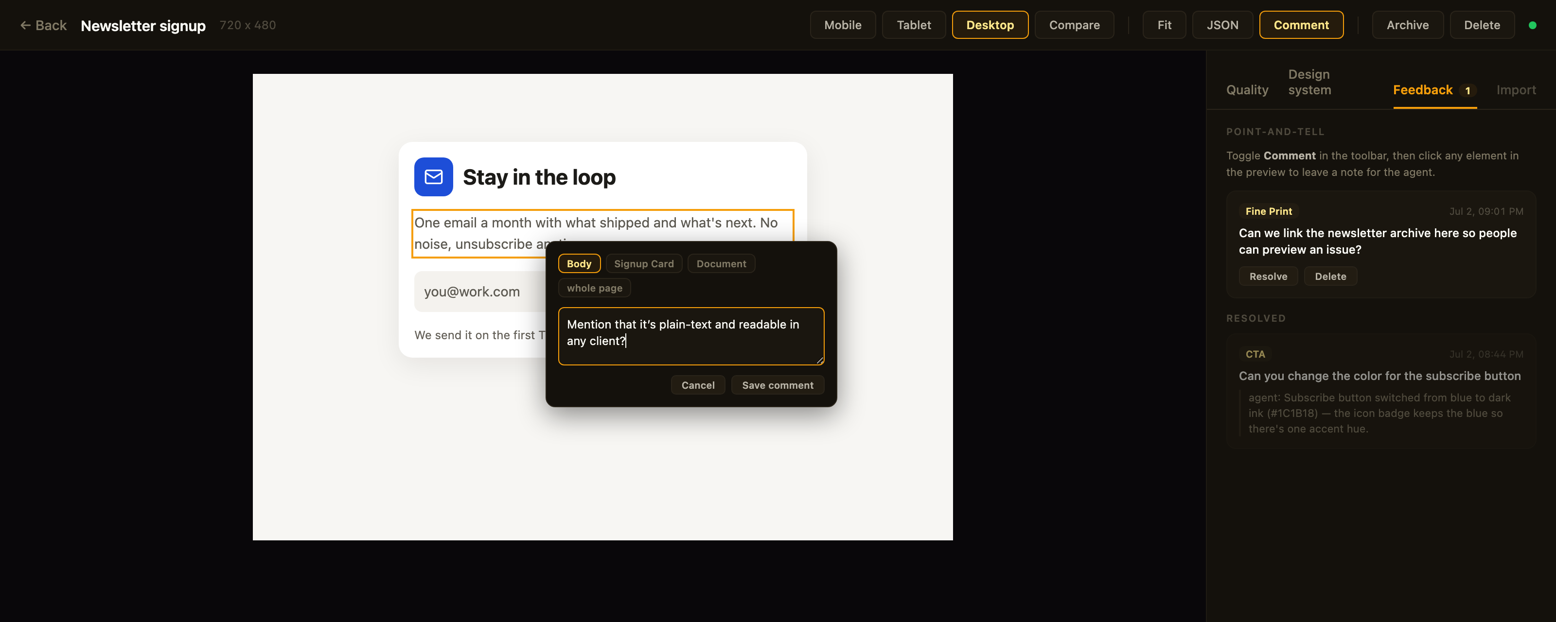
Above: point-and-tell in action — Comment mode is on, the clicked element is outlined, the popover's breadcrumb re-scopes the anchor, and the Feedback tab tracks open comments plus the agent's replies to resolved ones.
Feedback panel. Point-and-tell: toggle Comment in the toolbar and click any element in the preview to leave a note for the agent — a breadcrumb in the popover re-scopes the anchor from the exact element up to its card, section, or the whole page. The Feedback tab lists open comments (badge = open count) with click-to-highlight, lets you resolve or delete them, and shows the agent's resolution note as a reply once it has addressed the item. Comments persist on the canvas itself (metadata.feedback — git-diffable in bound repos) and the agent reads them over MCP via get_feedback; open feedback blocks the agent from presenting, same as open quality issues.
Design-system panel. A second inspector tab shows the canvas's effective design tokens — color swatches, type scale, spacing, and radius — resolved through the full workspace ▸ project ▸ canvas inheritance chain. Each section notes its dominant source layer, and any token resolving from a different layer is tagged (canvas / project / workspace) so you can see at a glance what a given canvas customized versus inherited.
Designs are authored through MCP tool calls from your AI assistant — in the viewer you review, comment, and manage lifecycle; you don't edit nodes. Files persist to ~/.framesmith/canvases/ so the viewer keeps showing them across sessions.
Installation
No clone or build needed — register framesmith with your MCP client via npx (requires Node 20+).
Claude Code
claude mcp add framesmith -- npx -y framesmithCodex
Add to ~/.codex/config.toml:
[mcp_servers.framesmith]
command = "npx"
args = ["-y", "framesmith"]
Cursor
Add to ~/.cursor/mcp.json (or per-project .cursor/mcp.json):
{
  "mcpServers": {
    "framesmith": {
      "command": "npx",
      "args": ["-y", "framesmith"]
    }
  }
}
Windsurf
Add to ~/.codeium/windsurf/mcp_config.json:
{
  "mcpServers": {
    "framesmith": {
      "command": "npx",
      "args": ["-y", "framesmith"]
    }
  }
}
VS Code + MCP extension
Add to .vscode/mcp.json (project-scoped) or your global MCP settings:
{
  "servers": {
    "framesmith": {
      "command": "npx",
      "args": ["-y", "framesmith"]
    }
  }
}
Any other MCP-compatible client
framesmith speaks standard stdio MCP. Point your client at npx -y framesmith using whatever config shape your client expects.
Optional: set
FRAMESMITH_VIEWER_URL=http://localhost:3001in the MCP server env to pin it to a long-lived standalone viewer process — see Running the viewer.
Build from source (for development)
git clone https://github.com/vicmaster/framesmith.git
cd framesmith
npm install
npm run build
# then point your client at: node /path/to/framesmith/dist/index.js
Tools
init
One-call onboarding — the recommended first call each session, and safe to run repeatedly (idempotent). Binds the current repo if it isn't already (canvases become checked-in JSON under .framesmith/), ensures the convention projects exist, and returns the live state you need to start working.
| Param | Type | Description |
|-------|------|-------------|
| dir | string? | Directory to bind / detect. Defaults to the nearest git repo root above the server working directory. |
| workspaceName | string? | Name for the workspace when binding fresh. Defaults to the repo folder name. |
| projects | string[]? | Projects to ensure exist (default: ["Foundations", "UI"]). Existing projects are never removed, so it's safe for adding feature/area projects like Onboarding. |
Returns the bound workspace + project IDs (binding re-keys IDs to repo-* — use the ones init returns), the on-disk layout, the workspace-layer token count, a workflow cheatsheet, the current gotchas, the framesmith://guidelines URI, and the viewer URL. If any canvas in the workspace has open point-and-tell comments, the result also carries openFeedback: { total, note } — a nudge to run get_feedback before doing anything else. It does not seed design tokens — set those at the workspace layer with workspace_set_design_system. The default Foundations project is just a canvas that visualizes the workspace tokens (which is where the design system actually lives).
canvas_create
Create a new canvas. If projectId is omitted, it lands in the built-in Untitled project of the Personal workspace.
| Param | Type | Description |
|-------|------|-------------|
| name | string? | Canvas name |
| projectId | string? | Target project. Defaults to the built-in Untitled project. See project_list. |
The response also carries a diversification signal for the target project: the recently-built structures (newest first) and a hint to differ on at least one taxonomy axis, so successive canvases don't converge on the same layout. It's advisory — never blocking.
canvas_list
List canvases. Excludes archived canvases by default. A row carrying openFeedback: n has open point-and-tell comments waiting — read them with get_feedback before working on that canvas.
| Param | Type | Description |
|-------|------|-------------|
| projectId | string? | Scope to one project |
| includeArchived | bool? | Include archived canvases (default false) |
Returns [{ id, name, createdAt, lastModified, versionHash, projectId, archived, openFeedback?, variant?, variants? }] — openFeedback (a count) is present only when > 0; versionHash is the design-content hash canvas_version checks approvals against. variant: { of, state } is present on a state-variant row; variants: [{ state, canvasId }] rolls the designed states onto a base row (see canvas_add_variant).
canvas_add_variant
Clone a screen into a linked state variant — the empty / loading / error version of a canvas, as its own sibling canvas. The clone gets re-keyed node IDs, the same project, copied tokens/components/fonts, and carries the provenance/genre stamp (feedback and critique stay behind); it's named <base> · <state> and linked via metadata.variant = { of, state }.
| Param | Type | Description |
|-------|------|-------------|
| canvasId | string | The base canvas (a variant id also works — it resolves to the root base; variants never nest) |
| state | string | The state this variant designs — empty / loading / error recommended; free string accepted |
Returns { canvasId, name, state, of, idMap } — idMap maps every base node id to its clone, so follow-up edits target the right nodes immediately. One canvas per state per base (a duplicate state errors). The viewer shows a screen and its variants as one card with state chips; canvas_list rolls designed states onto the base row.
canvas_move / canvas_archive / canvas_unarchive / canvas_delete
Canvas lifecycle. canvas_move reassigns a canvas to a different project. canvas_archive sets a soft-delete flag (canvas stays on disk, hidden from default canvas_list); canvas_unarchive clears it. canvas_delete removes the canvas and its file permanently — irreversible.
viewer_url
Get the URL of the live viewer plus per-canvas URLs. Share these with the user so they can open the design in their browser. No params.
{
  "url": "http://localhost:3001",
  "gallery": "http://localhost:3001",
  "canvases": [
    { "name": "Login", "viewer": "http://localhost:3001/canvas/abc123" }
  ]
}
canvas_create already returns the per-canvas viewer URL in its response; reach for viewer_url when you want the gallery URL or to enumerate every existing canvas's URL in one call.
workspace_create / workspace_list / workspace_rename / workspace_delete
Top-level container CRUD. The built-in Personal workspace cannot be deleted, and workspace_delete refuses if the workspace still contains projects (move or delete them first).
project_create / project_list / project_rename / project_delete
Mid-level container CRUD inside a workspace. The built-in Untitled project cannot be deleted. project_delete refuses if the project still contains any canvases (archived ones still count — move or delete them first).
canvas_bind
Bind a workspace to the current project directory so its canvases live in the repo as open JSON — a .framesmith/ directory checked in alongside the code, instead of the global ~/.framesmith store. Run it once per repo.
| Param | Type | Description |
|-------|------|-------------|
| workspaceId | string? | Workspace whose projects + canvases migrate into the repo. Defaults to the built-in Personal workspace. |
| dir | string? | Directory to bind. Defaults to the nearest git repo root above the server's working directory. |
It creates .framesmith/workspace.json (the binding plus the design system, so a fresh clone resolves tokens identically) and one subdirectory per project holding one slug-named file per canvas:
.framesmith/
  workspace.json     # workspace + projects[] + design system
  design-system/
    design-tokens.json
  ui/
    bloom-landing.json
    login-form.json
It migrates the workspace's projects + canvases in and makes the repo the source of truth for the rest of the session. A canvas is either repo-bound or global, never both. Afterwards the server auto-detects .framesmith/ on startup (walking up from its working directory). Commit .framesmith/ so designs travel with the code and diff cleanly in review.
The bind also records the repo in ~/.framesmith/registry.json, so the standalone viewer shows bound repos alongside your global workspaces in one gallery (it rebuilds that read-only mirror on launch and whenever the registry changes).
batch_design
Execute operations on the scene graph. Operations are line-separated strings:
# Insert a frame into the document root
header=I("document", { type: "frame", layout: "horizontal", fill: "#1a1a2e", padding: 24, gap: 16, width: 1440, height: 80 })

# Insert text into the header
I(header, { type: "text", content: "My App", fontSize: 24, fontWeight: 700, color: "#ffffff" })

# Update a node
U("nodeId", { fill: "#e94560" })

# Delete a node
D("nodeId")

# Copy a node to a new parent
copy=C("sourceId", "parentId", { fill: "#0f3460" })

# Move a node
M("nodeId", "newParentId", 0)

# Replace a node entirely
R("nodeId", { type: "text", content: "Replaced" })
Returns { ok, nodeIds, results }. nodeIds maps each bound variable to the node ID it created — e.g. { "header": "n_a1b2" } — so you can target those nodes in later calls (bindings only live within a single call). results lists each op's outcome in order. If the call wrote a fontFamily nothing can serve yet (not cached, registered, or system/generic), a Font warnings content item names it — a cache-only check with no network call, so it's a heads-up, not exhaustive.
Node types: frame, text, rectangle, ellipse, image, icon, path, component, instance, toggle, checkbox, radio, select, chart, skeleton (loading-placeholder block — token-derived neutral fill; pulses subtly in the live viewer, always static in screenshots/exports so diffs stay deterministic; pulse: false opts a block out)
Properties: fill, gradient, stroke, strokeWidth, strokeStyle, borderTop, borderRight, borderBottom, borderLeft, cornerRadius, width, height, minWidth, minHeight, maxWidth, layout ("horizontal" | "vertical" | "grid"), gap, rowGap, gridColumns, gridColumn, gridRow, padding, alignItems, justifyContent, fontSize, fontFamily, fontWeight, color, content, textAlign, lineHeight, letterSpacing (px), textDecoration, textTransform, textOverflow ("ellipsis" — designed single-line truncation; canvas_stress reports clips behind it as info), tabularNums, fontVariationSettings, src, objectFit, opacity, shadow (CSS string, or "$elevation.<name>" referencing an elevation token), shadows, blur, backdropBlur, backdropFilter, overflow, wrap, position, x, y, icon, iconSize, iconColor, iconStyle, checked, disabled, value, d, viewBox, strokeLinecap, strokeLinejoin, strokeDasharray, animation, transition (object, or "$motion.<name>" referencing a motion token), kind, series, segments, innerRatio, centerValue, centerLabel, sparkKind, xDomain, yDomain, curve, gridlines, xLabels, yLabels, componentId, overrides
Use textTransform: "uppercase" for uppercase labels (don't bake casing into content), letterSpacing for tracking, and fontVariationSettings (e.g. '"wght" 650') for variable-font axes.
minHeight is the vertical analog of minWidth: a floor, not a cap. Prefer it over a fixed height on any node whose content can grow (a card, a table row) — it holds the design's rest-state rhythm while still letting the box expand under hostile-length content instead of clipping. See Width strategies for the same idea applied on the horizontal axis.
Charts are data-driven — the chart node does the value→coordinate math:
I(panel, { type: "chart", kind: "line", width: 600, height: 220, curve: "smooth", gridlines: 4,
  series: [
    { data: [210, 450, 648, 903, 1133, 1338, 1518], stroke: "$accent", strokeWidth: 2.5, area: true },   // actual
    { data: [225, 450, 675, 900, 1125, 1350, 1575, 1800, 2025, 2250, 2475, 2700], stroke: "$border", strokeDasharray: "6 4" }  // target
  ],
  xLabels: ["Jan", "", "", "", "", "", "", "", "", "", "", "Dec"] })
Phase 28 adds the dashboard kinds. A donut is data-bound segments plus a center figure — the legend stays your composition:
I(panel, { type: "chart", kind: "donut", width: 176, height: 176, centerValue: "1,204", centerLabel: "forms",
  segments: [
    { value: 385, color: "$chart-1", label: "North" },
    { value: 289, color: "$chart-2", label: "Highlands" },
    { value: 217, color: "$chart-3", label: "River delta" }
  ] })
A bar chart with a selected day is highlight: [11] on the series (selected bar solid, the rest muted; barGradient: true fades the muted bars inside the SVG, invisible to the gradient-overuse tell). A sparkline is kind: "sparkline" — axis-free, latest point emphasized by default, sized for a KPI card corner. segments[].color and series stroke both take $chart-1…$chart-6 refs.
Multi-series in one node; x positions are data indexes (a shorter series stops early against a longer one — booked months vs a full-year target); xDomain/yDomain default from the data (bars floor at 0); kind: "bar" renders grouped bars from the same series model. Dash the projected series, solid the actuals. Editing one value is a one-prop edit — never hand-compute path d strings for a chart.
Borders: stroke + strokeWidth draw all four sides (strokeStyle: "dashed" | "dotted" for forecast/placeholder outlines); per-side borders take an object — borderTop: { width: 1, color: "$border", style? } for table row rules, borderLeft: { width: 3, color: "$primary" } for accent edges. Paths dash via strokeDasharray: "6 4" (or [6, 4]).
Grid: layout: "grid" + gridColumns (a count → equal columns; an array of fr weights / CSS lengths like [2, 1, "240px"]; or a raw template string) gives real CSS grid for bento/editorial compositions that flex can only approximate. Children place with gridColumn / gridRow — a number means "span N", strings accept "span 2" or "1 / 3". gap covers both axes, rowGap overrides the row axis; responsive: "stack" collapses the grid to one column on mobile with spans reset. Tracks render as minmax(0, Nfr) so long content can't blow a column past its share. Unsafe gridColumns/gridColumn/gridRow values never reach the DOM — they fall back to equal columns / are dropped.
find_nodes
Find nodes by what they are — property values, text content, or name — instead of hand-tracking ids. Read-only; the query twin of replace_matching_properties.
| Param | Type | Description |
|-------|------|-------------|
| canvasId | string | Canvas ID |
| match | object? | Property/value predicate, AND across keys — e.g. { "fontSize": 30 } (token refs match literally, structured values by shape) |
| text | string? | Case-insensitive substring match on text content — e.g. "$1.52M" |
| name | string? | Exact match on the node name — e.g. "YearTable" |
| scope | string? | Node ID — limit the search to this subtree (inclusive) |
| type | string? | Only match nodes of this type (text, frame, …) |
All provided filters AND together (at least one is required). Returns { count, matches } where each match is { id, type, name?, path } — path is the named ancestor chain ("Document / Table / Row 2 / text"), so you can tell which match you want before editing it.
replace_matching_properties
Bulk property edit: find every node whose properties equal all the match entries and apply the set properties to each — one call instead of one U() op per node.
| Param | Type | Description |
|-------|------|-------------|
| canvasId | string | Canvas ID |
| match | object | Property/value predicate, AND across keys — e.g. { "width": 110 } or { "fill": "$secondary-container" } (token refs match literally; structured values like shadows match by shape) |
| set | object | Properties to write on every matched node — e.g. { "width": "100%" }. Can't change id/type |
| scope | string? | Node ID — limit matching to this subtree (inclusive). Default: whole document |
| type | string? | Only match nodes of this type (text, frame, …) |
| dryRun | bool? | Preview the matched nodes + count without writing |
Returns { ok, count, matches, dryRun? } where matches is [{ id, type, name? }]; dryRun: true is present only on preview calls. Preview with dryRun: true before wide matches — a value like width: 150 can match more nodes than intended.
create_component
Promote an existing subtree to a reusable component — the subtree moves into the canvas's component registry and an instance node takes its place, render-identical. Answers the evaluator's "no component instances found" advisory with a one-call action.
| Param | Type | Description |
|-------|------|-------------|
| canvasId | string | Canvas ID |
| nodeId | string | Root of the subtree to promote (not the document root, not an existing instance) |
| name | string? | Component name (default: the node's name, then type); seeds the componentId slug |
Returns { componentId, instanceId, name, overridableChildren } — overridableChildren lists the named descendants that instance overrides can target (overrides match children by name). Stamp more copies via batch_design: I("parent", { type: "instance", componentId, overrides: { "Title": { content: "…" } } }).
copy_nodes
Copy subtrees from one canvas into another (or duplicate within one) — the cross-canvas reuse C() can't do. Component definitions referenced by the copied trees travel along automatically.
| Param | Type | Description |
|-------|------|-------------|
| fromCanvasId | string | Source canvas |
| nodeIds | string[] | Roots of the subtrees to copy |
| toCanvasId | string | Target canvas (may equal the source to duplicate) |
| parentId | string? | Target parent (default: the target document root) |
| index | number? | Insert position (default: append) |
Returns { ok, copied, idMap, rootIds, copiedComponents } — idMap maps every source node id to its new id; a componentId collision with a different def re-keys the incoming def and remaps the copied instances.
screenshot
Render canvas to PNG (returned as base64 image).
| Param | Type | Description |
|-------|------|-------------|
| canvasId | string | Canvas ID |
| nodeId | string? | Specific node to capture |
| width | number? | Viewport width (default 1440) |
| height | number? | Viewport height (default 900) |
| fullPage | boolean? | Capture the whole design instead of one viewport — default false, so existing captures (diffs, responsive sets, the pattern gate) are byte-identical. A canvas taller than its artboard otherwise cuts off at the artboard height. export takes the same option (ignored for PDF, which paginates) |
| scale | number? | Device scale (default 2) |
| theme | string? | "dark" renders the design system's dark token layer (dark.colors/dark.elevation overrides); default light — a no-op without a dark layer |
read_nodes
Read node data from the scene graph. Already know the id(s)? This is the tool. If you don't — you're hunting for a node by what's on it — use find_nodes instead of eyeballing this tree.
| Param | Type | Description |
|-------|------|-------------|
| canvasId | string | Canvas ID |
| nodeIds | string[]? | Node IDs to read (default: root) |
| maxDepth | number? | Max traversal depth (default 5) |
snapshot_layout
Get computed bounding boxes via browser rendering.
| Param | Type | Description |
|-------|------|-------------|
| canvasId | string | Canvas ID |
| nodeId | string? | Root node to start from |
| maxDepth | number? | Max depth (default 10) |
Returns { nodeId, x, y, width, height, children? } per node — plus, on any node whose content exceeds its box, overflow data (scrollWidth/clientWidth/scrollHeight/clientHeight and an ellipsis flag for designed truncation): the same capture canvas_stress uses to detect clipping.
generate_scale
Derive, don't hand-pick: a named ratio + a base size → a full modular type scale (text-xs … text-3xl typography tokens) and a paired space scale (space-3xs … space-3xl, md = 1× base), written to the workspace / project / canvas token layer of your choice. Craft defaults are baked into every step — line-height bands (1.5 body / 1.35 subhead / 1.2 display) and negative display tracking — so the tracking advisory and the type-scale ratio check are satisfied by construction (generated sizes are declared as tokens, which pins them). Usage-dependent typography checks — measure, unique-size count, tabular numerals — still depend on how you apply the scale.
| Param | Type | Description |
|-------|------|-------------|
| ratio | string | number | minor-second (1.125), major-second (1.2), minor-third (1.25), major-third (1.333), perfect-fourth (1.5), golden (1.618) — or a number in (1, 2.2] |
| baseSize | number? | Body size the scale pivots on (default 16) |
| stepsDown / stepsUp | number? | Steps below/above base (defaults 2 / 4) |
| fluid | object? | { minViewport?, maxViewport? } — emit Utopia-style clamp() type sizes interpolating from ~85% at the small viewport to full size at the large (space stays static by design) |
| canvasId / projectId / workspaceId | string? | Exactly one — the token layer written to |
Returns the generated tokens plus overwrote (existing names replaced). Reference results as fontSize: "$text-lg" (the full token spec applies through the ref) and gap: "$space-md". Fluid clamp() sizes render as-is and are exempt from the numeric scale checks.
generate_design_system
The headline call for a new project's look: one seed color + one personality → the complete design language, deterministic, no API key. It composes generate_color_system and generate_scale, then adds everything those engines have no opinion about:
- A curated font pairing, loaded through the font pipeline so the first screenshot renders real faces —
technical= Space Grotesk + Inter,editorial= Fraunces + Source Sans 3,soft= Plus Jakarta Sans + Inter,data-dense= Inter + a JetBrains Monofiguresrole. - Typography roles the structures speak —
$display,$heading,$title(page/screen titles — one step below$display),$text-lg/$text-sm(untracked in-between sizes for card titles, nav, prose, and metadata),$body,$label,$caption(+$figureswith a mono face) — with per-role weight and tracking, alongside thetext-xs…text-3xlsteps.$labelis the one tracked role (it carriesletterSpacing), so structures reserve it for genuine control/CTA/table-header labels and use$text-smfor ordinary prose — labeling prose as$labelreads as a section eyebrow to the cliché census. - A radius stance (
radius-sm/md/lg— e.g. 6/10/14 fortechnical, 12/16/20 forsoft) and a density stance (the space scale pivots on the personality). chart-1…chart-6— a categorical series palette hue-walked from the seed (≥ 30° apart, purple band avoided unless the seed itself is purple, each ≥ 3:1 on both themes' surfaces per WCAG 1.4.11) for chart segments, series, and legend dots. Near-neutral seeds anchor at a stable blue and say so in the result (rangeNote).accent-tint/success-tint/warning-tint/danger-tint/neutral-tint— the tint layer: soft same-hue surfaces for status chips, icon tiles, pill badges, and initials avatars. One pairing rule: tint as the fill, base color as the ink (fill: "$success-tint"+color: "$success") — AA by construction, dark layer included.$elevation.flat/raised/floating/overlay— layered soft shadow tokens referenced from any node asshadow: "$elevation.raised". The dark layer re-states each depth (stronger black ink) so elevation reads on dark surfaces instead of vanishing.$motiondefaults (fast/base/slow) tuned to the personality's temperament.
| Param | Type | Description |
|-------|------|-------------|
| seed | string | The brand color everything derives from (#RRGGBB) |
| personality | string | Required — technical, editorial, soft, or data-dense. Dashboards → data-dense/technical, marketing/content → editorial, consumer → soft |
| baseSize / ratio | number? | Override the personality's type pivot / scale ratio |
| canvasId / projectId / workspaceId | string? | Exactly one — the token layer written to |
| preserveInherited | boolean? | Canvas scope only. Default true — see "Inherited tokens" below. Pass false to write the generated language whole. |
Same seed, different personality = a visibly different product. The two single-purpose generators below stay for targeted regeneration (just the palette, just the scale).
Inherited tokens (canvas scope). A token the canvas already resolves through an inherited workspace/project design system is kept instead of silently overwritten, and reported back so you can act on it rather than guess:
preservedFromDesignSystem— ordinary preserved tokens. For typography, preservation is field-wise: an inherited token that's only partially specified (e.g.{ fontSize: 13 }) is merged with the generated role rather than shadowing it whole, so the personality'sfontFamily/fontWeight/trackingstill land; the entry'sfilledFromPresetnames which fields the preset contributed. A fully-specified inherited token is preserved as-is.designSystemConflicts— preservations that land on a token in the semantic vocabulary this call itself defines (the surface/ink/border/accent semantics, the status colours and their paired-tintlayer, the$chart-*range, and the type roles). Keeping an inherited value there means two design languages on one screen — e.g. a near-blackbordersurviving onto a freshly generated light-green system. Status colours matter as much as surfaces: they are AA-tuned against the generated page, and the tint layer is paired with them, so an inheritedsuccesskeeps pairing with the generatedsuccess-tintand fails contrast. Each entry addswhyandfix.- Pass
preserveInherited: falseto skip all of this and write the generated language whole (the right call when this canvas should be the new system, not a blend of two). The response'stypographyRolesalways reports what the canvas actually resolves, which differs from the generated values exactly when preservation fired.
Same contract, same field names, as apply_preset and generate_color_system.
generate_color_system
One seed color → a full perceptual color system, written to the workspace / project / canvas token layer of your choice:
primary-50…primary-900— an OKLCH ramp with perceptually even lightness steps and chroma tapered at the extremes; out-of-gamut colors clip toward lower chroma, never hue-shift. (The hand-rolled conversions are validated against Chrome's ownoklch()parsing.)neutral-50…neutral-900— a matched neutral carrying a whisper of the seed's hue: never dead grey, never visibly tinted.success/warning/danger— status colors, hue held, each darkened from the shared band until it clears WCAG AA (4.5:1) as text on the generated light page surface (the off-whitebg-primary, not pure white — the stricter target, so passing there implies passing on white too) — the invariant is shared contrast, not shared lightness (a raw shared-lightness danger red can read under 4:1).- Semantic tokens —
bg-primary,bg-surface,bg-elevated,text-primary,text-secondary,border,accent: the same vocabulary the structure scaffolds already use. Text and accent steps are picked by measured contrast — every semantic text/surface pair clears WCAG AA by construction. chart-1…chart-6— the categorical series palette: a deterministic hue walk from the seed, ≥ 30° apart pairwise, purple band skipped unless the seed itself is purple, each color pushed until it clears the 3:1 graphical-object floor (WCAG 1.4.11) on both themes' surfaces. A near-neutral seed (no meaningful hue) anchors the walk at a stable blue instead of amplifying noise, and the response'srangeNotesays so.accent-tint/success-tint/warning-tint/danger-tint/neutral-tint— the tint layer: soft same-hue washes for status chips, icon tiles, pill badges, and initials avatars, each backed off until its paired base color (accent,success, …) clears AA text contrast on it. Pairing rule: tint as the fill, base color as the ink.
| Param | Type | Description |
|-------|------|-------------|
| seed | string | The brand color everything derives from (#RRGGBB) |
| canvasId / projectId / workspaceId | string? | Exactly one — the token layer written to |
| preserveInherited | boolean? | Canvas scope only. Default true — see "Inherited tokens" under generate_design_system above. Pass false to write the generated palette whole. |
The dark theme ships in the same call: the semantic dark mapping (Radix pattern: a reversed walk of the same ramps, AA-checked against its own surfaces) is written to the layer's dark.colors override — theme: "dark" on screenshot/export renders it, and canvas_evaluate contrast-checks both themes from then on. The status colors get a second pass here too: the light-tuned success/warning/danger are re-lit (hue held) until each clears AA against bg-elevated (the lightest dark surface — the stricter target), so a $danger message reads in both themes. The categorical and tint layers get dark counterparts too (dark.colors carries chart-1…chart-6 and the -tint tokens re-lit for the dark surfaces), written in the same call. Canvas scope honors the inherited-design-system contract, same as apply_preset and generate_design_system: ordinary preservations report as preservedFromDesignSystem, and a preserved value that lands on a token this call's own semantic vocabulary (bg-surface/text-primary/border/accent) reports as designSystemConflicts with a why/fix instead.
get_variables / set_variables
Read and write design tokens (colors, spacing, radius, typography — plus elevation shadow tokens, a dark override layer, and motion tokens: { duration, easing } pairs referenced from nodes as transition: "$motion.<name>"). Use $tokenName in node properties to reference variables. The dark layer is SPARSE, keyed by token name: anything not overridden inherits the light value — colors AND elevation can both carry a dark override; it drives theme: "dark" renders and the dual-theme contrast check.
{
  "colors": { "primary": "#e94560", "bg": "#1a1a2e" },
  "spacing": { "sm": 8, "md": 16, "lg": 24 },
  "radius": { "sm": 4, "md": 8 },
  "elevation": { "raised": [{ "x": 0, "y": 2, "blur": 4, "spread": -1, "color": "rgba(16,24,40,0.08)" }] },
  "motion": { "fast": { "duration": 150, "easing": "ease-out" } }
}
Reference an elevation token from a node as shadow: "$elevation.raised" (resolves to the layered shadows array; an explicit shadows on the node wins).
Then use in nodes: { fill: "$primary", padding: "$md", cornerRadius: "$sm", transition: "$motion.fast" }
workspace_set_design_system / workspace_get_design_system / workspace_apply_preset
Set tokens at the workspace level — every project + canvas under the workspace inherits them. Resolution order at render is canvas.variables (override) → project.designSystem → workspace.designSystem → built-in defaults, with the rightmost layer winning. Per-category merge: setting only colors doesn't reset spacing.
workspace_set_design_system({
  workspaceId: "...",
  variables: {
    colors: { primary: "#f59e0b", bg: "#0a0a0a" },
    spacing: { sm: 8, md: 16, lg: 24 }
  }
})
workspace_apply_preset({ workspaceId, preset }) is a shortcut that copies a named preset ("dark", "light", "material", "minimal") into the workspace.
project_set_design_system / project_get_design_system / project_apply_preset
Same shape, but at the project layer between workspace and canvas. Use for sub-brand overrides (e.g., a Marketing project that overrides one color while inheriting everything else from the workspace).
get_fonts / set_fonts
Fonts load by name automatically — naming a fontFamily in a typography token (or on a node) resolves it from Google Fonts at token-write time, with a render-time backstop catching anything else. Binaries are cached under ~/.framesmith/fonts/, so renders are offline and deterministic after the first resolve; typography.body.fontFamily becomes the document default. "mono" / "sans" are generic shorthands that render as CSS monospace / sans-serif — no registration, no network. An unresolvable family renders in the fallback stack and adds a Font warnings item to the screenshot/export result; batch_design additionally warns at write time when a call sets a fontFamily that nothing can serve yet.
set_fonts covers explicit registration. Three forms, combinable — with a stylesheet URL, the faces register under your family label (so { "family": "mono", "url": "<css2 URL>" } upgrades every fontFamily: "mono" node to the real face; the result's aliased field shows the mapping):
{
  "families": ["Inter", "JetBrains Mono"],
  "fonts": [
    { "family": "Inter", "url": "https://fonts.googleapis.com/css2?family=Inter:wght@400;700" },
    { "family": "Brand Face", "url": "https://example.com/brand.woff2", "weight": 400 }
  ]
}families— resolve by name from Google Fonts and merge into the existing declarations.fontswith a Google Fonts CSS URL (fonts.googleapis.com/css2?...) — faces are extracted from the stylesheet automatically.fontswith a direct binary URL (.woff2/.woff/.ttf/.otfor adata:URI) — for non-Google sources.
fonts replaces declarations wholesale (pass [] to clear); families merges. The renderer emits @font-face blocks plus <link rel="preconnect"> per remote origin, with font-display: swap.
export
Export a canvas or specific nodes to files on disk.
| Param | Type | Description |
|-------|------|-------------|
| canvasId | string | Canvas ID |
| format | string | "png", "jpeg", "webp", or "pdf" |
| outputPath | string | Directory to save files |
| nodeIds | string[]? | Specific nodes to export (default: full canvas) |
| width | number? | Viewport width (default 1440) |
| height | number? | Viewport height (default 900) |
| scale | number? | Device scale (default 2) |
| theme | string? | "dark" renders the design system's dark token layer (dark.colors/dark.elevation overrides); default light — a no-op without a dark layer |
Returns { exported: string[], versionHash } — the exported file paths plus the canvas's design-content hash at export time (see canvas_version), so an exported artifact can be tied back to the exact design that produced it.
list_presets
List available style guide presets. No params. Returns preset names and descriptions.
apply_preset
Apply a style guide preset to a canvas. Merges preset design tokens into the canvas variables, and copies in any reusable components (button, card, badge) the preset defines so they can be instanced. The preset is also recorded in the canvas provenance + per-project build log. Tokens the canvas already resolves through an inherited workspace/project design system are kept rather than overwritten and reported as preservedFromDesignSystem — for typography this merge is field-wise (a partially-specified inherited token, e.g. just fontSize, is filled out with the preset's other fields rather than shadowing the whole role); set them explicitly with set_variables if you want the preset's values instead.
| Param | Type | Description |
|-------|------|-------------|
| canvasId | string | Canvas ID |
| preset | string | Preset name: "dark", "light", "material", "minimal" |
list_structures
List available layout structures — named scaffolds you stamp onto a canvas and then populate. Returns each structure's name, kind, description, and (for pages) taxonomy axes. Distinct from presets: structures define layout skeleton, presets define color/token theme — they compose.
| Param | Type | Description |
|-------|------|-------------|
| projectId | string? | If given, also return a diversification signal for the project (recently-built structures + a hint to differ on ≥ 1 axis), so you pick a shape that contrasts with recent work. Omit it to get just the structure list. |
Two kinds:
page— whole-page scaffolds stamped once at the canvas root:marquee-hero,bento-grid,stat-led,editorial-longform,split-workbench,catalogue,dashboard,auth,pricing,settings,onboarding. Each is tagged on four independent axes —heroTreatment,density,rhythm,alignment— so you can deliberately vary page shape instead of defaulting to the same layout. Every page scaffold is regression-tested to score > 95 with zero cliché tells across all five presets (the pattern library's taste bar) and to passcanvas_stressCLEAN under long-text and i18n content, so it's a non-slop starting point you adapt, not boilerplate.component— reusable fragments stamped under any node viatargetId, repeatably:data-table(header + 3 rows with avatar/name/email, role chip, status dot, right-aligned numeric cell, actions, and a pagination footer),form-field,toolbar,stat-card(the original name for the KPI-card anatomy below, kept as an alias),toggle-row, plus the state scaffoldsempty-state(icon + title + hint + CTA — an empty screen is a first-run experience, not a void),skeleton-table(real header + skeleton rows matchingdata-tablegeometry, so the loaded table lands without layout shift),skeleton-card, andskeleton-stat-card(so a loading dashboard skeletons every data surface — the coverage check warns when a loading variant leaves a live region beside skeletoned ones). Phase 28 adds the dashboard micro-patterns:kpi-card(tinted icon tile + uppercase metric label + big tabular value + live sparkline + tinted delta pill — the dashboard structure stamps these),status-chip(the tint pair:$success-tintfill +$successink),segmented-control,breadcrumb, andinitials-avatar. A high-fidelity table costs one stamp instead of ~90 hand-placed nodes; a reference-grade KPI card costs one.
apply_structure
Stamp a layout structure onto a canvas and return the placeholder node IDs to populate. Scaffolds are token-driven, not hard-coded: every scaffold's spacing, radius, elevation, and typography — all of it, every text node's fontSize, not just titles — reference $space-* / $radius-* / $elevation.* / the type-role tokens ($display/$title/$heading/$text-lg/$text-sm/$body/$label/$caption, plus the usual $color tokens), so once a project has a generated design system, stamping a pattern already reads in its density, depth, and voice — no re-theming pass needed, and no scaffold can inject a size the generated scale doesn't have. apply_structure seeds neutral defaults (the pre-generator literal values) for any of those tokens the canvas can't already resolve, so an unthemed canvas still renders correctly; the result's seededColors / seededTokens list exactly which names got seeded. Populate the placeholders with batch_design U ops, then screenshot to verify.
- Page scaffolds insert at the canvas root (refusing on a non-empty canvas unless
replace), record provenance (metadata.provenance), and append to the per-project build log that feeds thediversificationsignal. - Component scaffolds insert under
targetId(default root), repeatably — every stamp re-keys its node IDs (form-field-1-…,form-field-2-…) and returns anidMap(template ID → live ID) for follow-up ops. Component stamps don't touch provenance or the build log: they don't shape the page.
| Param | Type | Description |
|-------|------|-------------|
| canvasId | string | Canvas ID |
| structure | string | Structure name (use list_structures, e.g. "marquee-hero", "data-table") |
| replace | boolean? | Page scaffolds: if the root already has children, clear them before stamping. Default false (refuses on a non-empty canvas) |
| targetId | string? | Component scaffolds: node to stamp under (default "document") |
canvas_import_html
Import an HTML snippet (+ optional CSS) as an editable canvas — the reverse of export. The markup renders headlessly and a computed-style DOM walk maps it to the scene graph:
| Source | → Scene graph |
|--------|---------------|
| flex/block container | frame + layout/gap/padding/alignItems/justifyContent/wrap |
| display: grid | rows of proportional columns from the computed track template (grid-column spans honored — numeric spans win, else the box width decides); irregular templates degrade to a stack with a warning. Recorded in report.layout |
| centered content (margin: auto, max-width, flex-center) | the parent centers (alignItems) and the child keeps its real width — max-width becomes the fluid width: "100%" + maxWidth idiom. Recorded in report.layout |
| floats / inline-block / unmodeled multi-column CSS | geometry clustering: children's computed boxes group into row bands (≥50% vertical overlap, consistent column counts) → rows of proportional columns. Conservative by design — anything that looks multi-column but doesn't cluster consistently imports as an honest stack with a stack-fallback entry + warning |
| <table> / <tr> / <td>/<th> | a vertical frame of horizontal row frames with proportional percentage cell widths (from the computed boxes — colspan handled free); thead/tbody unwrap, <caption> becomes a text node, bottom borders become hairline divider frames. Recorded in report.layout |
| text run | text (size, weight, color, family, line-height, letter-spacing, transform, align) |
| <img> (absolute/data URL) | image |
| inline <svg> | icon when the path data matches a bundled Lucide/Material glyph; else path |
| checkbox / radio / role="switch" / <select> | the input-primitive node types, with live checked/selected state |
| background / border / radius / shadow / opacity / overflow | fill / stroke+strokeWidth / cornerRadius / shadows / opacity / overflow |
Lossy by design. Every import returns a report — counts, warnings (dropped background images, grid containers, truncations), unmatched icons/fonts — and that report is the contract; the goal is an editable, honest starting point, not a pixel-perfect clone. Single-child wrapper divs collapse, same-style text runs merge, invisible nodes drop (all tunable via flatten).
| Param | Type | Description |
|-------|------|-------------|
| html | string | The snippet to import |
| css | string? | CSS to apply — e.g. the compiled Tailwind stylesheet. A bare Tailwind snippet has no runtime, so classes render unstyled without this |
| projectId | string? | Project to create the canvas in (default project if omitted) |
| name | string? | Canvas name (default "Imported HTML") |
| selector | string? | Import only the first match within the snippet |
| width | number? | Container width layouts resolve against (default 1440) |
| flatten | object? | { collapseWrappers, mergeTextRuns, dropInvisible, maxDepth } |
| tokenMatch | object? | { source: "workspace" \| "designMd" \| "tailwind" \| "none", tolerance?, designMd? } — snap concrete values back to $token refs (default: the target project's merged design system) |
| tailwind | object? | { theme: { name: value } } — the project's @theme map; widens which class names map to $tokens |
Token re-mapping makes the import a token-driven design instead of a pile of hex:
- Tailwind intent first — class names carry intent a computed value can't:
bg-surface→fill: "$surface",gap-4→16,rounded-xl→12,text-sm font-semibold uppercase→ typography props. Custom utilities resolve viatailwind.theme; palette classes (bg-red-500) map to the bundled v4 palette as hex literals (generated from the official oklch values by Chrome itself — seescripts/generate-tailwind-palette.ts), so a bare snippet styles without compiled CSS; arbitrary values and unknowns fall through to computed styles. Geometry intent and palette literals only fill gaps the CSS didn't set; token-ref colors override computed literals. - Nearest-color snapping second — remaining literal colors snap to the matched design system within
tolerance(exact matches always; near-ties between two tokens are reported and left literal, never guessed). Spacing/radius/fontSize values that equal a scale token are reported underreport.scaleMatches. - Fonts seen in computed styles feed the font-by-name resolver, so the imported canvas renders in the same faces.
Returns { canvasId, rootId, report } — report.snapped / literals / scaleMatches / warnings are the contract.
canvas_import_url
Import a live page as an editable, token-mapped canvas — point at a running app and the screen becomes the design-of-record without redrawing. Same engine and token re-mapping as canvas_import_html, plus live-page controls:
| Param | Type | Description |
|-------|------|-------------|
| url | string | The page to import (http/https only) |
| viewport | object? | { width, height } — the width layouts resolve against (default 1440×900) |
| selector | string? | Import one component instead of the whole page (default body) |
| waitFor | string | number? | CSS selector to await, or a delay in ms — for client-rendered UI |
| auth | object? | { headers?, cookies? } for gated pages — used in a throwaway browser context, never persisted to the canvas, provenance, or report |
| projectId / name / flatten / tokenMatch / tailwind | — | Same as canvas_import_html |
Relative image URLs resolve against the page; fonts seen in computed styles load through the font-by-name resolver so the canvas renders in the same faces. The source URL (never auth) is recorded in metadata.provenance.importedFrom.
canvas_sync_from_url
Drift detection — the design-of-record as a living contract. Re-imports a live page ephemerally (no canvas created, nothing mutated) and pixel-diffs it against an existing canvas at the same viewport:
| Param | Type | Description |
|-------|------|-------------|
| canvasId | string | The canvas that is the design-of-record |
| url | string | The live page to compare (http/https) |
| viewport | object? | Compare size (defaults to the canvas root size) |
| selector / waitFor / auth | — | Same as canvas_import_url (auth in a throwaway context, never persisted) |
Returns the diff image (changed regions in red), changePercent, changedPixels/totalPixels, and the import report. Both sides render at scale 1, so the percentage is comparable run-to-run — an unchanged page diffs at ~0%.
CI pattern (a pattern, not a shipped feature — pixel thresholds are workload-specific): after deploy, call canvas_sync_from_url for each route ↔ canvas pair and fail the job when changePercent exceeds your threshold — design ↔ code divergence becomes a build failure instead of a surprise. For structural drift, the check below has a shipped CLI form, so you don't have to wire this pattern yourself.
Pixel-level only — it tells you how much changed, not what. For that, see canvas_check_drift below.
canvas_check_drift
Structural drift detection — where canvas_sync_from_url answers "how much does it look different" (a pixel percentage), this answers "what diverged", in words. Re-imports the live page ephemerally (no canvas created, nothing mutated) and compares normalized inventories of both trees — text runs, controls, table shapes; never styles or geometry:
| Finding kind | Meaning |
|---|---|
| missing-in-page | The canvas shows something the page doesn't have — a phantom column, a control that was never built |
| missing-in-canvas | The page grew something the canvas doesn't show |
| control-mismatch | e.g. the canvas has a radio group ("Notification type"); the page has a select |
| table-mismatch | Column/header divergence (row-count differences are info-only — data length isn't drift) |
Mostly-numeric texts are treated as data, not structure, so live figures don't false-flag; unmatched page text is reported as a count, never per-string noise. Takes the same params as canvas_sync_from_url (canvasId, url, viewport, selector, waitFor, auth). Returns { inSync, findings, counts, versionHash, verdict } — inSync is true only with zero error/warning findings.
Run it when picking up a canvas that describes a shipped view — designing on a drifted canvas means faithfully restyling a fiction. On findings, reconcile deliberately: update the canvas, fix the implementation, or flag the difference — never silently annotate it away.
CLI: framesmith check-drift / framesmith verify
The same two gate checks, runnable where they fail loudly — CI or a pre-commit hook, no MCP client involved:
npx framesmith verify kpi-revenue-driver-control --hash sha256:8014d416f924378bnpx framesmith check-drift admin-stream-types --url https://staging.example.com/admin/stream_typesverify <canvasIdOrName> --hash <sha256:…>— exit0when the recorded hash still matches,1when the design changed since it was recorded,2on error. Chrome-free and fast enough for a pre-commit hook.check-drift <canvasIdOrName> --url <url>— structural drift against the live page; exit0in sync /1drifted /2error. Needs Chrome. Extra flags:--viewport WxH,--selector <css>,--wait-for <selector|ms>.- Shared:
--project-dir <dir>(where the.framesmith/discovery walk starts, default cwd — in CI, point it at the checkout) and--jsonfor machine-readable output. Canvases resolve by id or exact name; an ambiguous name is an error — a gate must never check the wrong canvas. - Gated pages (auth headers/cookies) are the MCP tool's job — credentials don't belong in shell history.
npx framesmith with no arguments still starts the MCP server; only these exact subcommands (plus help) are intercepted.
canvas_version
The falsifiable half of a design-approval gate: a stable content hash of the design itself (`sha