
freestyl
v1.0.0
Published
Style.. with style. Library for stylus to help rapidly build themes

Readme
In order to process stylus along with live-push, simply use:
$ gulp
In order to run the stylus process once, run:
$ gulp stylus
In order to process stylus and watch for changes, but not push to webdav:
$ gulp style-watch
Quick note on using JAVASCRIPT custom code:
Simple use this callout to pull in your plugin:
use("scripts/example.js")
You can use stylus nodes inside of your javascript, to find out more go here.
Quick note on JSON imports:
[file.json]

{
	"key1": "value1",
	"key2": {
		"key3": "#000"
	}
}
To import so that your json is available as key objects/variables:
json('../file.json')

.example
	color: key2-key3
To import so that your json is available like hash objects:
foo = json('../file.json', { hash: true })

.example
	color: foo.key2.key3
To find out more go here.
Functions:
Positioning
_abs_fix_rel([alignment] [value], [zindex])
Receives input from absolute(), fixed(), and relative(). Top, bottom, left or right with an optional value that defaults to 0 and an optional z-index perimeter. The below examples work the same for all three functions except for their 'position' property.
absolute(left 50% top, 123)
.example {
  position: absolute;
  top: 0;
  left: 50%;
  z-index: 123;
}
relative(left bottom)
.example {
  position: relative;
  left: 0;
  bottom: 0;
}
fixed(left 10px top 10px bottom auto right auto, 999)
.example {
  position: fixed;
  top: 10px;
  left: 10px;
  bottom: auto;
  right: auto;
  z-index: 999;
}
absolute(all)
.example {
  position: absolute;
  top: 0;
  left: 0;
  bottom: 0;
  right: 0;
}
fixed(fill, 999999)
.example {
  position: fixed;
  top: 0;
  left: 0;
  width: 100%;
  height: 100%;
  z-index: 999999;
}
Color Assist
cast([color] [weight] [opacity], [props])
Receives a [color] by name or code and then adjusts it's tint or shade based on its weight and than adds [opacity] based on percentage.
[weight] Color weight goes from 0-1000. 500 would have no change in the color input. A value below 500 will add white (tint) and a weight above 500 will add black (shade). This means a value of 1000 would be equivalent to black and 0 would be equivalent to white, despite the color that was input.
[props] is optional perimeter to add list of properties. If none are added and cast() is used outside of a property then it will default to 'color'.
cast(#f00 400 50%)
Color is tinted by 20% white and made 50% visible.
.example {
  color: rgba(255,51,51,0.5);
}
cast(goldenrod 75%)
Color is 75% visible.
.example {
  color: rgba(218,165,32,0.75);
}
cast(black 350)
Color is tinted by 30% white.
.example {
  color: #4d4d4d;
}
cast(lightblue, background-color)
Colors without options are simply passed through.
.example {
  background-color: #add8e6;
}
cast(lightblue 800, bg text border-color background-color color)
Color is shaded by 60% black.
.example {
  background-color: #26667c;
  color: #26667c;
  border-color: #26667c;
  background-color: #26667c;
  color: #26667c;
}
Flexbox Elements
box([flex], [place], [kids])
[flex] accepts perimeters in any order, works a bit like search just checks for keywords and outputs corresponding flex code. It will only output what is entered, nothing more, so you can use this in media queries without creating a bunch of extra CSS only to change an items flex-direction on mobile, for example.
[place] uses [<justify-content> <align-items> <align-content>] in that order.
[kids] You can use 0 for flex: 0 1 auto or 1 for flex: 1 1 auto or use a width value i.e. 50% or 300px. If you need to have specific values you can input flex values just surround them with quotes i.e. "3 1 auto" or "1 0 75%"
box(flex row wrap reverse, start start stretch, 0 1 50% 50%)
.example {
  display: -webkit-box;
  display: -webkit-flex;
  display: -ms-flexbox;
  display: flex;
  -webkit-box-orient: horizontal;
  -webkit-box-direction: reverse;
  -webkit-flex-direction: row-reverse;
  -ms-flex-direction: row-reverse;
  flex-direction: row-reverse;
  -webkit-flex-wrap: wrap;
  -ms-flex-wrap: wrap;
  flex-wrap: wrap;
  -webkit-box-pack: start;
  -webkit-justify-content: flex-start;
  -ms-flex-pack: start;
  justify-content: flex-start;
  -webkit-box-align: start;
  -webkit-align-items: flex-start;
  -ms-flex-align: start;
  align-items: flex-start;
  -webkit-align-content: stretch;
  -ms-flex-line-pack: stretch;
  align-content: stretch;
}

.example > *:nth-child(4n + 1) {
  -webkit-box-flex: 0;
  -webkit-flex: 0 1 auto;
  -ms-flex: 0 1 auto;
  flex: 0 1 auto;
}

.example > *:nth-child(4n + 2) {
  -webkit-box-flex: 1;
  -webkit-flex: 1 1 auto;
  -ms-flex: 1 1 auto;
  flex: 1 1 auto;
}

.example > *:nth-child(4n + 3) {
  -webkit-box-flex: 0;
  -webkit-flex: 0 1 50%;
  -ms-flex: 0 1 50%;
  flex: 0 1 50%;
}

.example > *:nth-child(4n + 4) {
  -webkit-box-flex: 0;
  -webkit-flex: 0 1 50%;
  -ms-flex: 0 1 50%;
  flex: 0 1 50%;
}
box(column, center center, 100%)
.example {
  -webkit-box-orient: vertical;
  -webkit-box-direction: normal;
  -webkit-flex-direction: column;
  -ms-flex-direction: column;
  flex-direction: column;
  -webkit-box-pack: center;
  -webkit-justify-content: center;
  -ms-flex-pack: center;
  justify-content: center;
  -webkit-box-align: center;
  -webkit-align-items: center;
  -ms-flex-align: center;
  align-items: center;
}

.example > * {
  -webkit-box-flex: 0;
  -webkit-flex: 0 1 100%;
  -ms-flex: 0 1 100%;
  flex: 0 1 100%;
}
You may also use "col-reverse" or exacts "column-reverse" or "row-reverse".
box(column reverse wrap)
.example {
  -webkit-box-orient: vertical;
  -webkit-box-direction: reverse;
  -webkit-flex-direction: column-reverse;
  -ms-flex-direction: column-reverse;
  flex-direction: column-reverse;
  -webkit-flex-wrap: wrap;
  -ms-flex-wrap: wrap;
  flex-wrap: wrap;
}
In order to use the "wrap-reverse" value just use that exactly.
box(wrap-reverse)
.example {
  -webkit-flex-wrap: wrap-reverse;
  -ms-flex-wrap: wrap-reverse;
  flex-wrap: wrap-reverse;
}
Change only alignment:
box(group: start start stretch)
.example {
  -webkit-box-pack: start;
  -webkit-justify-content: flex-start;
  -ms-flex-pack: start;
  justify-content: flex-start;
  -webkit-box-align: start;
  -webkit-align-items: flex-start;
  -ms-flex-align: start;
  align-items: flex-start;
  -webkit-align-content: stretch;
  -ms-flex-line-pack: stretch;
  align-content: stretch;
}
Change only children:
box(kids: 0 1 75% 25% 200px 800px "3 1 auto" "1 0 25%")
.example > *:nth-child(8n + 1) {
  -webkit-box-flex: 0;
  -webkit-flex: 0 1 auto;
  -ms-flex: 0 1 auto;
  flex: 0 1 auto;
}

.example > *:nth-child(8n + 2) {
  -webkit-box-flex: 1;
  -webkit-flex: 1 1 auto;
  -ms-flex: 1 1 auto;
  flex: 1 1 auto;
}

.example > *:nth-child(8n + 3) {
  -webkit-box-flex: 0;
  -webkit-flex: 0 1 75%;
  -ms-flex: 0 1 75%;
  flex: 0 1 75%;
}

.example > *:nth-child(8n + 4) {
  -webkit-box-flex: 0;
  -webkit-flex: 0 1 25%;
  -ms-flex: 0 1 25%;
  flex: 0 1 25%;
}

.example > *:nth-child(8n + 5) {
  -webkit-box-flex: 0;
  -webkit-flex: 0 1 200px;
  -ms-flex: 0 1 200px;
  flex: 0 1 200px;
}

.example > *:nth-child(8n + 6) {
  -webkit-box-flex: 0;
  -webkit-flex: 0 1 800px;
  -ms-flex: 0 1 800px;
  flex: 0 1 800px;
}

.example > *:nth-child(8n + 7) {
  -webkit-box-flex: 3;
  -webkit-flex: 3 1 auto;
  -ms-flex: 3 1 auto;
  flex: 3 1 auto;
}

.example > *:nth-child(8n + 8) {
  -webkit-box-flex: 1;
  -webkit-flex: 1 0 25%;
  -ms-flex: 1 0 25%;
  flex: 1 0 25%;
}
Responsive Grid
+rig([breakpoint] [direction])
The "+" symbol is required to pass the block of stylus through below it.
[breakpoint] These are all keys pulled from the json breakpoint settings. By default the options are "wide", "normal", "narrow", "narrower" and "mobile":
[json > settings.json]

{
  "bp": {
    "wide": "1680px",
    "normal": "1280px",
    "narrow": "980px",
    "narrower": "840px",
    "mobile": "736px"
  }
}[direction] You can use "min", "up", "above" or respectively "max", "down" or "below"
Note: The main thing to know is that "above" or "below" will result in a value GREATER/LESSER THAN the width input whereas the other options will result in a value that is greater/lesser than OR EQUAL TO the width input.
+rig(mobile up)
@media (min-width: 736px) {
.example {
color: #000;
}
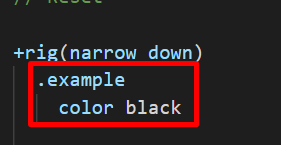
}+rig(narrow max) or +rig(narrow down)
@media (max-width: 980px) {
  .example {
    color: #000;
  }
}
+rig(narrow below)
@media (max-width: 979px) {
  .example {
    color: #000;
  }
}
+rig(1234px min) or +rig(1234pxup)
@media (min-width: 1234px) {
  .example {
    color: #000;
  }
}
+rig(1234px above)
@media (min-width: 1235px) {
  .example {
    color: #000;
  }
}