
freeze-table
v1.2.0
Published
Virtualized React list table — frozen (pinned) columns, drag to resize/reorder/hide, per-column filters, sortable, keyboard row navigation, sticky totals footer, and a built-in column + freeze toolbar. Themeable with CSS variables, per-slot classNames and
Downloads
2,761

Maintainers
 abmishra
Readme
freeze-table
A virtualized React list table for wide, dense, data-entry style screens — the kind with twenty columns, thousands of rows, per-column search boxes, frozen leading columns and a totals row pinned to the bottom.
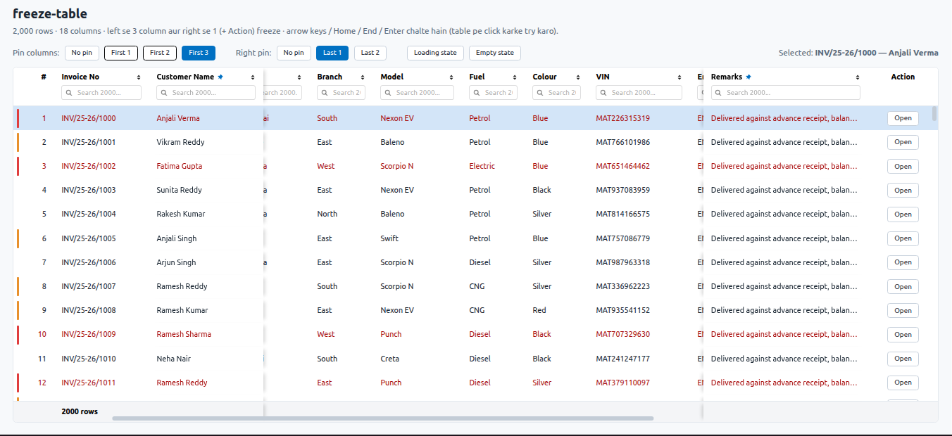
Built on react-table v7, which is bundled
in. No peer install, no UI library, no CSS file to import and nothing to configure to get
started — the handful of glyphs it needs (sort arrows, pin marker, spinner, empty-state
icon) are inline SVG.
And when it does have to match your app, it goes the whole way: CSS-variable tokens (with a built-in dark theme), per-slot class names, replaceable components — hand it your own button, popover and input — or fully unstyled, keeping the freeze and the virtualization and nothing else. See §12.
npm i freeze-tableThat is the whole install. react-table v7 is bundled in (see
Compatibility), so React is the only peer dependency.
import { FreezeTable } from 'freeze-table';

const columns = [
  { type: 'serial', pinned: true },
  { Header: 'Customer', accessor: 'name', width: 200, pinned: true },
  { Header: 'Invoice date', accessor: 'date', type: 'date' },
  { Header: 'Amount', accessor: 'amount', type: 'currency', width: 140, footer: 'sum' },
];

<FreezeTable columns={columns} data={rows} height={560} toolbar />
That table sorts, searches per column, freezes its first two columns, totals the amount column in a sticky footer, and ships its own Columns and Freeze menus.
Why
Most grids either give you a plain HTML table that dies at 2,000 rows, or a full datagrid framework with its own theming system. This one sits in between: it does exactly what an accounting / ERP list screen needs, in a handful of files you can read — a 300-line component shell over one hook per concern.
- Nothing to import but the component. No CSS file, no theme provider, no plugin
registration.
npm i freeze-tableand the table above is the whole setup. - One scrollport, both axes. Header, body and footer are children of the same wide inner div, so horizontal scrolling moves them together — columns never drift apart.
- Frozen columns are real
position: sticky. Nothing runs in JS per scroll frame, so the frozen block does not shake or lag behind the rest of the row. - Rows are windowed by hand (~15 lines) rather than by a virtualization library — which is precisely what keeps the single scrollport, and therefore the sticky freeze, possible.
- Keyboard first. ↑/↓/Home/End/Enter work on mount, without the user clicking in.
- The user's layout is theirs. Freeze boundary, column widths, column order and
hidden columns are all draggable / toggleable at runtime and survive a reload (one
pinStorageKey). Even the Action column can be dragged out of the right-hand end. - Selection repaints imperatively, so arrow-key navigation does not re-render every visible row.
- The config is short.
type: 'currency'is the alignment, the width floor, the ellipsis cell, thetitleand the grouping;footer: 'sum'is the reduce and the formatting.toolbaris the column and freeze menus. Nothing here is a framework you have to adopt — every one of them is a shorthand for something you can still write out.
Table of contents
- Quick start
- Layout and scroll model
- Column config
- Props
- Toolbar and imperative ref API
- Keyboard navigation and body states
- Footer totals
- Frozen (pinned) columns
- Column resizing, hiding and reordering
- Per-row status colouring
- Restoring position on re-entry
- Theming: tokens, classes, slots, unstyled
- Gotchas
- Demo, build, compatibility
- What changed in 1.1
- What changed in 1.0
1. Quick start
import React, { useMemo, useRef } from 'react';
import { FreezeTable } from 'freeze-table';

const COLUMNS = [
  // The 1..N display-order column. No accessor, no Cell, no `disableSortBy`.
  { type: 'serial', pinned: true },

  { Header: 'Customer Name', accessor: 'name', width: 200, pinned: true, footer: 'count' },

  // `type` brings the alignment, the width floor, the ellipsis + title cell and the
  // formatting; `footer: 'sum'` brings the reduce, formatted the same way.
  { Header: 'Invoice date', accessor: 'invoice_date', type: 'datetime' },
  { Header: 'Amount', accessor: 'amount', type: 'currency', width: 140, footer: 'sum' },
];

export default function CustomerList({ byId, fetched, openRow }) {
  const tableRef = useRef(null);
  const columns = useMemo(() => COLUMNS, []);
  const data = useMemo(() => Object.values(byId), [byId]);

  return (
    <FreezeTable
      ref={tableRef}
      columns={columns}
      data={data}
      height={560}
      status={fetched ? 'ready' : 'loading'}
      toolbar                      // Columns + Freeze menus, rendered for you
      locale="en-IN"
      currencySymbol="₹"
      pinStorageKey="customer-list"
      onRowEnter={(row) => openRow(row)}
    />
  );
}
Nothing above is required except columns and data. Everything else — type,
footer, toolbar, status, pinStorageKey — is a shorthand you can drop back down to
its longhand (Cell, Footer, your own menus, loading + dataFetched, the ref API) the
moment a screen needs something the shorthand does not cover.
Writing it the long way
The same two columns without any shorthand, which is what every version before 1.0 required — and still works exactly as it did:
{ Header: '#', id: 'sl', width: 50, minWidth: 50, align: 'right',
  disableFilters: true, disableSortBy: true,
  Cell: ({ row, rows }) => rows.indexOf(row) + 1 },

{ Header: 'Amount', accessor: 'amount', width: 140, minWidth: 140, align: 'right',
  Cell: ({ value }) => (
    <div style={ELLIPSIS}>{Number(value || 0).toLocaleString('en-IN', { minimumFractionDigits: 2 })}</div>
  ),
  Footer: (info) => info.rows
    .reduce((s, r) => s + Number(r.values.amount || 0), 0)
    .toLocaleString('en-IN', { minimumFractionDigits: 2 }) },
Both columns and data should be memoized — see Gotchas.
Exports
| Export | What it is |
|---------------|------------------------------------------------------------------|
| FreezeTable | The component (also the default export) |
| CommonTable | Alias of FreezeTable, for projects migrating off a local copy |
| ELLIPSIS | Shared single-line-ellipsis style object for custom Cells |
TypeScript definitions ship with the package (index.d.ts) — FreezeTableProps,
FreezeTableColumn, FreezeTableHandle are all exported as types.
2. Layout and scroll model
ft-root  (position: relative, the `height` you pass)
├── ft-wrap  (overflow: auto, native bars hidden) ← THE scrollport for BOTH axes
│   └── inner div (minWidth: totalColumnsWidth, flex column, minHeight 100%)
│       ├── ft-head   (position: sticky; top: 0)     ← labels + sort + search boxes
│       ├── body      (position: relative, height = rows * rowHeight)
│       │   └── ft-row (position: absolute, top = index * rowHeight) → ft-td cells
│       └── ft-foot   (position: sticky; bottom: 0)  ← optional totals row
├── ft-track ft-track-v  (inset by the header/footer heights) ← overlay vertical bar
└── ft-track ft-track-h ← overlay horizontal barheightis the TOTAL height (header + body + footer), not the body height. The band left for rows is measured with aResizeObserver, so rows fill the gap exactly — no clipped last row, no second scrollbar on the page.- There is exactly one vertical and one horizontal scrollbar, both on
ft-wrap. - Only the rows in
[firstIdx .. lastIdx](viewport ± 6) are mounted; each is absolutely positioned inside a container of the full content height, so the native scrollbar still represents the whole list. - The header/footer stay put because they are
sticky, not because anything is repositioned in JS.
Why the scrollbars are drawn, not native
ft-wrap covers the header and the footer as well as the rows, so its native vertical
scrollbar ran the full height of the table — a thumb sitting beside the header reads
as wrong, since the header does not scroll.
Moving that bar onto the body is not possible while the columns freeze: an element that scrolls in y is a scroll container in x too, so the body would become the sticky scrollport for the pinned cells and they would slide away with the rest of the row (this is exactly the react-window problem the component was rewritten to escape).
So the native bars are hidden and redrawn as overlays — the vertical track inset by the
measured header and footer heights, so it spans the rows only. Both bars are drawn
rather than just the vertical one because Firefox's scrollbar-width takes no axis, and
drawing both keeps them identical across browsers. Wheel, trackpad, keyboard and
touch scrolling all remain fully native; the thumbs are positioned from the same
rAF-throttled handler that drives the windowing, so nothing extra re-renders. Dragging a
thumb temporarily suspends row snapping, which would otherwise make the drag feel
sticky.
3. Column config
{
  Header,           // string | node
  label,            // plain-text name for the Columns / Freeze menus. REQUIRED when
                    //   Header is a node — a menu entry cannot render an element, and
                    //   without it the column is listed by its field name
  accessor,         // field key, or (row) => value (an accessor fn also needs `id`)
  id,               // required when accessor is a fn or absent
  type,             // 'text' | 'number' | 'currency' | 'date' | 'datetime' | 'boolean' | 'serial'
  footer,           // 'sum' | 'avg' | 'min' | 'max' | 'count' | node | fn(info)
  format,           // (value, row) => node — a one-off formatter, no Cell needed
  decimals,         // number/currency decimal places (currency defaults to 2)
  dateFormat,       // per-column override of the table's date pattern
  booleanLabels,    // [whenTrue, whenFalse] for a boolean column
  blankZero,        // render 0 as blank (default: true for text, false for numbers)
  Cell,             // optional renderer; default prints the raw value with ellipsis + title
  width,            // px — on its own this is ALSO the minWidth
  minWidth,         // px (defaults to `width`, else 90)
  maxWidth,         // px
  align,            // 'left' | 'center' | 'right' — header, cells and footer
  disableFilters,   // hide this column's search box
  disableSortBy,    // no sorting on this column
  Footer,           // string | node | fn(tableInstance) — see §7
  noPadding,        // drop the default cell/header padding
  pinned,           // DEFAULT freeze state: true / 'left' / 'right' — see §8
  hidden,           // DEFAULT visibility: true = start hidden — see §9
  hideable,         // false = can never be hidden (a key column)
  disableResizing,  // no drag-to-resize grip on this column
  Filter,           // custom filter UI (e.g. a dropdown for an enum column)
  filter,           // custom react-table filter fn (rows, columnIds, filterValue)
}
Column types
type is a shorthand for the four or five lines a column of that kind always needed.
It only fills in what you did not write — { type: 'currency', align: 'left' } is a
left-aligned currency column, not an argument.
| type | Fills in |
|-------------|--------------------------------------------------------------------------------------|
| text | ellipsis cell with a title (the default renderer, named) |
| number | right-aligned, locale grouping, decimals (default: as they come, max 3) |
| currency | right-aligned, locale grouping, 2 decimals, optional currencySymbol prefix |
| date | minWidth: 110, formatted with dateFormat (default 'DD-MM-YYYY') |
| datetime | minWidth: 150, formatted with dateTimeFormat (default 'DD-MM-YYYY HH:mm') |
| boolean | centred, ✓ / blank — override with booleanLabels: ['Yes', 'No'] |
| serial | the whole 1..N display-order column: # header, 50px, right-aligned, no sort/search |
Date columns accept a Date, an epoch number, an ISO string, or the
'YYYY-MM-DD HH:mm:ss' a SQL backend hands back (Safari refuses that one until the space
becomes a T, which is handled here). Anything unparseable is printed as it came,
never as Invalid Date. Format tokens: YYYY YY MMM MM DD HH hh mm ss A.
serial counts through rows — the filtered and sorted set — so the numbering stays
1..N after any sort or search.
A zero renders as blank in text (and untyped) columns and as a real 0 in numeric
ones. These lists are financial: a column of zeros is noise, but a formatted 0.00 in an
amount column is information. blankZero overrides it either way.
Footer shorthands
footer: 'sum' computes over info.rows — the filtered rows, so the total follows
the search boxes — and formats the result with the column's own formatter, so a currency
total lands with the same decimals and grouping as the cells above it. 'avg', 'min',
'max' and 'count' work the same way. Non-numeric and blank values are skipped rather
than turning the total into NaN.
Footer (the react-table key) still works and wins if you give both.
Widths are pixels, not flex weights
react-table computes totalWidth = min(max(minWidth, width), maxWidth), and
useFlexLayout only emits a real flex-grow when column.canResize is set — which only
useResizeColumns does, and this component does not use it. So every cell renders
flex: 0 0 auto at totalWidth px, and nothing stretches to fill leftover space.
A width on its own sets the minWidth too, so one number means one width:
{ width: 45 } renders 45px. (Before 1.0 it rendered 90px — react-table's floor — and
the fix was to repeat the number, which is why every older config says
width: 120, minWidth: 120. Those still mean exactly what they did.)
Set both when you want a column that renders wider than its floor. A width below an
explicit minWidth is still ignored (width: 2.4, minWidth: 200 → a 200px column).
A dragged width (§9) overwrites width, minWidth and maxWidth with the same
number, precisely so that expression collapses to it — the config's floor and ceiling are
the default, and an explicit drag outranks both.
What Cell receives
Cell gets the table instance spread, so:
- custom props you pass to the table are readable —
userListis forwarded:Cell: ({ value, userList }) => ... - core instance fields are available too — e.g. a display-order serial column:
Cell: ({ row, rows }) => rows.indexOf(row) + 1. Usingrows(the filtered + sorted set) keeps the numbering 1..N after any sort or filter;row.indexalone would shuffle.
context is the general-purpose version of the same thing, and the intended way for a
cell to reach your callbacks:
<FreezeTable columns={columns} data={rows} context={{ openPopup, canEdit }} />

{ Header: 'Customer', accessor: 'name',
  Cell: ({ value, row, context }) => (
    <a onClick={() => context.openPopup(row.original)}>{value}</a>
  ) }
That keeps columns a module-level constant. The older way — a factory rebuilt in
the caller — still works, and is what you want when a column's structure (not just its
callbacks) depends on props:
const columns = useMemo(() => makeColumns(openPopup), []);Auto-appended columns
__strip— prepended whenrowStripColoris given: the narrow status-bar column (stripWidth, default 14px). Unsortable, unfilterable, auto-freezes with the pinned run.__actions— added whenActionsis given: the Action column (minWidth: actionWidth, default 110). Renders<Actions object={row.original} fn={fn} />— note there is no row index. It starts at the right-hand end (actionIndex), but it is a real column: the user can drag it anywhere, and it freezes with whichever frozen run it ends up inside (§8, §9).
Date columns
type: 'datetime' covers it — including the 150px floor that keeps DD-MM-YYYY HH:mm
from being clipped:
{ Header: 'Created', accessor: 'created_at', type: 'datetime' }For a pattern this column alone needs, add dateFormat; to change it for the whole
table, use the dateFormat / dateTimeFormat props. For anything the tokens cannot
express, format: (v) => myOwnFormatter(v) keeps the ellipsis cell and drops the parsing.
4. Props
| Prop | Default | Meaning |
|---------------------|-----------------------|----------------------------------------------------------------------|
| columns | (required) | Column config array. Memoize it |
| data | (required) | Row array. Memoize it |
| height | 500 | Total table height — a number is px, '100%' / '60vh' / 'calc(…)' / 'fill' are used as-is |
| toolbar | false | Render the built-in Columns and Freeze menus (§5) |
| rowHeight | 44 | Row height px (a dense list uses 35) |
| fontSize | 12 | Drives cells, header labels and footer (dense: 11) |
| Actions | — | Component for the auto-appended Action column |
| fn | — | Passed straight through to Actions as its fn prop |
| actionWidth | 110 | Action column min width px |
| pinActions | false | Freeze just the Action column against the edge it sits at (§8) |
| actionIndex | 'last' | Where the Action column starts — 'first', 'last' or an index (§9) |
| userList | — | Forwarded onto the table instance → readable in every Cell |
| context | — | Also forwarded — the intended way for a Cell to reach your callbacks (§3) |
| locale | browser | BCP-47 locale for number / currency columns, e.g. 'en-IN' |
| currencySymbol | — | Prefix for currency cells and totals |
| dateFormat | 'DD-MM-YYYY' | Pattern for date columns |
| dateTimeFormat | 'DD-MM-YYYY HH:mm' | Pattern for datetime columns |
| status | — | 'idle' \| 'loading' \| 'ready' — one prop instead of loading + dataFetched (§6) |
| sortable | true | Master switch for sorting |
| searchable | true | Master switch for the per-column search boxes |
| loading | false | Spinner + loadingText instead of the body — superseded by status |
| dataFetched | true | Gate for the empty state — superseded by status (§6) |
| emptyText | 'No records found' | Empty-state copy |
| loadingText | 'Fetching records…' | Loading-state copy |
| footerLeft | null | Static left-aligned footer label (prefer a column Footer — §7) |
| showFooter | auto | Override footer visibility |
| rowNavigation | true | Keyboard row navigation (§6) |
| rowSnap | false | Settle vertical scrolling on a row boundary once it stops (§6) |
| onRowSelect | — | (rowData, index) on every selection change |
| onRowEnter | — | (rowData, index) on Enter — "open this row" |
| selectedBg | --ft-row-selected | Selected-row highlight colour |
| rowIdKey | 'id' | Field initialSelectedId matches against |
| initialSelectedId | null | Re-select + scroll to this row once, after the rows load |
| initialScrollLeft | 0 | Restore horizontal scroll once, after the rows load |
| rowStripColor | — | (rowData) => color \| null — coloured status bar column (§10) |
| rowStripTitle | — | (rowData) => string — hover tooltip on the strip cell |
| rowStyle | — | (rowData) => ({ backgroundColor?, color? }) — full-row tint (§10) |
| stripWidth | 14 | Strip column width px |
| pinStorageKey | — | Persist the freeze boundaries, column widths, hidden columns and column order in localStorage (§8, §9) |
| resizable | true | Drag-to-resize grip on every header's right edge (§9) |
| reorderable | true | Drag a header sideways to move that column (§9) |
| minColumnWidth | 48 | Floor for a drag-resized column, px (§9) |
| onColumnResize | — | (id, width, widths) — width is null on a reset (§9) |
| onColumnVisibilityChange | — | (hiddenIds) whenever a column is hidden or shown (§9) |
| onColumnOrderChange | — | (order) whenever the column order changes (§9) |
| defaultLayout | — | Starting layout for a table with nothing stored yet (§5) |
| onLayoutChange | — | (layout) whenever any part of the layout changes (§5) |
| theme | — | 'light' \| 'dark' \| 'auto' — the built-in palettes (§12) |
| tokens | — | Design tokens as inline custom properties, e.g. { accent: '#7c3aed' } (§12) |
| classNames | — | A class per slot, merged after the built-in one (§12) |
| components | — | Replace a slot outright — your button, popover, input (§12) |
| unstyled | false | No paint and no injected stylesheet; the freeze still works (§12) |
| styleNonce | — | nonce for the injected <style>, for a strict CSP (§12) |
| styleTarget | root node | Where to inject the stylesheet — set it for a shadow root (§12) |
| className | — | Extra class on the root element (applied after classNames.root) |
| style | — | Extra inline styles merged onto the root element (wins over tokens) |
5. Toolbar and imperative ref API
Two ways to drive the table from outside. Start with the toolbar; drop to the ref when you want the menus to look like the rest of your app.
The built-in toolbar
<FreezeTable columns={columns} data={rows} toolbar />That renders a strip above the header with two menus:
- Columns — show / hide (locked columns are listed but disabled), move a column one place either way, and Show all / Reset widths / Reset order. It stays open while you toggle, so several changes are one visit.
- Freeze — "Up to " for the left edge and "From " for the right, plus No freeze. Entries past what the viewport allows are disabled, not hidden, so the menu shows why a column cannot be frozen instead of quietly omitting it. The button carries the current counts.
Every choice hands focus back to the rows, so the arrow keys keep working without a click.
Pass an object to configure it:
toolbar={{
  columns: true,                     // show the Columns menu (default true)
  pin: false,                        // drop the Freeze menu
  left: <strong>Invoices</strong>,   // your own content, left-aligned
  right: <button onClick={refresh}>Refresh</button>,   // …and just before the menus
}}
The toolbar sits outside the scrollport, so it does not disturb the freeze — and it
counts towards height, which is the whole table box.
The ref
const tableRef = useRef(null);
<FreezeTable ref={tableRef} … />
Everything the toolbar does is here too, so a menu of your own is still a first-class option — that is all the built-in one is.
| Method | Meaning |
|--------------------|----------------------------------------------------------------------------|
| focus() | Re-focus the table container — e.g. return focus to the selected row after a modal closes |
| getScrollLeft() | Current horizontal offset — stash it before navigating away (§11) |
| selectRow(i) | Select + scroll to + focus row i |
| getLeftPinCount() | Current effective (viewport-capped) left boundary; 0 = none |
| getMaxLeftPinCount() | Largest left boundary the viewport allows — disable menu entries beyond it |
| setLeftPinCount(n) | Freeze the first N caller columns against the left edge |
| getRightPinCount() | Current effective right boundary; 0 = none |
| getMaxRightPinCount() | Largest right boundary the viewport allows |
| setRightPinCount(n) | Freeze the last N caller columns against the right edge |
| getColumnWidths() | User-resized widths only, as an id -> px map (§9) |
| setColumnWidth(id, px) | Set one column's width (clamped to minColumnWidth) |
| resetColumnWidths(id?) | Clear one override, or all of them when called with no argument |
| getHiddenColumns() | Ids of the currently hidden columns |
| setHiddenColumns(ids) | Replace the hidden set (hideable: false ids are ignored) |
| toggleColumn(id, visible?) | Hide/show one column — omit visible to flip it |
| showAllColumns() | Un-hide everything |
| getColumnOrder() | The current order as a flat list of ids — display order, hidden columns included, '__actions' among them (§9) |
| setColumnOrder(ids) | Replace the order; ids you leave out are slotted back in beside their configured neighbours. null restores the config order |
| moveColumn(id, i) | Move one column to position i of getColumnOrder() |
| resetColumnOrder() | Back to the order of your columns array |
| getColumnList() | [{ id, index, position, header, hidden, hideable, resizable, movable, width }] — everything a column menu needs, in display order, Action column included |
| setColumnWidths(map) | Replace the whole id -> px map at once |
| getLayout() | The whole layout as one object: { pins: { left, right }, widths, hidden, order } |
| setLayout(layout) | Apply one. Every key is optional; null restores the column config |
| resetLayout() | Drop every user layout choice |
Both boundaries persist when pinStorageKey is set. getPinCount / getMaxPinCount /
setPinCount are the pre-0.6 names for the three left-hand methods — they still work,
but nothing in those names said which edge they meant, hence the rename.
Saving a layout per user
pinStorageKey persists the layout in localStorage, which is per browser. getLayout()
is the same state as a plain object, so it can be stored per user instead — saved
views, a layout that follows someone between machines, an "apply this preset" button:
<FreezeTable
  ref={tableRef}
  defaultLayout={savedView}                       // what the server had
  onLayoutChange={(layout) => saveView(layout)}   // any change: pins, widths, hidden, order
/>
onLayoutChange is the one callback for all four choices — the three onColumn*
callbacks cover only their own slice, and the freeze boundaries have none of their own.
Priority when a table mounts: localStorage (if pinStorageKey is set) → defaultLayout
→ the column config. Freeze counts come back uncapped, so a boundary saved on a wide
screen is not permanently trimmed by the window it was read from.
selectRow(0) is the one you reach for on a list that re-fetches on a Search click:
the table is already mounted, so the mount-time focus effect will not fire again and
focus would otherwise stay on the Search button, leaving the arrow keys dead until the
user clicks the table.
6. Keyboard navigation and body states
- The first render selects and highlights row 0 and focuses the table, so the arrows work immediately.
- ↑ / ↓ move the selection (auto-scrolling it into view), Home / End jump to the
first / last row, click selects, Enter fires
onRowEnter. - Typing inside an
INPUT/TEXTAREA/SELECTis never hijacked, so the per-column search boxes behave normally. - The selection highlight is painted imperatively: rows are a
React.memothat reads the selected index from a ref, and an effect updates only the affected DOM nodes. Without this, every keypress re-rendered every visible row — visibly laggy on icon-heavy lists. - Selection is index-based: after a sort the highlight stays at the same position
(a different logical row). Track ids yourself via
onRowSelectif you need otherwise. - Turn the whole thing off with
rowNavigation={false}.
Body states
status is one prop with three values:
| status | Body |
|-------------|-------------------------------------------------------------|
| 'loading' | the spinner and loadingText |
| 'ready' | the rows — or emptyText when there are none |
| 'idle' | neither: nothing has been asked for yet |
The 'idle' state is the one worth knowing about: before the first fetch there are no
rows and nothing is loading, and "No records found" over a list nobody has searched yet
is a lie. That is what the old loading + dataFetched pair encoded between them — two
booleans that had to be wired together correctly, in the right order, on every screen.
Both still work, and status wins when you pass it.
Row-boundary scroll snapping (rowSnap, off by default)
Because ft-wrap is the single scrollport and the header is sticky inside it, rows
scroll under the header, so a freely-scrolled list leaves a partial row along the
header's bottom edge. rowSnap settles the scroll on a row boundary instead, the way a
spreadsheet does, so the topmost row is always whole.
It is off by default, because snapping and continuous scrolling genuinely trade against each other: every wheel notch gets re-settled onto a row, and that reads as the list catching and stuttering rather than gliding. Free scrolling feels better to most people than a guaranteed whole top row; turn it on if your screen is dense enough for the partial row to matter.
When enabled it is CSS — scroll-snap-type: y proximity plus scroll-snap-align: start
on each row, with scroll-padding-top set to the measured header height so a snapped row
lands just below the header rather than at the hidden top of the scrollport. Snapping
is suspended while the wheel is turning and restored ~160 ms after it stops, so the
scroll glides and settles once at the end instead of catching on every notch. Dragging a
scrollbar thumb suspends it too. The horizontal axis is never snapped.
proximity, not mandatory: rows are windowed, so snap targets appear and disappear as
you scroll, and mandatory snapping fights both that and programmatic scrolls.
Body states, in order: loading → spinner; rows.length === 0 && dataFetched → the
soft empty state; otherwise the list.
Gotcha:
dataFetcheddefaults totrueandloadingtofalse, so passing neither flashes "No records found" before the first fetch ever returns. Wire both from your own fetch flag:<FreezeTable loading={!fetched} dataFetched={fetched} … />
7. Footer totals
Any column can define Footer (string, node, or a function). A footer function
receives the table instance, so info.rows are the filtered rows — totals and counts
update live as the user types in a column search box:
Footer: (info) => `Voucher Count : ${info.rows.length}`

Footer: (info) => info.rows
  .reduce((s, r) => s + Number(r.values.debit || 0), 0)
  .toLocaleString('en-IN', { minimumFractionDigits: 2 })
Use align: 'right' on amount columns so the total lines up under the values.
footerLeft renders a single left-aligned label, but it is a static overlay outside
react-table — it cannot see the filtered rows. For a live record count, use a Footer
function on the first data column instead.
The footer appears automatically when any column has a Footer or footerLeft is set;
override with showFooter.
8. Frozen (pinned) columns
Columns freeze against either edge, and each side is described by a single number:
| Side | Column config | The count | Rides along |
|---|---|---|---|
| Left | pinned: true / pinned: 'left' | pinCount — how many leading columns | the status strip |
| Right | pinned: 'right' | rightPinCount — how many trailing columns | the Action column |
Freezing only makes sense as a run against its own edge — a frozen column in the middle would have its neighbours scroll out from under it — so only a leading run counts on the left and only a trailing run on the right. A flag after the first unflagged column (or, on the right, before the last one) is ignored.
Both counts speak in terms of the columns currently on screen: a hidden column (§9)
is not counted, so "first 3" with the second column hidden freezes the 1st, 3rd and 4th
of your columns array.
The status strip freezes left whenever
pinCount > 0— it sits left of everything and would otherwise be stranded outside the block.The Action column freezes with whichever run it lies inside. Left at its default position that means the right-hand one, exactly as before; drag it (§9) in front of a left-frozen run and it freezes there instead; park it in the middle of the scrolling columns and it cannot freeze at all, because a frozen run has to stay contiguous.
To freeze only the row's actions, pass
pinActionsand leaverightPinCountat 0. Keeping the row controls reachable without scrolling back is the commonest reason to want anything frozen on the right, and it should not force a data column along with it (this too follows the column wherever it sits, and is ignored in the middle):<FreezeTable columns={columns} data={rows} Actions={RowActions} pinActions />The user changes the boundaries at runtime through
setLeftPinCount(n)andsetRightPinCount(n)on the ref (0 = no freezing on that side). WithpinStorageKeyset, both choices persist —localStorage["ctPin:<key>"]and["ctPinR:<key>"]— and beat the config flags on the next mount.Each boundary column shows a small blue pin in its header: the last frozen column on the left, the first on the right. That is the only indicator on purpose — an icon on every frozen column ate header width and truncated the labels.
The left block casts a shadow to its right once the table is scrolled; the right block casts one to its left until the scroll reaches the end.
Viewport cap. The frozen blocks are hard-capped so at least 250px of viewport is
always left for the scrolling columns (getMaxLeftPinCount() / getMaxRightPinCount()). The
right block is measured first and the left one funded from what remains, so the two caps
cannot both claim the same viewport. A stored-but-too-large boundary is clamped at
render, so a persisted over-wide choice self-corrects. Freezing wider than the viewport
would leave no room to actually read the scrolling columns.
The freeze menu
toolbar renders one (§5). If you want it in your own design system, the component's
state is fully addressable through the ref: list No pin plus every column ("pin up to
here" semantics), read getLeftPinCount() when the menu opens, and disable entries past
getMaxLeftPinCount(). The right-hand block works the same way through
getRightPinCount() / setRightPinCount():
const openPinMenu = () => {
  setCurrent(tableRef.current.getLeftPinCount());
  setMax(tableRef.current.getMaxLeftPinCount());
  setOpen(true);
};

const pickPin = (n) => {
  tableRef.current.setLeftPinCount(n);
  tableRef.current.focus();   // hand the arrow keys back to the rows
  setOpen(false);
};
If your list also has single-letter keyboard shortcuts, include the menu-open state in their guard so they do not fire while the menu is up.
How the freeze works
Plain CSS position: sticky on the header, body and footer cells of every frozen
column — left: <total width of the frozen columns before it> for the left block, and
the mirror image, right: <total width of the frozen columns beyond it>, for the right. Nothing runs in JS per
scroll frame — that is the entire point. An earlier design counter-translated every
frozen cell from the scroll handler, and because JS repositions them a frame after the
compositor has already scrolled the rest, the frozen block visibly shook during
horizontal scroll.
Sticky only works because ft-wrap is the single scrollport for both axes — which is why
the rows are windowed by hand rather than by a virtualization library whose own
overflow container would become the sticky scrollport for the body cells and break the
freeze.
Frozen body cells use background: inherit, so they track the row's selection / hover /
status background with no extra bookkeeping. The last frozen column gets a right-hand
shadow once the table is scrolled.
9. Column resizing, hiding and reordering
Three more per-user layout choices, built the same way as the freeze boundary (§8): the
column config carries the default, the user's choice lives in the table's own state,
and the caller drives it through the ref. All three persist under pinStorageKey.
Resizing
Every header except the status strip carries a drag grip on its right edge — invisible until you hover it, then a thin blue line. Drag it to resize; double-click it to drop the override and go back to the configured width.
<FreezeTable
  columns={columns}
  data={rows}
  resizable            // default true — pass false to switch every grip off
  minColumnWidth={48}  // the drag cannot go below this
  pinStorageKey="sales-invoice-list"          // widths survive a reload
  onColumnResize={(id, width) => log(id, width)}
/>- Per column:
disableResizing: truedrops that column's grip. - The Action column is resizable too — a dragged width replaces the
actionWidthprop for that list. - The drag paints a guide line and commits the width once, on release. It deliberately does not resize live: the column defs are what the memoized rows hang off, so a per-frame width would re-render every visible row sixty times a second. This is also what Excel and Sheets do.
- A resized frozen column widens the frozen block, so the pin cap (§8) may quietly reduce the effective freeze count — the frozen block never gets to eat the viewport.
Hiding
// column config: the DEFAULT only
{ Header: 'Engine No', accessor: 'engine', width: 140, minWidth: 140, hidden: true }
{ Header: 'Invoice No', accessor: 'invoice', width: 150, minWidth: 150, hideable: false }
tableRef.current.toggleColumn('engine'); // flip one column
tableRef.current.toggleColumn('engine', true); // or say which way
tableRef.current.setHiddenColumns(['engine', 'vin']);
tableRef.current.showAllColumns();toolbar renders the menu (§5); building your own works exactly like the freeze menu.
getColumnList() gives you
one entry per caller column — { id, index, header, hidden, hideable, resizable, width }
— so the menu never has to re-derive any of it from your column config:
{tableRef.current?.getColumnList().map((c) => (
  <label key={c.id}>
    <input
      type="checkbox"
      checked={!c.hidden}
      disabled={!c.hideable}
      onChange={() => {
        tableRef.current.toggleColumn(c.id);
        forceUpdate();          // the table owns the state; re-render your menu
      }}
    />
    {c.header || c.id}
  </label>
))}
Things worth knowing:
- A hidden column is gone from the layout, not merely invisible: the freeze counts and the sticky offsets are computed from the visible columns only. Pin "first 3" with the second column hidden and you freeze the 1st, 3rd and 4th.
- Its filter and sort stop applying while it is hidden, and come back when it is shown again (react-table keeps the state, and skips sort/filter entries whose column is not currently mounted).
- Its footer total goes with it — hide the Amount column and the footer loses that cell.
- A column needs an
id(or a stringaccessor) to be hidden or resized — a column with only an accessor function cannot be addressed. react-table demands anidfor those columns anyway. hideable: falselocks a column visible even againsthidden: true, and hiding every column falls back to showing them all — a blank table has no header to un-hide from.
Reordering
Drag a header sideways to move that column. The drag arms only after a few pixels, so an ordinary click still sorts; while it is armed the header dims and a blue line shows where the column will land, and the order is committed on release. Dragging near either edge of the table auto-scrolls, so a column can be carried across a table far wider than the screen.
The Action column moves like any other column — actionIndex only says where it
starts:
<FreezeTable
  columns={columns}
  data={rows}
  Actions={RowActions}
  actionIndex="first"      // 'last' (default) | 'first' | an index into `columns`
  reorderable              // default true — pass false to lock every header
  pinStorageKey="sales-invoice-list"
  onColumnOrderChange={(order) => log(order)}
/>- Per column:
disableReordering: truelocks that one in place. - The status strip is never movable — it belongs to the row, not to your columns.
- Reordering is a mouse gesture. On a touch screen, dragging a header sideways is how the table is panned, and hijacking it would leave a wide table unscrollable.
- A moved column keeps its sort, its filter and its width; what changes is where it sits, which is also what the freeze counts and the sticky offsets are computed from. Drag a column into the frozen run and it is frozen.
Driving it from a menu instead — getColumnList() comes back in display order, with a
position (the index moveColumn takes) and a movable flag, and includes the Action
column:
{tableRef.current?.getColumnList().map((c, i, list) => (
  <div key={c.id}>
    {c.header || c.id}
    <button disabled={!c.movable || i === 0}
            onClick={() => { tableRef.current.moveColumn(c.id, c.position - 1); forceUpdate(); }}>↑</button>
    <button disabled={!c.movable || i === list.length - 1}
            onClick={() => { tableRef.current.moveColumn(c.id, c.position + 1); forceUpdate(); }}>↓</button>
  </div>
))}
getColumnOrder() / setColumnOrder(ids) deal in the whole list at once, and
resetColumnOrder() goes back to your columns array. A stored order is merged with
the current config rather than trusted wholesale: ids the config no longer has are
dropped, and a column you have since added lands next to the neighbour you configured it
after — not dumped at the end as though the user had moved it there.
What gets persisted
With pinStorageKey="sales-invoice-list":
| Key | Holds |
|----------------------------------|------------------------------------------|
| ctPin:sales-invoice-list | left freeze count |
| ctPinR:sales-invoice-list | right freeze count |
| ctW:sales-invoice-list | {"<columnId>": <px>} — resized columns only |
| ctHide:sales-invoice-list | ["<columnId>", …] — hidden columns |
| ctOrd:sales-invoice-list | ["<columnId>", …] — the column order, "__actions" included |
Without the key nothing is stored and every choice lasts until unmount — unless you
persist it yourself, which is what getLayout() / onLayoutChange are for (§5). The two
can be combined: pinStorageKey for the fast per-browser restore, onLayoutChange for
the copy that follows the user to another machine.
10. Per-row status colouring
Two independent, optional props for lists where a row carries a state (cancelled, failed to post, …). Both take the raw row object and should be pure functions.
rowStripColor(rowData) => color | null prepends a narrow column drawing a coloured
bar at the left edge of the row. Return a falsy value for rows with no state. It is a
real column, so it stays aligned with the header and scrolls with the row.
Pick a saturated colour. A pale tint that reads fine across a whole row (
#ffe6e6) is invisible in a 4px bar.
rowStyle(rowData) => ({ backgroundColor?, color? }) tints the whole row. A returned
backgroundColor wins over the selection and hover highlights — a status colour must
never be masked by the blue selected-row background (row 0 is auto-selected on mount,
which would otherwise hide its status the instant the list loads). Rows returning no
backgroundColor highlight as normal.
Prefer the strip when the tint would be loud (a whole orange row is hard to read); use both only when the row colour is itself the requirement.
const STRIP = { Cancelled: '#e03e3e', Pending: '#e8912d', Posted: '#2aa76a' };

<FreezeTable
  rowStripColor={(r) => STRIP[r.status] || null}
  rowStripTitle={(r) => r.status}
  rowStyle={(r) => (r.status === 'Cancelled' ? { color: '#a11' } : undefined)}
/>
11. Restoring position on re-entry
When the list unmounts on navigation (list → edit → back), both scroll axes reset. Restore them with the pair below — each is applied once, after the rows load:
initialSelectedId(+rowIdKey) → vertical scroll + re-highlights the rowinitialScrollLeft→ horizontal scroll (without it a wide table always snaps back to column 1)
Stash both in module-scope variables — they survive the unmount:
let lastSelectedId = null;
let lastScrollLeft = 0;

export default function List() {
  const tableRef = useRef(null);

  const goToEdit = (row) => {
    lastSelectedId = row.id;
    lastScrollLeft = tableRef.current ? tableRef.current.getScrollLeft() : 0;
    navigateToEdit(row.id);
  };

  return (
    <FreezeTable
      ref={tableRef}
      initialSelectedId={lastSelectedId}
      initialScrollLeft={lastScrollLeft}
      onRowSelect={(row) => { lastSelectedId = row.id; }}
      onRowEnter={goToEdit}
    />
  );
}
Both restore effects intentionally have no dependency array — they retry on each render until the rows and the measured body height exist, then latch via a ref.
12. Theming: tokens, classes, slots, unstyled
The table is designed to sit inside someone else's UI. Four layers, each off by default, each reaching something the one before it cannot:
| Layer | Prop | Use it when |
|-------|------|-------------|
| 1. Tokens | theme, tokens | You want the built-in table, in your colours |
| 2. Classes | classNames | You write utility CSS and would rather pass classes than author a stylesheet |
| 3. Slots | components | You have a design system and want its button, popover and input |
| 4. Unstyled | unstyled | You want the freeze and the virtualization, and nothing else |
They compose. Most apps need only the first.
12.1 Why tokens and not props
Colour in this component lives in three places, and only a CSS custom property reaches all three:
- inline styles on the header, rows, cells and footer — an inline declaration beats
any stylesheet rule, so
.ft-row { background: … }from your CSS would never apply; - the injected stylesheet's pseudo-class rules —
.ft-btn:hover,.ft-btn:focus-visible,.ft-menu-item[aria-checked="true"],.ft-thumb:active,.ft-resizer:hover::after. Two thirds of the colours are here, and no prop can express a:hover; - a JS handler, for the row hover — the row background is written directly onto
element.style, which not even!importantin your CSS can beat cleanly.
An inline style may hold a var(), and it resolves against the element's own cascade.
So one variable set on .ft-root reaches a value that JavaScript wrote.
12.2 The token list
56 tokens. The ten marked ★ are the core: everything else derives from them, so setting those six or seven re-themes the whole table, and setting one specific token re-themes exactly one thing.
| Token | Light default | Dark |
|-------|---------------|------|
| --ft-bg ★ | #ffffff | #0f172a |
| --ft-surface ★ | #f4f5f7 | #1e293b |
| --ft-text ★ | #000000 | #e2e8f0 |
| --ft-text-muted ★ | #8a94a6 | #94a3b8 |
| --ft-border ★ | #e3e8ee | #334155 |
| --ft-accent ★ | #0070C2 | #38bdf8 |
| --ft-accent-soft ★ | #e9f2fb | #1e3a5f |
| --ft-accent-text ★ | #0a4d84 | #7dd3fc |
| --ft-radius ★ | 4px | (unchanged) |
| --ft-font ★ | inherit | (unchanged) |
| --ft-header-bg | var(--ft-bg) | — |
| --ft-header-text | var(--ft-text) | — |
| --ft-row-bg | var(--ft-bg) | — |
| --ft-row-hover | #eef4fb | #1e293b |
| --ft-row-selected | #d3e5f8 | #1e3a5f |
| --ft-row-border | #edf0f3 | #1e293b |
| --ft-foot-bg | var(--ft-surface) | — |
| --ft-foot-text | var(--ft-text) | — |
| --ft-toolbar-bg | #fbfcfd | #111c30 |
| --ft-menu-bg | var(--ft-bg) | — |
| --ft-menu-border | #dde3ea | #334155 |
| --ft-menu-text | #243447 | #e2e8f0 |
| --ft-menu-head-text | #66738a | #94a3b8 |
| --ft-menu-item-hover | #f0f5fa | #1e293b |
| --ft-menu-item-active-bg | var(--ft-accent-soft) | — |
| --ft-menu-item-active-text | var(--ft-accent-text) | — |
| --ft-menu-sep | #eceff3 | #334155 |
| --ft-menu-move-text | #8794a8 | #94a3b8 |
| --ft-menu-move-hover | #dfe7f0 | #334155 |
| --ft-radius-menu | 6px | (unchanged) |
| --ft-btn-bg | var(--ft-bg) | — |
| --ft-btn-text | var(--ft-menu-text) | — |
| --ft-btn-border | #d7dde5 | #334155 |
| --ft-btn-hover-bg | #f2f6fa | #1e293b |
| --ft-btn-hover-border | #c2ccd8 | #475569 |
| --ft-btn-active-bg | var(--ft-accent-soft) | — |
| --ft-btn-active-border | #9dc4e8 | #38bdf8 |
| --ft-input-bg | var(--ft-bg) | — |
| --ft-input-text | rgba(0,0,0,.87) | #e2e8f0 |
| --ft-input-border | rgba(34,36,38,.15) | #334155 |
| --ft-input-focus-border | #85b7d9 | #38bdf8 |
| --ft-input-placeholder | rgba(0,0,0,.35) | #64748b |
| --ft-icon | #5a6b82 | #94a3b8 |
| --ft-icon-muted | #c2cbd6 | #475569 |
| --ft-sort-icon | var(--ft-text) | — |
| --ft-search-icon | rgba(0,0,0,.45) | #94a3b8 |
| --ft-spinner-track | rgba(0,0,0,.10) | rgba(255,255,255,.12) |
| --ft-scrollbar | #c3ccd6 | #475569 |
| --ft-scrollbar-hover | #a7b3c1 | #64748b |
| --ft-scrollbar-active | #8c9bab | #94a3b8 |
| --ft-resize-line | var(--ft-accent) | — |
| --ft-drop-line | var(--ft-accent) | — |
| --ft-focus-ring | var(--ft-accent) | — |
| --ft-shadow-menu | 0 6px 20px rgba(20,32,48,.16) | 0 6px 20px rgba(0,0,0,.5) |
| --ft-shadow-pin | 6px 0 6px -4px rgba(0,0,0,0.18) | 6px 0 6px -4px rgba(0,0,0,0.5) |
| --ft-shadow-pin-right | -6px 0 6px -4px rgba(0,0,0,0.18) | -6px 0 6px -4px rgba(0,0,0,0.5) |
(unchanged) means the dark palette keeps the light value; — means the token derives
from a core one and follows it automatically.
At runtime: tokenNames(), CORE_TOKENS, LIGHT and DARK are exported, so you can
build a theme from your own design tokens rather than transcribing this table.
12.3 Three ways to set them
theme — the built-in palettes.
<FreezeTable theme="dark" columns={columns} data={rows} />
<FreezeTable theme="auto" columns={columns} data={rows} />   {/* follows prefers-color-scheme */}
Omit theme if your app has its own dark toggle. A Tailwind dark: app already
decides; a media query the table added on its own would fight it. Just set the variables:
.ft-root                { --ft-accent: #7c3aed; }
.dark .ft-root          { --ft-bg: #0f172a; --ft-surface: #1e293b; --ft-text: #e2e8f0;
                          --ft-border: #334155; --ft-row-hover: #1e293b;
                          --ft-row-selected: #1e3a5f; --ft-row-border: #1e293b; }
tokens — no CSS file at all. Inline custom properties on the root, inherited by
everything inside (the toolbar menus included). Keys work with or without the prefix:
<FreezeTable
  tokens={{ accent: '#7c3aed', 'row-hover': '#faf5ff', radius: '8px', font: 'Inter, sans-serif' }}
  columns={columns}
  data={rows}
/>
Your own stylesheet. Same variables, scoped however you like — per table with
classNames.root, per section, or globally on .ft-root.
Precedence, lowest to highest: injected defaults → your CSS → tokens → the style prop.
Your CSS always wins, whatever order the sheets load in. The default token blocks are
wrapped in :where(), which contributes zero specificity — so a plain .my-table beats
them, and you never have to reach for !important or care that the component injects its
sheet at mount time (i.e. after your stylesheet). That also means theme="dark" composes
rather than fights: set the prop for the palette, override --ft-accent in your own CSS,
and you get both.
The rules that are not defaults — .ft-btn:hover, .ft-menu-item, .ft-thumb — keep
their normal specificity. Those are component internals; overriding one is expected to
take a selector that outranks it.
One shape note: --ft-font is applied as font-family, so give it a family stack
(Inter, sans-serif), not a font shorthand value.
12.4 classNames — a class per slot
Merged after the component's own class, so in a flat-specificity setup (Tailwind and friends, where source order decides) yours wins.
<FreezeTable
  classNames={{
    root: 'rounded-lg border shadow-sm',
    toolbar: 'bg-slate-50',
    th: 'uppercase tracking-wide',
    row: 'hover:bg-violet-50',
  }}
/>
Every slot: root, toolbar, button, menu, menuItem, wrap, table, head,
th, thLabel, thFilter, resizer, body, row, cell, foot, footCell,
empty, loading, track, thumb. (CLASS_SLOTS at runtime.)
One caveat: a class cannot beat an inline style. classNames.row will not change the row
background — that is what --ft-row-bg is for. Use classes for what the component does
not set at all (rounding, shadow, letter-spacing, hover outlines), and tokens for what
it does.
12.5 components — replace the piece
Recolouring will not make the table look like your design system. These will:
| Slot | Props it receives |
|------|-------------------|
| FilterInput | { value, onChange, onClick, placeholder } — onClick must land on the input; it stops the click toggling the sort |
| Button | { children, className, onClick, ...aria } — spread the rest onto a real <button>; aria-expanded carries the open state |
| Menu | { children, align, className } |
| MenuItem | { children, checked, icon, className, ...rest } — forward role, aria-checked, disabled, onClick, title |
| MenuHeading | { children, note } — note is the menu's current state, shown on the right |
| CheckboxIcon | { checked } — the show/hide box in the Columns menu |
| RadioIcon | { checked } — the selected dot in the Freeze menu |
| GripIcon | — the drag-to-reorder grip on a Columns menu row |
| MenuSeparator | — |
| Spinner | { text } |
| Empty | { text } |
| SortIcon | { direction: 'asc' \| 'desc' \| null } |
| PinIcon | { title, color, size } |
| CheckIcon | { checked } |
| ColumnsIcon | — |
import { Button } from '@/components/ui/button'
import { Input } from '@/components/ui/input'

const components = useMemo(() => ({
  Button: ({ children, ...rest }) => <Button variant="outline" size="sm" {...rest}>{children}</Button>,
  FilterInput: ({ value, onChange, onClick, placeholder }) => (
    <Input className="h-7 text-xs" value={value} onChange={onChange} onClick={onClick} placeholder={placeholder} />
  ),
}), [])

<FreezeTable components={components} columns={columns} data={rows} />- Memoize it, like
columns— a fresh object literal each render costs work downstream. nullrenders nothing:components={{ SortIcon: null }}drops the sort arrows without supplying a replacement.undefinedfalls back to the built-in.Menumust not portal todocument.body. It deliberately lives inside.ft-root(but outside.ft-wrap) so it inherits the table's tokens — and a scroll container inside the scrollport would break the column freeze (§2).
12.6 unstyled
No injected stylesheet, and no background, border, text colour, padding or font weight on
any element. What stays is what is the table: position: sticky and the frozen
left/right offsets, the absolute row placement at index * rowHeight, the flex
layout, overflow, z-index and the measured widths.
<FreezeTable unstyled classNames={{ head: 'my-head', row: 'my-row', cell: 'my-cell' }} />You must give .ft-row, .ft-head and .ft-foot a background. Frozen cells inherit
their row's background; with a transparent one the scrolling columns show straight
through the frozen block. That is the single thing unstyled cannot do for you.
12.7 CSP, shadow DOM, and two copies on one page
By default the component injects one <style> tag. Three situations need more:
- A strict
style-srcwith no'unsafe-inline'— passstyleNonce={nonce}, or skip the injection entirely andimport 'freeze-table/styles.css'(the same text, emitted by the build from the same source, so the two cannot drift). Without either, the table still renders: every inlinevar()carries its literal as a fallback. You lose the hover states, the scrollbar thumbs and theming — not the table. - Inside a shadow root — the sheet goes to the table's own root node by default, so
this already works.
styleTargetis there for a node you resolve yourself. - Two versions of the package on one page (a micro-frontend, an older transitive
copy) — the
<style>id carries a schema version, so each injects its own rather than the first one silently styling both.
12.8 Class and attribute hooks
Stable hooks for your CSS, for the component's own imperative repaint, and for your tests:
| Class / attribute | On | Used for |
|------------------------|--------------------------------|-----------------------------------------|
| .ft-root | root element | token scope, positioning context for the overlay bars |
| .ft-wrap | scroller | scroll owner, focus target |
| .ft-track-v / -h | overlay scrollbar tracks | restyle the bars |
| .ft-thumb | scrollbar thumb | restyle the bars |
| .ft-toolbar | toolbar strip (toolbar only) | restyle the strip |
| .ft-btn | toolbar buttons | restyle the menu buttons |
| .ft-menu | an open toolbar menu | restyle the popovers |
| .ft-menu-item | one entry in a menu | aria-checked / [disabled] carry state |
| .ft-head / .ft-th | header row / cell | — |
| .ft-th-label | header label row | sort toggle click area |
| .ft-th-filter | search-box wrapper | — |
| .ft-resizer | grip on the header's right edge | the hover line (§9) |
| .ft-resize-guide | root element | the line that follows a resize drag |
| .ft-drop-line | root element | where a dragged column will land (§9) |
| .ft-th-dragging | .ft-th being dragged | the dimmed header during a reorder |
| .ft-row / .ft-td | row / body cell | selection repaint |
| .ft-foot / .ft-tf | footer row / cell | — |
| .ft-empty / .ft-loading | the two body states | — |
| data-ft-theme | .ft-root | 'light' / 'dark' / 'auto' when theme is set |
| data-ct-col | .ft-th | the column's id (reorder drop targets) |
| data-ct-index | .ft-row | row index (selection repaint) |
| data-ct-bg | .ft-row | the row's base background |
| data-ct-custom | .ft-row | '1' when rowStyle returned a bg |
| data-ct-pin | header / body / footer cell | '1' on frozen cells |
| data-ct-pin-last | same | '1' on the boundary column |
Every element also carries the legacy ct-* twin of its class (ft-row ct-row), so a
project migrating off a local copy keeps any existing selectors working.
Layout values, if you are matching something to them: cell padding 0 12px, header
7px 12px 9px, footer 8px 12px.
13. Gotchas
- Memoize
data. react-table'sautoResetSortBy/autoResetFiltersare already disabled inside the component (otherwise everyObject.values(byId)recreation silently cleared the sort, making a header click appear to do nothing), but an un-memoized array still causes needless row churn. In development the component now says so in the console when it sees the same contents arrive in a new array several renders running. - Memoize
columns— and when aCellneeds a callback, pass it throughcontext(§3) rather than rebuilding the column array around it. - Use
statusrather than wiringloadinganddataFetchedtogether, or the empty state flashes before the first fetch. heightis the whole box. A number is pixels; a