
frog-sass
v0.1.28
Published
frog-sass 样式库,让开发更加简洁.

Readme
frog-sass
frog-sass 样式库,让开发更加简洁.

基于 webpack & sass-loader。
Install
frog-sass 使用 npm 管理器,你需要通过 npm 来安装 frog-sass
npm install frog-sass --save安装 eyeglass 扩展包 (eyeglass 地址:https://github.com/sass-eyeglass/eyeglass)
npm install eyeglass --save-dev在你的 webpack.config.js 中添加如下代码
const path = require('path');
const webpack = require('webpack');
const eyeglass = require("eyeglass");

const config = {
  ...
  module: {
    rules: [
      {
        test: /(\.css|\.scss)$/,
        use: [
          { loader: 'style-loader' },
          { loader: 'css-loader' },
          {
            loader: 'sass-loader',
            options: eyeglass({
              includePaths: path.resolve(__dirname, 'node_modules')
            })
          }
        ]
      },
    ]
  },
  ...
};

module.exports = config;
在你的 scss 文件首行添加引用
@import "frog-sass";Using
清除浏览器默认样式 _reset
已内置于 frog-sass,引入 frog-sass 的同时已经在使用。变量 _const
Color
// 四种主色
$primary-color: $BLUE_7;
$secondary-color: $GREEN_7;
$warning-color: $RED_7;
$default-color: $GREY_7;

// $[颜色]_[1-10]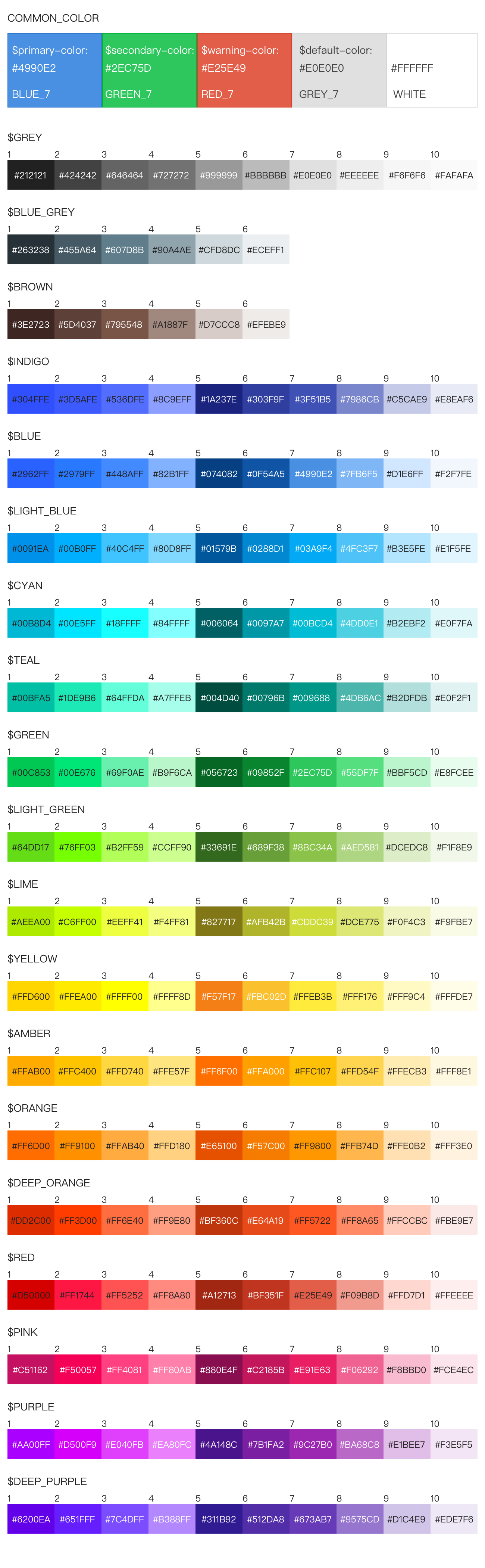
Font
// font-family
// html 标签已默认设置 PC 和 Mobile 两种字体
$PC_FONT_FAMILY: "Noto Sans CJK SC", "Source Han Sans CN", STXihei, SimHei, "Microsoft YaHei";
$MOBILE_FONT_FAMILY: "Noto Sans CJK SC", "Source Han Sans CN", "PingFang SC", STXihei;

// font-size
$FONT_SIZE_10, $FONT_SIZE_12, $FONT_SIZE_14,
$FONT_SIZE_16, $FONT_SIZE_18, $FONT_SIZE_20,
$FONT_SIZE_22, $FONT_SIZE_24

// 针对 Chrmoe 无法展示 10 号字问题,暂时采取缩放方式解决
// 缩放会缩小块级元素,最好直接作用于 span 标签使用
@media screen and (-webkit-min-device-pixel-ratio: 0) {
  span {
    @include font-size-10();
  }
}
Device
// 屏幕尺寸临界值
$SCREEN_XS: 480px;
$SCREEN_SM: 768px;
$SCREEN_MD: 992px;
$SCREEN_LG: 1200px;
统一添加浏览器前缀的方法
// 对于某些属性,浏览器的兼容可以通过添加前缀来处理
@mixin prefix($property, $value) {
  @each $prefix in -webkit-, -moz-, -ms-, -o-, '' {
    #{$prefix}#{$property}: $value;
  }
}

// 使用方法
.test {
  @include prefix(transition, border-left 2s);
}

// 编译之后
.test {
  -webkit-transition: border-left 2s;
  -moz-transition: border-left 2s;
  -ms-transition: border-left 2s;
  -o-transition: border-left 2s;
  transition: border-left 2s;
}
flex布局浏览器兼容
// 设置弹性布局
@mixin flexDisplay {
  display: flex;/* android 4.4 */
  display: -webkit-box;/* Android 2.1-3.0, iOS 3.2-4.3 */
  display: -webkit-flex;/* Chrome 21+ */
  display: -ms-flexbox;/* WP IE 10 */
}

// 水平布局下的子元素
@mixin flexJustify($position) {
  justify-content: $position;/* android 4.4 */
  -webkit-box-pack: $position;/* android 2.1-3.0, ios 3.2-4.3 */
  -webkit-justify-content: $position;/* Chrome 21+ */
  -ms-flex-pack: $position;/* WP IE 10 */
}

// 垂直布局下的子元素
@mixin flexAlign($position) {
  align-items: $position;/* android 4.4 */
  -webkit-box-align: $position;/* android 2.1-3.0, ios 3.2-4.3 */
  -webkit-align-items:$position;/* Chrome 21+ */
  -ms-flex-align: $position;/* WP IE 10 */
}

// 设置弹性布局的方向,子元素按照在源文档中声明的顺序从上到下显示
@mixin flexDirectionColum {
  flex-direction: column;/* android 4.4 */
  -webkit-box-orient: vertical;/* android 2.1-3.0, ios 3.2-4.3 */
  -webkit-flex-direction: column;/* Chrome 21+ */
  -ms-flex-direction: column;/* WP IE 10 */
}

// 子元素自动占据剩余的空间
@mixin flex1 {
  -webkit-box-flex:1;/* android 2.1-3.0, ios 3.2-4.3 */
  -webkit-flex:1;/* Chrome 21+ */
  -ms-flex:1;/* WP IE 10 */
  flex:1;/* android 4.4 */
}

// 水平布局下的子元素 两端对齐
@mixin flexPackJustify {
  -webkit-box-pack: justify;/* android 2.1-3.0, ios 3.2-4.3 */
  -webkit-justify-content: space-between;/* Chrome 21+ */
  -ms-flex-pack: justify;/* WP IE 10 */
  justify-content: space-between;/* android 4.4 */
}

// 使用方法
.test {
  @include flexDisplay();
  @include flexJustify(center);
  @include flexAlign(center);
}

// 编译之后
.test {
  display: flex;
  display: -webkit-box;
  display: -webkit-flex;
  display: -ms-flexbox;
  justify-content: center;
  -webkit-box-pack: center;
  -webkit-justify-content: center;
  -ms-flex-pack: center;
  align-items: center;
  -webkit-box-align: center;
  -webkit-align-items: center;
  -ms-flex-align: center;
}
常用组合的属性
// 省略号,单行文本超出指定宽度,显示省略号
@mixin ellipsis() {
  overflow: hidden;
  text-overflow: ellipsis;
  -ms-text-overflow: ellipsis;
  white-space: nowrap;
}

// 箭头,分为left,right,top,bottom四个方向的箭头,传入三个参数,分别是箭头指向,宽度,颜色
@mixin arrow($direction: right, $width: 10px, $color:#000000) {
  width: 0;
  height: 0;
  @if $direction == top {
    border-left: #{$width} solid transparent;  /* 左边框的宽 */
    border-right: #{$width} solid transparent; /* 右边框的宽 */
    border-bottom: #{$width} solid $color;
  } @else if $direction == bottom {
    border-left: #{$width} solid transparent;  /* 左边框的宽 */
    border-right: #{$width} solid transparent; /* 右边框的宽 */
    border-top: #{$width} solid $color;
  } @else if $direction == left {
    border-top: #{$width} solid transparent; /* 上边框的宽 */
    border-bottom: #{$width} solid transparent; /* 下边框的宽 */
    border-right: #{$width} solid $color;
  } @else if $direction == right {
    border-top: #{$width} solid transparent; /* 上边框的宽 */
    border-bottom: #{$width} solid transparent; /* 下边框的宽 */
    border-left: #{$width} solid $color;
  }
}

// 省略号使用方法
.test {
  @include ellipsis(); // 文本超出指定宽度,显示省略号
}

// 编译之后
.ellipsis {
  overflow: hidden;
  text-overflow: ellipsis;
  -ms-text-overflow: ellipsis;
  white-space: nowrap;
}

// 箭头使用方法
.arrow {
  @include arrow(top, 10px, #e4393c); // 生成一个宽度为10px的向上的红色箭头
}

// 编译之后
.arrow {
  width: 0;
  height: 0;
  border-left: 10px solid transparent;  /* 左边框的宽 */
  border-right: 10px solid transparent; /* 右边框的宽 */
  border-bottom: 10px solid #e4393c;
}
px2vw px2vh方法
// px2vw
@function px2vw($value, $width) {
  @return $value/$width*100vw;
}

// px2vh
@function px2vh($value, $height) {
  @return $value/$height*100vh;
}

// 使用方法,传入两个参数,第一个是元素宽度,第二个是设计稿宽度
.test {
  width: px2vw(37.5px, 375px)
}

// 编译之后
.test {
  width: 10vw;
}