
fullswipe
v1.0.0
Published
Swiping component for both Android and iOS
Maintainers
 natdm
natdmReadme
#Full Swipe React-Native Component ###Works on iOS and Android
###Customize anything.
- Opacity through RGB
- Functions on swipeOpen, swipeClose, cover click, and each icon click.
- Up to 4 icons underneath.
- Use an icon or text on the cover
###Props:
- title
- optional string/int
- Title for the cover
- iconSource
- optional uri (overrides 'title')
- Overrides title on the cover.
- height
- optional int
- backgroundColor
- optional int/string
- Background color for the cover. You can use RGB for opacity.
- menuItems
- optional array of objects (see menuItem props) (use rgba for opacity)
- Up to four. See below.
- menuBackgroundColor
- optional int/string (use rgba for opacity)
- Background color for the 'underneath' menu.
- fontSize
- optional string
- For the cover
- fontFamily
- optional string
- For the cover
- borderRadiusRight
- optional string
- Changes both the top and bottom border radius
- borderRadiusLeft
- optional string
- Changes both the top and bottom border radius
- onPress
- optional function
- Function to run when the cover is clicked instead of swiped.
- onSwipeOpenAction
- optional function - preformed on 'open' swipe
- Function runs when cover swiped open
- onSwipeCloseAction
- optional function - preformed on 'close' swipe
- Function runs when cover swiped closed
###menuItem props:
- title
- optional string/int
- Title for each icon or spot
- titleColor
- optional string
- Change the font color.
- icon
- optional uri
- Does not override the text, sits above.
- onPress
- optional function
- function to run on click.
###Example:
import FullSwipeComponent from './FullSwipe/FullSwipeComponent'
const wallpaper = 'http://wallpaper.pickywallpapers.com/1280x1024/clean-blurry.jpg';
const reactIcon = 'http://frostney.github.io/talks/react-native/slides/images/react-logo.png';
const gitIcon = 'https://fleep.io/blog/wp-content/uploads/2014/07/github_icon.png';
const goGopher = 'https://camo.githubusercontent.com/f04a7348c3f516c528405b48eccc96d3ad1abdeb/68747470733a2f2f7261772e6769746875622e636f6d2f676f6c616e672d73616d706c65732f676f706865722d766563746f722f6d61737465722f676f706865722d736964655f636f6c6f722e706e67';
const jsIcon = 'http://i.stack.imgur.com/Mmww2.png';
const listOfItems = [
{
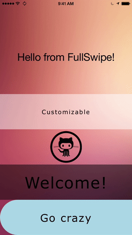
title: "Customizable",
backgroundColor: 'rgba(255,255,255,.5)',
menuBackgroundColor: 'rgba(255,255,255,.2)',
fontFamily: 'Verdana',
onPress: () => {
console.log("Hello")
},
onSwipeOpenAction: () => {
console.log("Open function ran!")
},
onSwipeCloseAction: () => {
console.log("You swiped close and your function ran")
},
menuItems: [
{
title: 'Use Text',
onPress: () => {
console.log(`Hello from Hello`)
}
},
{
icon: reactIcon,
onPress: () => {
console.log(`Hello from Hello`)
}
},
{
title: "< Or icons",
onPress: () => {
console.log(`Hello from Hello`)
}
},
{
title: "Or both",
icon: reactIcon,
onPress: () => {
console.log(`Hello from Hello`)
}
}
]
},
{
iconSource: gitIcon,
alignIconLeft: true,
title: "Hello",
fontSize: 45,
backgroundColor: 'rgba(0,0,0,0)',
menuBackgroundColor: 'rgba(255,255,255,.2)',
fontFamily: 'Verdana',
onPress: () => {
console.log("Hello")
},
onSwipeOpenAction: () => {
console.log("Open function ran!")
},
onSwipeCloseAction: () => {
console.log("You swiped close and your function ran")
},
menuItems: [
{
icon: reactIcon,
title: "React Native",
onPress: () => {
console.log(`Hello from Hello`)
}
},
]
},
{
title: "Welcome!",
fontSize: 45,
backgroundColor: 'rgba(0,0,0,.5)',
menuBackgroundColor: 'rgba(255,255,255,.5)',
fontFamily: 'Verdana',
onPress: () => {
console.log("Hello")
},
onSwipeOpenAction: () => {
console.log("Open function ran!")
},
onSwipeCloseAction: () => {
console.log("You swiped close and your function ran")
},
menuItems: [
{
icon: goGopher,
title: "Go gopher!",
onPress: () => {
console.log(`Hello from Hello`)
}
},
{
icon: jsIcon,
title: "JS Rocks"
}
]
},
{
title: "Go crazy",
fontSize: 30,
borderRadiusLeft: 50,
backgroundColor: 'lightblue',
menuBackgroundColor: 'rgba(255,255,255,.5)',
fontFamily: 'Verdana',
onPress: () => {
console.log("Hello")
},
onSwipeOpenAction: () => {
console.log("Open function ran!")
},
onSwipeCloseAction: () => {
console.log("You swiped close and your function ran")
},
menuItems: [
{
icon: goGopher,
title: "Go gopher!",
onPress: () => {
console.log(`Hello from Hello`)
}
},
{
icon: jsIcon,
title: "JS Rocks"
}
]
}
];
var FullSwipe = React.createClass ({
getInitialState: function () {
return {
text: 'Hello from FullSwipe!',
}
},
onPress: function () {
console.log("Button pressed");
},
swipeOpenUpdate: function () {
this.setState({text: "You just swiped open!"})
},
swipeCloseUpdate: function () {
this.setState({text: "And now it closed."})
},
render: function () {
const CompiledList = listOfItems.map((item, it) => (
<FullSwipeComponent
key={it}
title={item.title}
height={item.height}
menuItems={item.menuItems}
menuBackgroundColor={item.menuBackgroundColor}
fontSize={item.fontSize}
fontFamily={item.fontFamily}
backgroundColor={item.backgroundColor}
backgroundImage={item.backgroundImage}
iconSource={item.iconSource}
alignIconLeft={item.alignIconLeft}
borderRadiusLeft={item.borderRadiusLeft}
borderRadiusRight={item.borderRadiusRight}
onPress={item.onPress}
onSwipeOpenAction={this.swipeOpenUpdate}
onSwipeCloseAction={this.swipeCloseUpdate}
/>
));
return (
<Image style={styles.container}
source={{uri:wallpaper}}>
<View style={[styles.backdropView, {paddingBottom: 400}]}>
<Text style={styles.welcome}>{this.state.text}</Text>
</View>
<View style={[{position: 'absolute', bottom: 0}]}>
{CompiledList}
</View>
</Image>
);
}
});
var styles = StyleSheet.create({
container: {
flex: 1,
justifyContent: 'center',
alignItems: 'center',
backgroundColor: 'rgba(0,0,0,0)',
resizeMode: "cover",
},
welcome: {
fontSize: 30,
textAlign: 'center',
margin: 10,
},
instructions: {
textAlign: 'center',
color: '#333333',
marginBottom: 5,
},
backdrop: {
paddingTop: 60,
width: 320,
height: 120
},
backdropView: {
height: 120,
width: 320,
backgroundColor: 'rgba(0,0,0,0)',
},
headline: {
fontSize: 30,
fontWeight: 'bold',
fontFamily: 'Avenir Next',
textAlign: 'center',
backgroundColor: 'rgba(0,0,0,0)',
color: 'white'
}
});TODO: Unit tests and background image