
gantt-task-react-powern
v0.6.43
Published
Interactive Gantt Chart for React with TypeScript.


Readme
gantt-task-react-powern
Interactive Gantt Chart for React with TypeScript.
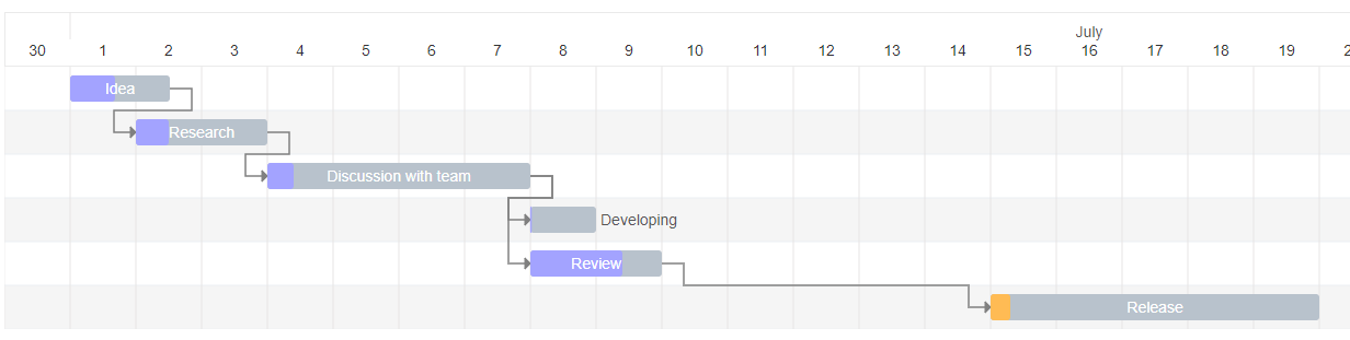
PowerN fork of gantt-task-react with critical-path support and additional features used by cpms-web. See DEVELOPMENT.md for contributor and publishing docs.
Install
npm install gantt-task-react-powernFor local development against this repo, running the bundled example, or installing into cpms-web via npm pack (tarball), see DEVELOPMENT.md — the end-to-end tarball workflow is Section 3B.
How to use it
import { Gantt, Task, EventOption, StylingOption, ViewMode, DisplayOption } from 'gantt-task-react-powern';
import "gantt-task-react-powern/dist/index.css";

let tasks: Task[] = [
    {
      start: new Date(2020, 1, 1),
      end: new Date(2020, 1, 2),
      name: 'Idea',
      id: 'Task 0',
      type:'task',
      progress: 45,
      isDisabled: true,
      styles: { progressColor: '#ffbb54', progressSelectedColor: '#ff9e0d' },
    },
    ...
];
<Gantt tasks={tasks} scheduleType="forward" />
You may handle actions
<Gantt
  tasks={tasks}
  viewMode={view}
  scheduleType="forward"
  onDateChange={onTaskChange}
  onDelete={onTaskDelete}
  onProgressChange={onProgressChange}
  onDoubleClick={onDblClick}
  onClick={onClick}
/>
How to run example
cd ./example
npm install
npm start
Gantt Configuration
GanttProps
| Parameter Name | Type | Description | | :------------------------------ | :-------------------- | :-------------------------------------------------------------------------------- | | tasks* | Task | Tasks array. | | scheduleType* | string | Scheduling mode used for critical-path and date calculations. | | leafTasks | Task[] | Optional pre-flattened leaf tasks (skips internal flattening when provided). | | startDate | Date | Project-level start date used for calendar/critical-path bounds. | | endDate | Date | Project-level end date used for calendar/critical-path bounds. | | projectCalendar | CalendarDefinition | Working calendar (shifts, off days, holidays) applied to scheduling. | | sliderTime | number | Vertical slider time marker (ms) drawn on the chart. | | EventOption | interface | Specifies gantt events. | | DisplayOption | interface | Specifies view type and display timeline language. | | StylingOption | interface | Specifies chart and global tasks styles |
EventOption
| Parameter Name | Type | Description | | :----------------- | :---------------------------------------------------------------------------- | :-------------------------------------------------------------------------------------- | | onSelect | (task: Task, isSelected: boolean) => void | Specifies the function to be executed on the taskbar select or unselect event. | | onDoubleClick | (task: Task) => void | Specifies the function to be executed on the taskbar onDoubleClick event. | | onClick | (task: Task) => void | Specifies the function to be executed on the taskbar onClick event. | | onDelete* | (task: Task) => void/boolean/Promise/Promise | Specifies the function to be executed on the taskbar on Delete button press event. | | onDateChange* | (task: Task, children: Task[]) => void/boolean/Promise/Promise | Specifies the function to be executed when drag taskbar event on timeline has finished. | | onProgressChange* | (task: Task, children: Task[]) => void/boolean/Promise/Promise | Specifies the function to be executed when drag taskbar progress event has finished. | | onExpanderClick* | onExpanderClick: (task: Task) => void; | Specifies the function to be executed on the table expander click | | onMultiSelect | (tasks: Task[]) => void | Invoked when tasks are multi-selected via checkboxes. | | onCalendarError | (task: Task, reason: string) => void | Invoked when a task cannot be scheduled against the project calendar. | | timeStep | number | A time step value for onDateChange. Specify in milliseconds. |
* Chart undoes operation if method return false or error. Parameter children returns one level deep records.
DisplayOption
| Parameter Name | Type | Description | | :------------- | :------ | :------------------------------------------------------------------------------------------------------------------- | | viewMode | enum | Specifies the time scale. Hour, Quarter Day, Half Day, Day, Week(ISO-8601, 1st day is Monday), Month, Quarter, Year. | | viewDate | date | Specifies display date and time for display. | | preStepsCount | number | Specifies empty space before the fist task | | locale | string | Specifies the month name language. Able formats: ISO 639-2, Java Locale. | | rtl | boolean | Sets rtl mode. |
StylingOption
| Parameter Name | Type | Description |
| :------------------------------- | :------- | :--------------------------------------------------------------------------------------------- |
| headerHeight | number | Specifies the header height. |
| ganttHeight | number | Specifies the gantt chart height without header. Default is 0. Its mean no height limitation. |
| columnWidth | number | Specifies the time period width. |
| listCellWidth | string | Specifies the task list cell width. Empty string is mean "no display". |
| rowHeight | number | Specifies the task row height. |
| barCornerRadius | number | Specifies the taskbar corner rounding. |
| barFill | number | Specifies the taskbar occupation. Sets in percent from 0 to 100. |
| handleWidth | number | Specifies width the taskbar drag event control for start and end dates. |
| fontFamily | string | Specifies the application font. |
| fontSize | string | Specifies the application font size. |
| barProgressColor | string | Specifies the taskbar progress fill color globally. |
| barProgressSelectedColor | string | Specifies the taskbar progress fill color globally on select. |
| barBackgroundColor | string | Specifies the taskbar background fill color globally. |
| barBackgroundSelectedColor | string | Specifies the taskbar background fill color globally on select. |
| projectProgressColor | string | Specifies the project bar progress fill color globally. |
| projectProgressSelectedColor | string | Specifies the project bar progress fill color globally on select. |
| projectBackgroundColor | string | Specifies the project bar background fill color globally. |
| projectBackgroundSelectedColor | string | Specifies the project bar background fill color globally on select. |
| milestoneBackgroundColor | string | Specifies the milestone background fill color globally. |
| milestoneBackgroundSelectedColor | string | Specifies the milestone background fill color globally on select. |
| arrowColor | string | Specifies the relationship arrow fill color. |
| arrowIndent | number | Specifies the relationship arrow right indent. Sets in px |
| todayColor | string | Specifies the current period column fill color. |
| weekendColor | string | Specifies the weekend column fill color. |
| taskProgressColor | string | Default progress color applied to task bars when not overridden per-task. |
| taskLabelRenderer | function | (task: Task) => React.ReactNode`. Custom renderer for the label drawn next to each bar. |
| delayToRender | number | Debounce (ms) before rendering after task updates. |
| shouldNotShowLoadingOverlay | boolean | Disables the built-in loading overlay. |
| TooltipContent | | Specifies the Tooltip view for selected taskbar. |
| TaskListHeader | | Specifies the task list Header view |
| TaskListTable | | Specifies the task list Table view |
- TooltipContent:
React.FC<{ task: Task; fontSize: string; fontFamily: string; }>; - TaskListHeader:
React.FC<{ headerHeight: number; rowWidth: string; fontFamily: string; fontSize: string;}>; - TaskListTable:
React.FC<{ rowHeight: number; rowWidth: string; fontFamily: string; fontSize: string; locale: string; tasks: Task[]; selectedTaskId: string; setSelectedTask: (taskId: string) => void; onExpanderClick: (task: Task) => void; }>;
Task
| Parameter Name | Type | Description |
| :------------------ | :--------------- | :---------------------------------------------------------------------------------------------------- |
| id* | string | Task id. |
| name* | string | Task display name. |
| type* | string | Task display type: task, milestone, project |
| start* | Date | Task start date. |
| end* | Date | Task end date. |
| actualStart* | Date | Actual start date used for variance and critical-path calculations. |
| actualEnd* | Date | Actual end date used for variance and critical-path calculations. |
| progress* | number | Task progress. Sets in percent from 0 to 100. |
| depth* | number | Hierarchy depth of the task in the task tree (0 = root). |
| optionalId | string | Optional secondary id (e.g. external system id). |
| dependencies | DependencyType[] | Parent dependencies. Each entry is { id: string; type: "SS" \| "SF" \| "FS" \| "FF" }. |
| criticalPathArrows | object[] | Arrows on the critical path: { taskId: string; arrowColor: string; criticalPathType: string }. |
| styles | object | Specifies the taskbar styling settings locally. Object is passed with the following attributes: |
| | | - backgroundColor: String. Specifies the taskbar background fill color locally. |
| | | - backgroundSelectedColor: String. Specifies the taskbar background fill color locally on select. |
| | | - progressColor: String. Specifies the taskbar progress fill color locally. |
| | | - progressSelectedColor: String. Specifies the taskbar progress fill color globally on select. |
| | | - taskProgressColor: String. Overrides the task progress color locally. |
| | | - criticalPathColor: String. Color used when the task is on the critical path. |
| percentComplete | number | Percent complete (0–100), distinct from drag-driven progress. |
| plannedDuration | number | Planned duration. |
| remainingDuration | number | Remaining duration. |
| actualDuration | number | Actual duration. |
| durationType | string | Duration unit identifier. |
| isDisabled | bool | Disables all action for current task. |
| project | string | Task project name |
| hideChildren | bool | Hide children items. Parameter works with project type only |
| displayOrder | number | Explicit display order in the task list. |
| childrenCount | number | Number of children under this task (used by the expander). |
| calendar | CalendarDefinition | Per-task working calendar override. |
*Required
Critical path
getCriticalPaths is exported for consumers that need to compute critical paths outside the chart:
import { getCriticalPaths } from 'gantt-task-react-powern';Critical-path arrows and colors are driven by Task.criticalPathArrows and Task.styles.criticalPathColor.