
garden-form-validator
v1.0.18
Published
catalog week 2 form validator using react without cra and ts

Readme
Catalog-Week-2-Assignmnet | Garden-Form-Validator
A fully customizable React and TypeScript form validator with features such as:
- Form Validation for name, email, and password (with a strength meter)
- City Selection Modal with searchable and debounced input for choosing an Indian city
- Theme Customization via CSS custom properties and a settings panel (color picker)
- Post-Submission Success Animation that first displays a spinning flower and then transitions to a success checkmark overlay
- Modern Git Hooks integration using Husky
This package is designed to be both developer‑friendly and end‑user customizable while maintaining a sleek glass/frosted appearance.
Table of Contents
Installation
Clone the Repository
git clone https://github.com/jaibhedia/catalog-week2-assignment
cd form
Install Dependencies
Using npm:
npm installOr using Yarn:
yarn installBuild the Package (if needed)
The package is written in TypeScript, so you might need to compile it before publishing or using:
npm run build
Usage
Importing and Rendering the Form
After installing, you can import the main form component into your React app as follows:
import React from "react";
import { createRoot } from "react-dom/client";
import App from "react-ts-form-validator"; // if published on npm
import "react-ts-form-validator/dist/index.css"; // optional, if you publish compiled CSS

const container = document.getElementById("root");
const root = createRoot(container!);
root.render(<App />);
If you are using it locally from your repository, ensure your entry point (e.g., src/index.tsx) includes the full form code and styles.
Customizing the Theme
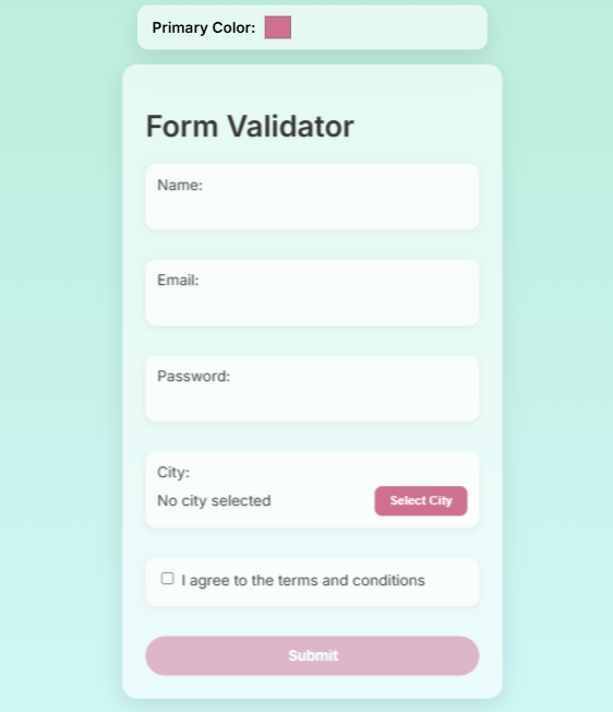
This package uses CSS custom properties for theming. A ThemeSettings component provides a color picker that lets users change the primary color dynamically. In the rendered UI, the color picker appears at the top:
<ThemeSettings />Changing the color picker updates the --primary-color CSS variable, which affects elements like the submit button and other accents.
City Modal & Search
- CityModal:
When the user clicks "Select City," a modal appears with a searchable list of Indian cities. - Search Input:
The search field uses a debouncing mechanism so that filtering occurs only after the user pauses typing.
Password Strength Meter
- The password input includes a live strength meter.
- The meter computes a score (0–100) based on password length, use of uppercase, lowercase, and special characters.
- It displays a progress bar whose width and color (red, yellow, green) vary with the strength, along with a label (Weak, Medium, Strong).
Post-Submission Animation
After successful submission:
- The form resets and a custom overlay is displayed.
- The overlay first shows a spinning flower emoji for 1 second.
- Then, it transitions to a checkmark with the message "Form Submitted Successfully!" for 2 seconds.
- The overlay automatically disappears after 3 seconds, or the user can dismiss it by clicking.
API / Components
ThemeSettings
Description:
A simple component that displays a color picker for modifying the primary theme color.
Usage:
import ThemeSettings from "./ThemeSettings";

// Render at the top of your app
<ThemeSettings />
CityModal
Description:
A modal component for selecting an Indian city. It includes:
- A search bar with debouncing (via a custom hook).
- A filtered list of cities.
- A "Cancel" button to close the modal.
Props:
isOpen: boolean– Whether the modal is visible.onClose: () => void– Callback to close the modal.onSelect: (city: string) => void– Callback when a city is selected.
Usage Example:
<CityModal
  isOpen={cityModalOpen}
  onClose={() => setCityModalOpen(false)}
  onSelect={(city) => setFormData({ ...formData, city })}
/>
FlowerCheckOverlay / SuccessOverlay
Description:
An overlay that provides a two-phase animation after form submission:
- Phase 1: Displays a spinning flower emoji for 1 second.
- Phase 2: Transitions to a green checkmark with a success message for 2 seconds.
Props:
onClose: () => void– Callback to close the overlay.
Usage Example:
{showMagic && <FlowerCheckOverlay onClose={() => setShowMagic(false)} />}Customization & Styling
All styles are driven by CSS custom properties defined in the :root selector in index.css:
:root {
  --primary-color: #cd7092;
  --background-color: rgba(255, 255, 255, 0.6);
  --input-bg: rgba(255, 255, 255, 0.7);
  --input-border-color: rgba(255, 255, 255, 0.3);
  --input-text-color: #444;
  --error-color: #e63946;
  --border-radius: 12px;
  --container-border-radius: 16px;
  --box-shadow: 0 8px 24px rgba(0, 0, 0, 0.1);
}
You can modify these values directly or use the provided ThemeSettings component to change them dynamically.
Development & Contributing
Local Development:
Run your project locally with your preferred dev server (e.g.,npm startif using Create React App or your custom Webpack setup).Linting and Testing:
Ensure you have proper scripts set up (e.g., ESLint, Jest) to maintain code quality. Consider integrating Husky for pre-commit hooks.Contributing:
Contributions are welcome! Please open an issue or submit a pull request for improvements, bug fixes, or new features.Building:
To compile the TypeScript code to JavaScript, run:npm run buildThis will create a
dist/folder with the compiled files.
License
This project is licensed under the MIT License. See the LICENSE file for details.
Summary
The React TS Form Validator package is a feature-rich, customizable form solution that combines robust form validation, dynamic theming, an interactive city selection modal, and engaging post-submission animations. Its modular design and CSS variable-based styling make it easy to integrate and customize in modern React projects.