
github-cards-react
v0.2.1
Published
Lightweight React component for displaying GitHub repository cards.
Maintainers
 imgalvin
Readme
GitHub Card

A lightweight React component for displaying GitHub repository cards.
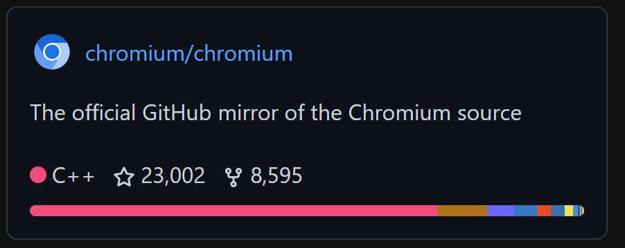
Screenshot showcasing an example of the card
NOTE: This package is currently only client-side. Server-side support is planned
Displays:
- Repository name
- Description
- Primary language
- Star count
- Fork count
Works in any React 18+ application.
Installation
npm:
npm install github-cards-reactBun:
bun add github-cards-reactpnpm:
pnpm add github-cards-reactUsage
React:
import { GithubCard } from "github-cards-react";

export default function App() {
  return (
    <GithubCard
      username="galvinpython"
      repo="github-cards-react"
    />
  );
}
Astro (with React)
---
import { GithubCard } from "github-cards-react";
---

<html lang="en">
  <body>
    <GithubCard username="galvinpython" repo="github-cards-react" client:load />
  </body>
</html>
Props
| Prop | Type | Required | Description |
| ---------------- | ------------------- | -------- | -------------------------------------------------------- |
| username | string | Yes | GitHub username or organization name |
| repo | string | Yes | Repository name |
| theme | "light" \| "dark" | No | Visual theme. Defaults to "light" |
| showLanguagesBar | boolean | No | Whether to fetch and display the languages bar. Defaults to false |
Testing
As of now, there is no official testing library implemented. There is however an Astro playground for you to test the library on. It's located in the tests folder