
globe-chart
v0.4.0
Published
Framework-agnostic <globe-chart> web component for country polygon choropleths on a 3D globe.

Maintainers
 benji1703
Readme
globe-chart
Framework-agnostic <globe-chart> web component (Lit) for
plotting per-country values on a 3D globe, built on
globe.gl.
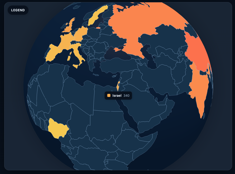
Pass ISO country codes and numeric values to render a choropleth with an optional legend, themes, camera controls, and in-component toast feedback.
Country outlines come from Natural Earth
110m admin-0 data (public domain), shipped as quantized TopoJSON. See NOTICE.
Demo
License
Dual model
- Open source projects (OSI-approved license): free under the MIT License
(
LICENSE). - Proprietary / closed-source / commercial products: require written approval
— see
COMMERCIAL.mdand email [email protected].
Install
npm install globe-chartThat's the whole setup. lit, globe.gl, and three install as dependencies
of this package, and the country map ships inside the package as a lazily
code-split JS module — no asset copying, no loader plugins, no CDN fetch, no
bundler configuration.
Shrink your bundle (recommended)
globe-chart only uses globe.gl's polygons layer, but three-globe (a globe.gl
dependency) statically imports the three.js WebGPU renderer, TSL shader
language, and h3-js for layers this component never touches (heatmaps,
hexbins). Aliasing them to the stubs shipped with this package cuts the
globe.gl chunk roughly in half (~460 kB → ~220 kB gzipped):
// vite.config.ts
export default defineConfig({
	resolve: {
		alias: {
			'three/webgpu': 'globe-chart/stubs/three-webgpu.js',
			'three/tsl': 'globe-chart/stubs/three-tsl.js',
			'h3-js': 'globe-chart/stubs/h3-js.js',
		},
	},
});
Webpack equivalent: resolve.alias with the same mappings. Skip this if other
parts of your app use those globe.gl layers or import three/webgpu directly.
Usage
<script type="module">
	import 'globe-chart';
</script>

<globe-chart id="globe" style="width: 600px; height: 600px" legend></globe-chart>
<script type="module">
	const el = document.getElementById('globe');
	el.data = [
		{ iso: 'US', value: 1200 },
		{ iso: 'FR', value: 280 },
	];
	el.config = {
		legend: { title: 'Revenue by country' },
		colors: { low: '#f5c518', high: '#c41e1e' },
	};
</script>
import { GlobeChart, globeChartMockData } from 'globe-chart';
const el = document.createElement('globe-chart');
el.data = globeChartMockData;
el.showLegend = true;
el.config = { legend: { title: 'Sample values' } };
document.body.append(el);Properties
| Property | Attribute | Default | Description |
| ------------------- | -------------------- | --------- | ------------------------------------------------ |
| data | — | [] | Rows to plot |
| countries | — | null | Host-supplied country polygons (GeoJSON features or TopoJSON) — replaces the packaged map |
| isoField | iso-field | 'iso' | ISO country code field |
| valueField | value-field | 'value' | Numeric value field |
| nameField | name-field | 'name' | Optional display name field on rows |
| loading | loading | false | Empty rolling globe |
| showLegend | legend | false | Overlay legend |
| legendPosition | legend-position | 'left' | 'left' | 'right' |
| theme | theme | 'auto' | 'light' | 'dark' | 'auto' (OS) |
| animated | animated | true | Polygon + camera transitions |
| animateNavigation | animate-navigation | true | Animate camera on jump / auto-center |
| autoCenter | auto-center | true | Fly to highest value on first reveal |
| autoRotate | auto-rotate | false | Keep spinning when loaded |
| autoRotateSpeed | auto-rotate-speed | 0.35 | Orbit rotate speed |
| config | — | {} | Nested options (legend, colors, camera, toasts…) |
| legendResults | — | null | Host-supplied remote search hits for the legend |
config (high level)
el.config = {
	legend: {
		title, subtitle, showScale, showCount, formatValue, emptyLabel,
		pageSize: 25, // 0 = no paging
		maxHeight: '280px',
		collapsible: true,
		collapseMode: 'mobile', // 'never' | 'always' | 'mobile'
		collapseOnSelect: 'mobile', // 'never' | 'mobile' | 'always'
		mobileBreakpoint: '(max-width: 768px)',
		toggleLabel: 'Legend',
		search: {
			enabled: true,
			mode: 'local' | 'remote' | 'hybrid',
			placeholder: 'Search countries…',
			debounceMs: 250,
			minLength: 1,
			provider: async (query, signal) => {
				const res = await fetch(`/api/countries?q=${encodeURIComponent(query)}`, { signal });
				return res.json(); // [{ iso, name?, value? }]
			},
		},
	},
	colors: { ocean, empty, low, high, stroke },
	labels: { tooltip: ({ iso, name, value, color, row }) => htmlString },
	camera: { initial, jumpAltitude, durations },
	globe: { atmosphereAltitude, strokeColor, curvatureDeg, topologyUrl, maxPixelRatio, pauseWhenHidden },
	toasts: { enabled, position, maxVisible, persistWarnings },
};
With collapseMode: 'mobile' (default), small screens show a Legend button;
desktop keeps the panel open. After a country select, the panel collapses only on
mobile (collapseOnSelect: 'mobile'). Use 'always' to collapse on every
viewport, or 'never' to keep it open.
For event-driven backends (no provider), listen for legend-search and set
el.legendResults = [{ iso, name, value? }, …] (or null to clear).
Events
| Event | Detail |
| ---------------- | ------------------------------------------- |
| ready | — |
| country-select | { iso, name, value, color… } |
| country-hover | { iso, name, value, color… } — fires once per country under the pointer, null when the pointer leaves the last country |
| legend-search | { query, signal } (remote/hybrid search) |
| globe-error | { title, body, details… } |
| globe-warning | { title, body, details… } |
All events are CustomEvents that bubble and cross the shadow boundary. In
TypeScript, addEventListener on a GlobeChart element is fully typed via
GlobeChartEventMap — document.querySelector('globe-chart') already returns
the right type through HTMLElementTagNameMap.
Migrating from 0.3.x:
error→globe-error,warning→globe-warning(the bare names collided with the nativeerrorevent), andcountry-hovernow fires withdetail: nullon hover end — checke.detailbefore use.
Imperative API
For host-driven navigation (deep links, "show me X" buttons, dashboards):
const el = document.querySelector('globe-chart')!;

el.select('FR');   // highlight France in the legend + fly the camera to it
el.select(null);   // clear the selection
el.flyTo('JP');    // camera only — selection unchanged
el.flyTo({ lat: 48.8, lng: 2.3, altitude: 1.5 }, 800);
el.selectedIso;    // 'FR' | null — current selection
select() / flyTo() return false when the ISO code matches no loaded
country. Programmatic selection does not emit country-select — events are
reserved for user interaction, so controlled wrappers can't loop.
Theming
theme="light" | "dark" | "auto" (default auto follows the OS). Defaults use a
clear blue sea and a yellow→red scale; override with CSS vars or config.colors.
CSS custom properties on the host:
--globe-chart-ocean-color/--globe-chart-empty-color--globe-chart-low-color/--globe-chart-high-color--globe-chart-land-color(alias for--globe-chart-high-color)--globe-chart-border-color--globe-chart-legend-bg/--globe-chart-legend-fg/--globe-chart-legend-muted--globe-chart-legend-max-height(orconfig.legend.maxHeight)--globe-chart-font
Feedback
Problems surface as in-component toasts (skipped rows, init failures, empty data)
and matching globe-error / globe-warning DOM events. Disable UI with
config.toasts.enabled = false if the host app handles events only.
Countries map data
The Natural Earth country outlines ship inside the package as a lazily code-split JS module (~26 kB gzip) — every bundler splits it into its own chunk automatically, so there is nothing to configure, copy, or host. Two overrides when you want different geometry:
// 1. Fetch a custom topology at runtime (CDN, /assets, higher-resolution map…)
el.config = { globe: { topologyUrl: '/assets/my-countries.json' } };

// 2. Supply polygons yourself — a TopoJSON topology or GeoJSON features
el.countries = myTopologyOrFeatures;
loadCountryFeatures and featuresFromTopology are exported for hosts that
want to preload or transform the data themselves (e.g. Angular
provideAppInitializer). The raw TopoJSON is also published at
globe-chart/dist/ne_110m_admin_0_countries.json for self-hosting.
Framework integration
<globe-chart> is a standard custom element — every framework below binds the
same properties and events. The package ships
custom-elements.json,
so VS Code / JetBrains give autocomplete and hover docs for attributes, events,
and CSS custom properties.
React
React 18 and below (or anyone preferring idiomatic props/callbacks): use the bundled wrapper — typed props, typed event callbacks:
import { GlobeChart } from 'globe-chart/react';

export function WorldMap({ rows }: { rows: { iso: string; value: number }[] }) {
	return (
		<GlobeChart
			data={rows}
			showLegend
			theme="dark"
			onCountrySelect={(e) => console.log(e.detail.iso, e.detail.value)}
			style={{ width: '100%', height: 480 }}
		/>
	);
}
React 19+ can also use <globe-chart> directly (properties and events are
handled natively); the wrapper still gives you typed onCountrySelect-style
callbacks either way.
Angular
Standalone component, signals, template bindings — no ViewChild or lifecycle
hooks needed. Angular's [prop] binding sets element properties, which is
exactly what the component expects:
import { Component, CUSTOM_ELEMENTS_SCHEMA, signal } from '@angular/core';
import type { CountryEventDetail } from 'globe-chart';
import 'globe-chart';

@Component({
	selector: 'app-world-map',
	standalone: true,
	schemas: [CUSTOM_ELEMENTS_SCHEMA],
	template: `
		<globe-chart
			[data]="rows()"
			[config]="config"
			legend
			theme="dark"
			(country-select)="onSelect($event)"
		></globe-chart>
	`,
})
export class WorldMapComponent {
	readonly rows = signal([
		{ iso: 'US', value: 1200 },
		{ iso: 'FR', value: 280 },
	]);
	readonly config = { legend: { title: 'Revenue by country' } };

	onSelect(event: Event) {
		const { iso, value } = (event as CustomEvent<CountryEventDetail>).detail;
		console.log(iso, value);
	}
}
No angular.json asset configuration is needed — the country map is a normal
lazily-loaded JS module, so the Angular build handles it like any other chunk.
Vue 3
Tell the compiler about the tag, then bind normally (.prop forces property
binding for complex values):
// vite.config.ts
vue({ template: { compilerOptions: { isCustomElement: (tag) => tag === 'globe-chart' } } });
<script setup lang="ts">
import 'globe-chart';
import type { CountryEventDetail } from 'globe-chart';
const rows = [{ iso: 'US', value: 1200 }, { iso: 'FR', value: 280 }];
const onSelect = (e: CustomEvent<CountryEventDetail>) => console.log(e.detail.iso);
</script>
<template>
<globe-chart :data.prop="rows" legend theme="dark" @country-select="onSelect" />
</template>Svelte
Svelte supports custom elements out of the box:
<script lang="ts">
	import 'globe-chart';
	const rows = [{ iso: 'US', value: 1200 }, { iso: 'FR', value: 280 }];
</script>

<globe-chart data={rows} legend on:country-select={(e) => console.log(e.detail.iso)} />
SSR (Angular Universal, Next.js, Nuxt…)
The component guards its DOM/CSS reads, and WebGL setup is deferred until the element is actually visible in a browser, so importing it during SSR does not crash. Still, the globe is inherently client-side — load it in a client-only context for best results:
- Angular: import
'globe-chart'in the component file; render the tag inside@deferor guard withafterNextRenderif you SSR the page. - Next.js:
dynamic(() => import('globe-chart/react').then(m => m.GlobeChart), { ssr: false }). - Nuxt: wrap in
<ClientOnly>.
Framework demos
Live integrations showing globe-chart in every major framework, each with a 2026-era ITDR/ISPM security dashboard:
| Framework | Demo | Source | | --------- | ---- | ------ | | React | globe-chart-demo-react | benji1703/globe-chart-demo-react | | Vue 3 | globe-chart-demo-vue | benji1703/globe-chart-demo-vue | | Svelte | globe-chart-demo-svelte | benji1703/globe-chart-demo-svelte | | Angular | globe-chart-demo-angular | benji1703/globe-chart-demo-angular |
Attribution
Natural Earth public-domain country boundaries — see NOTICE.