
goey-toast-vue3
v0.1.2
Published
A gooey, morphing toast component for Vue 3 built on vue-sonner with Motion animations
Maintainers
 ktuncerr
Readme
goey-toast-vue3
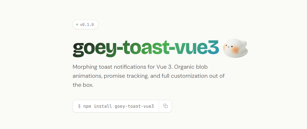
Morphing toast notifications for Vue 3. Organic blob animations, promise tracking, and full customization out of the box.
Vue 3 port of goey-toast by @anl331. Built on vue-sonner and Motion.
Features
- Organic blob morph animation (pill → blob → pill)
- Five toast types: default, success, error, warning, info
- Promise toasts with loading → success/error transitions
- Action buttons with optional success label morph-back
- Description body supporting strings and Vue components
- Configurable display duration and bounce intensity
- Custom fill color, border color, and border width
- CSS class overrides via
classNamesprop - 6 positions with automatic horizontal mirroring for right-side positions
- Center positions with symmetric morph animation
- Hover pause: hovering an expanded toast pauses the dismiss timer
- Hover re-expand: hovering a collapsed pill re-expands the toast
- Pre-dismiss collapse animation
Installation
npm install goey-toast-vue3Peer Dependencies
npm install vue motion| Package | Version | | -------- | --------- | | vue | >= 3.3.0 | | motion | >= 11.0.0 |
CSS Import (Required)
import 'goey-toast-vue3/styles.css'Add this once in your app's entry point (e.g. main.ts). Without it, toasts will appear unstyled.
Quick Start
<!-- App.vue -->
<script setup lang="ts">
import { GoeyToaster, goeyToast } from 'goey-toast-vue3'
import 'goey-toast-vue3/styles.css'
</script>

<template>
  <GoeyToaster position="bottom-right" />
  <button @click="goeyToast.success('Saved!')">Save</button>
</template>
API Reference
goeyToast Methods
goeyToast(title, options?)              // default (neutral)
goeyToast.success(title, options?)      // green
goeyToast.error(title, options?)        // red
goeyToast.warning(title, options?)      // yellow
goeyToast.info(title, options?)         // blue
goeyToast.promise(promise, data)        // loading -> success/error
goeyToast.dismiss(toastId?)             // dismiss one or all toasts
GoeyToastOptions
Options passed as the second argument to goeyToast() and type-specific methods.
| Option | Type | Description |
| ------------- | ---------------------- | ---------------------------------------- |
| description | string \| Component | Body content (string or Vue component) |
| action | GoeyToastAction | Action button configuration |
| icon | string \| Component | Custom icon override |
| duration | number | Display duration in ms |
| id | string \| number | Unique toast identifier |
| classNames | GoeyToastClassNames | CSS class overrides |
| fillColor | string | Background color of the blob |
| borderColor | string | Border color of the blob |
| borderWidth | number | Border width in px (default 1.5) |
| timing | GoeyToastTimings | Animation timing overrides |
| spring | boolean | Enable spring/bounce animations (default true) |
| bounce | number | Spring intensity 0.05 (subtle) → 0.8 (dramatic), default 0.4 |
GoeyToastAction
| Property | Type | Required | Description |
| -------------- | ------------ | -------- | --------------------------------------------- |
| label | string | Yes | Button text |
| onClick | () => void | Yes | Click handler |
| successLabel | string | No | Label shown after click (morphs back to pill) |
GoeyToastTimings
| Property | Type | Default | Description |
| ----------------- | -------- | ------- | --------------------------------- |
| displayDuration | number | 4000 | Milliseconds toast stays expanded |
GoeyToastClassNames
| Key | Target |
| --------------- | ---------------- |
| wrapper | Outer container |
| content | Content area |
| header | Icon + title row |
| title | Title text |
| icon | Icon wrapper |
| description | Body text |
| actionWrapper | Button container |
| actionButton | Action button |
GoeyToasterProps
Props for the <GoeyToaster /> component.
| Prop | Type | Default | Description |
| -------------- | --------------------------------------------------------------------------------------------------------- | ---------------- | -------------------------------------------------- |
| position | 'top-left' \| 'top-center' \| 'top-right' \| 'bottom-left' \| 'bottom-center' \| 'bottom-right' | 'bottom-right' | Toast position |
| duration | number | — | Default display duration in ms |
| gap | number | 14 | Gap between stacked toasts (px) |
| offset | number \| string | '24px' | Distance from screen edge |
| theme | 'light' \| 'dark' \| 'system' | 'light' | Color theme |
| spring | boolean | true | Enable spring/bounce animations globally |
| bounce | number | 0.4 | Spring intensity: 0.05 (subtle) to 0.8 (dramatic) |
GoeyPromiseData<T>
Configuration for goeyToast.promise().
| Property | Type | Required | Description |
| ------------- | ---------------------------------------- | -------- | ------------------------------------------------ |
| loading | string | Yes | Title shown during loading |
| success | string \| ((data: T) => string) | Yes | Title on success |
| error | string \| ((error: unknown) => string) | Yes | Title on error |
| description | object | No | Per-phase descriptions (see below) |
| action | object | No | Per-phase action buttons (see below) |
| classNames | GoeyToastClassNames | No | CSS class overrides |
| fillColor | string | No | Background color of the blob |
| borderColor | string | No | Border color of the blob |
| borderWidth | number | No | Border width in px |
| timing | GoeyToastTimings | No | Animation timing overrides |
| spring | boolean | No | Enable spring/bounce animations (default true) |
| bounce | number | No | Spring intensity, default 0.4 |
description sub-fields:
| Key | Type |
| --------- | ------------------------------------------------- |
| loading | string \| Component |
| success | string \| Component \| ((data: T) => string \| Component) |
| error | string \| Component \| ((error: unknown) => string \| Component) |
action sub-fields:
| Key | Type |
| --------- | ----------------- |
| success | GoeyToastAction |
| error | GoeyToastAction |
Usage Examples
Basic Types
goeyToast('Notification received')
goeyToast.success('Changes saved')
goeyToast.error('Something went wrong')
goeyToast.warning('Storage is almost full')
goeyToast.info('New update available')
With Description
goeyToast.error('Payment failed', {
  description: 'Your card was declined. Please try again.',
})
Vue Component as Description
import DeploymentInfo from './DeploymentInfo.vue'

goeyToast.success('Deployment complete', {
  description: DeploymentInfo,
})
Action Button with Success Label
goeyToast.info('Share link ready', {
  description: 'Your link has been generated.',
  action: {
    label: 'Copy to Clipboard',
    onClick: () => navigator.clipboard.writeText(url),
    successLabel: 'Copied!',
  },
})
Promise Toast
goeyToast.promise(saveData(), {
  loading: 'Saving...',
  success: 'Changes saved',
  error: 'Something went wrong',
  description: {
    success: 'All changes have been synced.',
    error: 'Please try again later.',
  },
  action: {
    error: {
      label: 'Retry',
      onClick: () => retry(),
    },
  },
})
Custom Styling
goeyToast.success('Styled!', {
  fillColor: '#1a1a2e',
  borderColor: '#333',
  borderWidth: 2,
  classNames: {
    wrapper: 'my-wrapper',
    title: 'my-title',
    description: 'my-desc',
    actionButton: 'my-btn',
  },
})
Display Duration
goeyToast.success('Saved', {
  description: 'Your changes have been synced.',
  timing: { displayDuration: 5000 },
})
Disabling Spring Animations
// Per-toast
goeyToast.success('Saved', {
  description: 'Your changes have been synced.',
  spring: false,
})
<!-- Global -->
<GoeyToaster :spring="false" />When spring is false, all spring-based animations use smooth ease-in-out curves instead. Error shake animations still work regardless.
Bounce Intensity
goeyToast.success('Saved', { bounce: 0.1 })   // subtle
goeyToast.success('Saved', { bounce: 0.4 })   // default
goeyToast.success('Saved', { bounce: 0.8 })   // jelly mode
<!-- Global -->
<GoeyToaster :bounce="0.6" />Exports
import { GoeyToaster, goeyToast } from 'goey-toast-vue3'
import type {
  GoeyToastOptions,
  GoeyPromiseData,
  GoeyToasterProps,
  GoeyToastAction,
  GoeyToastClassNames,
  GoeyToastTimings,
  GoeyRenderable,
} from 'goey-toast-vue3'
Browser Support
Works in all modern browsers that support:
- SVG path animations
- ResizeObserver
- CSS custom properties