
gouhilee-ui
v1.0.28
Published
对elementPlus进行二次封装的组件库

Readme
vue3+element-plus封装公用组件
基于vue3+element-plus封装的公用组件,统一样式,增加效率。
分为4个模块
1、BaseTable:通用表格组件
2、BaseSearch:和表格搭配使用,表格头部的搜索功能组件
3、BaseDrawer:通用抽屉组件,主要是统一样式
4、BaseDialog:通用弹窗组件,主要是统一样式
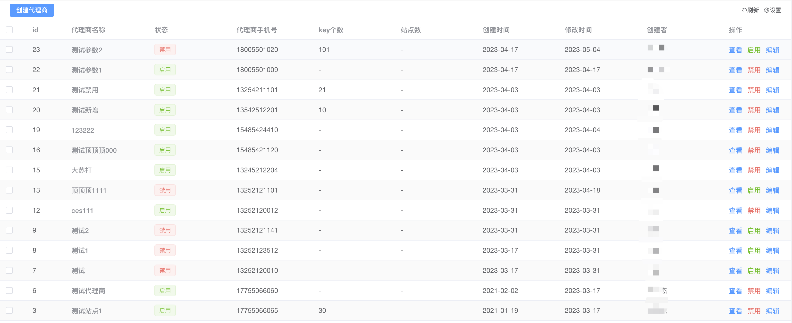
通用表格组件说明文档
通用表格
适用于常用表格的通用封装模式,通常搭配表格搜索组件和表格数据组件在一起使用
- 自适应表格
- 表格头部支持说明
- 可通过权限显示的下载按钮
- 快捷刷新按钮
- 自定义表格列
- 表格尺寸
基础配置
样例
<BaseTable
// 是否开启调试
:debug="process.env.NODE_ENV === 'development'"
// 表格的高度
:height="55"
// 表格名称
tableName="incomeListTable"
// 表格数据
:tableData="incomeData.items"
// 表格列
:tableColumn="tableColumn"
// loading加载
:loading="loading"
//  分页参数(可参考api)
:page="page"
// 刷新表格
@refresh="search"
// 分页条数
@handleSizeChange="handleSizeChange"
// 分页页数
@handleCurrentChange="handleCurrentChange"
// 是否显示多选框
:isCheck="false"
// 多选参数(可返回多选的ids)
@selectionChange="selectionChange"
// 是否支持展开
:isExpand="false"
>
  // 插槽组件
<template #btn>
    // 表格左上侧业务按钮
</template>
  // 插槽组件
<template #XXXHeader>
    // 自定义表头数据
</template>
  // 插槽组件
<template #tableHeader>
    // 这里写表格的头部内容
</template>
<template #companyName="{ data }">
    <el-popover placement="top-start" width="200" trigger="click">
      <div>
        <label style="margin-right:18px;">{{ data.companyName }}</label>
        <el-link :underline="false" type="primary" style="margin-bottom:3px;" @click="copy(data.companyName,$event)">复制</el-link>
      </div>
      <span slot="reference" class="span-color super-long-hidden">{{ data.companyName }}</span>
    </el-popover>
  </template>
  <template #categoryName="{data}">
    {{ data.categoryName + "/" + data.categoryItemName }}
  </template>
  <template #remark="{data}">
    <span v-if="data.markIncome == 2" class="span markIncome">不计入收益</span>
    <span v-if="!data.invoicedDate" class="span invoiced">未开票</span>
    <span class="span">{{ data.remark }}</span>
  </template>
  <template #invalid="{data}">
    <span :class="data.invalid === 1 ? 'red' : 'green'">{{
      data.invalid === 1 ? "作废" : "正常"
    }}</span>
  </template>
  <template #option="{data}">
    <el-link v-if="jurisdiction.indexOf('income.invalidIncome') != -1 && data.invalid !== 1" class="el-button__stop" type="danger" :underline="false" @click="addInvalidMemo(data)">作废</el-link>
    <el-link v-if="jurisdiction.indexOf('income.updateIncome') != -1" type="primary" style="margin-left:10px;" :underline="false" @click="addBigIncome(data.id)">{{ data.invalid !== 1 ? "编辑" : "查看" }}</el-link>
  </template>
</BaseTable>
tableColumn: [
{ prop: 'id', label: '编号', display: false, width: '80' },
{ prop: 'invoiceNumber', label: '发票编号', display: true, minWidth: '100' },
{ prop: 'invoiceCompany', label: '企业(发票抬头)', display: true, columnType: 1, columnSlot: 'invoiceCompany' },
{ prop: 'typeStr', label: '发票类型', minWidth: '80', display: true, columnType: 1, columnSlot: 'typeStr' },
{ prop: 'project', label: '开票项目', display: true },
{ prop: 'money', label: '开票金额', display: true, minWidth: '100' },
{ prop: 'createdAt', label: '开票时间', display: true, minWidth: '140', date: 'YYYY-MM-DD HH:mm' },
{ prop: 'userName', label: '申请人/部门', display: true, columnType: 1, columnSlot: 'userName' },
{ prop: 'status', label: '状态', display: true, minWidth: '100', columnType: 1, columnSlot: 'status' },
{ prop: 'incomeStr', label: '发票说明', display: true },
{ prop: 'remark', label: '备注', display: true },
{ prop: 'option', label: '操作', display: true, minWidth: '100', columnType: 1, columnSlot: 'option', required: true }
]API
table-data-表格数据
标识 | 说明 | 字段类型 | 描述 :----------- | :----------- | :-----------: | -----------: debug | 表格调试 | boolean | 当为false的时候,将不会存入sessionStorage中。建议外层直接给process.env.NODE_ENV === 'development',vue3:import.meta.env.VITE_NODE_ENV === 'development' height | 表格高度 | number | 用作表格上方多出的位置导致无法自适应,可以更加需求写上多出来的px高度即可 tableName | 表格名称 | string | 用作表格列的名称存入sessionStorage中 tableData | 表格显示内容 | [{}] | 可直接把接口返回的数组对象进行赋值(注意必须要有主键ID) loading | 表格loading状态 | string | 默认false,访问接口的时候给到true tips | 表格左上方的提示信息 | string | 废弃 isCheck | 是否显示多选 | boolean | 支持显示多选操作,可结合selectionChange方法使用 isExpand | 是否显示展开 | boolean | 支持点击展开 方法 | | | refresh | 刷新当前表格 | 原生方法 | | selectionChange | 获取多选框返回的ids | | sortChange | 获取排序的参数 | 接收值为:column: {prop: string, order: string}|
table-column-表格列
标识 | 说明 | 字段类型 | 描述 :----------- | :----------- | :-----------: | -----------: prop | 标识 | string | 表格需要显示值的名称(当标识为optinon,自动fixed=right) label | 字段 | string | 表格需要显示表头的名称 display | 显示 | boolean | 表格列是否显示 width | 定死长度 | string | 原生参数 minWidth | 最小长度 | string | 原生参数 columnType | 自定义列 | boolean,number | 表格列改成插槽的模式,给1就可以。判断是否有值 columnSlot | 插槽名称 | string | 配合columnType使用,用于插槽的名称 showOverflowTooltip | 是否超长隐藏 | boolean | 原生参数 required | 不显示可选列 | boolean | 不显示在自定义列的可选项中,可结合display做权限判断 date | 是否格式化日期 | datetime | 给到需要格式化的内容,如:'YYYY-MM-DD HH:mm' sortable | 是否支持排序 | boolean 或者 string | 如果是前端排序只需要传递true即可。如果需要获取排序参数给默认值:'custom'
page-分页
标识 | 说明 | 字段类型 | 描述 :----------- | :----------- | :-----------: | -----------: pageSize | 表格显示条数 | number | 分页的显示条数 pageNum | 表格显示页数 | number | 分页的显示页数 total | 表格显示总条数 | number | 分页的显示总条数 方法 | | | handleSizeChange | 点击条数 | 原生方法 | handleCurrentChange | 点击页数数 | 原生方法 |
export-导出(待开发)
标识 | 说明 | 字段类型 | 描述 :----------- | :----------- | :-----------: | -----------: export-ids | 导出ids | number[] | 导出选择的id,如果选择全部,则返回[]
通用搜索组件说明文档
通用搜索组件
用于常用表格的搜索组件
- 自适应宽度
- 支持左右结构

基础配置
样例
<BaseSearch :loading="loading" @search="search" @reset="reset">
  <template #searchFirst>
    <div class="search_item">
      <el-input v-model="searchForm.keywords" placeholder="请输入代理商名称" v-on:keyup.enter="search" @clear="search" clearable />
    </div>
  </template>
  <template #searchItem>
     <el-input v-model="searchForm.keywords" placeholder="请输入代理商名称" v-on:keyup.enter="search" @clear="search" clearable />
  </template>
  <template #searchRight>
     <el-button>添加</el-button>
  </template>
</BaseSearch>
API
baseSearch-表格搜索
标识 | 说明 | 字段类型 | 描述 :----------- | :----------- | :-----------: | -----------: searchFirst | 第一个搜索框容器,主要用于回车 | - | searchItem | 搜索列(属于左边容器) | - | searchRight | 右边容器 | - |
使用说明
安装通用组件
yarn add gouhilee-ui安装通用组件的依赖组件
yarn add dayjs
yarn add loadsh
yarn add sass
vue3组件中main.ts导入
import GouhiLeeUi from 'gouhilee-ui'
import "gouhilee-ui/dist/style.css"

---

// 导入全部通用组件
app.use(GouhiLeeUi)
找到根目录的env.d.ts文件添加申明类型
declare interface TableColumn {
  prop: string,
  label: string,
  display: boolean,
  minWidth?: number,
  width?: number,
  required?: boolean,
  columnType?: boolean,
  columnSlot?: string,
  showOverflowTooltip?: boolean,
  columnSlotHeader?: string,
  date?: string
}

declare interface Column {
  checkedColumn: string[],
  allColumn: string[]
}

declare interface CustomParams {
  tableColumn: TableColumn[];
  tableSize: string
}

declare interface Page {
  pageSize: number,
  pageNum: number,
  total?: number
}