
grainy-image
v1.2.3
Published
A Web Component for creating grainy/noisy image effects with 4 powerful methods: Canvas, CSS Gradient Mask, CSS Background Layers, and SVG feTurbulence
Maintainers
 yashrajbharti
Readme
Grainy Image Web Component


A powerful and flexible web component for applying grainy/noisy effects to images. Built with vanilla JavaScript, this component offers 4 different methods for creating grain effects, from pixel-level canvas manipulation to CSS gradient distortion tricks and SVG filters.
Features
- 4 Powerful Grain Methods: Canvas, CSS Gradient Mask, CSS Background Layers, and SVG feTurbulence
- Highly Configurable: Adjust intensity, animation, octaves, and more
- Web Component: Easy to use as a custom HTML element
- Performance Optimized: Each method optimized for its use case
- Zero Dependencies: Pure vanilla JavaScript
- Cross-browser Compatible: Works in all modern browsers
Installation
Via npm
npm install grainy-imageThen import in your JavaScript:
import 'grainy-image';Via CDN
<script src="https://unpkg.com/grainy-image@latest/grainy-image.js"></script>Manual
Download grainy-image.js and include it in your HTML:
<script src="grainy-image.js"></script>Quick Start
Open
index.htmlto see live examplesUse the custom element in your HTML:
<grainy-image
    method="canvas"
    intensity="0.3"
    width="400"
    height="300"
    src="your-image.jpg"
    alt="Description of the image">
</grainy-image>
Methods
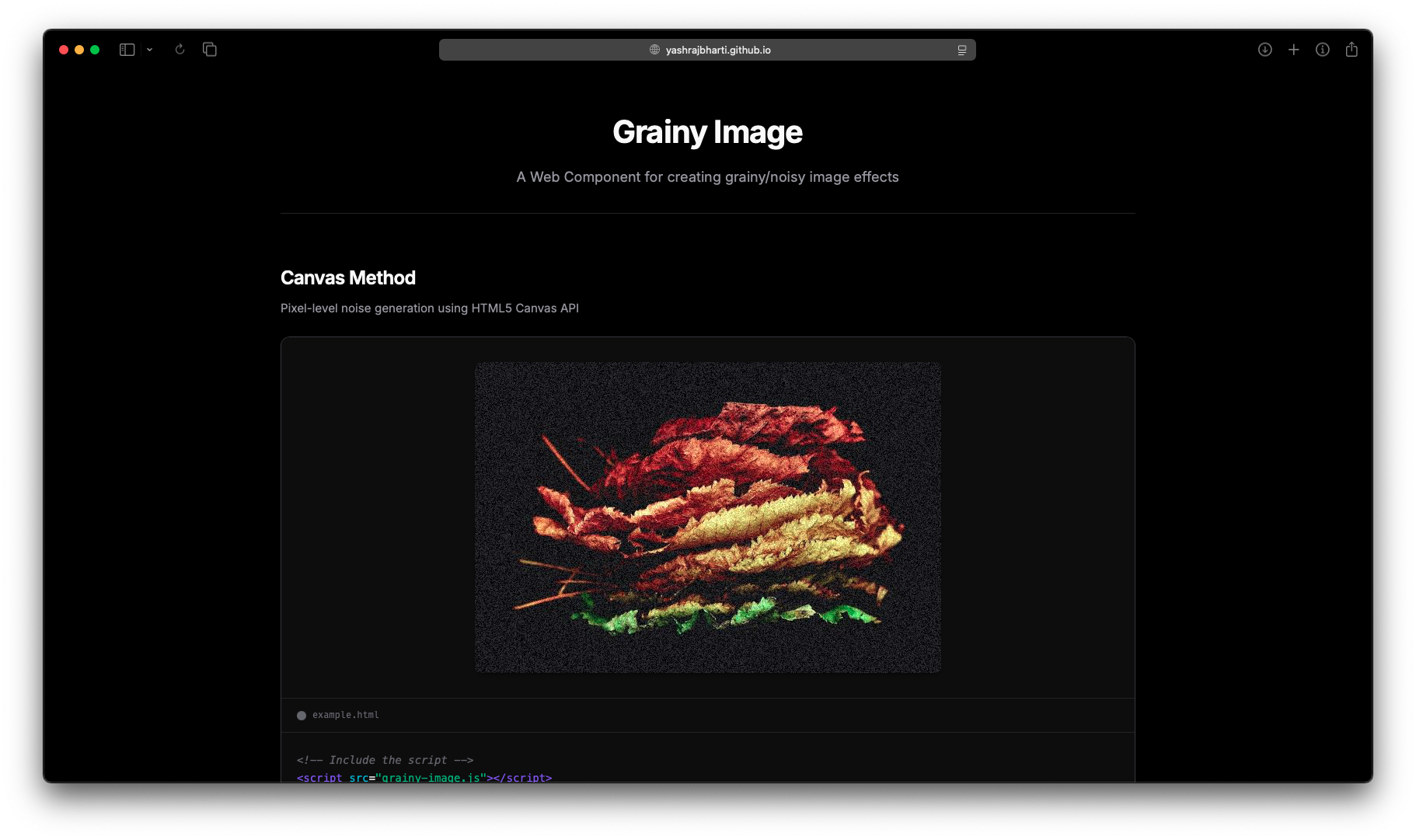
1. Canvas Method (method="canvas")
Generates noise at the pixel level using the Canvas API. Great for fine control and real-time animation. Provides true random noise that can be animated for a dynamic effect.
Attributes:
intensity: Noise intensity (0-1, default: 0.3)animated: Enable animation (true/false)
Example:
<grainy-image
    method="canvas"
    intensity="0.4"
    animated="true"
    src="image.jpg"
    alt="Photo with animated grain effect">
</grainy-image>
Best For:
- Photo editing interfaces
- Real-time filters
- Dynamic, changing grain effects
- Fine-grained control over noise
2. CSS Gradient Mask Method (method="css-mask")
Uses sub-pixel repeating radial gradients to create distortion. Inspired by Adam Argyle's technique. Creates a unique grain effect through rendering artifacts and has very low overhead.
Attributes:
intensity: Line width in pixels (0.00005-0.0002, default: 0.00011)animation-duration: Animation duration in seconds (default: 3)
Example:
<grainy-image
    method="css-mask"
    intensity="0.00015"
    animation-duration="10000"
    src="image.jpg"
    alt="Photo with gradient mask grain effect">
</grainy-image>
Best For:
- Subtle grain on text or UI elements
- Performance-critical applications
- Artistic distortion effects
- Unique, non-traditional grain patterns
3. CSS Background Layers Method (method="css-background")
Layers the image and a noise.svg texture using CSS backgrounds with blend modes. Creates a natural film grain effect by overlaying a noise texture.
Attributes:
intensity: Controls opacity (0-2, default: 1)noise-url: Path to noise SVG texture (default: "assets/noise.svg")animated: Enable subtle animation (true/false)
Example:
<grainy-image
    method="css-background"
    intensity="1"
    noise-url="assets/noise.svg"
    src="image.jpg"
    alt="Photo with background layer grain effect">
</grainy-image>
Best For:
- Natural film grain effects
- Vintage photo aesthetics
- Quick implementation with minimal code
- Consistent grain pattern across images
4. SVG feTurbulence Method (method="svg-turbulence")
Uses SVG filters with feTurbulence for fractal noise generation. Provides mathematical, organic-looking noise patterns with fine control over complexity.
Attributes:
intensity: Base frequency for turbulence (0.001-0.1, default: 0.02)octaves: Number of octaves for fractal detail (1-10, default: 3)
Example:
<grainy-image
    method="svg-turbulence"
    intensity="0.02"
    octaves="3"
    src="image.jpg"
    alt="Photo with SVG turbulence grain effect">
</grainy-image>
Best For:
- Organic, natural-looking grain
- Adjustable complexity with octaves
- Fractal noise patterns
- Professional photo effects
Attributes Reference
Complete Attributes Table
| Attribute | Applies To | Type | Default | Description |
|-----------|------------|------|---------|-------------|
| src | All methods | String | Required | Image URL or path |
| alt | All methods | String | "" | Alternative text for accessibility (recommended) |
| method | All methods | String | canvas | Grain method: canvas, css-mask, css-background, or svg-turbulence |
| width | All methods | Number | 400 | Width in pixels |
| height | All methods | Number | 300 | Height in pixels |
| intensity | All methods | Number | Varies* | Controls grain strength (see method-specific ranges below) |
| animated | Canvas, CSS Background | Boolean | false | Enable animated grain effect |
| animation-duration | CSS Gradient Mask | Number | 3 | Animation duration in seconds |
| octaves | SVG feTurbulence | Number | 3 | Number of octaves for fractal complexity (1-10) |
| noise-url | CSS Background | String | assets/noise.svg | Path to noise texture SVG file |
[!NOTE] Optional Attributes: All attributes except
srcare optional. Each method has sensible defaults.
[!IMPORTANT] Intensity Ranges by Method:
- Canvas:
0to1(default:0.3) - Higher values = more visible noise- CSS Gradient Mask:
0.00005to0.0002(default:0.00011) - Very small values for sub-pixel effects- CSS Background:
0to2(default:1) - Controls opacity of noise layer- SVG feTurbulence:
0.001to0.1(default:0.02) - Base frequency for turbulence
Method-Specific Attributes
| Method | Unique Attributes | Purpose |
|--------|-------------------|---------|
| Canvas | animated | Enable real-time noise regeneration |
| CSS Gradient Mask | animation-duration | Control speed of gradient animation |
| CSS Background | animated, noise-url | Animate noise position, custom texture |
| SVG feTurbulence | octaves | Control fractal complexity |
Dynamic Updates
You can dynamically update attributes using JavaScript:
const grainImage = document.querySelector('grainy-image');

// Update alt text for accessibility
grainImage.setAttribute('alt', 'Updated image description');

// Update intensity
grainImage.setAttribute('intensity', '0.5');

// Toggle animation (canvas and css-background)
grainImage.setAttribute('animated', 'true');

// Change method
grainImage.setAttribute('method', 'css-mask');

// Set animation duration (css-mask only)
grainImage.setAttribute('animation-duration', '5000');

// Set octaves (svg-turbulence only)
grainImage.setAttribute('octaves', '4');
Styling
The component uses Shadow DOM, so it's encapsulated by default. You can style the host element:
grainy-image {
    border-radius: 12px;
    box-shadow: 0 4px 8px rgba(0, 0, 0, 0.2);
    display: block;
    max-width: 100%;
}
Performance Considerations
Canvas Method
- Best for animated grain with full control
- Higher CPU usage when animated
- Excellent for one-time static grain generation
- Can handle any image size
CSS Gradient Mask
- Very performant, GPU-accelerated
- Minimal CPU usage
- Creates unique artistic grain patterns
- Always animated (subtle) for the effect to work
CSS Background Layers
- Lightweight and performant
- GPU-accelerated with blend modes
- Requires external noise texture file
- Very fast rendering
SVG feTurbulence
- GPU-accelerated SVG filters
- Great performance with no animation
- Mathematical precision
- No external dependencies
Examples
Hero Image with Subtle Grain
<grainy-image
    method="css-mask"
    intensity="0.0001"
    animation-duration="10000"
    width="1200"
    height="600"
    src="hero.jpg"
    alt="Hero banner image with subtle grain effect">
</grainy-image>
Credits
Inspired by:
- Adam Argyle's CSS grain technique
- CSS-Tricks grainy gradients
- SVG filter specifications (feTurbulence)
- Classic film grain effects
- CSS blend modes and layering techniques
License
MIT License - Feel free to use in your projects!
Contributing
Contributions welcome! Feel free to:
- Add new grain methods
- Improve existing methods
- Enhance performance
- Add more configuration options
- Fix bugs
- Improve documentation
- Add more examples
Create beautiful grainy images with ease!