
grid-overflow
v1.2.7
Published
A pure CSS solution for gallery masonry layout and grid layout. It has optional 3D hover effect, utility classes. Adjustable by CSS variables.
Maintainers
 roman-flossler
Readme
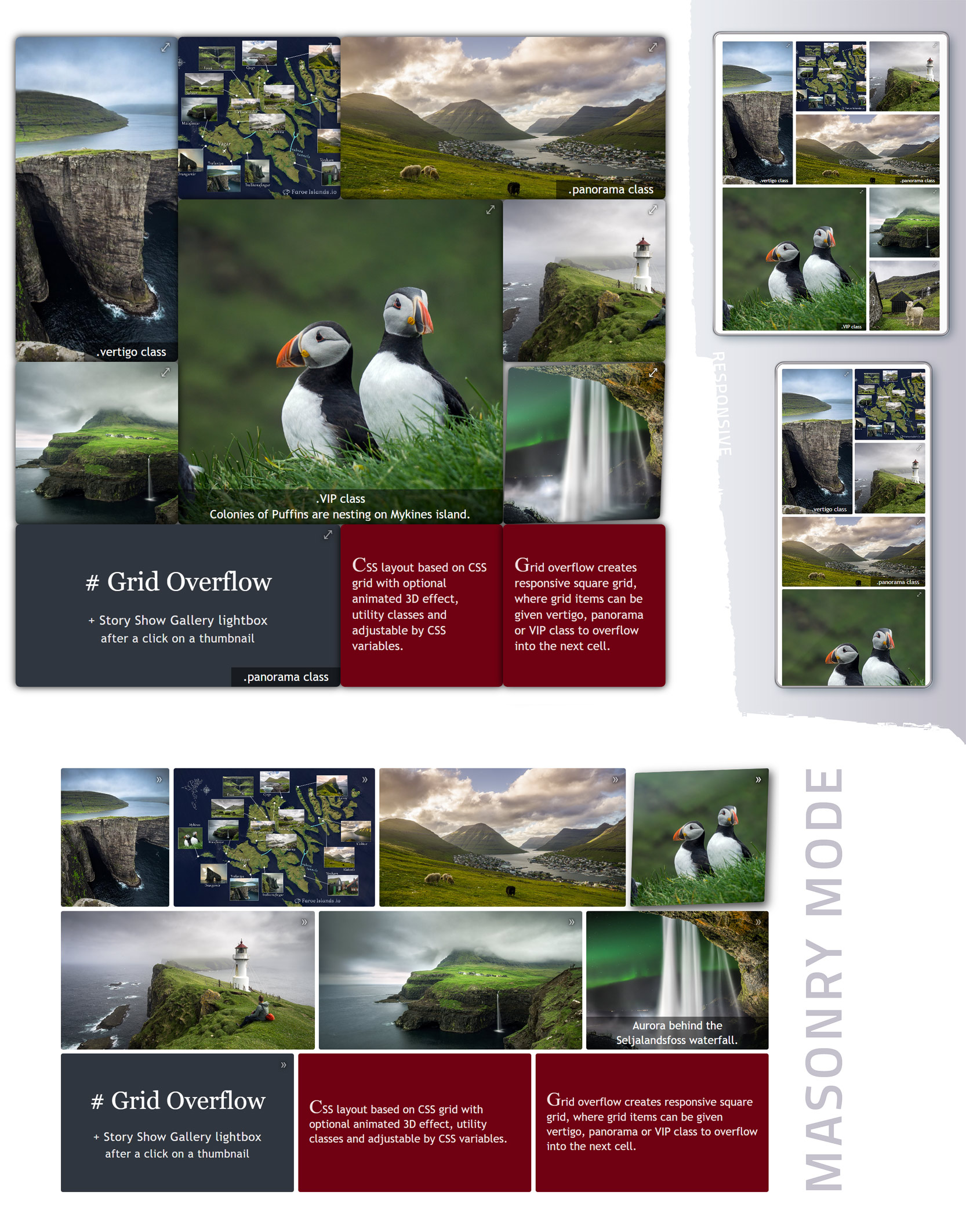
Grid Overflow - responsive CSS grid layout
A pure CSS solution for masonry layout and grid layout, where grid items can be given vertigo, panorama or VIP classes to set their overflow into the next cell.
Responsive CSS layout based on CSS grid + flex with optional animated 3D effect, utility classes and adjustable via CSS variables.
You can use images of any size, they will be automatically adjusted to fit the grid according to the CSS variables settings.
.
😎 You can try above example at https://www.flor.cz/gridOverflow
Grid Overflow can be used with any framework, here is the React demo - https://codesandbox.io/p/sandbox/cool-albattani-c7gm6s
Implementation
Link Grid Overflow CSS into head section of HTML document
<link rel="stylesheet" href="path/to/GridOverflow3D.min.css" />Create some parent element, its children with content and add neccessary classes:
<!-- gridOverflow class is required - creates responsive grid from grid's direct children (items) -->
<!-- go-3Dfx or go-zoomFx class adds to each grid item animated effect on mouse over. You can use them together -->
<!-- go-actionIcon class adds to top right corner of grid items some symbol, but only if grid item is <a> tag  -->
<div class="gridOverflow go-3Dfx go-actionIcon">

  <!-- grid item (grid's direct child) must have go_gridItem class. Grid element has square form by default. -->
  <a class="go_gridItem href="someURL">
    grid item content - thumbnail image <img>, text <p>
    <!-- go_caption class is for creating captions inside grid items -->
    <!-- go_caption-full creates caption with 100% width of the grid item -->
    <span class="go_caption go_caption-full">some caption</span>
  </a>

  <!-- go_gridItem-panorama class creates a grid item in the form of a horizontal rectangle (2x1 cells) -->
  <a class="go_gridItem go_gridItem-panorama" href="someURL"> grid item content - thumbnail image <img>, text <p> </a>

  <!-- go_gridItem-vertigo class creates a grid item in the form of a vertical rectangle (1x2 cells) -->
  <a class="go_gridItem go_gridItem-vertigo" href="someURL"> grid item content - thumbnail image <img>, text <p> </a>

  <!-- go_gridItem-VIP class creates a grid item in the form of a large square (2x2 cells) -->
  <a class="go_gridItem go_gridItem-VIP" href="someURL"> grid item content - thumbnail image <img>, text <p> </a>

  <!-- go_gridItem-centered centers the content -->
  <div class="go_gridItem go_gridItem-centered" href="someURL"><p> centered content - typically some text </p></div>
</div>
😎 Code example: https://codesandbox.io/s/gallery-thumbnails-in-css-grid-layout-full-screen-lightbox-8u6ybo
GridOverflow element will expand to fill 100% width of its parent element.
GridOverflow class has grid-auto-flow set to dense, it means that grid items may appear out of order to fill in holes left by larger items. It happens only if you use panorama, vertigo or VIP class. Without this classes each grid item will have the same size and there will be no problem to keep correct order of items.
Basic parameters of Grid Overflow can be set via CSS variables:
.gridOverflow {
  --gridGap: 10px;
  --itemMinWidth: 210px;
  --itemAspectRatio: 1;
  --itemRounding: 3px;
  --linkActionIcon: "⤢";

  --masonryItemHeight: 180px;
}
The number of columns in the grid is determined by --itemMinWidth, but the minimum is two columns.
If the parent element of the gridOverflow has a width of 700px, the grid will have 3 columns: 3 * 210px + 2 * 10px for the grid gap (numbers are defined by the CSS variables).
Items will expand to fill the entire width of the parent element.
If you set --itemMinWidth to 30%, there will be three columns regardless of the grid width. The remaining 10% is for the gap between items.
--itemAspectRatio defines the height/width ratio of a grid item. A value of 0.5 creates a horizontal rectangle - the height will be half the width. A value of 1 creates a square shaped item.
Masonry mode
Simply add the go-masonry class to the parent grid element to enable masonry mode. You can also specify --masonryItemHeight.
<!-- gridOverflow is required - creates the grid  -->
<!-- go-masonry class turns the grid layout into the masonry mode  -->
<!-- go-3Dfx or go-zoomFx class adds to each grid item animated effect on mouse over. You can use them together -->
<div class="gridOverflow go-masonry go-zoomFx go-actionIcon">

  <!-- grid item (grid's direct child) must have go_gridItem class.  -->
  <a class="go_gridItem href="someURL">
    <!-- length of the grid item is variable and depends on the image size, height depends on the --masonryItemHeight -->
    <img src="someURL" />
  </a>

  <a class="go_gridItem href="someURL">
    <img src="someURL" />
    <!-- go_caption class is for creating captions inside grid items -->
    <!-- go_caption-full creates caption with 100% width of the grid item -->
    <span class="go_caption go_caption-full">some caption</span>
  </a>

  <!-- go_gridItem-centered centers the content, its length depends on --itemMinWidth. -->
  <!-- Also go_gridItem-noImage class can be used for a text content (no centering)  -->
  <div class="go_gridItem go_gridItem-centered" href="someURL"><p> centered content - typically some text </p> </div>
</div>
😎 Code example: https://codesandbox.io/s/masonry-css-layout-of-gallery-thumbnails-full-screen-lightbox-wkzsvo
In masonry mode, the size of the grid items is determined by the aspect ratio of the images, so the Vertigo, Panorama and VIP classes have no effect. As well as --itemAspectRatio.
The CSS variable --itemMinWidth only affects grid items with go_gridItem-centered or go_gridItem-noImage classes. Grid items where the text or mixed content is supposed.
The minimum number of columns in the masonry mode is one.