
griddis
v0.3.7
Published
Framework-agnostic TypeScript dashboard layout engine for React, Vue, Svelte, Angular, and vanilla web apps.

Maintainers
 thooom
Readme
Griddis
A lightweight TypeScript dashboard grid engine for draggable, resizable widgets.
- ✨ Framework agnostic
- ✨ Responsive
- ✨ JSON layout persistence
- ✨ TypeScript first
- ✨ Drag and resize
Features
- Grid-based layout engine
- Drag-and-drop widget movement API
- Widget resizing API
- Snap-to-grid positioning
- Collision detection and resolution
- Optional same-size widget swap on drag collisions (enabled by default)
- Configurable grid dimensions (columns and optional row bounds)
- Template-based widget catalog controlled by the consuming project
- Save and restore layouts as JSON
- Event system for widget and layout updates
- Plugin architecture for custom widget behavior
- Strong TypeScript typing and modular public API
Installation
npm install griddisQuick Start
import { Dashboard } from 'griddis';

const dashboard = new Dashboard({
  columns: 12,
  rows: 10,
  swapEnabled: true,
  widgetTemplates: [
    { id: 'kpi-1x1', type: 'kpi', w: 1, h: 1, label: 'KPI 1x1' },
    { id: 'graph-2x2', type: 'graph', w: 2, h: 2, label: 'Graph 2x2' },
    { id: 'list-4x2', type: 'list', w: 4, h: 2, label: 'List 4x2' }
  ]
});

dashboard.registerPlugin('chart', (widget) => ({
  ...widget,
  data: widget.data ?? { title: 'New Chart' }
}));

dashboard.on('layoutChanged', (layout) => {
  console.log('Layout updated', layout);
});

// Adds an empty widget with size taken from the registered template.
dashboard.addWidgetFromTemplate('graph-2x2', {
  id: 'widget-1',
  x: 0,
  y: 0
});

// Optional runtime toggle if your app needs to disable swap behavior.
dashboard.setSwapEnabled(false);
The consuming project decides which templates exist and what each size/type means. For example: 1x1, 1x2, and 1x3 as KPI tiles; 2x2 and 2x3 as graphs; 4x2 as lists. The package only enforces layout behavior and sizing.
Core API Reference
This section lists the public functions on Dashboard and what each one is for.
Constructor and Options
- new Dashboard(options): Creates a dashboard instance.
- options.columns: Grid column count (default 12).
- options.rows: Optional max row count.
- options.swapEnabled: Enables same-size swap on drag collisions (default true).
- options.widgetTemplates: Initial template catalog.
- options.storage: Optional custom storage adapter.
- options.eventBus: Optional custom event bus.
Plugin API
- registerPlugin(type, initialize): Registers type-specific widget initialization logic.
Template and Size APIs
- setWidgetTemplates(templates): Replaces all templates.
- registerWidgetTemplate(template): Adds or updates one template.
- getWidgetTemplates(): Returns all registered templates.
- getValidSizesForType(type): Returns allowed w/h pairs for a widget type.
- addWidgetFromTemplate(templateId, options): Creates a widget using a registered template.
Widget and Layout APIs
- addWidget(widget): Adds a fully-defined widget.
- updateWidget(widget): Updates one widget and resolves collisions.
- moveWidget(id, x, y): Moves a widget to a target position.
- resizeWidget(id, w, h): Resizes a widget to a target size.
- removeWidget(id): Removes a widget.
- getWidgets(): Returns all widgets.
- setLayout(widgets): Replaces current layout with a full layout snapshot.
- clearLayout(): Clears all widgets.
- applyDefaultLayout(widgets, options): Applies a default layout; can be conditional.
Grid and Responsive APIs
- setColumns(columns): Changes column count and reflows layout.
- setRows(rows): Changes optional row bound and reflows layout.
- setDimensions({ columns, rows }): Updates both columns and rows.
- getDimensions(): Returns current grid dimensions.
- applyResponsiveDimensions(width, breakpoints): Selects and applies a breakpoint rule.
Swap APIs
- setSwapEnabled(enabled): Enables or disables same-size swap behavior at runtime.
- isSwapEnabled(): Reads current swap setting.
Events API
- on(event, handler): Subscribes to widgetAdded, widgetUpdated, widgetRemoved, or layoutChanged. Returns an unsubscribe function.
Persistence APIs
- saveLayout(key): Saves current layout by key.
- restoreLayout(key): Restores layout by key.
- saveScopedLayout(scope): Saves using a structured scope and returns resolved key.
- restoreScopedLayout(scope): Restores using a structured scope.
- hasScopedLayout(scope): Checks whether scoped layout exists.
- restoreScopedLayoutOrDefault(scope, defaultWidgets): Restores saved layout or applies default.
Interaction Patterns
Edit Mode Toggle
Dashboard is headless and does not include built-in edit mode state. Use app-level state to gate interactions in your UI. In the demo app, edit mode controls whether add/remove/drag/resize actions are enabled.
Add Widgets
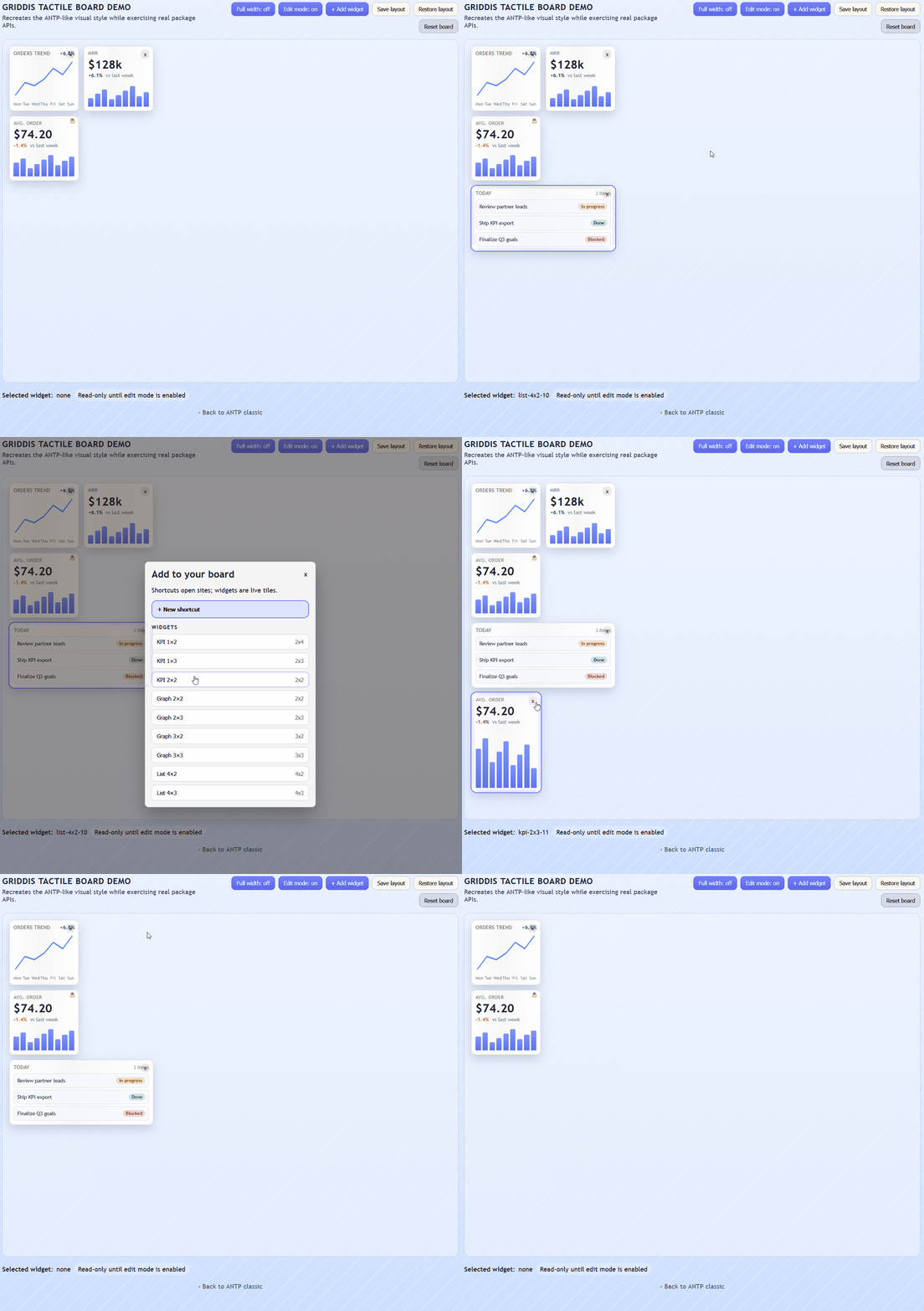
Use template-based adds when you want strict size/type control:
dashboard.addWidgetFromTemplate('graph-2x2', {
  id: 'sales-graph',
  x: 0,
  y: 0
});
Use addWidget when your app already has a fully composed widget object.
Move Widgets and Swap
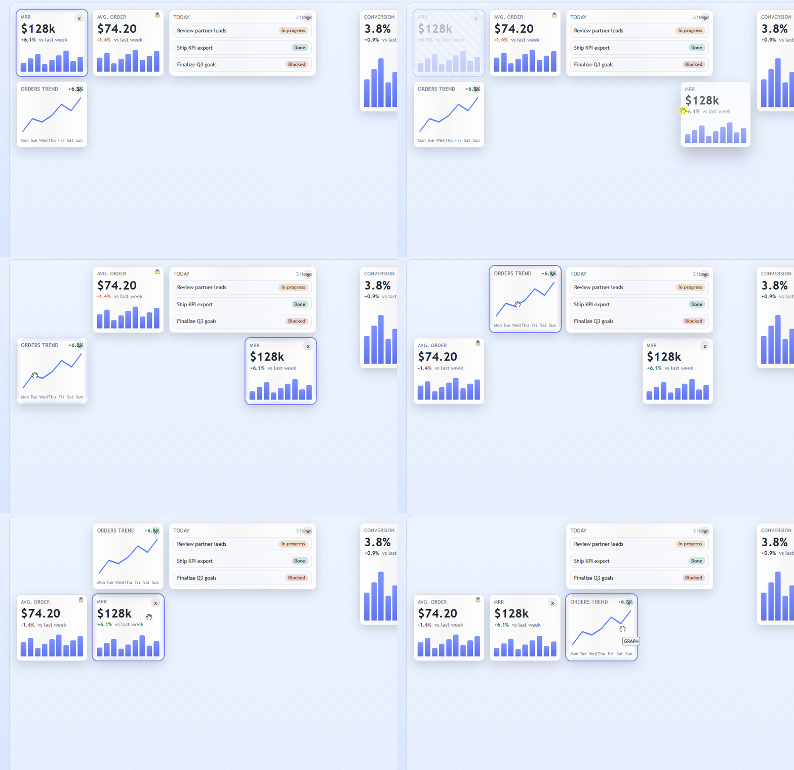
Use moveWidget for drag-and-drop updates:
dashboard.moveWidget('sales-graph', 3, 1);If swap is enabled, moving onto exactly one overlapping widget of the same size will swap positions. If swap is disabled or incompatible, normal collision resolution is applied.
dashboard.setSwapEnabled(true);
const swapEnabled = dashboard.isSwapEnabled();
Resize Widgets
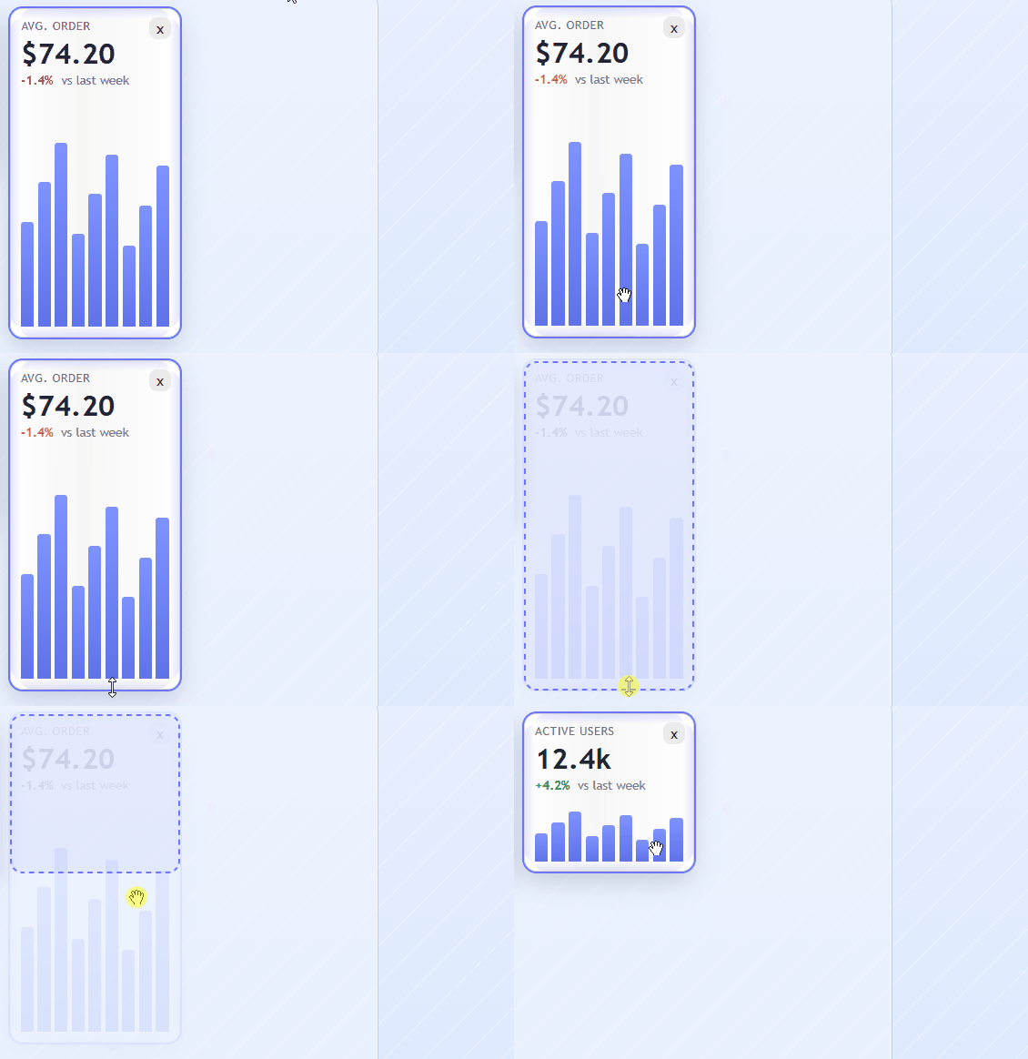
Use resizeWidget for programmatic size updates:
dashboard.resizeWidget('sales-graph', 3, 2);If the new size collides or violates bounds, collision handling/normalization applies through update logic.
Lock Resizing to Predetermined Sizes
There are two common layers:
- Template policy: Register only allowed sizes for each type.
- UI snapping policy: During resize drag, snap attempted size to nearest allowed size from getValidSizesForType(type).
Example allowed templates:
dashboard.setWidgetTemplates([
  { id: 'kpi-2x2', type: 'kpi', w: 2, h: 2 },
  { id: 'kpi-2x3', type: 'kpi', w: 2, h: 3 },
  { id: 'kpi-2x4', type: 'kpi', w: 2, h: 4 }
]);
Example resize snapping lookup:
const validSizes = dashboard.getValidSizesForType('kpi');
// validSizes => [{ w: 2, h: 2 }, { w: 2, h: 3 }, { w: 2, h: 4 }]
The included demo implements this approach when handling pointer resize events.
User Guide
This section describes a production-oriented setup for designing widgets, handling responsive breakpoints, defining defaults, and saving personal layouts.
1) How to Design a Widget
In griddis, widget design has 3 layers:
- Type: semantic category (
kpi,graph,list, etc.) - Template: concrete size for that type (
kpi-1x1,kpi-2x2, etc.) - UI render: your app's component/view for that type and data
Start by defining templates for every allowed size and type combination:
const dashboard = new Dashboard({
  columns: 9,
  widgetTemplates: [
    { id: 'kpi-1x1', type: 'kpi', w: 1, h: 1, label: 'KPI 1x1' },
    { id: 'kpi-1x2', type: 'kpi', w: 1, h: 2, label: 'KPI 1x2' },
    { id: 'graph-2x2', type: 'graph', w: 2, h: 2, label: 'Graph 2x2' },
    { id: 'list-4x2', type: 'list', w: 4, h: 2, label: 'List 4x2' }
  ]
});
Add widgets from templates so size/type rules stay centralized:
dashboard.addWidgetFromTemplate('graph-2x2', { id: 'sales-graph', x: 0, y: 0 });If you want default data when creating a type, use plugins:
dashboard.registerPlugin('kpi', (widget) => ({
  ...widget,
  data: widget.data ?? { title: 'Untitled KPI', value: null }
}));
2) How to Create Various Sizes (Columns and Screen Widths)
Responsive behavior is project-defined. The package gives you setColumns and setDimensions; your app decides breakpoints.
const responsivePolicy = [
  { key: 'ultra', minWidth: 1920, columns: 12 },
  { key: 'desktop', minWidth: 1024, columns: 9 },
  { key: 'tablet', minWidth: 640, columns: 6 },
  { key: 'mobile', minWidth: 0, columns: 3 }
];

function getCurrentBreakpoint(width: number) {
  return responsivePolicy.find((entry) => width >= entry.minWidth) ?? responsivePolicy[responsivePolicy.length - 1];
}

function applyResponsiveColumns() {
  const bp = getCurrentBreakpoint(window.innerWidth);
  dashboard.setColumns(bp.columns);
}

window.addEventListener('resize', applyResponsiveColumns);
applyResponsiveColumns();
If you prefer package-managed breakpoint selection, you can use applyResponsiveDimensions directly:
const selected = dashboard.applyResponsiveDimensions(window.innerWidth, responsivePolicy);
console.log(selected.key); // ultra | desktop | tablet | mobile
When columns shrink, griddis reflows layout to avoid overlap and keep widgets inside bounds.
3) How to Set a Default Layout (All Users)
Define a seed function in code and run it only when no user-specific layout exists.
function applyDefaultLayout() {
  dashboard.addWidgetFromTemplate('kpi-1x1', { id: 'kpi-a', x: 0, y: 0 });
  dashboard.addWidgetFromTemplate('graph-2x2', { id: 'graph-a', x: 1, y: 0 });
  dashboard.addWidgetFromTemplate('list-4x2', { id: 'list-a', x: 3, y: 0 });
}
Recommended boot sequence:
- Create dashboard with templates
- Apply current breakpoint columns
- Try restore personal layout
- If none found, apply default layout
4) How to Save Personal Layout for Specific Users
Use namespaced keys. Common pattern:
layout:${appId}:${userId}:${breakpointKey}
function layoutKey(appId: string, userId: string, breakpointKey: string) {
  return `layout:${appId}:${userId}:${breakpointKey}`;
}

async function savePersonalLayout(appId: string, userId: string, breakpointKey: string) {
  await dashboard.saveLayout(layoutKey(appId, userId, breakpointKey));
}

async function restorePersonalLayout(appId: string, userId: string, breakpointKey: string) {
  // Best used at startup with an empty dashboard.
  const widgets = await dashboard.restoreLayout(layoutKey(appId, userId, breakpointKey));
  return widgets.length > 0;
}
You can also use built-in scoped helpers:
await dashboard.saveScopedLayout({
  appId: 'sales',
  userId: 'u42',
  breakpointKey: 'desktop'
});

await dashboard.restoreScopedLayout({
  appId: 'sales',
  userId: 'u42',
  breakpointKey: 'desktop'
});
Default-layout fallback can be handled with one call:
const result = await dashboard.restoreScopedLayoutOrDefault(
  { appId: 'sales', userId: 'u42', breakpointKey: 'mobile' },
  [
    { id: 'default-kpi', type: 'kpi', x: 0, y: 0, w: 1, h: 1 },
    { id: 'default-graph', type: 'graph', x: 1, y: 0, w: 2, h: 2 }
  ]
);

console.log(result.source); // 'saved' or 'default'
For per-breakpoint layouts, restore on breakpoint changes:
- If saved layout exists for that breakpoint: restore it
- If no saved layout exists: adapt current layout by applying new columns
In browser-only apps this can be backed by localStorage; for multi-device sync use a server-backed StorageAdapter keyed by user identity.
Widget Model
interface DashboardWidget {
  id: string;
  type: string;
  x: number;
  y: number;
  w: number;
  h: number;
  minW?: number;
  minH?: number;
  maxW?: number;
  maxH?: number;
  data?: unknown;
}

interface WidgetTemplate {
  id: string;
  type: string;
  w: number;
  h: number;
  label?: string;
}

interface DashboardDimensions {
  columns: number;
  rows?: number;
}

interface LayoutScope {
  appId: string;
  userId: string;
  breakpointKey?: string;
  layoutId?: string;
  namespace?: string;
}

interface ResponsiveBreakpoint {
  key: string;
  minWidth: number;
  columns: number;
  rows?: number;
}
Project Structure
src/
  core/
    Dashboard.ts
    Widget.ts
    Layout.ts
  grid/
    GridEngine.ts
    CollisionEngine.ts
    DragManager.ts
    ResizeManager.ts
  events/
    EventBus.ts
  storage/
    StorageAdapter.ts
    MemoryStorage.ts
  plugins/
    PluginManager.ts
  types/
    index.ts
  utils/
Development
npm install
npm run lint
npm test
npm run build
Demo App
A local consumer app lives in demo/ so you can test the package as an npm dependency during development.
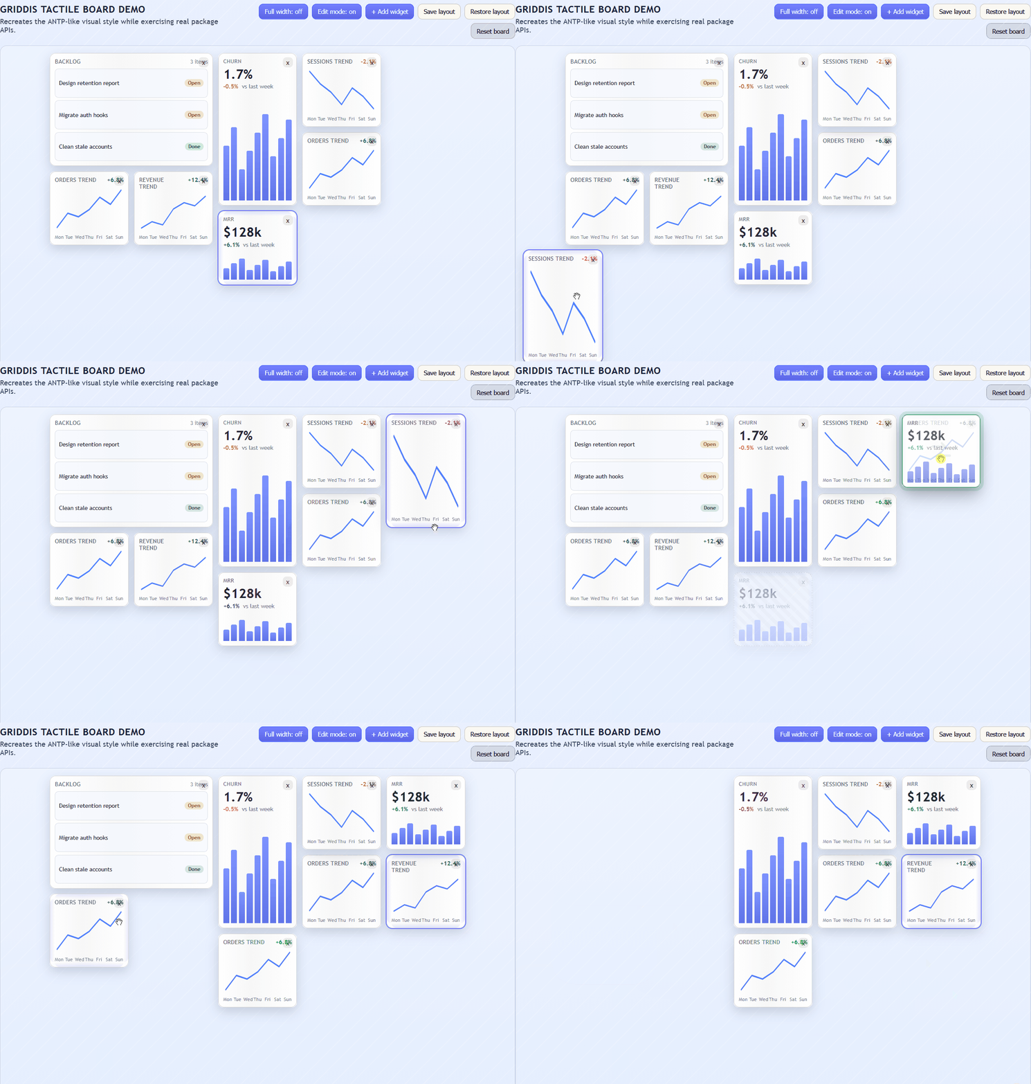
The demo is intentionally styled as a modern dashboard and exercises package APIs through UI actions:
- Toggle edit mode on/off to control whether layout editing is allowed
- Add and remove widgets
- Drag and move selected widgets
- Resize selected widgets
- Same-size swap candidate feedback (green), incompatible overlap feedback (red), and swap cursor hints during drag
- Ghost drag origin and live drag preview while moving widgets
- Resize overlap blocking with red invalid feedback when a resize would collide
- Save and restore layout
- Reset to a seeded reference layout
npm run build
npm run demo:install
npm run demo:dev
For a production-style check of the demo consumer:
npm run demo:buildIf this build succeeds, your package exports and runtime integration are valid in a real app context.
License
MIT