
gridsome-plugin-remark-container
v0.1.3
Published
Markdown parsing for custom containers
Maintainers
 davidcouronne
Readme
gridsome-plugin-remark-container
gridsome plugin remark container
Based on remarkable-admonitions
Installation
npm install gridsome-plugin-remark-container
or
yarn add gridsome-plugin-remark-container
// gridsome.config.js
module.exports = {
  transformers: {
    //Add markdown support to all file-system sources
    remark: {
      externalLinksTarget: "_blank",
      externalLinksRel: ["nofollow", "noopener", "noreferrer"],
      anchorClassName: "icon icon-link",
      plugins: ["gridsome-plugin-remark-container"]
    }
  }
};
// main.js
import "gridsome-plugin-remark-container/themes/default.css";
//or
import "gridsome-plugin-remark-container/themes/docusaurus.css";
//or
import "gridsome-plugin-remark-container/themes/classic.css";
//or
import "gridsome-plugin-remark-container/themes/vuepress.css";Usage
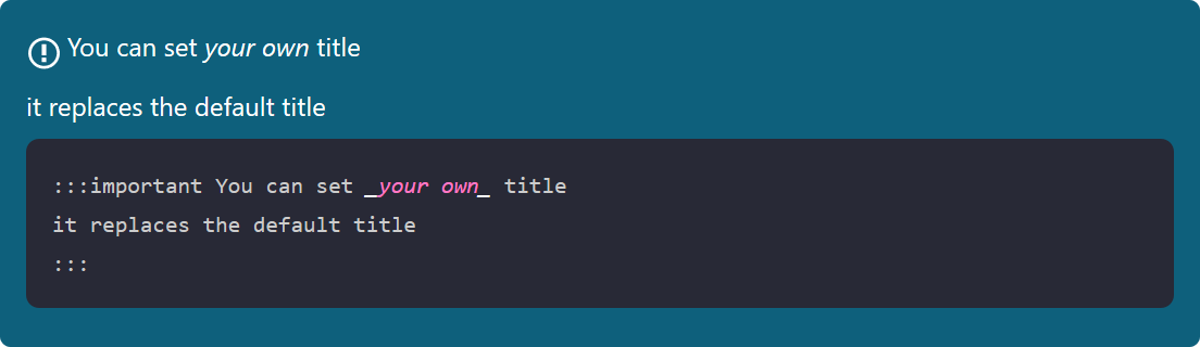
The general syntax is
:::keyword optional title
some content
:::
For example,
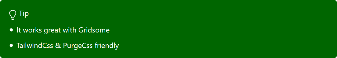
:::tip pro tip
`gridsome-plugin-remark-container` is pretty great!
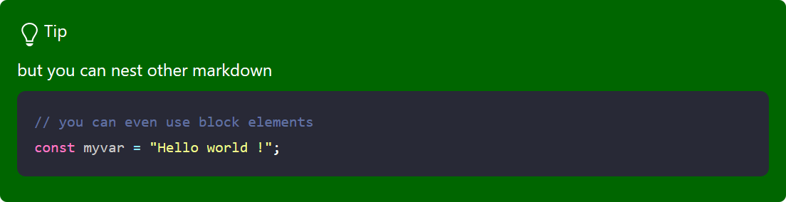
:::The default keywords are important, tip, note, warning, danger and details.
Samples


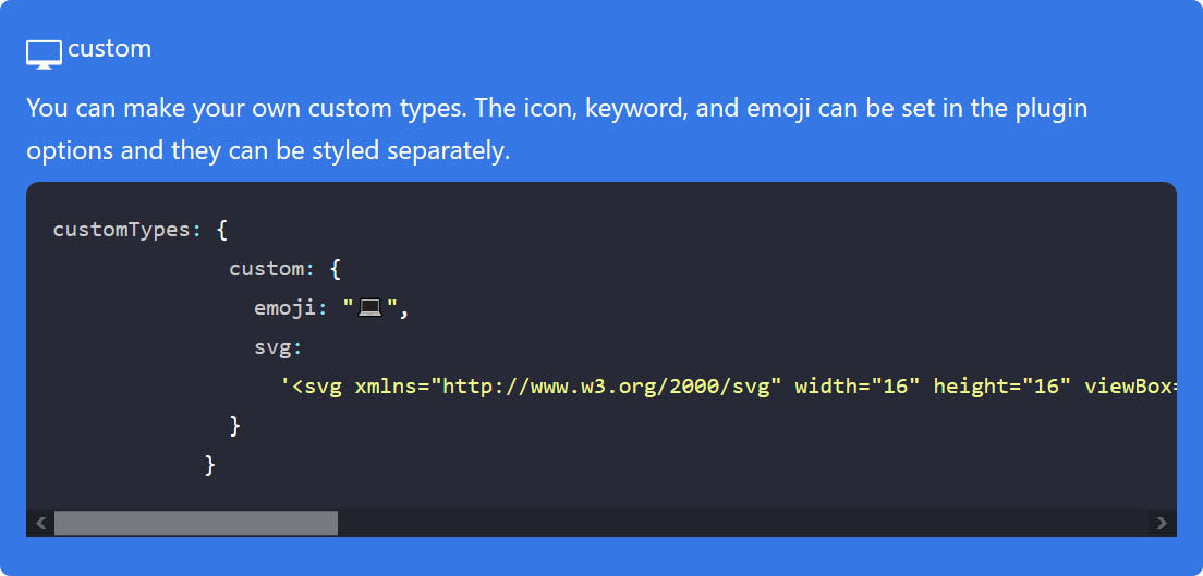

Custom Types
The customTypes option can be used to add additional types. You can set the svg and emoji icons as well as the keyword. You only have to include the svg/emoji fields if you are using them.
For example, this will allow you to generate blocks with the custom keyword.
//gridsome.config.js;
module.exports = {
.....
transformers: {
//Add markdown support to all file-system sources
remark: {
plugins: [
[
"gridsome-plugin-remark-container",
{
customTypes: {
custom: {
defaultTitle: "Custom",
emoji: "💻",
svg:
'<svg xmlns="http://www.w3.org/2000/svg" width="16" height="16" viewBox="0 0 16 16"><path fill-rule="evenodd" d="M15 2H1c-.55 0-1 .45-1 1v9c0 .55.45 1 1 1h5.34c-.25.61-.86 1.39-2.34 2h8c-1.48-.61-2.09-1.39-2.34-2H15c.55 0 1-.45 1-1V3c0-.55-.45-1-1-1zm0 9H1V3h14v8z"></path></svg>'
}
}
}
]
]
}
}
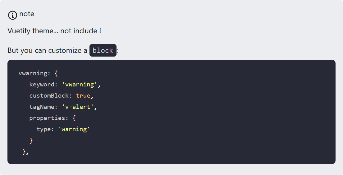
};Advanced
You can override the default behaviour of the plugin.
May you work whith Vuetify, et you want to use the vuetify's alerts.
customTypes: {
 vwarning: {
    keyword: 'vwarning',
    customBlock: true,
    tagName: 'v-alert',
    properties: {
      type: 'warning'
    }
  },
}
Then:
:::vwarning
...
:::
will be render:
 <v-alert type="warning">
    ...
</v-alert>
Default options
[
"gridsome-plugin-remark-container",
{
  customTypes: {},
  useDefaultTypes: true, //set to false if you don't want to use default types
  tag: ':::',
  icons: 'svg', //can be 'emoji' or 'none'
  classMaster: 'admonition' //generate admonition-content, admonition-icon, admonition-heading
}
]
Default types
// natively supported types
const types = {
// aliases
secondary: 'note',
info: 'important',
success: 'tip',
danger: 'warning',
// base types
note: {
keyword: 'note',
defaultTitle: 'Note',
emoji: 'ℹ️',
svg:
'<svg xmlns="http://www.w3.org/2000/svg" width="14" height="16" viewBox="0 0 14 16"><path fill-rule="evenodd" d="M6.3 5.69a.942.942 0 0 1-.28-.7c0-.28.09-.52.28-.7.19-.18.42-.28.7-.28.28 0 .52.09.7.28.18.19.28.42.28.7 0 .28-.09.52-.28.7a1 1 0 0 1-.7.3c-.28 0-.52-.11-.7-.3zM8 7.99c-.02-.25-.11-.48-.31-.69-.2-.19-.42-.3-.69-.31H6c-.27.02-.48.13-.69.31-.2.2-.3.44-.31.69h1v3c.02.27.11.5.31.69.2.2.42.31.69.31h1c.27 0 .48-.11.69-.31.2-.19.3-.42.31-.69H8V7.98v.01zM7 2.3c-3.14 0-5.7 2.54-5.7 5.68 0 3.14 2.56 5.7 5.7 5.7s5.7-2.55 5.7-5.7c0-3.15-2.56-5.69-5.7-5.69v.01zM7 .98c3.86 0 7 3.14 7 7s-3.14 7-7 7-7-3.12-7-7 3.14-7 7-7z"/></svg>'
},
tip: {
keyword: 'tip',
defaultTitle: 'Tip',
emoji: '💡',
svg:
'<svg xmlns="http://www.w3.org/2000/svg" width="12" height="16" viewBox="0 0 12 16"><path fill-rule="evenodd" d="M6.5 0C3.48 0 1 2.19 1 5c0 .92.55 2.25 1 3 1.34 2.25 1.78 2.78 2 4v1h5v-1c.22-1.22.66-1.75 2-4 .45-.75 1-2.08 1-3 0-2.81-2.48-5-5.5-5zm3.64 7.48c-.25.44-.47.8-.67 1.11-.86 1.41-1.25 2.06-1.45 3.23-.02.05-.02.11-.02.17H5c0-.06 0-.13-.02-.17-.2-1.17-.59-1.83-1.45-3.23-.2-.31-.42-.67-.67-1.11C2.44 6.78 2 5.65 2 5c0-2.2 2.02-4 4.5-4 1.22 0 2.36.42 3.22 1.19C10.55 2.94 11 3.94 11 5c0 .66-.44 1.78-.86 2.48zM4 14h5c-.23 1.14-1.3 2-2.5 2s-2.27-.86-2.5-2z"/></svg>'
},
warning: {
keyword: 'warning',
defaultTitle: 'Warning',
emoji: '🔥',
svg:
'<svg xmlns="http://www.w3.org/2000/svg" width="12" height="16" viewBox="0 0 12 16"><path fill-rule="evenodd" d="M5.05.31c.81 2.17.41 3.38-.52 4.31C3.55 5.67 1.98 6.45.9 7.98c-1.45 2.05-1.7 6.53 3.53 7.7-2.2-1.16-2.67-4.52-.3-6.61-.61 2.03.53 3.33 1.94 2.86 1.39-.47 2.3.53 2.27 1.67-.02.78-.31 1.44-1.13 1.81 3.42-.59 4.78-3.42 4.78-5.56 0-2.84-2.53-3.22-1.25-5.61-1.52.13-2.03 1.13-1.89 2.75.09 1.08-1.02 1.8-1.86 1.33-.67-.41-.66-1.19-.06-1.78C8.18 5.31 8.68 2.45 5.05.32L5.03.3l.02.01z"/></svg>'
},
important: {
keyword: 'important',
defaultTitle: 'Important',
emoji: '❗️',
svg:
'<svg xmlns="http://www.w3.org/2000/svg" width="14" height="16" viewBox="0 0 14 16"><path fill-rule="evenodd" d="M7 2.3c3.14 0 5.7 2.56 5.7 5.7s-2.56 5.7-5.7 5.7A5.71 5.71 0 0 1 1.3 8c0-3.14 2.56-5.7 5.7-5.7zM7 1C3.14 1 0 4.14 0 8s3.14 7 7 7 7-3.14 7-7-3.14-7-7-7zm1 3H6v5h2V4zm0 6H6v2h2v-2z"/></svg>'
},
caution: {
keyword: 'caution',
defaultTitle: 'Caution',
emoji: '⚠️',
svg:
'<svg xmlns="http://www.w3.org/2000/svg" width="16" height="16" viewBox="0 0 16 16"><path fill-rule="evenodd" d="M8.893 1.5c-.183-.31-.52-.5-.887-.5s-.703.19-.886.5L.138 13.499a.98.98 0 0 0 0 1.001c.193.31.53.501.886.501h13.964c.367 0 .704-.19.877-.5a1.03 1.03 0 0 0 .01-1.002L8.893 1.5zm.133 11.497H6.987v-2.003h2.039v2.003zm0-3.004H6.987V5.987h2.039v4.006z"/></svg>'
},
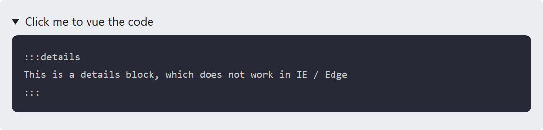
details: {
keyword: 'details',
customBlock: true,
tagName: 'details',
children: `[element('summary', '', titleNodes), contentNodes]`,
properties: {
type: 'success',
className: ['admonition', 'admonition-details']
}
},
}
exports.types = typesCredit
Syntax and classic theme based on remarkable-admonitions.
The SVG icons included are from GitHub Octicons.