
hcg-searchable-select
v1.0.4
Published
Pure vanilla JavaScript searchable select dropdown. No dependencies. Progressively enhances a native <select> with type-to-search, match highlighting, and keyboard navigation.

Maintainers
 html-code-generator
Readme
hcg-searchable-select - Vanilla JavaScript Searchable HTML Select Dropdown
A pure vanilla JavaScript searchable <select> dropdown. No dependencies. It progressively enhances a normal <select> element, so your forms keep working and submit a regular value.
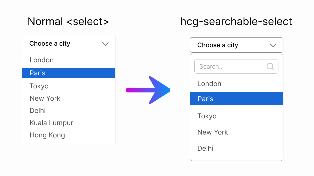
Features
- Type-to-search filtering with match highlighting (
<mark>) - Full keyboard support:
- Closed + focused: ArrowUp / ArrowDown step the value like a native
<select>(no popup) - Open: ArrowUp / ArrowDown move the highlight, Enter selects, Escape closes
- Enter / Space / Alt+ArrowDown open the search panel
- Closed + focused: ArrowUp / ArrowDown step the value like a native
- Native
changeevent andonChange/onOpen/onClosecallbacks - Works with any number of selects on one page
- Accessible - ARIA combobox / listbox pattern with live
aria-activedescendant - Progressive enhancement - the real
<select>is kept for form submission - Respects disabled options and disabled selects
- Mobile-friendly - the on-screen keyboard never covers the options list
- Handles duplicate values, placeholder vs clearable empty options, and form reset
- Programmatic API:
open(),close(),refresh(),destroy() - React-ready (bundled component +
destroy()for clean unmount) - Accepts a CSS selector string or a DOM element
- Namespaced
hcg-select-*classes (no style collisions), themeable via CSS variables - Pure vanilla JS, zero dependencies, modern ES2015+
Demo
- Live demo and documentation: https://www.html-code-generator.com/javascript/searchable-select
- GitHub: https://github.com/html-code-generator/hcg-searchable-select
Install
Pick whichever fits your setup - npm, CDN, or a direct download.
npm
npm install hcg-searchable-selectimport hcgSelect from "hcg-searchable-select";
import "hcg-searchable-select/hcg-select.css";
hcgSelect("#country");CommonJS also works: const hcgSelect = require("hcg-searchable-select");
CDN (no build step)
Use jsDelivr or unpkg - both serve the package straight from npm. Drop these into your HTML and you're done (the script auto-initializes any select[data-hcg-select]):
<!-- jsDelivr -->
<link rel="stylesheet" href="https://cdn.jsdelivr.net/npm/hcg-searchable-select@1/hcg-select.css">
<script src="https://cdn.jsdelivr.net/npm/hcg-searchable-select@1/hcg-select.js"></script>
<!-- unpkg -->
<link rel="stylesheet" href="https://unpkg.com/hcg-searchable-select@1/hcg-select.css">
<script src="https://unpkg.com/hcg-searchable-select@1/hcg-select.js"></script>Pin a version for production (e.g. [email protected]) instead of @1, which floats to the latest 1.x. The global hcgSelect() is then available on window.
Direct download
Grab hcg-select.js and hcg-select.css from the repo and host them yourself.
Usage
1. Include the files
<link rel="stylesheet" href="hcg-select.css">
<script src="hcg-select.js"></script>
2. Add a select
Add the data-hcg-select attribute. It is auto-initialized on page load.
<select id="country" data-hcg-select data-placeholder="Select a country">
  <option value="">- Select a country -</option>
  <option value="in">India</option>
  <option value="us">United States</option>
  <option value="uk">United Kingdom</option>
</select>
That's it. The widget reads the options, hides the native select, and renders a searchable dropdown.
Manual initialization
For selects added dynamically, or to pass options:
hcgSelect("#country", {
  placeholder: "Select a country",
  searchPlaceholder: "Type to search...",
  noResultsText: "Nothing found"
});

// Re-scan after adding markup later (whole document or a container element)
hcgSelect.init();
hcgSelect.init(document.getElementById("form-section"));
hcgSelect accepts a CSS selector string or a DOM element, and returns an API:
var api = hcgSelect(document.getElementById("country"));
api.open();      // open the panel
api.close();     // close the panel
api.clear();     // reset to the placeholder option (when clearable)
api.refresh();        // rebuild the list from the current <option>s, then re-sync label + disabled state
api.disable();        // disable the widget (sets the native select.disabled = true)
api.enable();         // enable the widget
api.setDisabled(b);   // set disabled state from a boolean
api.destroy();        // tear down the widget and restore the original native <select>
api.element;          // the wrapper element
api.select;           // the underlying <select>
disable() / enable() / setDisabled() set the native select.disabled (the
single source of truth), so the widget, the native element, and your forms never
disagree. Setting select.disabled directly works too - a MutationObserver keeps
the widget in sync either way.
Call api.refresh() after you add, remove, rename, disable, enable, or reorder the
native <option>s (or toggle the select's own disabled) so the widget stays in sync.
Reacting to selection (events / callbacks)
You have two ways to react when the user picks an option - use whichever fits.
1. Native change event (works with any framework / form code)
The underlying native <select> always holds the current value and fires a bubbling change event when the user picks an option:
document.getElementById("country").addEventListener("change", function () {
  console.log(this.value);
});
2. Callback options
Pass callbacks when you initialize manually:
hcgSelect("#country", {
  onChange: function (value, option, select) {
    console.log("picked", value, option.text);
  },
  onOpen:  function (select, api) { /* panel opened */ },
  onClose: function (select, api) { /* panel closed */ }
});
onChange receives the new value, the selected <option> element, and the <select>.
It fires after the native change event, so both mechanisms stay in sync.
React
The core is framework-agnostic vanilla JS, so it works in React via a ref +
useEffect. The destroy() API method makes mount/unmount clean.
Live React demo on StackBlitz: https://stackblitz.com/edit/hcg-searchable-select-react
Option A: use the bundled component
import { useState } from "react";
import HcgSelect from "hcg-searchable-select/react/HcgSelect.jsx";
import "hcg-searchable-select/hcg-select.css";

function Example() {
  const [country, setCountry] = useState("in");
  return (
    <HcgSelect value={country} onChange={setCountry} placeholder="Select a country">
      <option value="">- Select a country -</option>
      <option value="in">India</option>
      <option value="us">United States</option>
      <option value="uk">United Kingdom</option>
    </HcgSelect>
  );
}
onChange receives (value, option, select). Changing value or the <option>
children re-syncs the widget automatically.
Option B: wrap it yourself
import { useEffect, useRef } from "react";
import hcgSelect from "hcg-searchable-select";
import "hcg-searchable-select/hcg-select.css";

function CountrySelect({ value, onChange }) {
  const ref = useRef(null);
  const apiRef = useRef(null);

  useEffect(() => {
    apiRef.current = hcgSelect(ref.current, {
      onChange: (val) => onChange(val)
    });
    return () => apiRef.current && apiRef.current.destroy(); // clean unmount
  }, []);

  useEffect(() => {
    if (ref.current && ref.current.value !== value) {
      ref.current.value = value;
      apiRef.current.refresh();
    }
  }, [value]);

  return (
    <select ref={ref} defaultValue={value} data-placeholder="Select a country">
      <option value="">- Select a country -</option>
      <option value="in">India</option>
      <option value="us">United States</option>
    </select>
  );
}
Always call
api.destroy()in the effect cleanup so React can unmount the original<select>without leaving the generated wrapper behind.
Options
| Option | Default | Description |
| ------------------- | ------------- | -------------------------------------------- |
| placeholder | "Select..." | Text shown when nothing is selected. Falls back to data-placeholder. |
| searchPlaceholder | "Search..." | Placeholder text for the search input. |
| noResultsText | "No results"| Text shown when no option matches. |
| clearable | false | Show a clear button (requires a first <option value=""> placeholder). Also via data-clearable. |
| typeAhead | true | When the control is focused and closed, typing a letter jumps to the first matching option (native-select behavior). Set false to disable. |
| onChange | - | function(value, option, select) called when the user selects an option (after the native change event). |
| onOpen | - | function(select, api) called when the panel opens. |
| onClose | - | function(select, api) called when the panel closes. |
Styling
All colors, fonts, and layout values are CSS custom properties on the .hcg-select wrapper, so you can theme it:
.hcg-select {
  --hcg-select-border-focus: #16a34a;
  --hcg-select-active: #dcfce7;
  --hcg-select-mark: #fef08a;
  --hcg-select-radius: 10px;
}
Available variables and their defaults:
| Variable | Default | Controls |
| --- | --- | --- |
| --hcg-select-border | #cbd5e1 | Border color |
| --hcg-select-border-focus | #2563eb | Focused border / accent |
| --hcg-select-bg | #fff | Control and panel background |
| --hcg-select-hover | #eff6ff | Option hover background |
| --hcg-select-active | #dbeafe | Active (highlighted) option background |
| --hcg-select-text | #1e293b | Text color |
| --hcg-select-muted | #64748b | Placeholder, captions, disabled text |
| --hcg-select-mark | #fde047 | Search match highlight |
| --hcg-select-clear | #ef4444 | Clear button hover accent |
| --hcg-select-radius | 8px | Corner radius |
| --hcg-select-z | 9999 | Panel z-index |
| --hcg-select-panel-width | 100% | Panel width (e.g. 360px or max-content for long labels; never narrower than the control) |
| --hcg-select-font-family | inherit | Font family for the whole widget |
| --hcg-select-font-size | 15px | Control (selected value) font size |
| --hcg-select-option-font-size | 14px | Options, search input, "No results" |
| --hcg-select-font-weight | 400 | Control font weight |
Native parity notes
- Disabled options (
<option disabled>) are rendered greyed out and cannot be selected by click or keyboard. - Disabled select (
<select disabled>) renders a greyed, non-interactive widget that cannot be opened. Togglingselect.disableddynamically is reflected automatically (via aMutationObserver) - norefresh()needed; disabling while the panel is open also closes it. - Duplicate values are handled by selecting the exact clicked option (by index), so the right label always shows even when two options share a value.
- Placeholder vs empty value: only the first option with an empty value (
value="") is treated as the placeholder and hidden from the list. Any later empty-value option (e.g. "None", "Any", "Clear") stays in the list, is selectable, and displays its own label. <select multiple>is not supported - it is left untouched (with a console warning), keeping native multi-select behavior.- Programmatic changes & form reset: the widget listens to the native
changeevent and to the parent form'sresetevent, soselect.value = "..."(with a dispatchedchange) andform.reset()both update the displayed label. If you changeselect.valuewithout dispatchingchange, callapi.refresh(). - Clearing the selection: the first empty-value option is the placeholder and is not re-selectable from the list (matching the native "prompt" convention). To offer a clear/reset choice, add an empty-value option that is not first, e.g.
<option value="">None</option>. - Dynamic option changes: adding, removing, renaming, or disabling
<option>s is detected automatically (via a debouncedMutationObserver) and the list rebuilds - norefresh()call needed.refresh()is still available for an explicit, synchronous rebuild. - Re-initialization: calling
hcgSelect()again on an already-enhanced select returns the existing API instance (it does not create a second widget). - Required / validation: if the native
<select>hasrequired, the control mirrorsaria-required="true", andaria-invalid="true"is set on a failed constraint check (cleared once valid), so the custom UI participates in form error states. - Events: committing a selection fires both a native
inputandchangeevent (bubbling), so controlled-component frameworks that listen on either will react.
Keyboard
When the control is focused and closed (behaves like a native <select>):
| Key | Action |
| --- | --- |
| ArrowDown / ArrowUp | Step to the next / previous option and commit it immediately (skips disabled options, clamps at the ends). Fires change + onChange. |
| Typing a letter | Type-ahead: jump to the first option starting with the typed characters (disable with typeAhead: false) |
| Enter / Space / Alt+ArrowDown | Open the search panel |
When the panel is open:
| Key | Action | | --- | --- | | Type | Filter the list | | ArrowDown / ArrowUp | Move the highlight (wraps top/bottom); does not commit | | Home / End | Highlight the first / last selectable option | | Enter | Select the highlighted option | | Escape | Close and return focus to the control | | Tab | Move focus out, which closes the panel |
Note: while open, arrow keys only move the highlight - selection commits on Enter or click. This is the ARIA combobox pattern (navigating is not selecting), so you do not fire a
changeper keystroke.
Accessibility
- The control and the search input expose the ARIA combobox pattern; while the panel is open the focused search input carries
role="combobox",aria-expanded,aria-controls, andaria-activedescendant, so screen readers announce the active option as you arrow through the list. - The listbox uses
role="listbox"/role="option"witharia-selected, and disabled options getaria-disabled.
Mobile
When the panel opens, the search input is not focused automatically, so the on-screen keyboard stays down and the full options list is visible. The user can scroll and tap an option directly, or tap the search box to start filtering.
Browser support
All modern browsers (Chrome, Firefox, Safari, Edge).
License
MIT - HTML Code Generator (https://www.html-code-generator.com/)