
hcg-toast
v1.0.0
Published
Lightweight vanilla JavaScript toast notification library. Success, error, warning, and info types, auto-dismiss, sticky toasts, six positions, stack limits, pause on hover, and TypeScript definitions. Zero dependencies.

Maintainers
 html-code-generator
Readme
hcg-toast
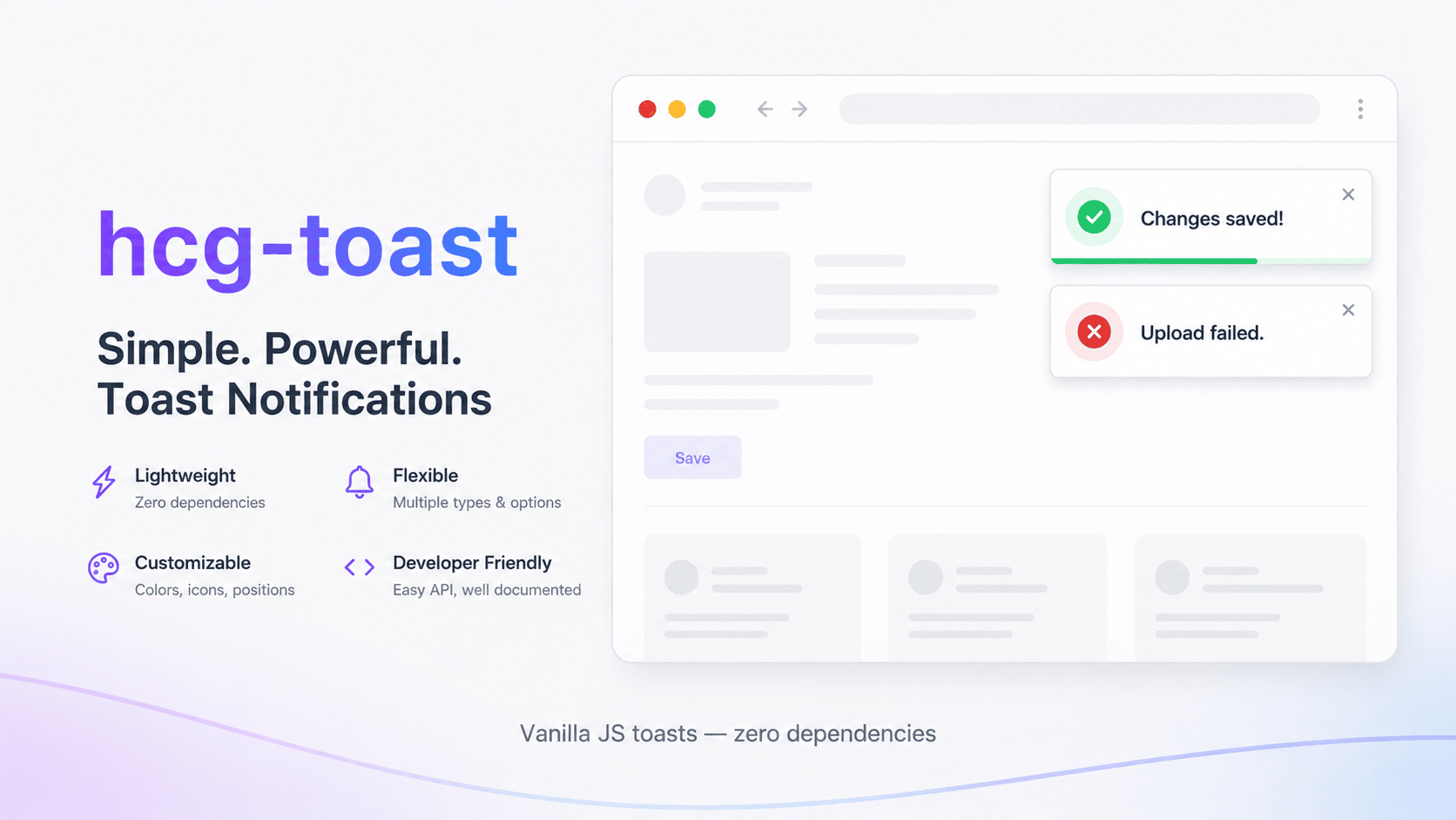
A lightweight, zero-dependency JavaScript toast / notification library. Show success, error, warning, and info messages with auto-dismiss, sticky toasts, six screen positions, stack limits, pause on hover, optional progress bars, and custom icons.
- Zero dependencies, ~6 KB unminified
- UMD build - works with
<script>tags, CommonJS, and bundlers - Global API:
toast()with shorthand helpers andtoast.create()for custom instances - Custom icons via
icon,iconHtml, or hide withicon: false - Accessible:
role="alert"/role="status"witharia-live="off"on non-errors (avoids browser freezes during rapid bursts); errors usearia-live="assertive" - TypeScript definitions included
Links
- Documentation & live demo: html-code-generator.com/javascript/toast-notification
- npm: npmjs.com/package/hcg-toast
- GitHub: github.com/html-code-generator/hcg-toast
Demo
Try the live demo and full documentation, or open index.html from the GitHub repo over a local server for a working example.
npx serve .Installation
Install from npm:
npm install hcg-toastOr download hcg-toast.js and hcg-toast.css and include them on your page:
<link rel="stylesheet" href="hcg-toast.css">
<script src="hcg-toast.js"></script>
In a module / Node environment:
require('hcg-toast/hcg-toast.css');
const toast = require('hcg-toast');
Or with ESM:
import toast from 'hcg-toast';
import 'hcg-toast/hcg-toast.css';
Usage
Singleton (default)
<link rel="stylesheet" href="hcg-toast.css">
<script src="hcg-toast.js"></script>
<script>
    toast.success('Changes saved!');
    toast.error('Upload failed', { title: 'Error', duration: 6000 });
    toast.dismiss(id);
    toast.dismissAll();
    toast.configure({ position: 'bottom-right', maxToasts: 5 });
</script>
Typed helpers
Shorthand methods set the toast type for you so you do not need to pass type on every call. Each helper uses the matching icon and accent color.
toast.success('Profile updated.');
toast.error('Could not save changes.');
toast.warning('You have unsaved edits.');
toast.info('Sync complete.');

// equivalent to toast(message, { type: 'success' })
toast('Saved!', { type: 'success', title: 'Done' });
Each call to show() (or a typed helper) returns a numeric toast id you can pass to dismiss(id).
Custom instance
const bottomToast = toast.create({
    position: 'bottom-center',
    maxToasts: 3,
});

bottomToast.info('Processing…', { duration: 0, closable: true });
bottomToast.dismissAll();
bottomToast.destroy();
Custom icons
By default each type shows a built-in icon (info, success, warning, error). Override per toast or set a default on the instance:
// Emoji or text icon
toast.success('Backup complete.', { icon: '💾' });

// SVG or HTML icon (trusted markup only)
toast.info('Syncing files…', {
  iconHtml: '<svg viewBox="0 0 20 20" fill="currentColor" aria-hidden="true"><path d="M10 3a7 7 0 100 14A7 7 0 0010 3z"/></svg>'
});

// Hide the icon column
toast('Plain message.', { icon: false });

// Default icon for all toasts on an instance
const stars = toast.create({ icon: '⭐' });
stars.info('You have a new message.');
iconHtml takes precedence over icon when both are set. Only pass trusted HTML to iconHtml.
Options
| Option | Type | Default | Description |
| ---------------- | ----------------------------------------- | ------------- | -------------------------------------------------------- |
| message | string | required | Main body text |
| title | string | - | Optional heading above the message |
| type | 'info' \| 'success' \| 'warning' \| 'error' | 'info' | Toast variant (icon and accent color) |
| duration | number | 4000 | Auto-dismiss delay in ms; 0 = sticky until dismissed |
| closable | boolean | true | Show a close button |
| pauseOnHover | boolean | true | Pause the auto-dismiss timer while hovered |
| position | see below | 'top-right' | Screen position for this instance's container |
| maxToasts | number | 5 | Max visible toasts; oldest dismissed when exceeded (per call or instance default) |
| showProgress | boolean | true | Show a progress bar when duration > 0 |
| icon | string \| false | type default | Custom icon text or emoji; false hides the icon |
| iconHtml | string | - | Custom icon HTML (e.g. SVG); overrides icon |
| ariaLive | 'off' \| 'polite' \| 'assertive' | 'off' | Live region on each toast; errors default to 'assertive' when unset |
| onShow | (toast) => void | - | Called after the enter class is applied (animation start) |
| onDismiss | (toast, reason) => void | - | Called when removed; reason: 'timeout', 'close', 'api' |
Positions: top-left, top-center, top-right, bottom-left, bottom-center, bottom-right
Instance methods
| Method | Returns | Description |
| --------------- | -------------- | ----------------------------------------------------- |
| show(msg, opts) | number \| null | Show a toast; returns id |
| success(msg, opts) | number \| null | Shorthand for type: 'success' |
| error(msg, opts) | number \| null | Shorthand for type: 'error' |
| warning(msg, opts) | number \| null | Shorthand for type: 'warning' |
| info(msg, opts) | number \| null | Shorthand for type: 'info' |
| dismiss(id) | void | Remove one toast with exit animation |
| dismissAll() | void | Remove all toasts immediately |
| configure(opts) | void | Merge default options for this instance |
| destroy() | void | Dismiss all, remove container, detach instance |
The default singleton exposes the same methods on toast itself, plus toast.create(). Calling toast.destroy() removes the default instance so the next call recreates it.
Styling
All default styles live in hcg-toast.css, using plain single-class selectors and CSS custom properties on .hcg-toast-container. Edit that file directly, or override any rule from your own stylesheet (loaded after it). Available class hooks:
.hcg-toast-container- fixed-position stack host (position modifiers:--top-right,--bottom-center, etc.).hcg-toast-item- individual toast (type modifiers:--info,--success,--warning,--error).hcg-toast-icon,.hcg-toast-body,.hcg-toast-title,.hcg-toast-message.hcg-toast-close- dismiss button.hcg-toast-progress-track/.hcg-toast-progress- auto-dismiss track and shrinking bar (shown whenduration > 0andshowProgress: true).hcg-toast-item--enter/.hcg-toast-item--exit- animation states
.hcg-toast-container {
    --hcg-toast-radius: 8px;
    --hcg-toast-success-accent: #10b981;
}
Multiple instances
Create as many toast containers as you need. Each call to toast.create() returns a fully independent instance with its own position, defaults, stack, and API. The shared hcg-toast.css styles them all, so you only link it once.
const topRight = toast.create({ position: 'top-right' });
const bottomCenter = toast.create({ position: 'bottom-center', maxToasts: 2 });

topRight.success('Saved!');
bottomCenter.info('Syncing…', { duration: 0 });

bottomCenter.destroy();
Notes when running several instances:
- Each instance injects its own
.hcg-toast-containerwhen first used. toast.configure()only affects the default singleton, not custom instances.- Call each instance's
destroy()when removing it permanently.
Browser support
Works in all modern browsers that support CSS transitions and requestAnimationFrame (Chrome, Firefox, Safari, Edge). Respects prefers-reduced-motion: reduce by disabling enter/exit and progress animations (the progress track stays visible for timed toasts).
License
MIT - HTML Code Generator (https://www.html-code-generator.com/)