
hebrew-markdown-react
v2.0.0
Published
React wrapper for Dor Pascal's Hebrew Markdown Editor with RTL support, live preview, math formulas, and themes.
Maintainers
 relbns
Readme
hebrew-markdown-react
Hebrew-friendly Markdown Editor for React (RTL, Preview, KaTeX, Syntax Highlighting)
React wrapper for the Hebrew Markdown Editor
A modern, RTL-friendly Markdown editor with live preview, math rendering, and Apple-inspired design — now as a reusable React component.

📸 Screenshot
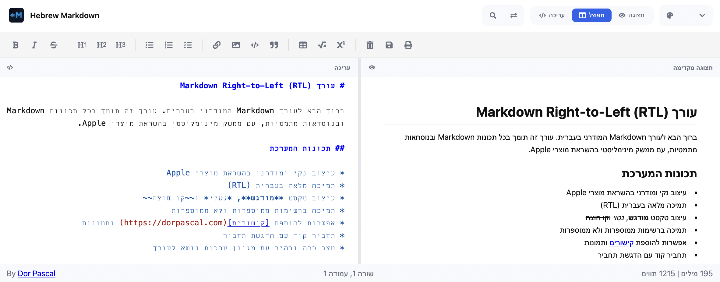
✨ Features
- ✅ Full Hebrew (RTL) support
- ✅ Live Markdown preview
- ✅ Toolbar with formatting actions
- ✅ Multiple view modes (editor / preview / split)
- ✅ Theme selection + Dark/Light mode
- ✅ Math expressions with KaTeX
- ✅ Syntax highlighting for code blocks
- ✅ Word & character count
- ✅ Export as
.md - ✅ Print the document
🔗 Demo
📦 Installation
npm install hebrew-markdown-reactPeer dependencies (make sure you already have these installed):
npm install react react-dom🚀 Usage
Import the component and use it in your app:
import { HebrewMarkdownEditor } from "hebrew-markdown-react";
import { useState } from "react";

export default function App() {
  const [value, setValue] = useState("# שלום עולם 👋");

  return (
    <div style={{ height: '80vh', width: '100%' }}>
      <HebrewMarkdownEditor
        value={value}
        onChange={(val) => setValue(val)}
        onSave={(val) => console.log("Saved:", val)}
        showCredits={false}
      />
    </div>
  );
}
Setting Initial View Mode
You can set the initial view mode using the VIEW_MODES constant for type safety:
import { HebrewMarkdownEditor, VIEW_MODES } from "hebrew-markdown-react";
import { useState } from "react";

export default function App() {
  const [value, setValue] = useState("# שלום עולם 👋");

  return (
    <div style={{ height: '80vh', width: '100%' }}>
      <HebrewMarkdownEditor
        value={value}
        onChange={(val) => setValue(val)}
        viewMode={VIEW_MODES.EDITOR_ONLY}
      />
    </div>
  );
}
Available view modes:
VIEW_MODES.SPLIT- Split view (default)VIEW_MODES.EDITOR_ONLY- Editor onlyVIEW_MODES.PREVIEW_ONLY- Preview only
⚙️ Props
| Prop | Type | Default | Description |
|------|------|---------|-------------|
| value | string | "" | The markdown content of the editor. |
| onChange | (content: string) => void | – | Callback fired on every content change. |
| onSave | (content: string) => void | undefined | If provided, shows a "Save" button in the toolbar and is called when the user saves (Ctrl+S or button). |
| height | string | "100%" | The height of the editor container (e.g., "500px", "80vh"). The component fills its parent by default. |
| className | string | "" | Custom CSS class to apply to the root hmr-container element for custom styling. |
| viewMode | 'split' \| 'editor-only' \| 'preview-only' | 'split' | The initial view mode of the editor. |
| showCredits | boolean | true | Show credit link in the status bar. |
🎨 Custom Styling
You can override the default styles by targeting the prefixed CSS classes. The root container has the class hmr-container.
Here's an example of how to change the toolbar background and the primary color:
/* your-custom-styles.css */
.my-custom-editor .hmr-toolbar {
  background-color: #f0f0f0;
  border-bottom: 1px solid #ccc;
}

.my-custom-editor {
  --hmr-primary: #ff5722; /* Change the primary color */
}
Then, apply your custom class via the className prop:
import "./your-custom-styles.css";

<HebrewMarkdownEditor
  className="my-custom-editor"
  value={value}
  onChange={setValue}
/>
Development
- Requires Node.js 20.19.0 or higher (see
.nvmrc)
nvm use- Install dependencies:
npm install📖 Storybook
Run Storybook locally to explore and play with the editor:
npm run storybook🤝 Contributing
Contributions are welcome! 🚀
- Fork the repo
- Create a branch (
git checkout -b feature/awesome) - Commit changes (
git commit -m "Add awesome feature") - Push (
git push origin feature/awesome) - Open a Pull Request
📃 License
This project is licensed under the MIT License. See the LICENSE file for details.
👤 Authors
- Dor Pascal – Creator of the original Hebrew Markdown Editor
- Ariel Benesh – Creator of the React wrapper (
hebrew-markdown-react)