
help-center-widget-react
v1.0.1
Published
React help center component for React.
Downloads
24

Readme
🛟 Help Center Widget for React
Publish help articles, FAQs, and guides. Allow customers to find answers on their own, reduce repetitive questions, and keep your support team to focus on more challenging issues.
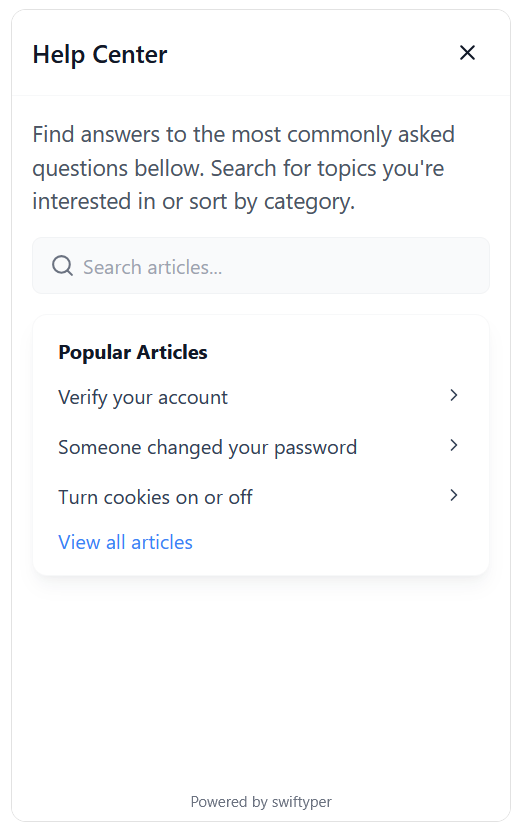
👀 Preview
📦 Installation
Install the widget via npm or yarn:
npm install help-center-widget-react
# or
yarn add help-center-widget-react
✨ Key Features
- 🚀 Easy Integration: Get started with minimal setup.
- 📱 Responsive Design: Optimized for all screen sizes.
- 🔍 Search Functionality: Allow users to quickly find relevant articles.
- 📚 Article Categorization: Organize content for better discovery.
- 🗂️ Multi-Language Support: Target a global audience.
- 💪 TypeScript Compatibility: Fully typed for a seamless developer experience.
- 🌓 Dark Mode Support: Matches your user's preferences.
🔧 Configuration
Register your project on Swiftyper.
Customize the widget to fit your needs using the following options:
| Option | Type | Description |
|----------------------------|----------|----------------------------------------------------------------|
| apiKey | string | API key for authenticating with the help center. |
| locale | string | Locale setting for the widget (e.g., en_US, de_DE). |
| isOpen | boolean | Whether the widget is open by default. |
| launcherPosition | string | Position of the launcher on the screen (e.g., bottom-right). |
| launcherColor | string | Color of the launcher icon. |
| launcherBackgroundColor | string | Background color of the launcher. |
| launcherSize | string | Size of the launcher (e.g., 3.5rem). |
| launcherMargin | string | Margin around the launcher (e.g., 1rem). |
| launcherAnimation | boolean | Enable animation for the launcher. |
| widgetRadius | string | Border radius of the widget (e.g., 12px). |
| widgetWidth | string | Width of the widget (e.g., 400px). |
| widgetHeight | string | Height of the widget (e.g., 650px). |
| displayMode | string | Display mode of the widget (modal, popup). |
| showModalBackdrop | boolean | Show a backdrop when the widget is in modal mode. |
| backdropColor | string | Color of the modal backdrop (e.g. rgba(0, 0, 0, 0.5)). |
| launcherIconSvg | string | Custom SVG icon for the launcher. |
⚡️ Quick Start
Follow these steps to integrate the widget into your app:
- Add the following script to your React app:
import { HelpCenterWidget } from 'help-center-widget-react';

function App() {
  return (
    <div>
      <HelpCenterWidget
        apiKey="YOUR_API_KEY"
        launcherPosition="bottom-right"
        launcherColor="#fff"
        launcherBackgroundColor="#2563eb"
        displayMode="popup"
      />
      {/* Your app content */}
    </div>
  );
}
Replace
YOUR_API_KEYwith your actual API key.Customize the configuration options as needed.
🖥️ Browser Support
The widget supports all modern browsers:
- Chrome (latest)
- Firefox (latest)
- Safari (latest)
- Edge (latest)
🤝 Contributing
We welcome contributions! If you'd like to help improve this project, feel free to open an issue or submit a pull request.
📜 License
This project is licensed under the MIT License. See the LICENSE file for details.