npm package discovery and stats viewer.

Discover Tips

  • General search

    [free text search, go nuts!]

  • Package details

    pkg:[package-name]

  • User packages

    @[username]

Sponsor

Optimize Toolset

I’ve always been into building performant and accessible sites, but lately I’ve been taking it extremely seriously. So much so that I’ve been building a tool to help me optimize and monitor the sites that I build to make sure that I’m making an attempt to offer the best experience to those who visit them. If you’re into performant, accessible and SEO friendly sites, you might like it too! You can check it out at Optimize Toolset.

About

Hi, 👋, I’m Ryan Hefner  and I built this site for me, and you! The goal of this site was to provide an easy way for me to check the stats on my npm packages, both for prioritizing issues and updates, and to give me a little kick in the pants to keep up on stuff.

As I was building it, I realized that I was actually using the tool to build the tool, and figured I might as well put this out there and hopefully others will find it to be a fast and useful way to search and browse npm packages as I have.

If you’re interested in other things I’m working on, follow me on Twitter or check out the open source projects I’ve been publishing on GitHub.

I am also working on a Twitter bot for this site to tweet the most popular, newest, random packages from npm. Please follow that account now and it will start sending out packages soon–ish.

Open Software & Tools

This site wouldn’t be possible without the immense generosity and tireless efforts from the people who make contributions to the world and share their work via open source initiatives. Thank you 🙏

© 2026 – Pkg Stats / Ryan Hefner

hs-uix

v1.6.5

Published

Production-ready UI components for HubSpot UI Extensions — DataTable, FormBuilder, and more

Readme

hs-uix

npm version license

Production-ready UI components for HubSpot UI Extensions. Built entirely on HubSpot's native primitives — no custom HTML, no CSS, no iframes.

Install

npm install hs-uix
import { DataTable } from "hs-uix/datatable";
import { FormBuilder } from "hs-uix/form";
import { AutoStatusTag, AutoTag, KeyValueList, SectionHeader } from "hs-uix/common-components";
import { formatCurrency, formatDate } from "hs-uix/utils";

// or import everything from the root
import { DataTable, FormBuilder, AutoStatusTag, AutoTag } from "hs-uix";

Requires react >= 18.0.0 and @hubspot/ui-extensions >= 0.12.0 as peer dependencies (already present in any HubSpot UI Extensions project).

Components

| Component | Description | Docs | |-----------|-------------|------| | DataTable | Filterable, sortable, paginated table with auto-sized columns, inline editing, row grouping, and more | Full documentation | | FormBuilder | Declarative, config-driven form with validation, multi-step wizards, and 20+ field types | Full documentation | | Kanban | Stage-based board with filters, sort, headline metrics, card action bars, and DataTable-parity card field config | Full documentation | | Common Components | Thin visual wrappers over HubSpot primitives — AutoTag, AutoStatusTag, AvatarStack, SectionHeader, KeyValueList, StyledText | Full documentation | | Utils | Pure helpers for formatting, options, HubSpot value guards, and tag-variant inference | Full documentation |


DataTable

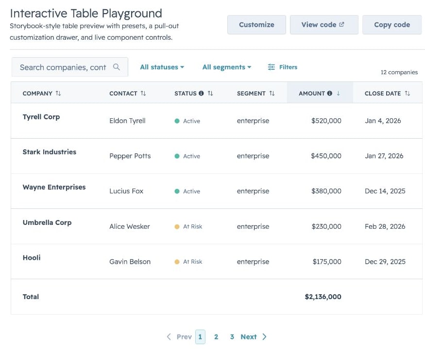
A drop-in table component for HubSpot UI Extensions. Define your columns, pass your data, and you get search, filtering, sorting, pagination, inline editing, row grouping, and auto-sized columns out of the box.

Full-Featured DataTable

Quick Start

import { DataTable } from "hs-uix/datatable";
import { AutoStatusTag, AutoTag, KeyValueList, SectionHeader } from "hs-uix/common-components";
import { formatCurrency, formatDate } from "hs-uix/utils";

const COLUMNS = [
  { field: "name", label: "Company", sortable: true, renderCell: (val) => val },
  { field: "status", label: "Status", renderCell: (val) => <AutoStatusTag value={val} /> },
  { field: "segment", label: "Segment", renderCell: (val) => <AutoTag value={val} /> },
  { field: "amount", label: "Amount", sortable: true, renderCell: (val) => formatCurrency(val) },
  { field: "closeDate", label: "Close Date", renderCell: (val) => formatDate(val) },
];

<DataTable data={deals} columns={COLUMNS} searchFields={["name"]} pageSize={10} />

<SectionHeader
  title="Deal Summary"
  description="A compact summary block using common components."
/>

<KeyValueList
  items={[
    { label: "Open deals", value: 12 },
    { label: "Pipeline", value: formatCurrency(245000) },
  ]}
/>

That's a searchable, sortable, paginated table with auto-sized columns in 5 lines of config.

Features

  • Full-text search with optional fuzzy matching via Fuse.js
  • Select, multi-select, and date range filters with active badges and clear/reset controls
  • Click-to-sort headers with three-state cycling
  • Client-side or server-side pagination
  • Collapsible row groups with per-column aggregation
  • Row selection with bulk action bar
  • Per-row actions via rowActions
  • Two edit modes (discrete click-to-edit and inline always-visible) supporting 12 input types with validation
  • Auto-width column sizing based on data analysis
  • Column-level footer for totals rows
  • Works with useAssociations for live CRM data
  • Server-side mode with loading/error states, search debounce, and unified onParamsChange callback

Highlights

Filters & Footer Totals

Active Filters

Row Selection & Bulk Actions

Row Selection with Action Bar

Inline Editing

Discrete Editing

Two edit modes: discrete (click-to-edit, default) and inline (always-visible inputs). Supports text, textarea, number, currency, stepper, select, multiselect, date, time, datetime, toggle, and checkbox.

Row Grouping

Row Grouping

Full-Row Editing

Full-Row Editing

useAssociations

useAssociations + DataTable

Connect live CRM data (contacts, deals, tickets, etc.) to a DataTable with useAssociations from @hubspot/ui-extensions/crm.


FormBuilder

Declarative, config-driven forms for HubSpot UI Extensions. Define fields as data, get a complete form with validation, layout, multi-step wizards, and full HubSpot component integration.

Basic Form

Quick Start

import { FormBuilder } from "hs-uix/form";

const fields = [
  { name: "firstName", type: "text", label: "First name", required: true },
  { name: "lastName", type: "text", label: "Last name", required: true },
  { name: "email", type: "text", label: "Email", pattern: /^[^\s@]+@[^\s@]+$/, patternMessage: "Enter a valid email" },
];

<FormBuilder
  columns={2}
  fields={fields}
  onSubmit={(values) => console.log(values)}
/>

Features

  • 20+ field types mapping to native HubSpot components (text, number, select, date, toggle, repeater, crmPropertyList, and more)
  • Four layout modes: fixed columns, responsive AutoGrid, explicit row layout, and legacy half-width
  • Built-in validation chain: required, pattern, length/range, custom sync, and custom async with loading indicators
  • Conditional visibility and dependent property grouping
  • Multi-step wizards with per-step validation
  • Repeater fields for dynamic add/remove rows
  • Accordion sections and field group dividers
  • Custom field type plugin registry
  • Controlled and uncontrolled modes
  • Ref API for imperative access (submit, validate, reset, getValues, setFieldValue, etc.)
  • Submit lifecycle hooks (transformValues, onBeforeSubmit, onSubmitSuccess, onSubmitError)
  • Auto-save, dirty tracking, read-only mode, and form-level alerts

Highlights

Layout

Explicit Layout

Conditional Visibility & Dependent Properties

Dependent & Cascading

Async Validation

Async Validation

Repeater Fields

Repeater Fields

Sections & Groups

Sections & Groups

Custom Field Types

Custom Field Types

Display Options

Display Options

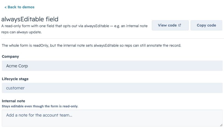
Read-Only Mode

Read-Only Mode


Kanban

A stage-based board view that shares DataTable's config vocabulary (cardFieldscolumns, filters, sort, selection) so you can offer users a table-or-board toggle without rewriting the data layer. Drag-and-drop isn't available inside HubSpot UI Extensions, so stage changes happen through an inline Select (or menu) on each card.

Kanban — HubSpot Deals preset with metrics

Quick Start

import { Kanban } from "hs-uix/kanban";
import { AutoTag } from "hs-uix/common-components";
import { formatCurrencyCompact, formatDate } from "hs-uix/utils";

const STAGES = [
  { value: "qualified",     label: "Qualified",      variant: "info" },
  { value: "proposal",      label: "Proposal",       variant: "info" },
  { value: "negotiation",   label: "Negotiation",    variant: "warning" },
  { value: "closed_won",    label: "Closed Won",     variant: "success", terminal: true },
  { value: "closed_lost",   label: "Closed Lost",    variant: "default", terminal: true },
];

const CARD_FIELDS = [
  { field: "name",      placement: "title" },
  { field: "company",   placement: "subtitle" },
  { field: "amount",    placement: "meta",   render: (val) => formatCurrencyCompact(val) },
  { field: "segment",   placement: "body",   render: (val) => <AutoTag value={val} /> },
  { field: "closeDate", placement: "footer", render: (val) => formatDate(val) },
];

<Kanban
  data={deals}
  stages={STAGES}
  groupBy="stage"
  cardFields={CARD_FIELDS}
  onStageChange={(row, newStage) => updateDealStage(row.id, newStage)}
/>

Features

  • Stage-based columns with variant-colored headers (success / warning / info / default), collapse-to-rail, and stage-level count badges
  • cardFields with placement (title / subtitle / meta / body / footer) — same render/truncate/visible hooks as DataTable columns
  • Filters and sort with the same config shape as DataTable (select, multiselect, dateRange)
  • Headline metrics rendered above the board (deal totals, weighted pipeline, win rate) via a metrics prop
  • Stage transition prompts — async confirmation or extra-property capture before committing a stage change, declared per-stage via stage.onEnterRequired.render
  • Selection bar + card actions for bulk moves, deletes, or custom handlers (KanbanCardActions)
  • Empty / loading / error render slots that mirror DataTable's override API
  • Paired view adapters — use deriveCardFieldsFromColumns from hs-uix/utils to project a DataTable columns config into Kanban cardFields with a single function call

Highlights

HubSpot Deals preset

Kanban — HubSpot Deals preset with metrics

Drop-in preset shaped like HubSpot's native deals pipeline: stage-variant headers, per-stage amount totals in the header metric, and an avatar-stack footer row. Hide the summary row with showMetrics={false} for dashboards that already surface totals elsewhere.

Kanban — HubSpot Deals preset without metrics

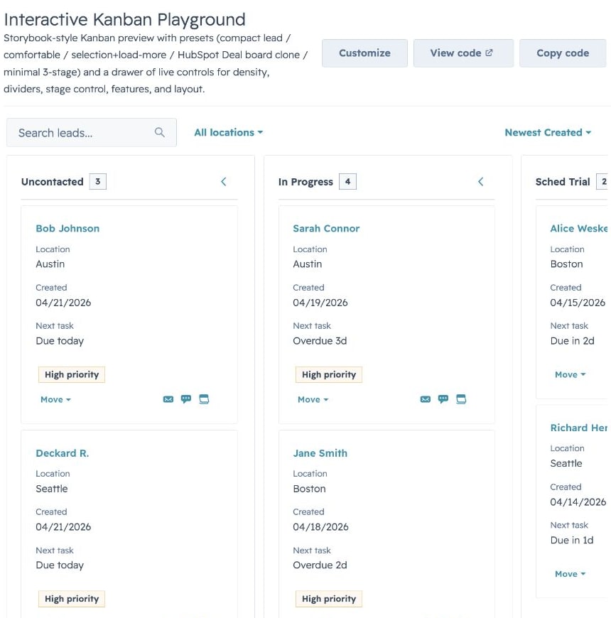
Compact lead board

Kanban — Compact lead board preset

cardDensity="compact" with trimmed cardFields for high-volume boards (leads, tickets, tasks) where you want to fit 8-12 cards per column on a typical viewport without horizontal scrolling.

Load-more & stage controls

Kanban — Select + load more preset

Per-stage pagination via an onLoadMore handler and stageMeta.hasMore, plus inline Select stage controls on each card (stageControl="select"). Switch to "menu" for action-menu style transitions, or "none" for read-only boards.


Common Components

Thin, composable visual wrappers built on HubSpot's native primitives — the reusable pieces that show up across DataTable rows, FormBuilder cells, and Kanban cards. Use them to skip rewriting the same status-tag / avatar-stack / label-value block on every surface.

Quick Start

import {
  AutoStatusTag,
  AutoTag,
  AvatarStack,
  SectionHeader,
  KeyValueList,
  StyledText,
  HS_DATE_PRESETS,
} from "hs-uix/common-components";
import { formatCurrency } from "hs-uix/utils";

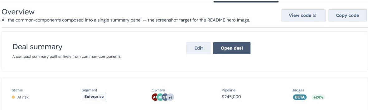
<SectionHeader
  title="Deal Summary"
  description="A compact summary block using common components."
/>

<KeyValueList
  items={[
    { label: "Status", value: <AutoStatusTag value="At risk" /> },
    { label: "Segment", value: <AutoTag value="Enterprise" /> },
    { label: "Owners", value: <AvatarStack items={["AR", "JK", "SP", "MB", "LM"]} maxVisible={4} /> },
    { label: "Pipeline", value: formatCurrency(245000) },
  ]}
/>

What's inside

  • AutoStatusTagStatusTag with variant inferred from the value (Active → success, At risk → warning, Failed → danger, etc.)
  • AutoTagTag with the same inference, for non-status labels
  • AvatarStack — overlapping circular avatars as a single SVG (letters, image URLs, or mixed); +N overflow chip past maxVisible
  • SectionHeader — title + optional description + actions slot
  • KeyValueList — vertical list of label/value rows via DescriptionList
  • StyledText — SVG-rendered text with rotation, custom color, and pill backgrounds for cases native <Text> can't express

Plus low-level builders (makeAvatarStackDataUri, makeStyledTextDataUri) that return { src, width, height } for composing into larger SVGs, and style constants (HS_FONT_FAMILY, HS_TEXT_COLOR, HS_SUBTLE_BG, HS_MUTED_TEXT, HS_NEUTRAL_CHIP) that mirror HubSpot's native CSS — so custom SVGs sit alongside the rest of the UI without a color mismatch.

Highlights

AutoTag & AutoStatusTag

AutoTag variants

AutoStatusTag variants

Pass a free-form status string and get a properly-colored tag back. Matching is case-insensitive and tolerates underscores / dashes / phrases ("in_progress", "on hold", "at-risk" all resolve). Override via overrides={{ "Processing": "warning" }} and fallback="info" for values that don't match built-in heuristics.

AvatarStack

Avatar stack

Overlapping avatars rendered as a single SVG via <Image>. T-shirt sizing (xsxl) or a raw pixel number. Letters auto-color from the built-in palette; image URLs get circular-clipped. Extras past maxVisible collapse into a neutral +N chip.

SectionHeader & KeyValueList

KeyValueList

Pair SectionHeader (title / description / action slot) with KeyValueList (DescriptionList rows) for compact summary panels. direction="column" on the list switches to stacked label-on-top rows.

StyledText

Styled text

Reach for StyledText when native <Text> can't do what you need: vertical rail labels (orientation="vertical-down"), HubSpot-style pill badges (background={{ preset: "tag" }}), or a specific glyph color. Plain horizontal preset: "tag" usage renders through native HubSpot Tag; rotated/custom tag cases still use the SVG fallback. Use native <Text> anywhere copy-paste matters.

HS_DATE_PRESETS

HubSpot's native quick-date preset list (Today, Last 7 days, This quarter, …) as a ready-to-use options array for DataTable / Kanban select filters. Values are stable identifiers ("today", "7d", "this_quarter") — translate to date bounds via filterFn or server-side in onFilterChange.


Utils

Pure helper functions for formatting values, building option arrays, detecting HubSpot-shaped date/time objects, and inferring tag variants from raw data. Zero side effects, no JSX — drop them into renderCell, sortComparator, or a server handler.

Quick Start

import {
  formatCurrency,
  formatCurrencyCompact,
  formatDate,
  formatDateTime,
  formatPercentage,
  buildOptions,
  findOptionLabel,
  getAutoTagVariant,
  createStatusTagSortComparator,
  sumBy,
} from "hs-uix/utils";

formatCurrency(1234.56);              // → "$1,235"
formatCurrencyCompact(123_580_000);   // → "$123.6M"
formatDate("2026-04-15");             // → "Apr 15, 2026"
formatPercentage(0.1567);             // → "16%"

const statusOptions = buildOptions(
  [{ name: "Open", id: "o" }, { name: "Closed", id: "c" }],
  { labelKey: "name", valueKey: "id" },
);
findOptionLabel(statusOptions, "o"); // → "Open"

getAutoTagVariant("At risk");         // → "warning"
sumBy(deals, "amount");               // → total

What's inside

  • formatters.js — locale-aware Intl-based number / currency / date / percentage formatters. Every formatter accepts a trailing options object that spreads into the underlying Intl call, so anything Intl.NumberFormat supports (narrow symbol, specific fraction digits, grouping) is reachable without a new helper.
  • options.jsbuildOptions(items, opts?) to shape raw arrays into { label, value } for HubSpot Select / MultiSelect; findOptionLabel(options, value, fallback?) for the reverse lookup.
  • hubspotValues.js — type guards for HubSpot's DateInput / TimeInput / DateTimeInput value shapes (isDateValueObject, isTimeValueObject, isDateTimeValueObject). Use in filterFn or sortComparator to distinguish a HubSpot date-object from a raw string/Date.
  • tagVariants.js — heuristic mappers from free-form status strings to semantic tag variants (getAutoTagVariant, getAutoStatusTagVariant, getAutoTagDisplayValue) plus createStatusTagSortComparator for DataTable columns grouped by color, then alphabetical within each color.
  • collections.jssumBy(items, keyOrFn) for total / weighted-total rows, safe against null / missing values.

Highlights

Formatters

formatCurrency(9500, { currency: "EUR" });            // → "€9,500"
formatCurrencyCompact(4160);                          // → "$4.2K"
formatDate(Date.now(), { month: "numeric" });         // → "4/15/2026"
formatDateTime("2026-04-15T14:30:00Z");               // → "Apr 15, 2026, 9:30 AM" (local)
formatPercentage(0.1567, { maximumFractionDigits: 1 });// → "15.6%"

Every formatter treats null / undefined as safe — formatCurrency(null)"$0", formatDate(null)"" — so they're safe to drop into cells rendering partially-loaded data.

Tag Variants

The same inference that powers AutoTag / AutoStatusTag, exposed as plain functions for use in custom cells and sort comparators. Default ordering: success → warning → danger/error → info → default; override via variantOrder on createStatusTagSortComparator.

Options & HubSpot Value Guards

Build select options from CRM records, resolve labels back to values, and detect HubSpot's structured date/time value objects in one import — no more ad-hoc .map(r => ({ label: r.name, value: r.id })) at every call site.


Migrating from @hs-uix/datatable or @hs-uix/form

Both packages have been merged into hs-uix. Update your imports:

- import { DataTable } from "@hs-uix/datatable";
+ import { DataTable } from "hs-uix/datatable";

- import { FormBuilder } from "@hs-uix/form";
+ import { FormBuilder } from "hs-uix/form";
npm uninstall @hs-uix/datatable @hs-uix/form
npm install hs-uix

License

MIT