
image-to-theme-colors
v4.2.1
Published
Compose accessible UI themes (article body/card + affirmation overlays) from any image
Downloads
193
Maintainers
 lisennk
Readme
image-to-theme-colors
Compose accessible UI themes from any image. The library exposes two functions tuned to two product surfaces:
composeArticleTheme— for an article system whose open-state body uses the image as a hero transitioning into a colored background, plus a closed-state feed card and a circular control (e.g. a like button) drawn on top.composeAffirmationTheme— for an affirmation card whose entire backdrop is the image, with a category label pinned to the top and circular controls (Share, Bookmark, More) at the bottom.
For articles, the algorithm analyzes the image's color composition and outputs:
body.background— solid color and gradient for the open-state article background, with WCAG AAA (7:1) contrast against your text colors.card.background— solid color and gradient for the feed card surface, with sufficient contrast against your feed background (1.15:1 light, 1.12:1 dark).card.content.accentColor— color for circular controls / icons sitting on the card. Mirrorsbody.content.labelColorso the open-state and feed-state palettes stay coherent; clears WCAG AA (4.5:1) against the card surface.
…all on a shared hue per theme so the body, card, icon, and text read as one color family.
For affirmations, the algorithm samples the image's top and bottom regions
(the overlays' underlying surfaces) and returns the same themes.{light,dark}
shape, with overlays nested under the same card.content namespace the
article uses for its closed-state surface:
card.content.labelColor— fill for the category label at the top of the card.card.content.accentColor— fill for the circular controls at the bottom.
Affirmation overlays don't change with theme, so the light and dark
values are identical — the wrap is preserved for API parity with
composeArticleTheme.
Install
npm install image-to-theme-colorsRequires Node.js 18+ and sharp (installed automatically).
Quick start
Article (open-state body + closed-state card):
import { composeArticleTheme } from "image-to-theme-colors";

const result = await composeArticleTheme("./hero.jpg");
// result.themes.light.body.background.baseColor       "#C0D0FF"
// result.themes.light.body.background.linearGradient  ["#C0D0FF", "#BAC9F9"]
// result.themes.light.card.background.baseColor       "#D5E2ED"
// result.themes.light.card.background.linearGradient  ["#D5E2ED", "#B2CADD"]
// result.themes.light.card.content.accentColor        "#214154"  // = body label
// result.themes.dark.body.background.baseColor        "#0F172F"
// …
Affirmation card (image backdrop + label + circular icons):
import { composeAffirmationTheme } from "image-to-theme-colors";

const result = await composeAffirmationTheme("./affirmation.jpg");
// result.themes.light.card.content.labelColor   "#B0C1E8"
// result.themes.light.card.content.accentColor  "#B0C1E8"
// result.themes.dark.card.content.labelColor    "#B0C1E8"  (same as light)
API
composeArticleTheme(input, options?)
Analyzes an image and returns body and card colors for light and dark themes.
Parameters:
| Parameter | Type | Description |
|-----------|------|-------------|
| input | string \| Buffer | File path or image buffer |
| options | ArticleThemeOptions | Optional configuration |
Options:
| Option | Type | Default | Description |
|--------|------|---------|-------------|
| lightThemeTextColor | string | "#2A2925" | Text color on the light body background. The body background guarantees 7:1 contrast against this. |
| darkThemeTextColor | string | "#FFFFFF" | Text color on the dark body background. The body background guarantees 7:1 contrast against this. |
| lightThemeFeedBackgroundColor | string | "#F0F0F0" | Feed (page) background behind cards on the light theme. The card background guarantees 1.15:1 contrast against this. |
| darkThemeFeedBackgroundColor | string | "#110F0E" | Feed (page) background behind cards on the dark theme. The card background guarantees 1.12:1 contrast against this. |
| lightThemeCardTitleColor | string | "#2A2925" | Title text color on light-theme cards. The card guarantees 7:1 (AAA) contrast against this. |
| lightThemeCardSubtitleColor | string | "#51504D" | Subtitle text color on light-theme cards. The card guarantees 6:1 contrast against this. |
| darkThemeCardTitleColor | string | "#FCFCFC" | Title text color on dark-theme cards. The card guarantees 7:1 (AAA) contrast against this. |
| darkThemeCardSubtitleColor | string | "#A09F9E" | Subtitle text color on dark-theme cards. The card guarantees 6:1 contrast against this. |
Returns: Promise<ArticleTheme>
interface ArticleTheme {
  themes: {
    light: ArticleThemeColors;
    dark: ArticleThemeColors;
  };
}

interface ArticleThemeColors {
  body: BodyTheme;
  card: CardTheme;
}

interface BodyTheme {
  background: BackgroundColors;
  content: BodyContent;
}

interface BodyContent {
  /**
   * Icon color inside the Liquid-Glass control at the top of the
   * article. Two values for the scroll crossfade: `overImage` while
   * the control sits over the hero, `overBody` after it scrolls onto
   * the body background. Each clears 4.5:1 (WCAG AA) against its
   * glass tint, falling back to 3:1 when the theme-appropriate side
   * has no room.
   */
  accentColor: { overImage: string; overBody: string };
  /**
   * Color of the small category label (e.g. "Article") that sits in
   * the hero-to-body transition zone. Solved against the composite of
   * the body's first gradient stop and the image's lower portion at
   * the label's vertical position. Reused as `card.content.accentColor`
   * so the open-state and feed-state palettes stay coherent.
   */
  labelColor: string;
}

interface CardTheme {
  background: BackgroundColors;
  content: {
    /**
     * Category label on the feed card surface. Same value as
     * `accentColor` — exposed under the label name for semantic
     * clarity when styling a text label rather than an icon.
     */
    labelColor: string;
    /** Circular control on the feed card. = body.content.labelColor. */
    accentColor: string;
  };
}

interface BackgroundColors {
  /** Base color / first gradient stop, e.g. `"#C0D0FF"`. */
  baseColor: string;
  /** Gradient stops, e.g. `["#C0D0FF", "#BAC9F9"]`. */
  linearGradient: [string, string];
}
composeAffirmationTheme(input, options?)
Analyzes an image and returns colors for the label (top) and circular icons (bottom) of an affirmation card. The image itself is the card's backdrop, so each overlay's color is solved against the slice of the image it sits on.
Parameters:
| Parameter | Type | Description |
|-----------|------|-------------|
| input | string \| Buffer | File path or image buffer |
| options | AffirmationThemeOptions | Optional configuration |
Options:
| Option | Type | Default | Description |
|--------|------|---------|-------------|
| topRegionFraction | number | 0.25 | Fraction of image height (0.05–0.5) treated as the top region (under the label). Lower for thinner top bands when the label covers a smaller share of the image. |
| bottomRegionFraction | number | 0.25 | Fraction of image height (0.05–0.5) treated as the bottom region (under the icons). |
Returns: Promise<AffirmationTheme>
interface AffirmationTheme {
  themes: {
    light: AffirmationThemeColors;
    dark: AffirmationThemeColors;  // identical to light
  };
}

interface AffirmationThemeColors {
  card: {
    content: {
      /** Color for the category label at the top (≈ article body.content.labelColor). */
      labelColor: string;
      /** Color for the circular icons at the bottom (≈ article card.content.accentColor). */
      accentColor: string;
    };
  };
}
See How composeAffirmationTheme works
below for the algorithm details.
Example with a smaller top band (e.g. a label that overlaps only the top 12% of a thumbnail):
const result = await composeAffirmationTheme("./affirmation.jpg", {
  topRegionFraction: 0.12,
  bottomRegionFraction: 0.20,
});
const { labelColor, accentColor } = result.themes.light.card.content;
Examples
With custom text and feed colors:
const result = await composeArticleTheme(buffer, {
  lightThemeTextColor: "#1A1A1A",
  darkThemeTextColor: "#F0F0F0",
  lightThemeFeedBackgroundColor: "#F5F5F5",
  darkThemeFeedBackgroundColor: "#0A0A0A",
});
Using the gradient in CSS:
const { light } = (await composeArticleTheme("./hero.jpg")).themes;

// open-state body
articleEl.style.backgroundColor = light.body.background.baseColor;
articleEl.style.backgroundImage =
  `linear-gradient(to bottom, ${light.body.background.linearGradient[0]}, ${light.body.background.linearGradient[1]})`;

// feed card
cardEl.style.backgroundColor = light.card.background.baseColor;
cardEl.style.backgroundImage =
  `linear-gradient(to bottom, ${light.card.background.linearGradient[0]}, ${light.card.background.linearGradient[1]})`;

// like button on the card
likeBtnEl.style.color = light.card.content.accentColor;
From an HTTP upload (Express + multer):
app.post("/upload", upload.single("image"), async (req, res) => {
  const colors = await composeArticleTheme(req.file.buffer);
  res.json(colors);
});
Affirmation card with overlays applied in CSS:
const aff = await composeAffirmationTheme("./affirmation.jpg");
const { labelColor, accentColor } = aff.themes.light.card.content;

cardBackdropEl.style.backgroundImage = `url("./affirmation.jpg")`;
labelEl.style.color = labelColor;            // category tag at top
shareIcon.style.color = accentColor;         // circular controls at bottom
bookmarkIcon.style.color = accentColor;
moreIcon.style.color = accentColor;
Errors
Both functions reject with the underlying sharp error if the input
can't be decoded (unsupported format, corrupted file, missing path).
There's no input validation beyond what sharp does — pass valid
image bytes or a readable file path. Fully transparent images
(every pixel below the alpha threshold) will throw on the empty pixel
array; this is rare in practice but worth noting if you accept
arbitrary uploads.
How composeArticleTheme works
The article algorithm runs in four phases:
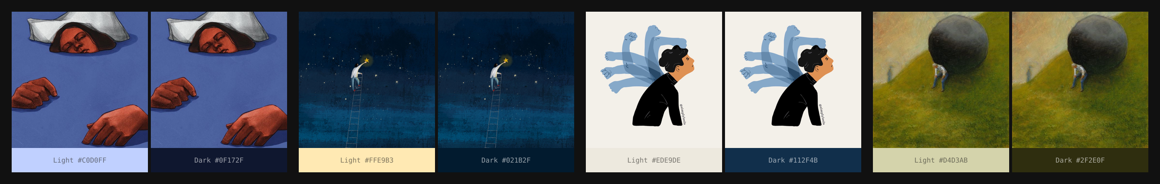
1. Pixel extraction — Resizes the image to 150px (preserving aspect ratio) and converts to HSL pixel data.
2. Analysis — Builds a hue histogram with extra weight on border/edge pixels (which are more likely to be the image background rather than the subject). Also detects accent colors, background tints, and bottom-edge colors for gradient transitions.
3. Strategy selection — Picks one of four approaches based on the image:
| Strategy | Trigger | Example | |----------|---------|---------| | Achromatic | Average saturation < 8% | B&W line art | | Dominant mid-tone | Clear mid-tone color dominates | Green painting, blue illustration | | Light background | Median lightness > 70% | Person on white/pastel background | | Dark background | Mostly dark with bright accent | Night sky with a star |
4. Color generation — Produces the body colors using chroma-preserving lightness adjustment, iterative S/L co-solving, and WCAG AAA contrast enforcement, then derives the card colors from the body's hue:
- Card background: the lightest tint (light theme) / darkest shade (dark theme) that still clears the feed-background contrast budget and the title (7:1) + subtitle (6:1) contrast budgets. If those constraints conflict (text-readability requires a card too close in luminance to the feed bg), text wins and feed contrast may dip below its budget.
- Card content (
accentColor): reusesbody.content.labelColor— same hue, AA (4.5:1) contrast against the body+image label-area composite. Because that composite sits between body and card bg in lightness, the value also clears AA against the card surface (typically with margin to spare).
Design decisions
Background-first: Border and bottom-edge pixels are weighted higher because the gradient transitions from the bottom of the image into the article text. The algorithm prioritizes the image's background color over foreground subjects.
Foreground detection: When a foreground object extends to the bottom edge (e.g. hands), the algorithm detects this by checking whether the bottom color is concentrated at the bottom (background) or spread through the image (foreground).
Multi-hue images: When the bottom edge has a distinctly different color from the dominant (e.g. green hill below blue sky), the algorithm uses the bottom color for the dark theme and the accent for the light theme.
Card hue follows body: The feed card never invents its own hue — it inherits from the body so that the closed-state preview, the open-state background, and the icon all read as the same color family.
How composeAffirmationTheme works
The affirmation algorithm samples the top and bottom slices of the image (each ~25% by height, configurable) and decides which mode the image is in:
- Split when the slices' median lightness differ enough that the image reads as two zones (e.g. a sky over a ground). Label and accent are solved independently against their own slice.
- Uniform otherwise. The label is solved against the top slice and reused as the accent, since both controls sit on the same visual character.
Within each mode the output's hue mirrors the relevant slice's dominant cluster, while its lightness and saturation are tuned so the control reads cleanly against the underlying image. A dark image yields a light pastel control; a bright vivid image yields a dark or desaturated control. Fully achromatic regions (low saturation overall, e.g. a black-and-white text page) yield a near-gray output.
EXIF orientation is honored before sampling, so phone photos saved sideways are analyzed against the visual top of the image, not the file's storage top.
Design decisions
- Top-anchored hue under low purity: when the top slice mixes two competing hues (e.g. a horizon line cutting through it), the very topmost band gets a separate read so the label takes the cleaner dominant rather than the saturation-weighted average.
- Identical light/dark values: affirmation overlays don't change
with theme — the image itself is the same. The dual-theme wrap
exists for API parity with
composeArticleTheme. - Pathological-input fallback: when either slice is too small to summarize (extreme aspect ratios, tiny images), the algorithm collapses to a single combined-image color rather than producing a split decision from a sparse histogram.
Performance
Processing a single image takes 50–100ms on a modern CPU. The algorithm is fully CPU-bound (no GPU required).
Development
git clone <repo-url>
cd image-to-theme-colors
npm install
Run the article validation suite against the 10 reference hero images:
npm run dev:validateRun the affirmation validation suite against the 13 reference affirmation images:
npm run dev:validate-affirmationStart the batch preview server to test multiple images at once:
npm run dev:server
# Open http://localhost:3000
Start the card+article demo (single image, full card and open-state preview, with copy-to-clipboard hex outputs):
npm run dev:demo
# Open http://localhost:3030
Build the library:
npm run buildLicense
MIT — see LICENSE.