
img-focus
v1.7.0
Published
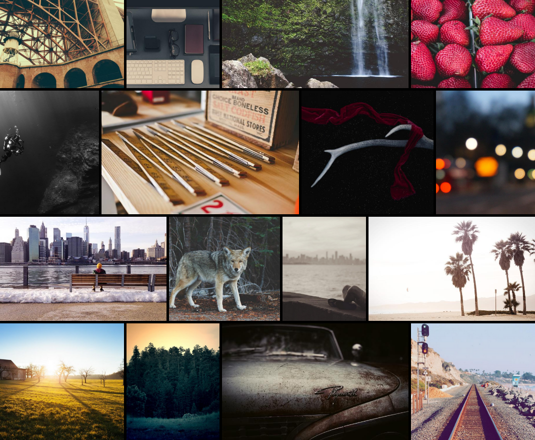
Photo gallery web component

Readme
img-focus
Responsive photo gallery
A lightweight set of web components to display un-croped pictures.
Getting started
Installation
Install web components through your package manager:
npm install img-focusImport dist/img-focus.js in your HTML file.
Add following tags with corresponding attributes:
img-focustag to setup your gallery.img-phototag for each photo of your gallery, content can be appended, it will be displayed as a photo overlay.srcsetphoto sources, it will be used to display thumbnail and fullscreen photo (mandatory, no default)sizesphoto sizes, it may be defined to reduce network load (optionnal, default:(min-width: 50em) 15vw, 100vw)widthandheightintrinsic photo width and height, it will be used to avoid layout shift (optionnal, no default)altphoto alternative text, it will be displayed as photo caption when openning a photo (optionnal, no default)
<img-focus>
  <img-photo
    srcset="https://picsum.photos/seed/1/320/300 320w, https://picsum.photos/seed/1/640/600 640w, https://picsum.photos/seed/1/1280/1200 1280w"
    width="1280"
    height="1200"
    alt="Photo 1"
  >
    Photo 1
  </img-photo>
  <img-photo
    srcset="https://picsum.photos/seed/2/320/400 320w, https://picsum.photos/seed/2/640/800 640w, https://picsum.photos/seed/2/1280/1600 1280w"
    width="1280"
    height="1600"
    alt="Photo 2"
  >
    Photo 2
  </img-photo>
</img-focus>
Configuration
CSS custom variables:
--img-focus-gap: define gap between photos (default:0)--img-focus-lines-height: minimum lines height (default:200px)--img-focus-icons-color: navigation icons color (default:#fff)--img-focus-caption-color: caption text color (default:#fff)
DOM events:
img-focus-photo-open: photo opennedimg-focus-photo-close: current openned photo closed
Developing
Following scripts are avalaible:
npm run build: build projectnpm run start: debug projectnpm run test: test project