
ink-fine-progress
v0.1.0
Published
High-resolution progress bar component for Ink with 1/8 block precision

Maintainers
 zakurozakuro
Readme
ink-fine-progress
High-resolution progress bar for Ink, with 1/8 sub-character rendering using Unicode block elements.
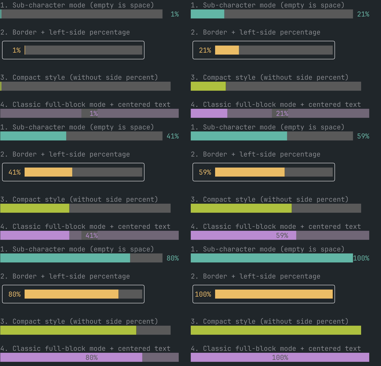
Features
- 1-char = 8 steps (
█+▏▎▍▌▋▊▉) - Optional classic full-block mode (
mode="full") for old-school behavior submode empty area is always space (tqdm-like)- Percent field is fixed-width (
" 8%"," 25%","100%") - Optional centered percent label (
percentPosition="center") with fill-aware color inversion - Width-aware text layout for centered labels (handles wide Unicode glyphs)
- Works with fixed
widthor parent<Box width={...}>+width="100%" - Unified track background with
backgroundColor(filled/unfilled consistent) - Optional percent label (
left/right/center/none) - Optional border wrapping via Ink
<Box borderStyle="..."> <Text>prop passthrough (style, wrap, dimColor, bold, etc.)
Install
npm install ink-fine-progressyarn add ink-fine-progresspnpm add ink-fine-progressBasic usage
import React from 'react';
import {Box} from 'ink';
import {ProgressBar} from 'ink-fine-progress';

export function Example({progress}: {progress: number}) {
  return (
    <Box width={40}>
      <ProgressBar
        value={progress}
        total={100}
        width="100%"
        color="whiteBright"
        backgroundColor="cyan"
      />
    </Box>
  );
}
Examples gallery
npm run example:galleryAlso available:
npm run example:basicRelated Projects
ink-progress-bar- classic Ink progress bar API@inkjs/uiProgressBar - broader Ink UI component settqdm- reference behavior for Unicode sub-block bars
Classic full-block mode
<ProgressBar
  value={done}
  total={total}
  mode="full"
  backgroundColor="magenta"
  backgroundCharacter="░"
  percentPosition="center"
/>
API
| Prop | Type | Default | Description |
|---|---|---|---|
| value | number | - | Current progress value (0 to total) |
| total | number | 100 | Maximum value |
| width | number \| string | "100%" | Track container width; use number for fixed width or "100%" to follow parent width |
| color | TextProps["color"] | undefined | Foreground color (Ink Text compatible) |
| backgroundColor | TextProps["backgroundColor"] | undefined | Background color (Ink Text compatible) |
| showPercent | boolean | true | Show/hide percent label |
| percentPosition | "left" \| "right" \| "center" \| "none" | "right" | Percent label placement. In center, filled area uses color=backgroundColor, background=color and empty area uses normal colors |
| mode | "sub" \| "full" | "sub" | sub: 1/8 partial blocks, full: full blocks only |
| borderStyle | BoxProps["borderStyle"] | undefined | Wrap output in bordered Ink Box |
| character | string | "█" | Full block character |
| backgroundCharacter | " " \| "░" \| "▒" \| "▓" | " " | Unfilled track character (full mode only; sub mode empty is space) |
All additional props are forwarded to Ink <Text>.