
input-color-picker
v1.0.5
Published
Color picker library produced in Angular language.
Maintainers
 hongdaesik
Readme
InputColorPicker


A lightweight Angular color picker component with an SVG-based palette, search input, and full ControlValueAccessor support for seamless Reactive Forms / ngModel integration. Ships with 1,700+ built-in colors.
Installation
npm install input-color-pickerQuick Start
import { Component } from '@angular/core'
import { FormsModule } from '@angular/forms'
import { InputColorPickerComponent } from 'input-color-picker'

@Component({
  selector: 'app-example',
  imports: [FormsModule, InputColorPickerComponent],
  template: `
    <input-color-picker [(ngModel)]="selectedColor" />
    <p>Selected: {{ selectedColor }}</p>
  `
})
export class ExampleComponent {
  selectedColor = '#6366f1'
}
API
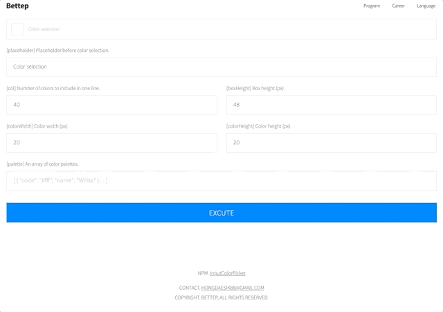
Inputs
| Property | Type | Default | Description |
|----------|------|---------|-------------|
| [col] | number | 40 | Number of color swatches per row. |
| [palette] | Palette[] | 1,700+ built-in colors | Custom color palette array. |
| [boxHeight] | number | 48 | Height of the trigger button in pixels. |
| [colorWidth] | number | 20 | Width of each color swatch in pixels. |
| [colorHeight] | number | 20 | Height of each color swatch in pixels. |
| [placeholder] | string | 'Color selection' | Placeholder text when no color is selected. |
Forms Support
The component implements ControlValueAccessor and works with both template-driven and reactive forms.
// Template-driven
<input-color-picker [(ngModel)]="color" />

// Reactive Forms
<input-color-picker [formControl]="colorControl" />
<input-color-picker formControlName="color" />
Types
import { Palette, Color } from 'input-color-picker'

// Palette — each color entry in the picker
interface Palette {
  code: string   // Hex color code (e.g. '#ff3100')
  name: string   // Display name  (e.g. 'Red')
}
Custom Palette
import { Component } from '@angular/core'
import { FormsModule } from '@angular/forms'
import { InputColorPickerComponent, Palette } from 'input-color-picker'

@Component({
  selector: 'app-custom',
  imports: [FormsModule, InputColorPickerComponent],
  template: `
    <input-color-picker
      [(ngModel)]="color"
      [palette]="brandColors"
      [col]="5"
      [colorWidth]="32"
      [colorHeight]="32"
      [placeholder]="'Pick a brand color'"
    />
  `
})
export class CustomComponent {
  color = ''

  brandColors: Palette[] = [
    { code: '#1877F2', name: 'Facebook Blue' },
    { code: '#1DA1F2', name: 'Twitter Blue' },
    { code: '#FF0000', name: 'YouTube Red' },
    { code: '#E4405F', name: 'Instagram Pink' },
    { code: '#0A66C2', name: 'LinkedIn Blue' },
  ]
}
Changelog
| Version | Description |
|---------|-------------|
| 1.0.5 | Angular 21 upgrade. Signal inputs, inject(), effect() migration. |
| 1.0.4 | Standalone / SSR compatible. |
| 1.0.3 | Modify package dependency version range. |
| 1.0.2 | Remove package dependency. |
| 1.0.0 | Initial release. |